plot包
> str(trees)
'data.frame':   31 obs. of  3 variables:
 $ Girth : num  8.3 8.6 8.8 10.5 10.7 10.8 11 11 11.1 11.2 ...
 $ Height: num  70 65 63 72 81 83 66 75 80 75 ...
 $ Volume: num  10.3 10.3 10.2 16.4 18.8 19.7 15.6 18.2 22.6 19.9 ...
> head(trees)
  Girth Height Volume
1   8.3     70   10.3
2   8.6     65   10.3
3   8.8     63   10.2
4  10.5     72   16.4
5  10.7     81   18.8
6  10.8     83   19.7
> setwd("e:/")   #改变工作目录
> write.csv(trees, "trees.csv")    #保存csv文件
> Data <- read.csv("trees.csv", header = TRUE)
> Data <- Data[ ,2:ncol(Data)]      #去掉序列一列
> Data
   Girth Height Volume
1    8.3     70   10.3
2    8.6     65   10.3
3    8.8     63   10.2
4   10.5     72   16.4
5   10.7     81   18.8
6   10.8     83   19.7
7   11.0     66   15.6
8   11.0     75   18.2
9   11.1     80   22.6
10  11.2     75   19.9
11  11.3     79   24.2
12  11.4     76   21.0
13  11.4     76   21.4
14  11.7     69   21.3
15  12.0     75   19.1
16  12.9     74   22.2
17  12.9     85   33.8
18  13.3     86   27.4
19  13.7     71   25.7
20  13.8     64   24.9
21  14.0     78   34.5
22  14.2     80   31.7
23  14.5     74   36.3
24  16.0     72   38.3
25  16.3     77   42.6
26  17.3     81   55.4
27  17.5     82   55.7
28  17.9     80   58.3
29  18.0     80   51.5
30  18.0     80   51.0
31  20.6     87   77.0
> jpeg(file="myplot.jpeg")      #保存为jpeg格式
> x <- Data$Girth
> y <- Data$Height
> plot(x, y, main = "树围与树高关系图", xlab = "Girth", ylab = "Height")
> dev.off()
windows
      2
> png(file="myplot.png", bg="transparent")      #保存为png格式
> x <- Data$Girth
> y <- Data$Height
> plot(x, y, main = "树围与树高关系图", xlab = "Girth", ylab = "Height")
> dev.off()
windows
      2
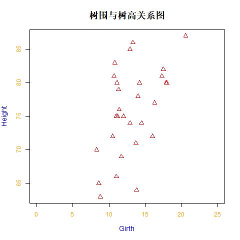
> pdf(file="myplot.pdf")      #保存为pdf格式
> plot(x, y, main = "树围与树高关系图", xlab = "Girth", ylab = "Height",
+     xlim = c(0,25),                             #设置x轴刻度范围
+     pch = 2, col = "red", cex = 1.2,            #设置图形几何形状和颜色
+     col.lab = "blue", col.axis = "orange",
+     cex.lab = 1.2, cex.main = 1.5)
There were 48 warnings (use warnings() to see them)
> dev.off()
windows
      2
1、标题文字设置参数:main(主标题),sub(副标题),xlab(x轴标题)和ylab(y轴标题)
2、坐标轴有无:axes (TRUE/FALSE)
3、坐标轴区间参数:xlim,ylim
4、点类型参数:pch
5、线类型、宽度参数:lty,lwd
6、颜色设置参数:col, col.axis, col.lab, col.main, col.sub
7、大小(包括图形和字体)参数:cex, cex.axis, cex.main, cex.sub, cex.lab
8、如果点类型是空心点(pch=21-25),还可以设置内部填充颜色:bg参数
注 意:plot( )函数执行后会把图形区的其他东西全“擦”掉再新作图,这样的图形函数称为高水平图形函数;而 box( ), title( ), axis( ), points( )这些函数只是在原有图形基础上添加东西,它们称为低水平图形函数。只有使用了 高级图形函数产生图形区后才能使用低水平图形函数。各图形元素的低水平图形函数有:
1、添加标题(主、副标题和坐标轴标题):title( )
2、添加坐标轴:axis( )
3、添加数据点:points( )
4、添加线:lines( )
5、添加水平线或垂直线:abline( )
6、添加文字:text( )
7、添加一个多边形:polygon( )
8、添加定位:legend( )
ggplot2包
> install.packages("ggplot2")
> library(ggplot2)
> str(diamonds)
Classes ‘tbl_df’, ‘tbl’ and 'data.frame':       53940 obs. of  10 variables:
 $ carat  : num  0.23 0.21 0.23 0.29 0.31 0.24 0.24 0.26 0.22 0.23 ...
 $ cut    : Ord.factor w/ 5 levels "Fair"<"Good"<..: 5 4 2 4 2 3 3 3 1 3 ...
 $ color  : Ord.factor w/ 7 levels "D"<"E"<"F"<"G"<..: 2 2 2 6 7 7 6 5 2 5 ...
 $ clarity: Ord.factor w/ 8 levels "I1"<"SI2"<"SI1"<..: 2 3 5 4 2 6 7 3 4 5 ...
 $ depth  : num  61.5 59.8 56.9 62.4 63.3 62.8 62.3 61.9 65.1 59.4 ...
 $ table  : num  55 61 65 58 58 57 57 55 61 61 ...
 $ price  : int  326 326 327 334 335 336 336 337 337 338 ...
 $ x      : num  3.95 3.89 4.05 4.2 4.34 3.94 3.95 4.07 3.87 4 ...
 $ y      : num  3.98 3.84 4.07 4.23 4.35 3.96 3.98 4.11 3.78 4.05 ...
 $ z      : num  2.43 2.31 2.31 2.63 2.75 2.48 2.47 2.53 2.49 2.39 ...
> head(diamonds)
# A tibble: 6 x 10
  carat cut       color clarity depth table price     x     y     z
  <dbl> <ord>     <ord> <ord>   <dbl> <dbl> <int> <dbl> <dbl> <dbl>
1 0.230 Ideal     E     SI2      61.5   55.   326  3.95  3.98  2.43
2 0.210 Premium   E     SI1      59.8   61.   326  3.89  3.84  2.31
3 0.230 Good      E     VS1      56.9   65.   327  4.05  4.07  2.31
4 0.290 Premium   I     VS2      62.4   58.   334  4.20  4.23  2.63
5 0.310 Good      J     SI2      63.3   58.   335  4.34  4.35  2.75
6 0.240 Very Good J     VVS2     62.8   57.   336  3.94  3.96  2.48
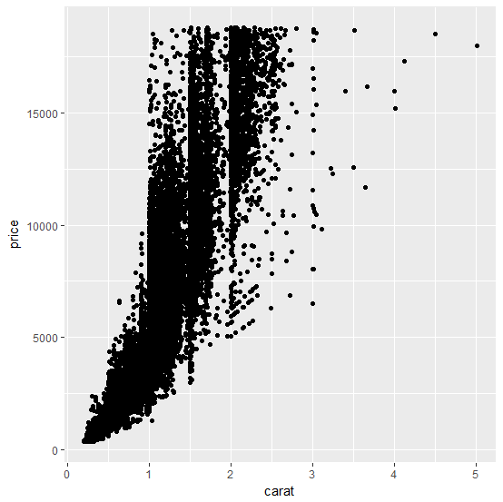
> ggplot(diamonds,aes(carat,price))+geom_point()
> ggplot(diamonds,aes(carat,price))+geom_point(aes(shape=cut)) #按形状分类
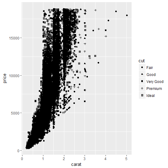
> ggplot(diamonds,aes(carat,price))+geom_point(aes(colour=cut)) #按颜色分类

> ggplot(diamonds,aes(carat,price))+geom_point(aes(size=cut)) #按大小分类
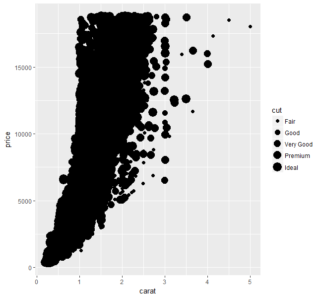
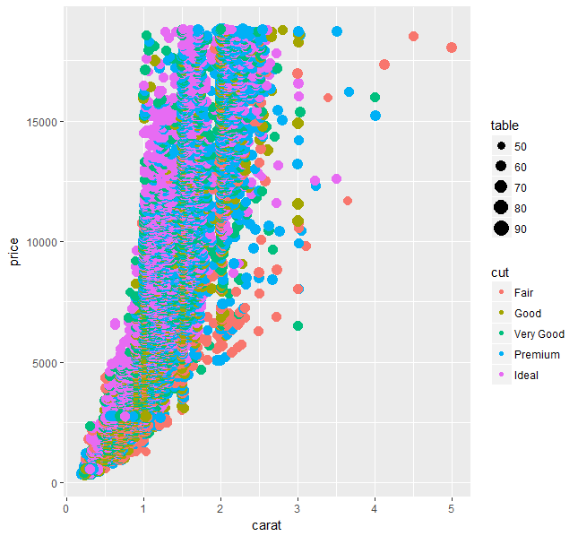
> ggplot(diamonds,aes(carat,price))+geom_point(aes(colour=cut,size=table)) #大小/颜色
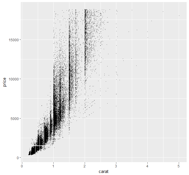
因为数据集记录较多,数据点相互重合,使得很多区域很难辨识的现象。
1.使用alpha参数(透明化处理)
> ggplot(diamonds,aes(carat,price))+geom_point(alpha = 1/10)
2.使用像素级散点图
> ggplot(diamonds,aes(carat,price))+geom_point(shape=".")
图像美化
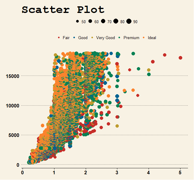
R语言可视化——散点图及美化> install.packages("ggthemes")
> library(ggthemes)
> ggplot(diamonds,aes(carat,price))+
+ geom_point(aes(colour=cut,size=table))+
+ ggtitle("Scatter Plot")+
+ theme_wsj()+
+ scale_colour_wsj()+
+ guides(size=guide_legend(title=NULL),colour=guide_legend(title=NULL))
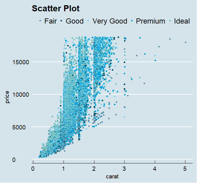
> ggplot(diamonds,aes(carat,price))+
+ geom_point(aes(colour=cut))+
+ ggtitle("Scatter Plot")+
+ theme_economist(base_size=14)+
+ scale_colour_economist()+
+ guides(colour=guide_legend(title=NULL))
想要看某一个区域内的具体分布情况
> ggplot(diamonds,aes(carat,price))+
+ geom_point(aes(colour=cut,size=table))+
+ ggtitle("Scatter Plot")+
+ theme_wsj()+
+ scale_colour_wsj()+
+ guides(size=guide_legend(title=NULL),colour=guide_legend(title=NULL))+
+ xlim(1,2)+
+ ylim(5000,10000)

> ggplot(diamonds,aes(carat,price))+
+ geom_point(aes(colour=cut,size=table))+
+ ggtitle("Scatter Plot")+
+ theme_economist(base_size=14)+
+ scale_colour_economist()+
+ guides(size=guide_legend(title=NULL),colour=guide_legend(title=NULL))+
+ xlim(1,2)+
+ ylim(5000,10000)
