目录
最近博主在完成一项R语言绘图的课程作业,
就想着造福一下R语言零基础的同学们(从零基础的安装到导包到最终的各种类型的图形绘制)
不可谓最好,但可谓很全。
非常适合新手小白使用。
本教程肝了两夜,期末来临,时间紧张!
共两万五千字!!!
真心不易!!!
建议三连!!!
建议收藏!!!
一、【R语言入门】——安装R和Rstuido软件
R语言是用于统计分析,图形表示和报告的编程语言和软件环境;Rstudio是编辑、运行R语言的最为理想的工具之一。
1、R安装包
1.1、直接下载博主我的安装包资源(亲测安全有效)
1.2、官网下载R安装包
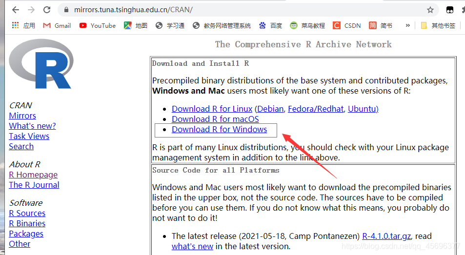
下载地址为:https://cran.r-project.org 进入链接,如下图所示,在页面顶部提供了三个下载链接,分别对应三种操作系统:Windows、Mac和Linux。请选择自己操作系统对应的链接,接下来我将以windows为例给大家展示安装过程。
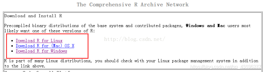
接下来单击【Download R for Windows】——>【base】——>【Download R 3.3.1 for Windows】,即可下载相应安装包。
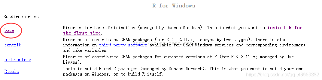
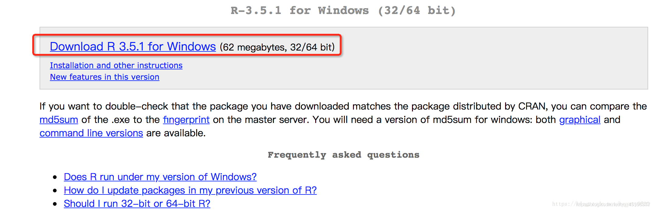
单击base,进入下面页面,点击【Download R 3.5.1 for Windows】
2、安装R
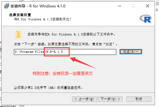
下载完R安装包(我下的按转包名称为:“R-4.1.0-win.exe”),之后双击开始安装,跟一般的软件安装一样,根据需要进行相关安装设置并不断点击下一步即可。
step1、选择安装位置
可改成自己的安装路径。
特别注意: 安装目录一定要为英文!!!!!!!!!!!!!
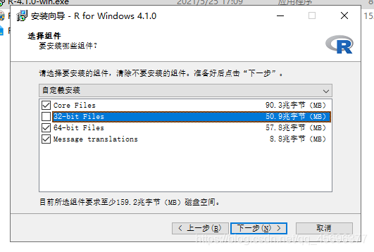
step2、安装组件
注意:根据自身电脑操作系统的位数选择,但64位系统可全选,因为64位向下兼容32位系统。(要想知道R语言的32位和64位区别的请继续往下查看博客)
step3、启动选项

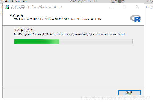
step4、正在安装
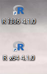
step5、安装完成,并生成桌面快捷方式
下面是桌面快捷方式,分为32位和64位:R i386为32位的,R x64为64位的。
step6、打开R
双击两个快捷方式中任意一个即可打开R的原生IDE
接下来就是大家所关心的R的32位与64位的区别啦
3.R的32位与64位的区别!
提问:
R既有32位版本也有64位版本。那么我们该选择使用哪个版本呢?
答:
除了32位操作系统不能安装64位版本以外,在大多数情况下,你可以任意选择。两个版本都使用32位整数,也就意味着 他们在数值计算时具有相同的数值精度。
两者的主要区别在于内存管理方面。64位的R使用了64位的指针,而32位的R使用的则是32位指针。这意味着 64位的R可以使用和搜索更大的内存空间。
从经验来看, 32位版本的R要比64位版本的R更快 ,虽然并不总是如此。但从另一角度来看,64位版本的R在处理更大型的文件和数据集时所面临的内存管理问题更少。两个版本允许的最大向量长度都是20亿左右。
推荐:
如果你的操作系统不支持64位程序,或者你的计算机内存小于4GB,那么应该选择32位版本的R。如果操作系统支持64位版本的R,那么适用于windows系统和Mac系统的R安装程序会自动安装两个版本的R。
4、下载RStudio安装包
4.1、直接下载博主我的安装包资源(亲测安全有效)
4.2、官网下载
下载地址: http://www.rstudio.com/ide 进入下载页面后,可以发现有Desktop和Server两个版本,我们选择Desktop。
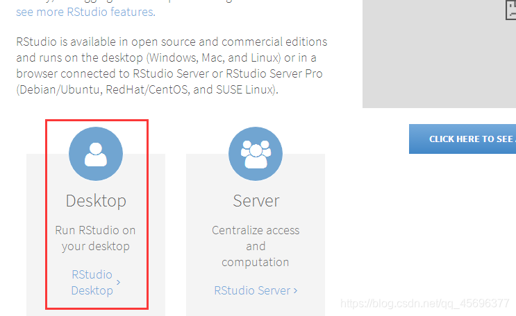
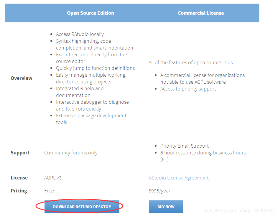
单击蓝色圆形图标,进入跳转到Desktop版本下载窗口,Desktop版本又分为两个版本:Open Source Edition(免费)和Commercial License(付费)。
初学者自己用的话可选择前者,单击【 DOWNLOAD RSRUDIO DESKTOP】。
单击【DOWNLOAD RSRUDIO DESKTOP】后进入下载页面,根据自己电脑的操作系统选择下载的版本,因为我的操作系统是win7,所以我选择【RStudio 0.99.903-Windows Vista/7/8/10】,单击并下载得到【RStudio-0.99.903.exe】。
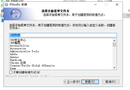
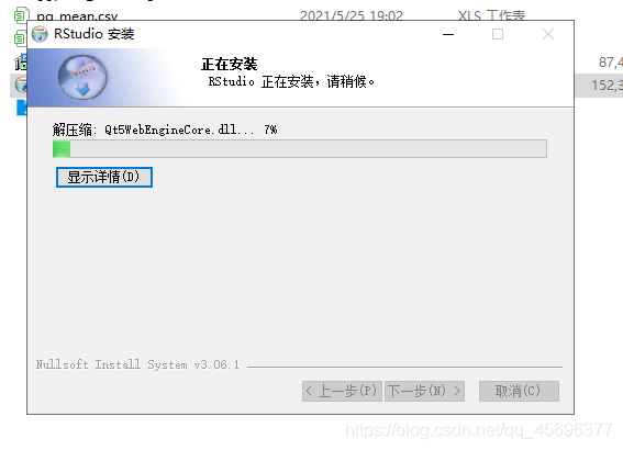
5、安装RStudio
step1、双击【RStudio-0.99.903.exe】进行安装
step2、选择安装位置
可自行更改安装路径。

step3、正在安装
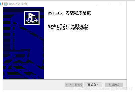
step4、安装完成
step5、IDE功能介绍
打开RStudio之后,会出现上图所示的窗口,其中有三个独立的面板。最大的面板是控制台窗口,这是运行R代码和查看输出结果的地方。也就是运行原生R时看到的控制台窗口。其他面板则是RStudio所独有的。隐藏在这些面板中的包括一个文本编辑器、一个画图界面、一个代码调试窗口、一个文件管理窗口等。
注意:有的人可能会问,有了RStudio还需要下载R吗?
即使使用RStudio,还是需要事先为计算机安装好R。RStudio只是辅助你使用R进行编辑的工具,它自身不附带R程序。
6、R语言环境安装
下载步骤:
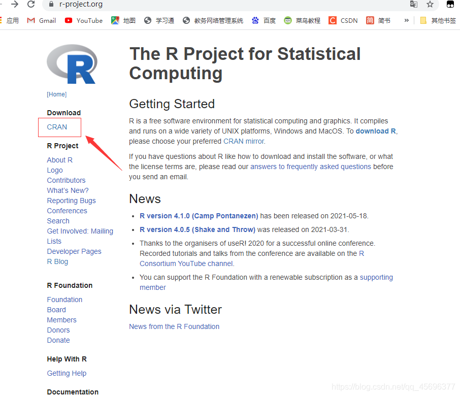
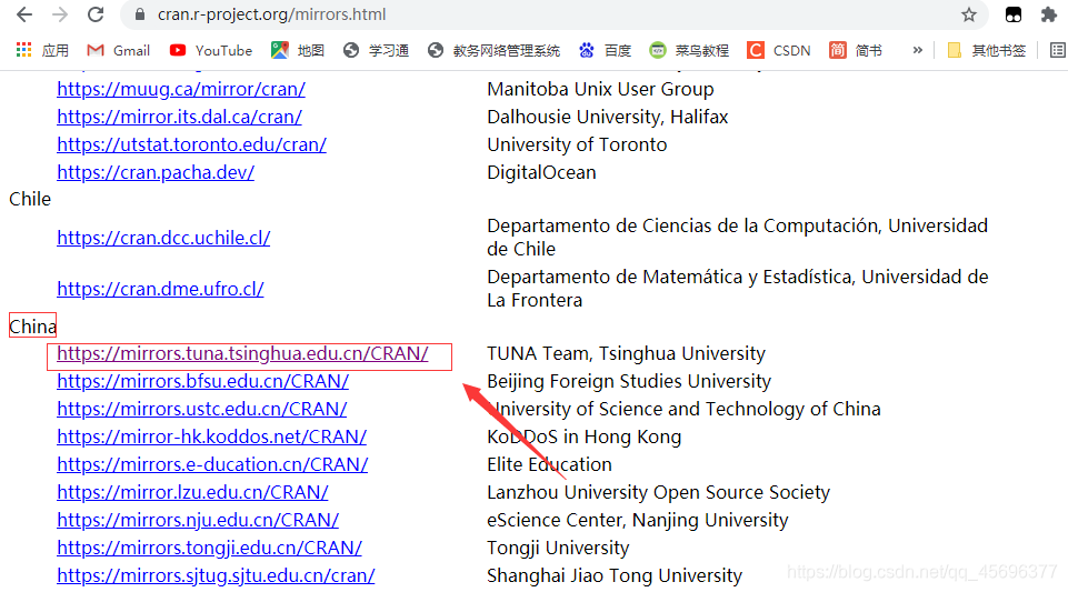
打开https://cran.r-project.org/
step1
step2
step3
下载好软件以后,接着傻瓜式安装

双击图标,点击启动
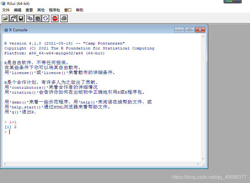
- 用’demo()'来看一些示范程序,用’help()'来阅读在线帮助文件,或
- 用’help.start()'通过HTML浏览器来看帮助文件。
- 用’q()'退出R.
R语言的相关环境搭建至此已经全部准备完毕,接下来正式进入正题
二、【R语言入门】——R语言绘图之ggplot2绘制条形直方图
2.1、什么是数据可视化? (What is Data Visualization?)
Wiki says “Data visualization is the graphic representation of data.
It involves producing images that communicate relationships among the
represented data to viewers of the images.”Wiki说: “数据可视化是数据的图形表示。 它涉及制作图像,以将表示的数据之间的关系传达给图像的查看者。”
2.2、R语言绘制频率直方图
频率直方图是数据统计中经常会用到的图形展示方式,同时在生物学分析中可以更好的展示表型性状的数据分布类型;R基础做图中的hist函数对单一数据的展示很方便,但是当遇到多组数据的时候就不如ggplot2绘制来的方便。
2.2.1、基础做图hist函数
hist(rnorm(200),col='blue',border='yellow',main='',xlab='')

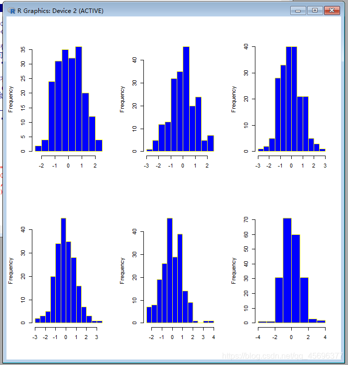
2.2.1.1、多图展示
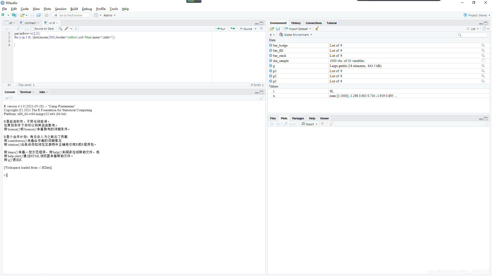
par(mfrow=c(2,3))
for (i in 1:6) {

    hist(rnorm(200),border='yellow',col='blue',main='',xlab='')}
2.2.2、ggplot2绘制
- 构造一组正态分布的数据
PH<-data.frame(rnorm(300,75,5))
names(PH)<-c('PH')
#显示数据
head(PH)

##         PH
## 1 72.64837
## 2 67.10888
## 3 89.34927
## 4 75.70969
## 6 82.85354
- 加载ggplot2作图包并绘图
library(ggplot2)
library(gridExtra)
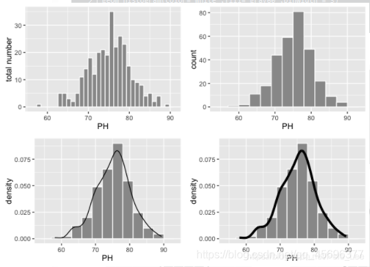
p1<-ggplot(data=PH,aes(PH))
geom_histogram(color='white',fill='gray60') #控制颜色
ylab(label = 'total number') #修改Y轴标签
2.2.2.1、修改柱子之间的距离
p2<-ggplot(data=PH,aes(PH))
geom_histogram(color='white',fill='gray60',binwidth = 3)
2.2.2.2、添加拟合曲线
p3<-ggplot(data=PH,aes(PH,..density..))
geom_histogram(color='white',fill='gray60',binwidth = 3)
geom_line(stat='density')
2.2.2.3、修改线条的粗细
p4<-ggplot(data=PH,aes(PH,..density..))
geom_histogram(color='white',fill='gray60',binwidth = 3)
geom_line(stat='density',size=1.5)
grid.arrange(p1,p2,p3,p4)
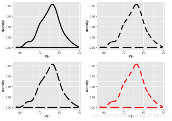
2.2.2.4、绘制密度曲线
p1<-ggplot(data=PH,aes(PH,..density..))
geom_density(size=1.5)
2.2.2.5、修改线条样式
p2<-ggplot(data=PH,aes(PH,..density..))
geom_density(size=1.5,linetype=2)
p3<-ggplot(data=PH,aes(PH,..density..))
geom_density(size=1.5,linetype=5)
2.2.2.6、修改颜色
p4<-ggplot(data=PH,aes(PH,..density..))
geom_density(size=1.5,linetype=2,colour='red')
grid.arrange(p1,p2,p3,p4)
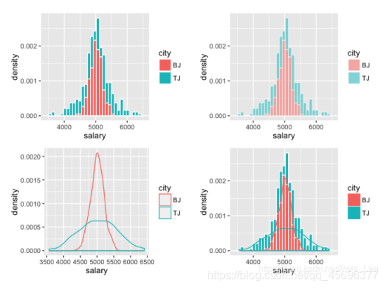
2.2.2.7、多组数据展示
- 构造两组数据
df<-data.frame(c(rnorm(200,5000,200),rnorm(200,5000,600)),rep(c('BJ','TJ'),each=200))
names(df)<-c('salary','city')
- 结果展示
library(ggplot2)
p1<-ggplot()
geom_histogram(data=df,aes(salary,..density..,fill=city),color='white')
p2<-ggplot()
geom_histogram(data=df,aes(salary,..density..,fill=city),color='white',alpha=.5)
p3<-ggplot()
geom_density(data=df,aes(salary,..density..,color=city))
p4<-ggplot()
geom_histogram(data=df,aes(salary,..density..,fill=city),color='white') geom_density(data=df,aes(salary,..density..,color=city))
grid.arrange(p1,p2,p3,p4)
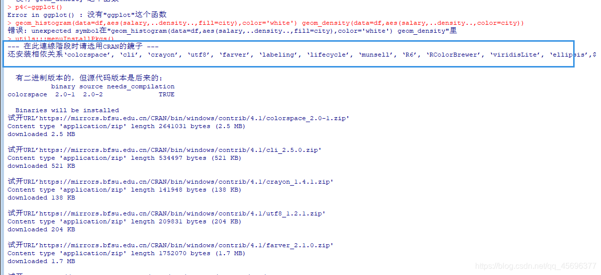
注:如果出现如下加载ggplot2包失败的问题
2.3、加载ggplot2包失败的解决办法
2.3.1、法一、R x64 4.1.0
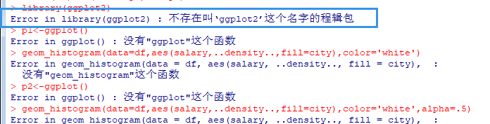
step 1
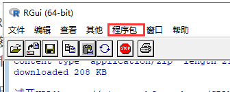
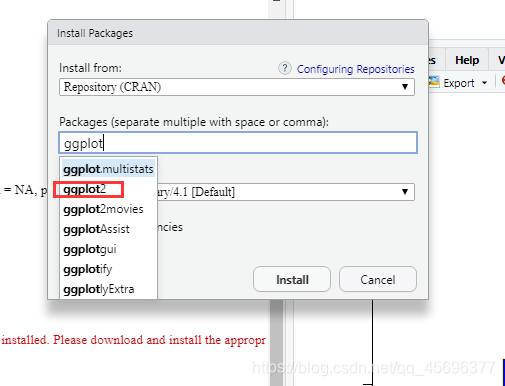
step 2 安装程序包 -->ggplot2
f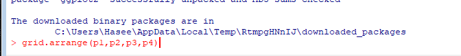
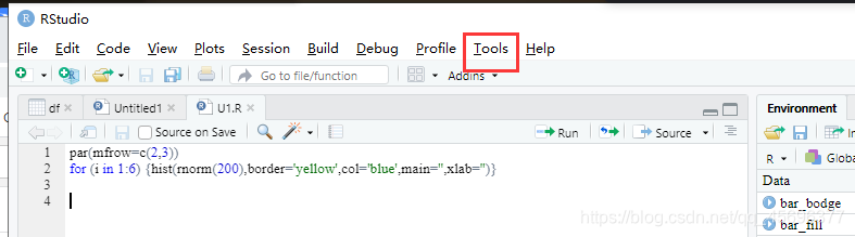
2.3.2、法二 、 RStudio
step1 Tools–> Install Packages
step 2
2.4、什么是ggplot2? (What is ggplot2?)
为了更加真正的帮助大家理解,博主我去查询翻译了由哈德利·威克姆、丹妮尔·纳瓦罗和托马斯·林·佩德森撰写的《ggplot2:用于数据分析的优雅图形》第三版的在线版本。甄选出了部分核心内容如下:
While this book gives some details on the basics of ggplot2, it’s primary focus is explaining the Grammar of Graphics that ggplot2 uses, and describing the full details. It is not a cookbook, and won’t necessarily help you create any specific graphic that you need. But it will help you understand the details of the underlying theory, giving you the power to tailor any plot specifically to your needs.
虽然本书提供了 ggplot2 基础知识的一些细节,但它的主要重点是解释 ggplot2 使用的图形语法,并描述完整的细节。它不是一本食谱,也不一定能帮助您创建所需的任何特定图形。但它将帮助您了解基本理论的细节,使您能够根据自己的需要专门定制任何情节。
Wiki says “Data visualization is the graphic representation of data.
It involves producing images that communicate relationships among the
represented data to viewers of the images.”Wiki说: “数据可视化是数据的图形表示。 它涉及制作图像,以将表示的数据之间的关系传达给图像的查看者。”
The inputs we are interested in are:
我们感兴趣的输入是:
-
Call the ggplot(df) function which creates a blank canvas with the
dataset(df) of interest调用ggplot(df)函数,该函数将使用感兴趣的数据集(df)创建一个空白画布
-
Specify aesthetic mappings, which specifies how you want to map
variables to visual aspects. In this case, we are simply mapping the
variables to the x- and y-axes. 指定美学映射,这指定了如何将变量映射到视觉方面。
在这种情况下,我们只是将变量映射到x轴和y轴。 -
You then add new layers that are geometric objects which will show
up on the plot and additional layers as required.
然后添加作为几何对象的新图层,这些图层将显示在图形上,并根据需要添加其他图层。
2.4.1、搭建环境 (Setting up the environment)
Because ggplot2 package isn’t part of the standard distribution of R or R Base, you have to download the package from CRAN(Comprehensive R Archive Network) repository and install it.
由于ggplot2软件包不是R或R Base的标准发行版的一部分,因此您必须从CRAN(综合R存档网络)存储库下载该软件包并进行安装。
Here is how to install a package for the first time with theinstall.packages() function and to load the package at the start of each R session with the library() function.
这是第一次使用install.packages()函数安装软件包,并在每个R会话开始时使用library()函数加载软件包的方法。
To install the ggplot2 package, use the following:
要安装ggplot2软件包,请使用以下命令:
install.packages("ggplot2")
And then to load it, use the following:
然后使用以下命令加载它:
library(ggplot2)
2.4.2、虹膜数据集 (The Iris Dataset)
The Iris Dataset contains four features (length and width of sepals and petals) of 50 samples of three species of Iris (Iris setosa, Iris virginica and Iris versicolor). Four features were measured from each sample: the length and the width of the sepals and petals, in centimetres.
鸢尾花数据集包含三种鸢尾花(鸢尾花,鸢尾花和鸢尾花)的50个样本的四个特征(萼片和花瓣的长度和宽度)。 从每个样品中测量出四个特征:萼片和花瓣的长度和宽度,以厘米为单位。
The data is already available in the datasets package of R. We can simply access the data using the following:
R中的datasets包中已经有可用的datasets 。我们可以使用以下命令简单地访问数据:
library(datasets)
data("iris")
2.5、以下是ggplot2下的常用图形
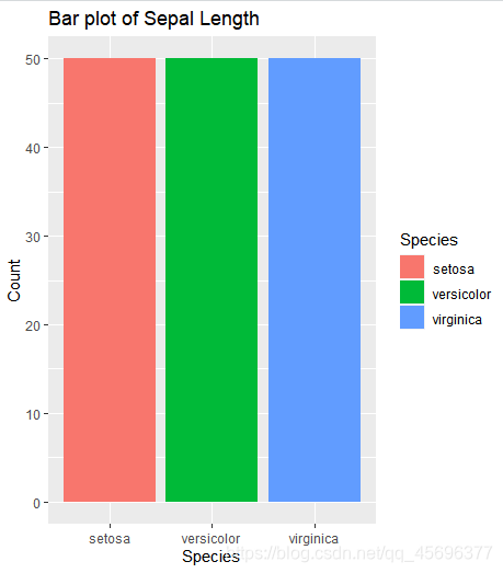
2.5.1、条形图 (1. Bar Graphs)
A Bar Graph (or a Bar Chart) is a graphical display of data using bars of different heights. They are good if you to want to visualize the data of different categories that are being compared with each other.
条形图(或条形图)是使用不同高度的条形图的数据图形显示。 如果您要可视化正在相互比较的不同类别的数据,那么它们很好。
The following code is used to create a bar graph using the geom_bar() function that contains “Species” on the x-axis and count of each category on the y-axis:
以下代码用于使用geom_bar()函数创建条形图,该函数在x轴上包含“ Species”,在y轴上包含每个类别的计数:
ggplot(data=iris, aes(x=Species, fill = Species)) +
geom_bar() +
  xlab("Species") +
  ylab("Count") +
  ggtitle("Bar plot of Sepal Length")
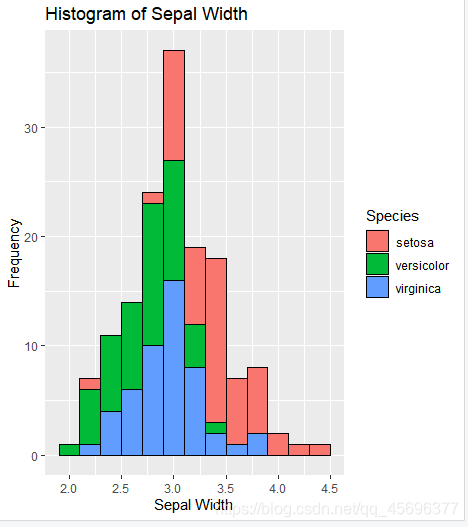
2.5.2、直方图 (2. Histograms)
A Histogram is a graphical display of continuous data using bars of different heights. It is similar to a bar graph, except histograms group the data into bins. The height of each bar shows the number of elements in the bin.
直方图是使用不同高度的条形图的连续数据的图形显示。 它类似于条形图,不同之处在于直方图将数据分组到箱中。 每个条形图的高度显示箱中元素的数量。
In R, you can create a histogram using the geom_histogram() function and specify required arguments as follows:
在R中,您可以使用geom_histogram()函数创建直方图, geom_histogram()如下所示指定所需的参数:
ggplot(data=iris, aes(x=Sepal.Width)) +
  geom_histogram(binwidth=0.2, color="black", aes(fill=Species)) +
  xlab("Sepal Width") +
  ylab("Frequency") +
  ggtitle("Histogram of Sepal Width")
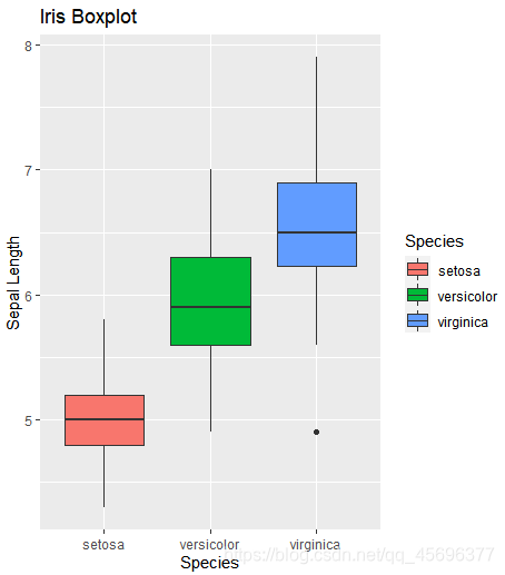
2.5.3、箱形图 (3. Boxplots)
The box-whisker plot (or a boxplot) is a quick and easy way to visualize complex data where you have multiple samples. A box plot is a good way to get an overall picture of the data set in a compact manner.
箱须图(或箱图)是一种快速简便的方法,可在您有多个样本的情况下可视化复杂数据。 箱形图是一种以紧凑的方式获得数据集的整体图的好方法。
To create a box plot, usegeom_boxplot() and specify what variables you want on the X and Y axes and add different colours to the plot using the following code:
要创建箱形图,请使用geom_boxplot()并在X和Y轴上指定所需的变量,然后使用以下代码向图中添加不同的颜色:
ggplot(data=iris, aes(x=Species, y=Sepal.Length)) +
  geom_boxplot(aes(fill=Species)) +
  ylab("Sepal Length") + ggtitle("Iris Boxplot")
Image for post
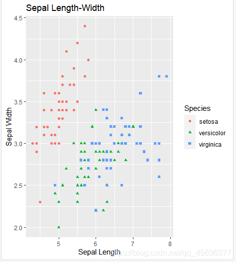
2.5.4.散点图 (4. Scatter Plots)
A scatter plot is a graphical display of the relationship between two sets of data. They are good if you to want to visualize how two variables are correlated. That’s why they are also called correlation plot.
散点图是两组数据之间关系的图形显示。 如果您想可视化两个变量之间的关系,则它们非常有用。 这就是为什么它们也称为相关图。
To create a scatter plot, use ggplot() with geom_point() and specify what variables you want on the X and Y axes as shown below:
要创建散点图, ggplot()与geom_point()并在X和Y轴上指定所需的变量,如下所示:
ggplot(data=iris, aes(x = Sepal.Length, y = Sepal.Width)) + geom_point(aes(color=Species, shape=Species)) +
  xlab("Sepal Length") +  ylab("Sepal Width") +
  ggtitle("Sepal Length-Width")
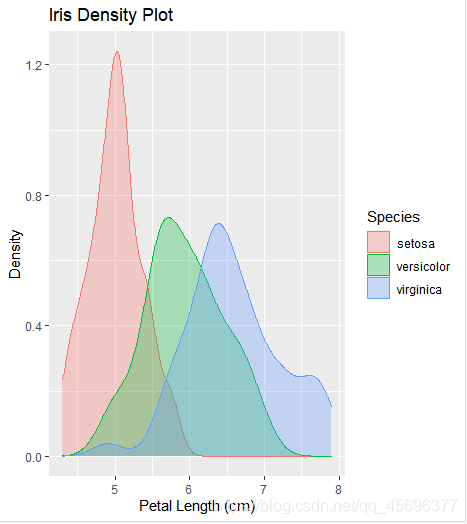
2.5.5、密度图 (5. Density Plots)
A density plot is a representation of the distribution of a numeric variable. It is a smoothed version of the histogram and is used in the same kind of situation. Density plots are used to study the distribution of one or a few variables.
密度图表示数字变量的分布。 它是直方图的平滑版本,在相同情况下使用。 密度图用于研究一个或几个变量的分布。
Density plots are built-in ggplot2 thanks to the geom_density geom. Only one numeric variable is needed as input as shown below:
由于使用了geom_density geom,密度图是内置的geom_density 。 只需一个数字变量作为输入,如下所示:
ggplot(iris, aes(x=Sepal.Length,
                 colour=Species, fill=Species)) +
  geom_density(alpha=.3) +
  xlab("Petal Length (cm)") +
  ylab("Density") +
  ggtitle("Iris Density Plot")
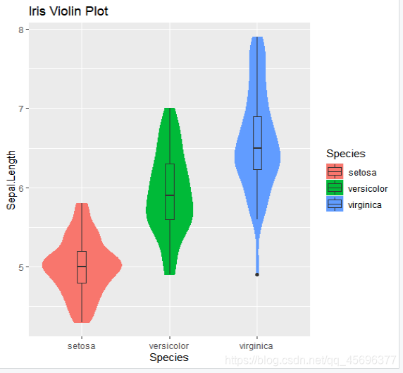
2.5.6、小提琴图 (6. Violin Plot)
Violin plots are similar to box plots, except that they also show the kernel probability density of the data at different values. Typically, violin plots will include a marker for the median of the data and a box indicating the interquartile range, as in standard box plots.
小提琴图类似于箱形图,不同之处在于它们还显示了不同值的数据的核概率密度。 通常,小提琴图将包括数据中位数的标记和指示四分位数范围的框,如在标准框图中一样。
The function geom_violin() is used to produce a violin plot as shown below:
函数geom_violin()用于产生小提琴图,如下所示:
ggplot(iris, aes(Species, Sepal.Length, fill=Species)) +
  geom_violin(aes(color = Species), trim = T)+
  geom_boxplot(width=0.1) +
  ggtitle("Iris Violin Plot")
2.5、R语言 ggplot2包
ggplot2超详细讲解教程及相关实例
R语言 ggplot2包
2.6、结论
I hope you liked this introductory explanation about visualizing the iris dataset with ggplot2 package in R. You can run these examples yourself an improve on them. You can also apply these visualization methods to other datasets as well.
我希望您喜欢这个介绍性的说明,它涉及使用R中的ggplot2包可视化虹膜数据集。您可以自己运行这些示例,以对其进行改进。 您还可以将这些可视化方法也应用于其他数据集。
Check out this book if you’re interested in learning more and for any future references — Data Visualization in R With ggplot2, ggplot2
如果您有兴趣了解更多信息以及将来的参考资料,请查看本书《R的ggplot2》
和《ggplot2中的 数据可视化》
翻译自:
https://medium.com/@namithadeshpande/plotting-data-using-ggplot2-in-r-578d29275b84
三、【R语言入门】——R语言绘图之散点图
#下载并安装ggplot2包

if(!suppressWarnings(require('ggplot2'))){


install.packages('ggplots')

require('ggplot2')

}

head(diamonds)
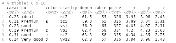
简单介绍一下数据集中变量的含义:
carat:砖石的重量(卡拉);
cut:砖石的切工,共有5种水平;
color:砖石的颜色,共有7个水平;
clarity:砖石的纯度;
depth,table,x,y和z为砖石的5种物理指标,深度、宽度等;
price:砖石的价格
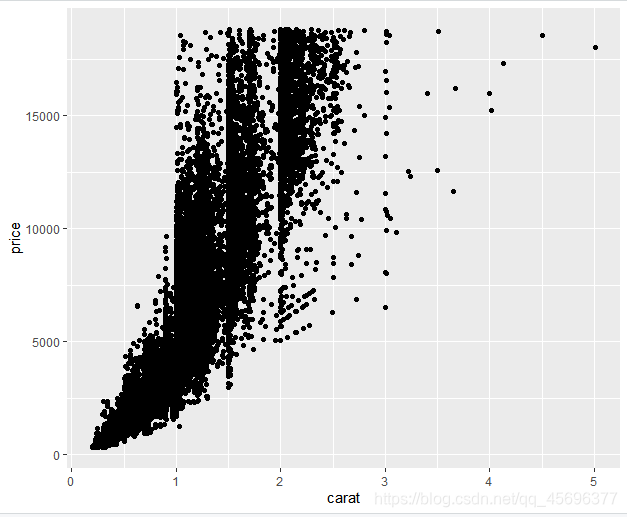
#绘制diamonds数据集中carat与price的散点图

qplot(carat, price, data = diamonds)
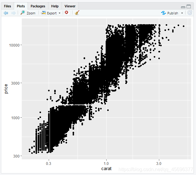
#对x和y坐标做对数变换,可以使用log参数

qplot(log(carat), log(price), data = diamonds)

#或者

qplot(carat, price, data = diamonds, log='xy')
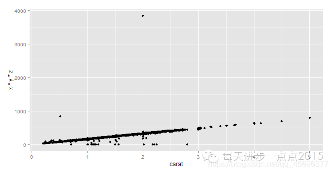
绘制砖石重量与体积的散点图

qplot(carat, x*y*z, data = diamonds)
#对diamonds数据集进行抽样
set.seed(1234)
dia_sample <- diamonds[sample(1:nrow(diamonds),1000),]
#为散点图添加图形的其他装饰属性,使用col参数添加颜色
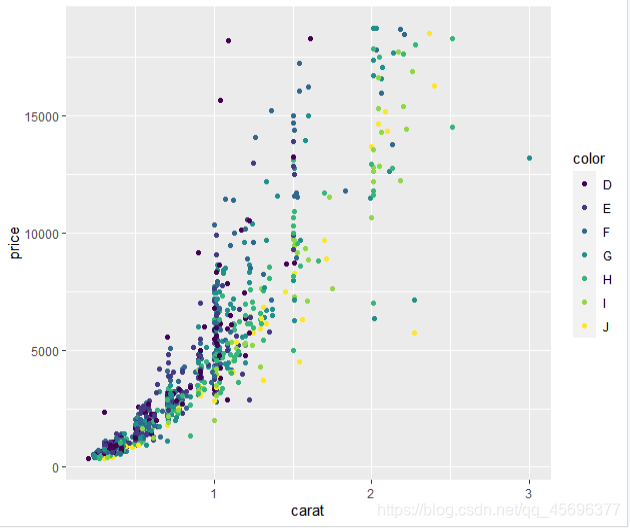
qplot(carat, price, data = dia_sample, col = color)
#为散点图添加图形的其他装饰属性,使用shape参数添加形状属性
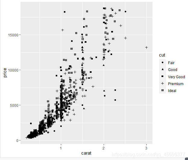
qplot(carat, price, data = dia_sample, shape = cut)
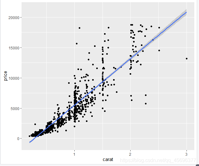
#为散点图添加拟合曲线,使用method参数

qplot(carat, price, data = dia_sample,

geom = c('point','smooth'), method = 'lm')

0?wx_fmt=png
qplot(carat, price, data = dia_sample,

geom = c('point','smooth'),

method = 'loess', span = 0.2)
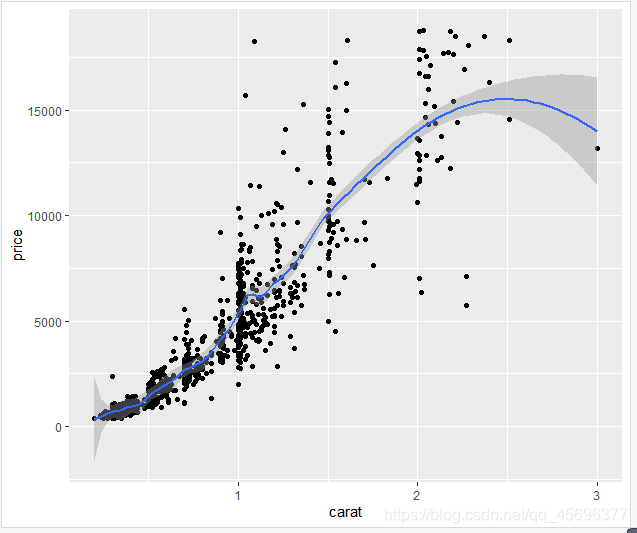
span越小,平滑线越弯曲(0–>1:很不平滑–>很平滑)
四、【R语言入门】——R语言绘图之折线图
折线图一
#绘制密度曲线
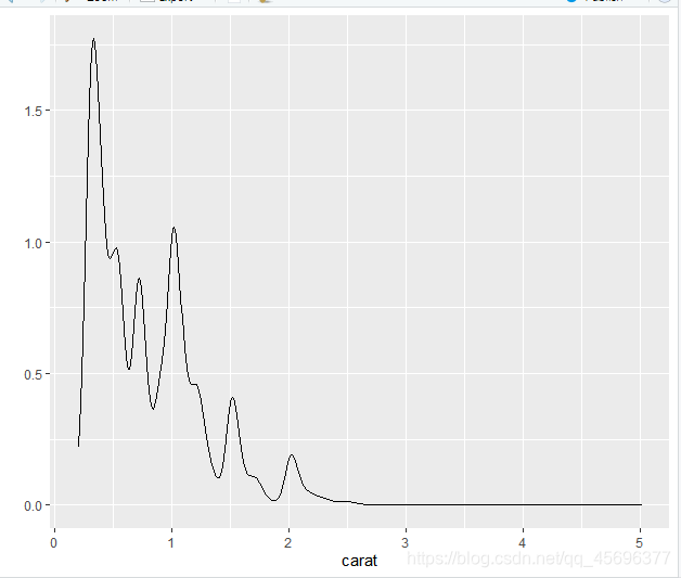
qplot(x = carat, data = diamonds, geom = 'density')
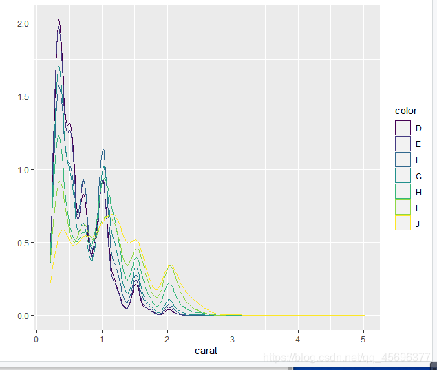
qplot(x = carat, data = diamonds, geom = 'density',col = color)
折线图二
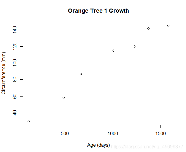
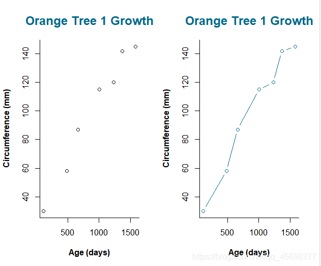
如果将散点图上的点从左往右连接起来,就会得到一个折线图。我们以R中自带的Orange数据集为例,来学习折线图的画法,该数据集中包含五种橘树的树龄和年轮数据。要考察橘树的年轮如何随着树龄变化,先画个散点图看看:
# 先看第一种橘树,提取第一种树的数据,保存在t1中
t1 <- subset(Orange, Tree==1)
# 绘制散点图
plot(t1$age, t1$circumference,
        xlab="Age (days)",
        ylab="Circumference (mm)",
        main="Orange Tree 1 Growth")
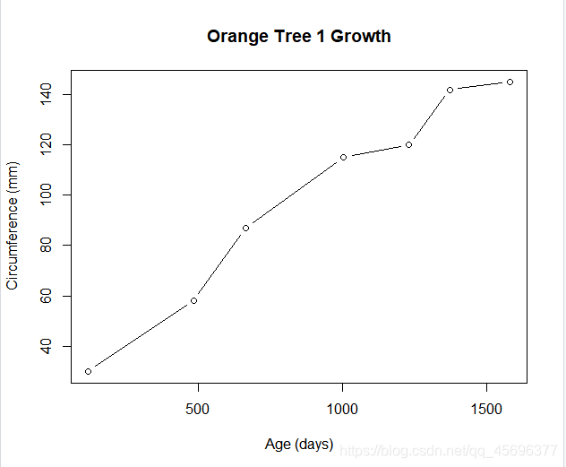
再画折线图:
# 绘制折线图
plot(t1$age, t1$circumference,
     xlab="Age (days)",
     ylab="Circumference (mm)",
     main="Orange Tree 1 Growth",
     type="b")
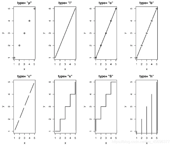
折线图的图形外观还可以有很多种,均可通过type命令来完成,下表展示了type可选的取值:
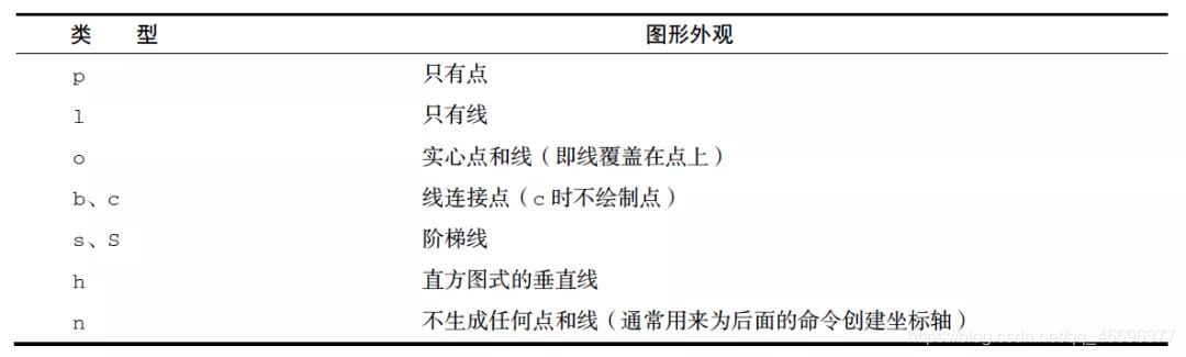
选取上表中各种类型的type值,就可以得到各式各样的折线图:
试着调整图形
虽然上面的图形已经可以准确表达数据信息,但有时自动生成的图形可能无法满足需求。
比如,我们想把上面的散点图和折线图放在同一张图中,便于比较,或者想改变文字的字体、颜色等…… 此时,可以在用plot()作图前,先用par()函数设置你想改变的参数:
# 设置par()函数
par(mfrow=c(1,2),bty='l',cex.main=1.5,
    col.main='deepskyblue4',font.lab=2,
    family='Times New Roman')
# 绘制散点图
plot(t1$age, t1$circumference,
     xlab="Age (days)",
     ylab="Circumference (mm)",
     main="Orange Tree 1 Growth")
# 绘制折线图
plot(t1$age, t1$circumference,
     xlab="Age (days)",
     ylab="Circumference (mm)",
     main="Orange Tree 1 Growth",col='deepskyblue4',
     type="b")
大家可以先将这段代码复制到R中运行(记得先用本文开头的方法生成t1这个对象),看看出现了什么?
par(mfrow=c(1,2),bty='l',cex.main=1.5,
    col.main='deepskyblue4',font.lab=2,
    family='Times New Roman')
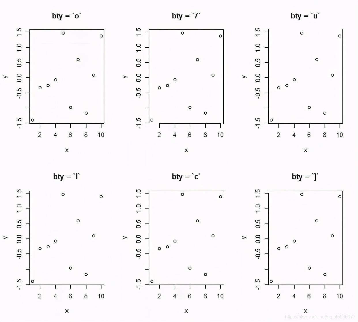
par()是R中用来设置图形参数的函数。
上面的代码中,mfrow是图形整体布局命令,不是针对某个具体的图形而言的,而是对整个绘图区域的布局。定义整体有几行、几列图形,其赋值形式为c(行数,列数);
bty是设置图形边框类型的函数,其取值及效果如下图:
cex.main:设置标题文本的放大倍数,还可用cex.axis 和 cex.lab分别设置坐标轴刻度值和名称文本的放大倍数;
col.main:设置文本标题的颜色,大家能猜出坐标轴刻度值和名称的颜色如何设置吗?欢迎留言呀~
font.lab:设置坐标轴名称的字型:

family:设置图形中所有文本的字体。
最终得到的图形如下:
五、【R语言入门】—— R语言ggplot2基础绘图案例
如果实在没有时间学习的小伙伴们,可以直接下载博主我写好的demo案例,基本够用,内涵详细代码及图片。
内含
1.条形图三张(详细代码及png图)
2.散点图五张(详细代码及png图)
3.折线图两张(详细代码及png图)
注:内容会不断更新
望共勉
猜你可能喜欢
【通信工程】信息类,电子类,电气工程,自动化,计算机,软件工程,机电,等相关专业 全套学习指导 【建议收藏】
【一篇理清】C语言/C++/C#,及JAVA/Python的区别在什么地方?【建议收藏】
欢迎点赞+关注哦,有问题欢迎评论或者私信博主我