一个比较好的ggplot学习博文
author: 李丕栋
email: [email protected]
date: 2016年3月7日
http://blog.csdn.net/tanzuozhev/article/details/50822204
本文在 http://www.cookbook-r.com/Graphs/Bar_and_line_graphs_(ggplot2) 的基础上加入了自己的理解.
ggplot2 接受的数据类型必须为data.frame结构,
离散数据作为x轴
对于条形图, 对于高度的设置有两种不同的选择:
- x,y 对应的数值为实际的图上数值, x为横轴标签,y为纵轴高度.这时候使用
geom_bar(stat="identity")作为图层.
library(ggplot2)
dat <- data.frame(
  time = factor(c("Lunch","Dinner"), levels=c("Lunch","Dinner")),
  total_bill = c(14.89, 17.23)
)
dat
- 1
- 2
- 3
- 4
- 5
- 6
##     time total_bill
## 1  Lunch      14.89
## 2 Dinner      17.23
- 1
- 2
- 3
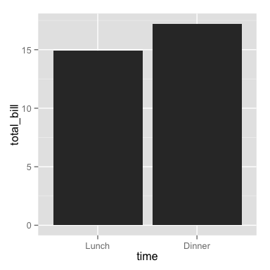
time列为因子型变量, 表示x轴标签和填充颜色 total_bill 列为y轴的实际数值, 表示高度
ggplot(data=dat, aes(x=time, y=total_bill)) +
    geom_bar(stat="identity")
- 1
- 2
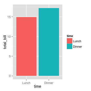
# 以time作为颜色填充
ggplot(data=dat, aes(x=time, y=total_bill, fill=time)) +
    geom_bar(stat="identity")
- 1
- 2
- 3
## 等同于
 ggplot(data=dat, aes(x=time, y=total_bill)) +
    geom_bar(aes(fill=time), stat="identity")
- 1
- 2
- 3

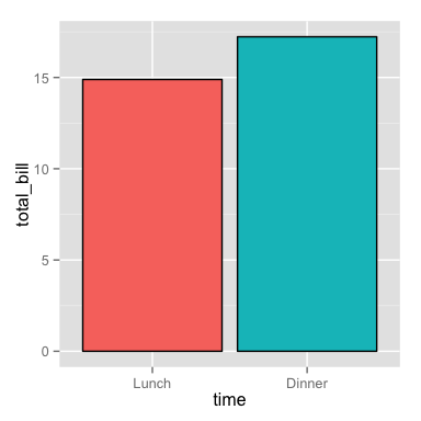
# 添加黑色轮廓线
ggplot(data=dat, aes(x=time, y=total_bill, fill=time)) +
    geom_bar(colour="black", stat="identity")
- 1
- 2
- 3

# 去除图例
ggplot(data=dat, aes(x=time, y=total_bill, fill=time)) +
    geom_bar(colour="black", stat="identity") +
    guides(fill=FALSE)
- 1
- 2
- 3
- 4
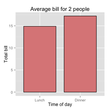
# 添加其他信息 title, narrower bars, fill color, and change axis labels
ggplot(data=dat, aes(x=time, y=total_bill, fill=time)) +
    geom_bar(colour="black", fill="#DD8888", width=.8, stat="identity") +
    guides(fill=FALSE) +
    xlab("Time of day") + ylab("Total bill") +
    ggtitle("Average bill for 2 people")
- 1
- 2
- 3
- 4
- 5
- 6
- 输入一组数据,对于x轴与y轴的信息需要进行统计计数.x轴为数据去除重复项的保留值,y轴为x轴对应的重复次数.使用
geom_bar(stat="bin")作为新图层.
# 使用reshape2包的tips数据集
library(reshape2)
# 数据展示
head(tips)
- 1
- 2
- 3
- 4
##   total_bill  tip    sex smoker day   time size
## 1      16.99 1.01 Female     No Sun Dinner    2
## 2      10.34 1.66   Male     No Sun Dinner    3
## 3      21.01 3.50   Male     No Sun Dinner    3
## 4      23.68 3.31   Male     No Sun Dinner    2
## 5      24.59 3.61 Female     No Sun Dinner    4
## 6      25.29 4.71   Male     No Sun Dinner    4
- 1
- 2
- 3
- 4
- 5
- 6
- 7
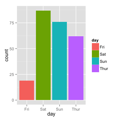
这里输入的变量只有x,没有y,x轴为day,要使用 stat="bin"代替 stat="identity",数据去重后留下Sun Sat Thur Fri,它们对应的重复次数作为y轴.
# Bar graph of counts
ggplot(data=tips, aes(x=day,fill=day)) +
    geom_bar(stat="bin")
- 1
- 2
- 3
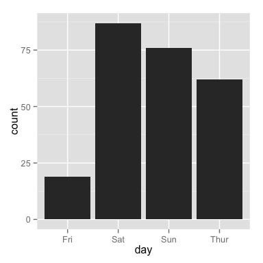
## 等同于
ggplot(data=tips, aes(x=day)) +
   geom_bar()# stat参数默认为 bin
- 1
- 2
- 3
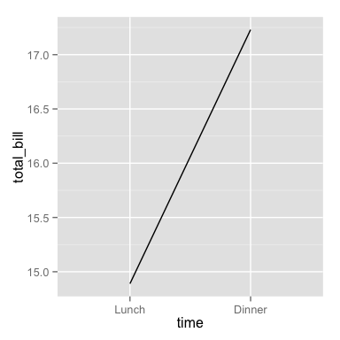
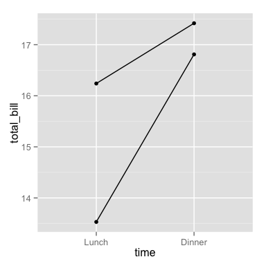
折线图
time: x-axis
total_bill: y-axis
# Basic line graph
ggplot(data=dat, aes(x=time, y=total_bill, group=1)) +
    geom_line()
- 1
- 2
- 3
## This would have the same result as above
# ggplot(data=dat, aes(x=time, y=total_bill)) +
# geom_line(aes(group=1))
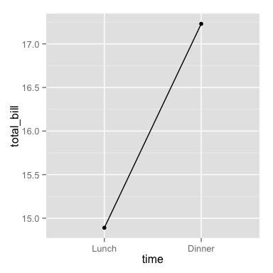
# 折线图添加点
ggplot(data=dat, aes(x=time, y=total_bill, group=1)) +
geom_line() +
geom_point()
- 1
- 2
- 3
- 4
- 5
- 6
- 7
- 8
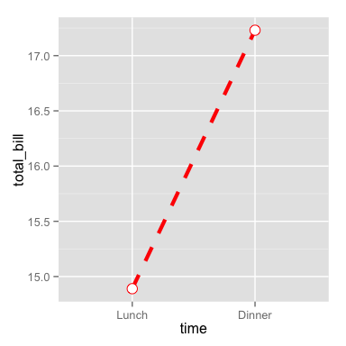
# 修改颜色
# Change line type and point type, and use thicker line and larger points
# Change points to circles with white fill
ggplot(data=dat, aes(x=time, y=total_bill, group=1)) +
    geom_line(colour="red", linetype="dashed", size=1.5) +
    geom_point(colour="red", size=4, shape=21, fill="white")
- 1
- 2
- 3
- 4
- 5
- 6
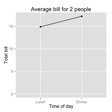
# Change the y-range to go from 0 to the maximum value in the total_bill column,
# and change axis labels
# 修改y轴的范围,从0到最大值
ggplot(data=dat, aes(x=time, y=total_bill, group=1)) +
    geom_line() +
    geom_point() +
    expand_limits(y=0) +# 修改y轴的范围,从0到最大值 expand_limits(y = c(1, 9)),y从1到9
    xlab("Time of day") + ylab("Total bill") +
    ggtitle("Average bill for 2 people")
- 1
- 2
- 3
- 4
- 5
- 6
- 7
- 8
- 9
更多数据变量
新建数据,这里增加了一个变量sex
dat1 <- data.frame(
    sex = factor(c("Female","Female","Male","Male")),
    time = factor(c("Lunch","Dinner","Lunch","Dinner"), levels=c("Lunch","Dinner")),
    total_bill = c(13.53, 16.81, 16.24, 17.42)
)
dat1
- 1
- 2
- 3
- 4
- 5
- 6
##      sex   time total_bill
## 1 Female  Lunch      13.53
## 2 Female Dinner      16.81
## 3   Male  Lunch      16.24
## 4   Male Dinner      17.42
- 1
- 2
- 3
- 4
- 5
条形图
变量映射
time: x-axis
sex: color fill
total_bill: y-axis.
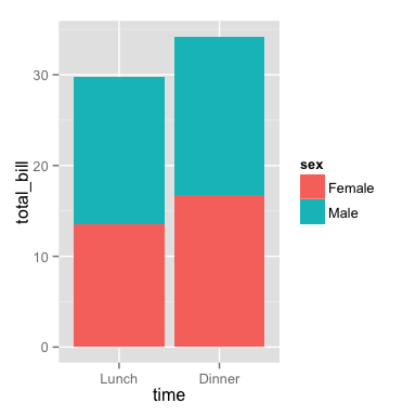
# 这里涉及了几个图形的位置摆放
# 默认为堆叠(Stacked bar graph)
ggplot(data=dat1, aes(x=time, y=total_bill, fill=sex)) +
    geom_bar(stat="identity")
- 1
- 2
- 3
- 4
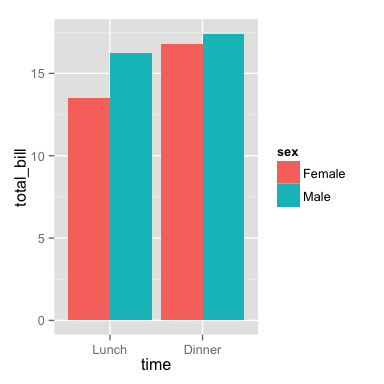
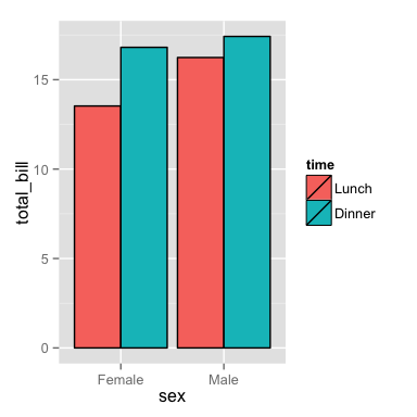
# 位置摆放, position_dodge()为分开摆放

ggplot(data=dat1, aes(x=time, y=total_bill, fill=sex)) +
    geom_bar(stat="identity", position=position_dodge())
- 1
- 2
- 3
- 4
# Change colors
ggplot(data=dat1, aes(x=time, y=total_bill, fill=sex)) +
    geom_bar(stat="identity", position=position_dodge(), colour="black") +
    scale_fill_manual(values=c("#999999", "#E69F00"))# 修改填充的颜色,填充的颜色数组大小必须与fill(sex)的大小一致
- 1
- 2
- 3
- 4
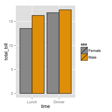
修改变量的映射,x轴为sex,颜色填充为time
# Bar graph, time on x-axis, color fill grouped by sex -- use position_dodge()
ggplot(data=dat1, aes(x=sex, y=total_bill, fill=time)) +
    geom_bar(stat="identity", position=position_dodge(), colour="black")
- 1
- 2
- 3
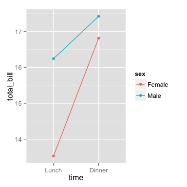
折线图
变量映射
time: x-axis
sex: line color
total_bill: y-axis.
为了画出多条线,数据必须进行分组, 这里我们对sex进行分组,就会出现两条线,Female一条,Male一条.
# 简单图
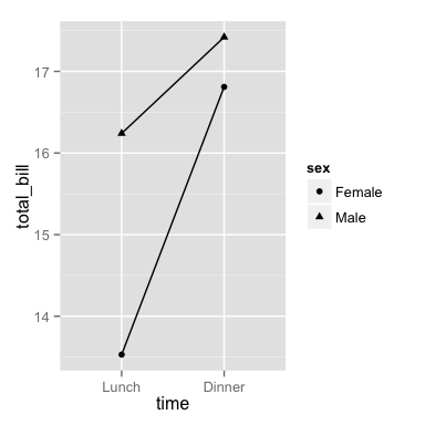
ggplot(data=dat1, aes(x=time, y=total_bill, group=sex)) +
geom_line() +
geom_point()
- 1
- 2
- 3
- 4
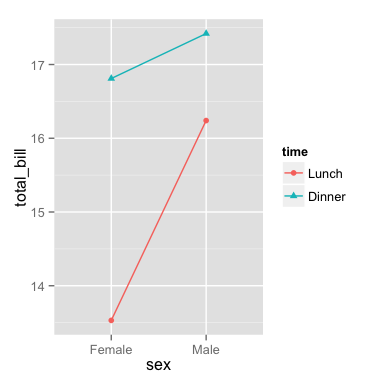
# 加入颜色
ggplot(data=dat1, aes(x=time, y=total_bill, group=sex, colour=sex)) +
    geom_line() +
    geom_point()
- 1
- 2
- 3
- 4
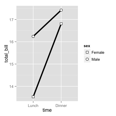
# Map sex to different point shape, and use larger points
ggplot(data=dat1, aes(x=time, y=total_bill, group=sex, shape=sex)) +
    geom_line() +
    geom_point()
- 1
- 2
- 3
- 4
# Use thicker lines and larger points, and hollow white-filled points
ggplot(data=dat1, aes(x=time, y=total_bill, group=sex, shape=sex)) +
    geom_line(size=1.5) +
    geom_point(size=3, fill="white") +
    scale_shape_manual(values=c(22,21))# 修改shape的类型
- 1
- 2
- 3
- 4
- 5
修改变量的映射关系,按照time进行分组,Lunch一组,Dinner一组
ggplot(data=dat1, aes(x=sex, y=total_bill, group=time, shape=time, color=time)) +
    geom_line() +
    geom_point()
- 1
- 2
- 3
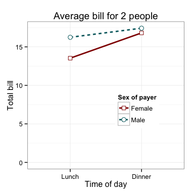
例子
条形图
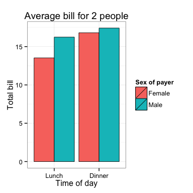
ggplot(data=dat1, aes(x=time, y=total_bill, fill=sex)) +
    geom_bar(colour="black", stat="identity",
             position=position_dodge(),
             size=.3) +                        # Thinner lines
    scale_fill_hue(name="Sex of payer") +      # Set legend title
    xlab("Time of day") + ylab("Total bill") + # Set axis labels
    ggtitle("Average bill for 2 people") +     # Set title
    theme_bw()
- 1
- 2
- 3
- 4
- 5
- 6
- 7
- 8
折线图
ggplot(data=dat1, aes(x=time, y=total_bill, group=sex, shape=sex, colour=sex)) +
    geom_line(aes(linetype=sex), size=1) +     # Set linetype by sex
    geom_point(size=3, fill="white") +         # Use larger points, fill with white
    expand_limits(y=0) +                       # 设置x y轴的起止范围,这里是y从0开始
    scale_colour_hue(name="Sex of payer",      # Set legend title
                     l=30)  +                  # Use darker colors (lightness=30)
    scale_shape_manual(name="Sex of payer",
                       values=c(22,21)) +      # Use points with a fill color
    scale_linetype_discrete(name="Sex of payer") +
    xlab("Time of day") + ylab("Total bill") + # Set axis labels
    ggtitle("Average bill for 2 people") +     # Set title
    theme_bw() +                          # 设置主题
    theme(legend.position=c(.7, .4))           # 设置图例的位置
- 1
- 2
- 3
- 4
- 5
- 6
- 7
- 8
- 9
- 10
- 11
- 12
- 13
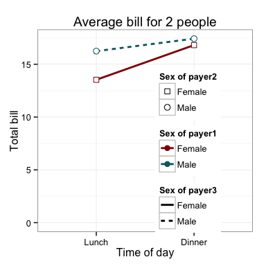
这幅折线图中, 使用了颜色scale_colour_hue,形状 scale_shape_manual,线型scale_linetype_discrete三种属性,应该有3个图例,但是因为图例的名称相同所以归为一类,如果三个图例的名称不同,就会出现3个图例.
ggplot(data=dat1, aes(x=time, y=total_bill, group=sex, shape=sex, colour=sex)) +
    geom_line(aes(linetype=sex), size=1) +     # Set linetype by sex
    geom_point(size=3, fill="white") +         # Use larger points, fill with white
    expand_limits(y=0) +                       # 设置x y轴的起止范围,这里是y从0开始
    scale_colour_hue(name="Sex of payer1",      # Set legend title
                     l=30)  +                  # Use darker colors (lightness=30)
    scale_shape_manual(name="Sex of payer2",
                       values=c(22,21)) +      # Use points with a fill color
    scale_linetype_discrete(name="Sex of payer3") +
    xlab("Time of day") + ylab("Total bill") + # Set axis labels
    ggtitle("Average bill for 2 people") +     # Set title
    theme_bw() +                          # 设置主题
    theme(legend.position=c(.7, .4))           # 设置图例的位置
- 1
- 2
- 3
- 4
- 5
- 6
- 7
- 8
- 9
- 10
- 11
- 12
- 13
连续型数据做x轴
新建数据
datn <- read.table(header=TRUE, text='
supp dose length
  OJ  0.5  13.23
  OJ  1.0  22.70
  OJ  2.0  26.06
  VC  0.5   7.98
  VC  1.0  16.77
  VC  2.0  26.14
')
- 1
- 2
- 3
- 4
- 5
- 6
- 7
- 8
- 9
dose作为x轴, 这里dose为numeric,视为连续型变量
ggplot(data=datn, aes(x=dose, y=length, group=supp, colour=supp)) +
    geom_line() +
    geom_point()
- 1
- 2
- 3
当把dose作为连续型变量时,尽管dose只有 0.5, 1.0, 2.0 三类,x轴也必须显示0.5,1.0,1.5,2.0甚至更多的点.
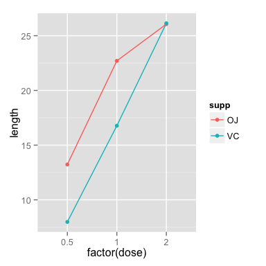
离散型数据做x轴
这里我们将dose数据转化为factor类型,就成了离散型, 0.5, 1.0, 2.0就只是单纯的类别名称.
# Copy the data frame and convert dose to a factor
datn2 <- datn
datn2$dose <- factor(datn2$dose)
ggplot(data=datn2, aes(x=dose, y=length, group=supp, colour=supp)) +
    geom_line() +
    geom_point()
- 1
- 2
- 3
- 4
- 5
- 6
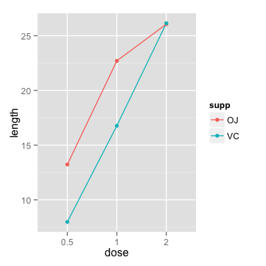
# 直接在ggplot中转换格式也是可以的
ggplot(data=datn, aes(x=factor(dose), y=length, group=supp, colour=supp)) +
    geom_line() +
    geom_point()
- 1
- 2
- 3
- 4
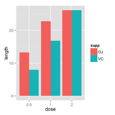
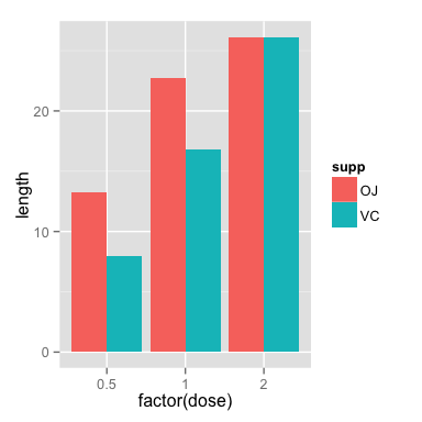
连续型数据和离散型用于条形图, 得到了相同的图.
# Use datn2 from above
ggplot(data=datn2, aes(x=dose, y=length, fill=supp)) +
    geom_bar(stat="identity", position=position_dodge())
- 1
- 2
- 3
# 直接使用factor转化
ggplot(data=datn, aes(x=factor(dose), y=length, fill=supp)) +
    geom_bar(stat="identity", position=position_dodge())
- 1
- 2
- 3
author: 李丕栋
email: [email protected]
date: 2016年3月7日