Matplotlib的绘图功能
文章目录
1.条形图
import matplotlib.pyplot as plt

data = [5, 20, 15, 25, 10]

plt.bar(range(len(data)), data)
plt.show()
bar(left, height, width=0.8, bottom=None, **kwargs)

可以通过增加关键字对条形图进行修饰:
-
颜色
facecolor(或fc):用于设置柱体的颜色
通过 color 关键字参数 可以一次性设置多个颜色,color是一个数组
-
描边
- edgecolor 或 ec:描边的颜色,如white,black,blue
- linestyle 或 ls: 描边的样式,如 “-” , “–”;
- linewidth 或 lw:描边的宽度 :
-
填充
hatch :hatch的值用于设置填充条形图的图形,如 “X”, “o” ,"/" ;
注意:hatch的长个数表示填充的密度,如"“表示用”/"密集得填充
-
误差线
yerr: 定义误差的浮动的绝对值 error_kw: 误差线关键字,是一个字典 关键字有: ecolor:误差线的颜色 elinewidth: 误差线的宽度,即粗细 capsize: 误差线帽子的长度 -
图例位置
pyplot.legend(**ky) #loc: 可选'best','upper left','bottom right' 等 #bbox_to_anchor=(0.2, 1),以左下角为为原点,调整位置 #bbox_transform=ax.transAxes #frameon: 图例是否有边框 #下面的操作由于修改边框的颜色 leg = plt.legend() leg.get_frame().set_edgecolor('b') -
合并图例
#得到坐标轴1图例的句柄和标签值 handles_1, labels_1 = ax1.get_legend_handles_labels() #得到坐标轴2图例的句柄和标签值 handles_2, labels_2 = ax2.get_legend_handles_labels() #关键字传入,传入label(一个数组)参数可以改变图例的标签值 plt.legend(handles=handles_1 + handles_2, bbox_to_anchor=(0.1, 1)) -
设置刻度线标签(tick label)
import matplotlib.pyplot as plt

data = [5, 20, 15, 25, 10]
labels = ['Tom', 'Dick', 'Harry', 'Slim', 'Jim']

plt.bar(range(len(data)), data, tick_label=labels)
plt.show()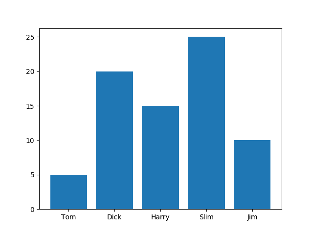
示例:
import matplotlib.pyplot as plt

labels = [0.3, 0.5, 1.0, 1.5, 3.0]
bottom_means = [20, 80, 160, 250, 400]
top_means = [210, 250, 1200, 1500, 2600]
top_std = [20, 40, 80, 200, 500]
width = 0.15  # the width of the bars: can also be len(x) sequence

#subplots是将多个图画到同一个平面上得工具,在matlab也有同样的函数

fig, ax = plt.subplots()
ax.bar(labels, bottom_means, width, color='white', edgecolor='black', ls='-', lw=1, hatch='', label='PFOA in water')
ax.bar(labels, top_means, width, color='white', edgecolor='black', ls='-', lw=1, yerr=top_std, bottom=bottom_means,
       hatch='xx',
       label='PFOA on SS')
#设置y轴上得标签值
ax.set_ylabel('PFOA amount (g)')
#设置图标的标题
ax.set_title('Initial PFOA concentration (mg/L)')
#设置图例,loc=location,指的是图例的位置
ax.legend(loc='upper left')

plt.show()
绘制其他样式的柱形图
-
水平的条形图
import matplotlib.pyplot as plt

data = [5, 20, 15, 25, 10]

plt.barh(range(len(data)), data)
plt.show()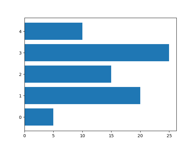
-
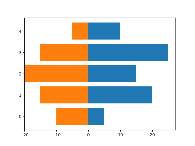
正负条形图
import numpy as np
import matplotlib.pyplot as plt

a = np.array([5, 20, 15, 25, 10])
b = np.array([10, 15, 20, 15, 5])

plt.barh(range(len(a)), a)
plt.barh(range(len(b)), -b)
plt.show()
2.误差线
坐标轴参数
-
设置双Y坐标轴
ax2 = plt.twinx()主要通过twinx( )方法创建出另一个坐标轴,此时在下面画图将会以右侧纵坐标为准
-
修改坐标轴的范围
pyplot.ylim(ymax=400) pyplot.ylim(ymin=10) pyplot.xlim(xmax=10) -
设置坐标轴刻度的参数
pyplot.tick_params(which='major', direction='in', length=6) #可选关键字 #可选参数which:选择major or minor #direction:刻度的朝向,可选in or out #length: 刻度的长度 #width: 刻度的宽度 #size : 刻度标签的大小 #axis: 指定是纵坐标还是,横坐标,可选xaxis or yaxis #colors:刻度标签的颜色axis.xaxis.set_minor_locator(MultipleLocator(0.25)) #设置纵坐标或者横坐标的次纵坐标的位置,上面表示每个0.25画一个次纵坐标 -
设置坐标轴颜色
axis.spines['bottom'].set_color('red') #设置坐标轴的颜色,可选参数top or bottom or left or right -
隐藏坐标轴
#隐藏y轴坐标
plt.gca().get_yaxis().set_visible(False)
#隐藏x轴坐标
plt.gca().get_xaxis().set_visible(False)
plot方法
-
**plot([x], y, [fmt], data=None, kwargs)
fmt:可选参数[fmt] 是一个字符串来定义图的基本属性如:颜色(color),点型(marker),线型(linestyle)
具体形式 fmt = ‘[color][marker][line]’
参考了:matplotlib.pyplot.plot()参数详解
plot(x, y, 'bo-') # 蓝色圆点实线color: 线的颜色
marker: 点的形状
line: 线的形状
	#maker的可选值
    =============    ===============================
    character        description
    =============    ===============================
    ``'.'``          point marker
    ``','``          pixel marker
    ``'o'``          circle marker
    ``'v'``          triangle_down marker
    ``'^'``          triangle_up marker
    ``'<'``          triangle_left marker
    ``'>'``          triangle_right marker
    ``'1'``          tri_down marker
    ``'2'``          tri_up marker
    ``'3'``          tri_left marker
    ``'4'``          tri_right marker
    ``'s'``          square marker
    ``'p'``          pentagon marker
    ``'*'``          star marker
    ``'h'``          hexagon1 marker
    ``'H'``          hexagon2 marker
    ``'+'``          plus marker
    ``'x'``          x marker
    ``'D'``          diamond marker
    ``'d'``          thin_diamond marker
    ``'|'``          vline marker
    ``'_'``          hline marker
    =============    ===============================
#line的可选值 ============= =============================== character description ============= =============================== ``'-'`` solid line style 实线 ``'--'`` dashed line style 虚线 ``'-.'`` dash-dot line style 点画线 ``':'`` dotted line style 点线 ============= ===============================如果不选maker,那么只是直接连线
-
其他关键字
lw(linewidth):线的宽度(粗细)
c(color):线的颜色
ls(linestyle):线的样式
marker:折点的形状
markeredgecolor 或 mec -- 折点外边颜色
markeredgewidth 或 mew -- 折点线宽
markerfacecolor 或 mfc --折点实心颜色
markerfacecoloralt 或 mfcalt
markersize 或 ms --折点大小
-
errorbar方法
errorabar方法专门用来作误差线,但它无法很好的定义连线的参数,因此可以与plot方法配合使用。
errorbar(x, y,**kwargs)
#x,y 绘图的点
#关键字:
#xerr,yerr: 数据的误差范围
#fmt: 数据点的标记样式以及相互之间连接线样式
#ecolor: 误差棒的线条颜色
#elinewidth: 误差棒的线条粗细
#capsize: 误差棒边界横杠的大小
#capthick: 误差棒边界横杠的厚度
#ms(markersize): 数据点的大小
#mfc: 数据点的颜色
#mec: 数据点边缘的颜色
3.文字注释
text方法
text方法专门用来向图表中添加文字
pyplot.text(-3, 40, "要添加的内容"(可以使用Latex语法),**keyword)
# 可选的关键字:
# alpha 设置字体的透明度
# family 设置字体
# size 设置字体的大小
# style 设置字体的风格
# wight 字体的粗细
# bbox 给字体添加框,alpha 设置框体的透明度, facecolor 设置框体的颜色
figtext方法
figtext方法可以向图标中任意位置添加文字
#使用figtext()
x = np.arange(0, 2*np.pi, 0.01)
plt.plot(np.sin(x))
plt.figtext(0.5, 0.5, "sin(0)=0")  # 使用figtext时,x,y代表相对值,表示图片的宽高
plt.show()
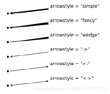
annotate方法
annoatate方法可以添加箭头
plt.figure(figsize=(6, 6))
x = np.random.randint(0, 10, size=10)
x[5] = 30    # 对x中索引值为5的重新赋值
plt.plot(x)
plt.ylim([-2, 35])
# plt.annotate(text="this point is important", xy=(5, 30), xytext=(6, 31),arrowprops={"width": 2, "headlength": 5, "headwidth": 5, "shrink": 0.1})
plt.annotate(s="this point is important", xy=(5, 30), xytext=(6, 31),arrowprops={

    "arrowstyle":"->"})
# 如果arrowprops中有arrowstyle,就不应该有其他的属性,
#xy代表的是箭头的位置,xytext代表的是箭头文本的位置。
plt.show()
#箭头参数:
#text : "string"

#xy: 箭头的坐标

#xytext: 文字的坐标

#arrowprops: 箭头的属性,字典类型:
#下面是箭头的属性:
#headlength:箭头头部的长度

#headwidth:箭头头部的宽度

#facecolor:箭头颜色

#shrink:箭头的长度(两坐标距离的比例,0~1)

#width:箭头的宽度
箭头的样式:
其他例子
import numpy as np
import matplotlib.pyplot as plt
from matplotlib.ticker import MultipleLocator
# x轴坐标
x = [0, 1, 2, 5, 8, 10, 15]
# 曲线1的y轴坐标
y1 = [188, 135, 108, 80, 74, 70, 74]
# 右侧曲线y轴的缩放系数
k = 7 / 200
# 右侧曲线的y轴值
y2 = [178 * k, 125 * k, 96 * k, 65 * k, 48 * k, 38 * k, 43 * k]
y3 = [18, 15, 13, 9, 7, 5, 6]
y4 = [0, 55, 76, 110, 126, 140, 132]
# 生成子图和图像
fig, ax1 = plt.subplots()
# 绘制误差线,并用字典加以修饰
# $x^2$这是使用Latex渲染
ax1.errorbar(x, y1, yerr=7, lw=1, ecolor='k', color='k', marker='o', mfc='w', ms=10,
             capsize=3, mec='k', label="$SS$")
ax1.errorbar(x, y3, yerr=7, lw=1, ecolor='k', color='k', marker='s', mfc='w', ms=7,
             capsize=3, mec='k', label="$Water$")
ax1.errorbar(x, y4, yerr=7, lw=1, ecolor='k', color='k', marker='^', mfc='w', ms=10,
             capsize=3, mec='k', label="$Precipitate$")
ax1.set_ylabel("PFOA amount (g)", fontdict={

    'weight': 'bold', 'size': 13})
# 开启次坐标轴
plt.minorticks_on()
# plt.legend(frameon=False, bbox_to_anchor=(0.915, 1)
# 获取子图1的图例句柄和标签值
handles_1, labels_1 = ax1.get_legend_handles_labels()
# 设置次坐标轴的相关参数
plt.gca().get_xaxis().set_minor_locator(MultipleLocator(1))
plt.gca().get_yaxis().set_major_locator(MultipleLocator(40))
plt.gca().get_yaxis().set_minor_locator(MultipleLocator(20))
# 设置 x轴和y轴刻度的相关参数
plt.tick_params(which='minor', axis='x', direction='in')
plt.tick_params(which='minor', axis='y', direction='in')
plt.tick_params(which='major', axis='x', length=4)
plt.tick_params(which='major', axis='y', length=4)
# plt.annotate(xy=(0, 0), xytext=(14, 160), text="$y=x^2$",
#              arrowprops={"width": 2, "headlength": 5, "headwidth": 5,
#
#                          "shrink": 0.05})
# 生成右侧的纵坐标,当前画图将以右侧为准
ax2 = plt.twinx()
# 设置 右侧y轴的坐标轴范围
plt.ylim(ymax=7)
line4 = plt.errorbar(x, y2, lw=1, yerr=7 * k, marker='o', mfc='b', ms=10, capsize=3, label="$Residual turbidity$")

plt.gca().get_yaxis().set_minor_locator(MultipleLocator(0.5))
# 设置右侧纵坐标的y轴参数
plt.tick_params(which='minor', axis='y', direction='in')
plt.tick_params(which='major', axis='y', length=4)
ax2.set_ylabel("Residual turbidity (NTU)", fontdict={

    'weight': 'bold', 'color': 'blue', 'size': 13})
ax2.spines['right'].set_color('blue')
# plt.legend(frameon=False, bbox_to_anchor=(1, 0.85))
# 获得子图的图例句柄和标签值
handles_2, labels_2 = ax2.get_legend_handles_labels()
# 将两个图例合并
plt.legend(handles=handles_1 + handles_2, bbox_to_anchor=(0.1, 1))
# 绘制标题栏
plt.title("PACl dose (mg/L)", fontdict={

    'weight': 'bold', 'size': 15})

plt.show()
fig.savefig('p2.svg', bbox_inches='tight')
import kwargs as kwargs
import numpy as np
from brokenaxes import brokenaxes
from matplotlib import pyplot as plt
from matplotlib.pyplot import minorticks_on
from matplotlib.ticker import MultipleLocator

# 此处使用numpy生成一组数列,这是x轴的值,是左闭右开的
x = np.arange(0, 25, 5)
# 设置y轴的值
y1 = [0.8, 0, 0, 0, 0]
y2 = [6.5, 2.5, 0.8, 0, 0]
y3 = [370, 90, 8.2, 1.3, 0]
# 生成图像和两个子图,第一个子图有两列,第二个子图有一列,ax1会在ax2下方显示
fig, (ax2, ax1) = plt.subplots(2, 1, sharex=True)
# 为整个图像添加一个大的子图,只是为了能够添加y轴的标题
fig.add_subplot(211, frameon=False)
# 隐藏ax1上方的坐标轴
ax1.spines['top'].set_visible(False)
# 隐藏 ax2的底部坐标轴
ax2.spines['bottom'].set_visible(False)
# 将次坐标轴打开
minorticks_on()
# 设置x轴和y轴的主次坐标轴间隔
ax1.xaxis.set_major_locator(MultipleLocator(5))
ax1.xaxis.set_minor_locator(MultipleLocator(2.5))
ax1.yaxis.set_minor_locator(MultipleLocator(2))
# 设置ax1和ax2的y轴范围
ax1.set_ylim(0, 8.5)
ax2.set_ylim(95, 400)
# 隐藏ax2的x轴刻度线
ax2.tick_params(which='both', axis='x', length=0)
# 绘制误差线
ax1.errorbar(x, y1, yerr=0.4, fmt='k-s', lw=0.8, mfc='w', mec='k', capsize=2, elinewidth=0.2, ms=7,
             label='0.5 mg/L PFOA')
ax2.errorbar(x, y1, yerr=0.4, fmt='k-s', lw=0.8, mfc='w', mec='k', capsize=2, elinewidth=0.2, ms=7,
             label='0.5 mg/L PFOA')
ax1.errorbar(x, y2, yerr=0.4, fmt='k-o', lw=0.8, mfc='w', mec='k', capsize=2, elinewidth=0.2, ms=7,
             label='1 mg/L PFOA')
ax2.errorbar(x, y2, yerr=0.4, fmt='k-o', lw=0.8, mfc='w', mec='k', capsize=2, elinewidth=0.2, ms=7,
             label='1 mg/L PFOA')
ax1.errorbar(x, y3, yerr=0.4, fmt='b-^', lw=0.8, mfc='w', ecolor='blue', mec='b', capsize=2, elinewidth=0.2, ms=7,
             label='3mg/L PFOA')
ax2.errorbar(x, y3, yerr=0.4, fmt='b-^', lw=0.8, mfc='w', ecolor='blue', mec='b', capsize=2, elinewidth=0.2, ms=7,
             label='3mg/L PFOA')
# 绘制两条斜杠,表示坐标轴之间不连续
d = 0.015
# 下面这句话是一个字典,表示以整个坐标轴的长度为单位1,颜色设为黑色
kwargs = dict(transform=ax2.transAxes, color='k', clip_on=False, lw=0.8)
ax2.plot((-d, +d), (-d, +d), **kwargs)  # top-left diagonal

kwargs.update(transform=ax1.transAxes)  # switch to the bottom axes
ax1.plot((-d, +d), (1 - d, 1 + d), **kwargs)  # bottom-left diagonal

ax1.plot((1, 1), (1, 1 + 20 * d), **kwargs)

# What's cool about this is that now if we vary the distance between
# ax and ax2 via f.subplots_adjust(hspace=...) or plt.subplot_tool(),
# the diagonal lines will move accordingly, and stay right at the tips
# of the spines they are 'breaking'
ax2.legend()
# 将大子图的x轴 y轴 ,刻度线全部隐藏
plt.tick_params(labelcolor='none', top='off', bottom='off', left='off', right='off')
plt.tick_params(which='both', length=0)

plt.title("PAC dose (mg/L)", size='14', weight='bold')
fig.text(0.04, 0.5, 'PFOA in water (g/L)', size='15', weight='bold', ha='center', va='center', rotation='vertical')

plt.show()
plt.title("PAC dose (mg/L)")
# 下面表示dpi表示像素密度,当时保存为矢量图就不存在像素的概念了
fig.savefig('p3.svg', dpi=600)