1、问题由来
如何居中一直是前端开发一个比较有意思的问题,估计每个做前端开发的人都能说出几种方法来。但是不知道各位有没有想过背后更深一点的东西。下面我将借着本篇博客对使用margin居中的问题阐述一下自己的见解。
2、如何居中
水平居中
首先我们来讨论一下水平居中的情况。
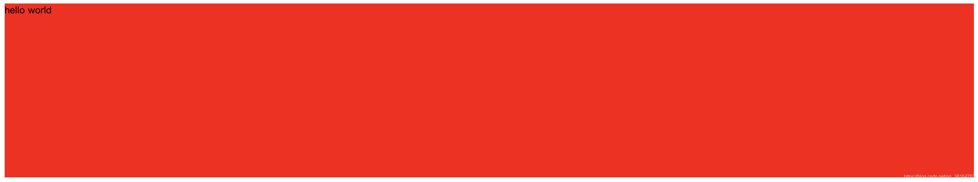
实现起来非常简单,使用margin:0 auto即可,我们看如下代码
<!doctype html>
<html lang="en">
<head>
    <meta charset="UTF-8">
    <meta name="viewport"
          content="width=device-width, user-scalable=no, initial-scale=1.0, maximum-scale=1.0, minimum-scale=1.0">
    <meta http-equiv="X-UA-Compatible" content="ie=edge">
    <title>Document</title>
    <style>
        .center {
            margin: 0 auto;
            width: 100px;
            height: 100px;
            background-color: red;
        }
    </style>
</head>
<body style="border: 1px solid black;">
    <div class="center">
        hello world
    </div>
</body>
</html>
得到的效果如下

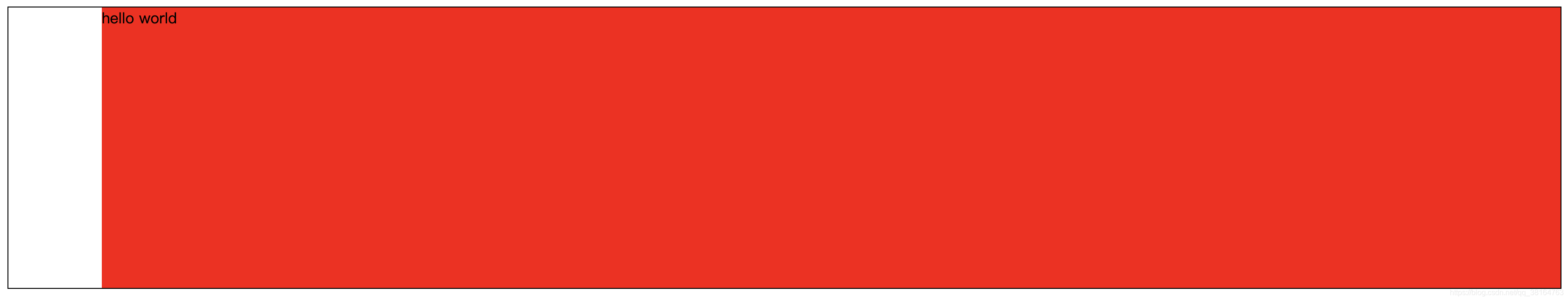
这样这个div就被我们居中了,下面我们稍微修改一下代码:
        .center {
            margin:0 auto;
            /*width: 300px;*/
            height: 300px;
            /*background-color: red;*/
        }
就变成了下面这样

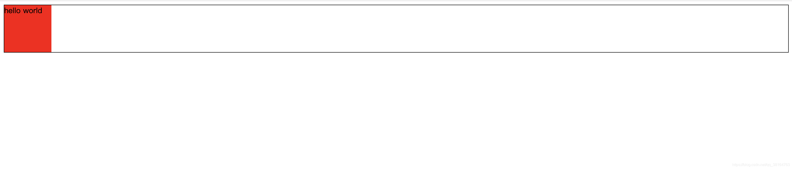
为什么居中的效果突然消失了?其实这个问题应该很容易想明白。我们在css样式中去掉了宽度和背景色,那么我们下面加上背景色来看看。
原来并不是div没有居中,你可以理解为div已经居中了,但是因为你没有设置宽度,所以div的宽度就变成了100%。那么他的宽度为什么会变成100%呢?这就涉及到使用margin:0 auto居中的原理了。
使用maring:0 auto居中的原理
这涉及到一个名词:横向格式化属性。那么横向格式化属性是个什么东西?他包含七个属性:margin-left、border-left-width、padding-left、width、padding-rigth、border-right-width、margin-right,这七个属性影响着块级框的横向布局。他们七个的值加起来要等于元素容纳块的宽度,而这个宽度通常就是块级父元素的width值。用公式来表示就是:
margin-left + border-left-width + padding-left + width + padding-rigth + border-right-width + margin-righ = width
这七个值中可以设置为auto的值只有三个,margin-left、margin-right、width,如果把其中一个值设置为auto,其他两个值设置为具体值,那么设为auto的那个属性的具体长度要能满足元素框的宽度等于父元素的宽度,即满足那个等式。
那么你可能会想,如果我把其中两个设置为auto呢?下面我们来讨论这种情况:
- 把margin-left和margin-right全部设为auto,width设置为具体值,这时候两个外边距的长度相等,具体表现就是元素在父元素中居中显示,也就是我们想要的水平居中效果。
- 把某一边的外边距和width设置为auto,此时设置为auto的外边距等于0,宽度根据等式计算。举个简单的例子:
        .center {
            margin-left: 100px;
            margin-right: auto;
            width: auto;
            height: 300px;
            background-color: red;
        }
此时我们将margin-right设置为了auto,那它就会变成0,由于没有设置border和padding,那么他们默认为0,所以width+margin-left应该等于父元素的宽度,这里我的父元素就是body,所以表现出来应该就是margin-left等于100px然后div占满了剩下的空间,如图
这就是设置两个auto的情况。
那么还有一种情况,我们把三个值全部设置为auto,这时候会把左右边距全部设置为0,width则是要多宽有多宽。其实这就是我们在上面去掉宽度后显示的结果。因为去掉宽度后宽度的默认值就是auto,你又把左右边距设置成了auto,那么左右边距自然变成0了,这也是为什么居中失效的原因。
接下来你可能会想,那我一个auto都不设置,全部设置成具体值,那你那个等式不就不成立了吗?这种情况在css里面被称作过约束,在这种情况下margin-right会被强制设置为auto。
垂直居中
了解完水平居中,我们现在来讨论一下垂直居中。有了水平居中的经验,你很容易这样想,我垂直居中把它设置为margin:auto 0不就行了吗?真的是这样吗,我们来试一试
<!doctype html>
<html lang="en">
<head>
    <meta charset="UTF-8">
    <meta name="viewport"
          content="width=device-width, user-scalable=no, initial-scale=1.0, maximum-scale=1.0, minimum-scale=1.0">
    <meta http-equiv="X-UA-Compatible" content="ie=edge">
    <title>Document</title>
    <style>
        .center {
            margin: auto 0;
            width: 100px;
            height: 100px;
            background-color: red;
        }
    </style>
</head>
<body>
    <div class="center">
        hello world
    </div>
</body>
</html>
他产生的效果是下面这样的:
他为什么不会自动设置上边距和下边距?其实这跟auto的默认行为有关,上下外边距如果被设置为auto,最终会变成0,就跟没有外边距是一样的效果。这很容易想明白,父元素的高度都不确定,如何去自动居中?所以不可能像横向margin那样计算,这也就解释了为什么我们不能使用auto来垂直居中元素。那么我们如何来实现垂直居中?我们通常使用的代码是下面这样:
<!doctype html>
<html lang="en">
<head>
    <meta charset="UTF-8">
    <meta name="viewport"
          content="width=device-width, user-scalable=no, initial-scale=1.0, maximum-scale=1.0, minimum-scale=1.0">
    <meta http-equiv="X-UA-Compatible" content="ie=edge">
    <title>Document</title>
    <style>
        .father {
            position: relative;
            width: 500px;
            height: 500px;
            background-color: blue;
        }
        .center {
            position: absolute;
            left: 0;
            right: 0;
            top: 0;
            bottom: 0;
            margin: auto;
            width: 100px;
            height: 100px;
            background-color: red;
        }
    </style>
</head>
<body>
    <div class="father">
        <div class="center"></div>
    </div>
</body>
</html>
我们为center元素加上绝对定位,并且把他的各个值全部设置为0,这时神奇的事情发生了:
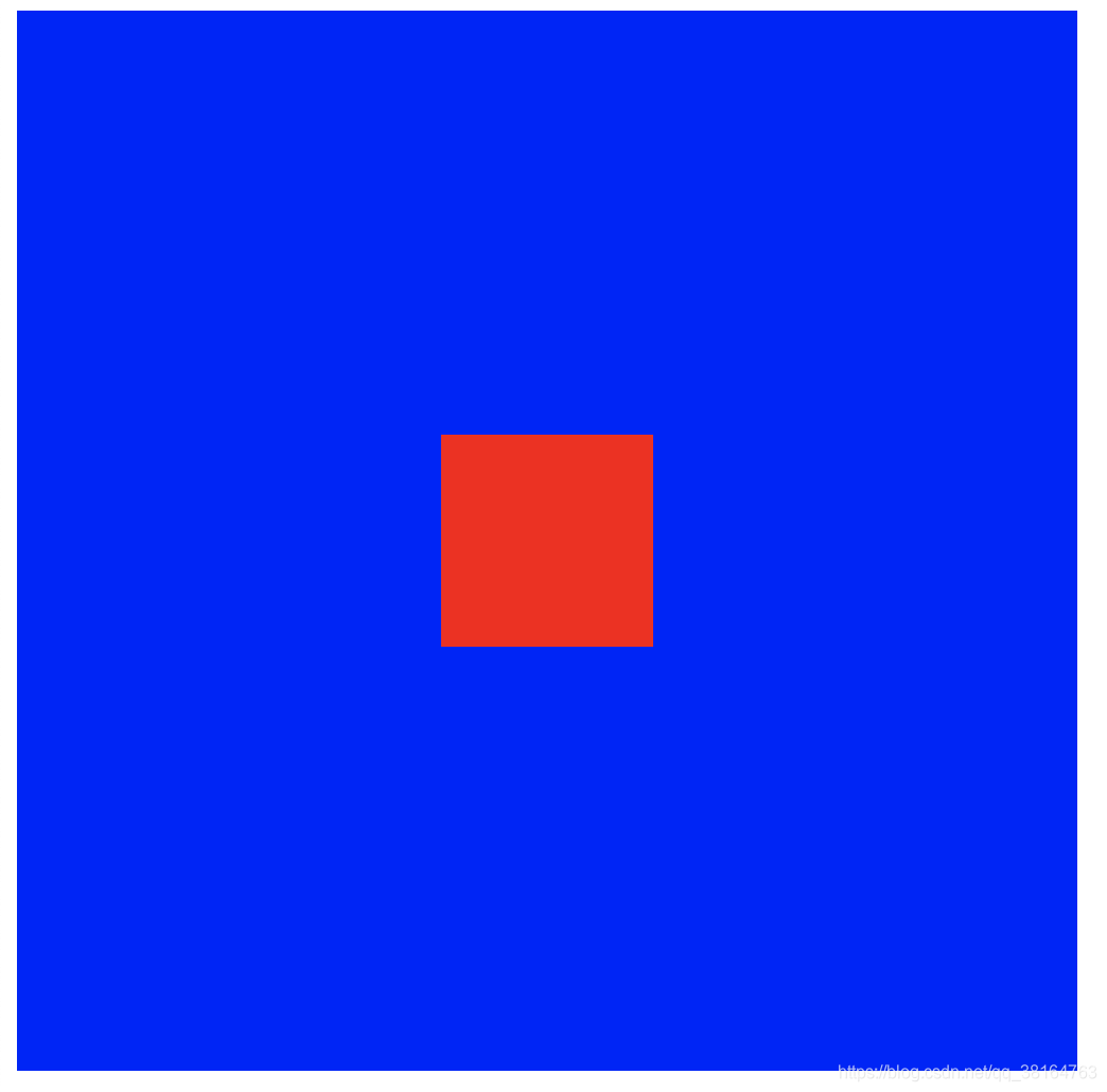
我们成功居中了子元素,那这又是什么道理?其实此时在纵向上又存在一个等式:
top + margin-top + border-top-width + padding-top + height + padding-bottom + border-bottom-width + margin-bottom + bottom = height
在上面的式子中,top和bottom被设置成了0,margin等于auto,这时候浏览器为了满足这个等式会把上下的距离均匀分给margin,即达到我们想要的居中效果。同时横向也是一样的道理,所以我们可以看到其实这个元素是水平垂直居中,如果此时存在过约束,一般会忽略right属性。好了,这就是自己对于margin:0 auto是如何把元素居中的一些思考,下面介绍一些其他居中的方式。
3.其他居中方式
- 使用绝对定位+负margin,这种方法需要知道子元素的高度
<!doctype html>
<html lang="en">
<head>
    <meta charset="UTF-8">
    <meta name="viewport"
          content="width=device-width, user-scalable=no, initial-scale=1.0, maximum-scale=1.0, minimum-scale=1.0">
    <meta http-equiv="X-UA-Compatible" content="ie=edge">
    <title>Document</title>
    <style>
        .father {
            position: relative;
            width: 500px;
            height: 500px;
            background-color: blue;
        }
        .center {
            width: 100px;
            height: 100px;
            background-color: red;
            position: absolute;
            top: 50%;
            margin-top: -50px;
        }
    </style>
</head>
<body>
    <div class="father">
        <div class="center">
            <span style="line-height: 100px">hello world</span>
        </div>
    </div>
</body>
</html>
- 相对定位+transform,这种情况不需要知道子元素的高度
<!doctype html>
<html lang="en">
<head>
    <meta charset="UTF-8">
    <meta name="viewport"
          content="width=device-width, user-scalable=no, initial-scale=1.0, maximum-scale=1.0, minimum-scale=1.0">
    <meta http-equiv="X-UA-Compatible" content="ie=edge">
    <title>Document</title>
    <style>
        .father {
            position: relative;
            height: 500px;
            width: 500px;
            background-color: blue;
        }
        .center {
            position: relative;
            top: 50%;
            width: 200px;
            height: 200px;
            background-color: red;
            transform: translateY(-50%);
        }
    </style>
</head>
<body>
    <div class="father">
        <div class="center">hello</div>
    </div>
</body>
</html>
- 使用flex布局
<!doctype html>
<html lang="en">
<head>
    <meta charset="UTF-8">
    <meta name="viewport"
          content="width=device-width, user-scalable=no, initial-scale=1.0, maximum-scale=1.0, minimum-scale=1.0">
    <meta http-equiv="X-UA-Compatible" content="ie=edge">
    <title>Document</title>
    <style>
        .father {
            display: flex;
            justify-content: center;
            align-items: center;
            width: 500px;
            height: 500px;
            background-color: blue;
        }
        .center {
            width: 100px;
            height: 100px;
            background-color: red;
        }
    </style>
</head>
<body>
    <div class="father">
        <div class="center">hello</div>
    </div>
</body>
</html>
- 行内元素将line-height设置为父元素高度居中
<!doctype html>
<html lang="en">
<head>
    <meta charset="UTF-8">
    <meta name="viewport"
          content="width=device-width, user-scalable=no, initial-scale=1.0, maximum-scale=1.0, minimum-scale=1.0">
    <meta http-equiv="X-UA-Compatible" content="ie=edge">
    <title>Document</title>
    <style>
        .father {
            width: 500px;
            height: 500px;
            background-color: red;
        }
        .center {
            line-height: 500px;
        }
    </style>
</head>
<body>
    <div class="father">
        <span class="center">hello</span>
    </div>
</body>
</html>
- 在父元素设置text-align:center水平居中行内元素
<!doctype html>
<html lang="en">
<head>
    <meta charset="UTF-8">
    <meta name="viewport"
          content="width=device-width, user-scalable=no, initial-scale=1.0, maximum-scale=1.0, minimum-scale=1.0">
    <meta http-equiv="X-UA-Compatible" content="ie=edge">
    <title>Document</title>
    <style>
        .father {
            width: 500px;
            height: 500px;
            text-align: center;
            background-color: red;
        }
        .center {
            line-height: 500px;
        }
    </style>
</head>
<body>
    <div class="father">
        <span class="center">hello</span>
    </div>
</body>
</html>
- 设置vertical-align:middle让图片和文字居中显示
<!doctype html>
<html lang="en">
<head>
    <meta charset="UTF-8">
    <meta name="viewport"
          content="width=device-width, user-scalable=no, initial-scale=1.0, maximum-scale=1.0, minimum-scale=1.0">
    <meta http-equiv="X-UA-Compatible" content="ie=edge">
    <title>Document</title>
    <style>
        .center {
            vertical-align: middle;
        }
    </style>
</head>
<body>
    <img class="center" src="buct.jpg" alt="" width="100px" height="100px"><span>hello world</span>
</body>
</html>
好了,这就是这篇博客的全部内容了,有错误的地方还请大家指出。
