最近帮忙改了个css外观,意外发现了一些细节,这里记录一下
css使用基础
#是id,.是class
#content1 {
  padding: 10px;
}

.content2 {
  padding: 10px;
}
指明嵌套元素:
ul.li {
  padding: 0;
}
.ul>li .a {
  font-size: 0.9em;
}
css中固定距离用px,相对距离用em (推荐,适配手机端),宽度控制用百分比适应
#content {
  margin: 30px 0 0 0;
  /* padding: 10px; */
  padding: .8em 1.2em .4em 1.2em;
  min-height: 500px; /* 最小距离 */
  width: 80%; /* 相对父容器 */
}
另一种写法:外边距margin,内边距padding,left和right是常用。
margin-left: 10px;
margin-top: 10px;
top上边距,bottom底边距。
  top: 0;
  bottom: 0;
textarea去掉默认白色背景和扩展边框

去掉白色背景:
background-color: transparent;
去掉扩展边框:
resize: none;
最终效果:(很好的适应黑夜模式)
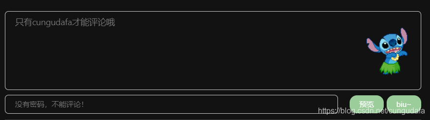
同时黑夜模式打字看不见的情况:

设置字体颜色:
color: #999;
button悬停效果和阴影
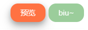
.button {
  background-color: #9BCD9B;/* Green */
  border: none;
  margin-left: 8px;
  color: white; /* text color */
  padding: 10px 24px;
  text-align: center;
  text-decoration: none;
  display: inline-block;
  font-size: 12px;
  border-radius: 12px;  /* circle */
  outline: none;
  cursor: pointer;
}

.button:hover {
  background-color: #ff7242;
  box-shadow: 0 4px 8px 0 rgba(0, 0, 0, 0.24), 0 8px 16px 0 rgba(0, 0, 0, 0.19); /* shadow */
}
css3手写选择按钮


/* check  */
.checke{
  position: relative;
  -webkit-appearance: none;
  width:45px;
  height: 22px;
  line-height: 22px;
  background: #eee;
  border-radius: 15px;
  outline: none;
}
.checke:before{
  position: absolute;
  left: 0;
  content: '';
  width: 22px;
  height: 22px;
  border-radius: 50%;
  background: #eee;
  box-shadow: 0px 0px 5px #ddd;
  transition: all 0.2s linear;
}

.checke:checked{
 background: #18ff0a;
}
.checke:checked:before{
  left: 22px;
  transition: all 0.2s linear;
}
再记录一下打开显示和隐藏:(jq版本)
<input type="checkbox" class="1" value="1">
<script type="text/javascript">
   $(':checkbox').click(function () {
       if (this.checked && this.value == "1") {
          document.getElementById("2").style.display = "block";
       } else {
          document.getElementById("2").style.display = "none";
       }
    });
</script>
<div id = "2" style="display:none;">xxxxxxxxx<div>
一行元素等分
注意input必须单独占一个元素,不能包裹
		 <div class="row">
            <input class="child">
            <input class="child" >
            <div class="child">
              <button class="button">1</button>
              <button class="button">2</button>
            </div>
          </div>
.row{
  width: 100%;
  display: flex; /* 等分 */
}
.child{
  flex: 1;
}
一个版本的样式
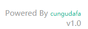
<div class="power">Powered By <a href="https://cungudafa.js.org/" target="_blank">cungudafa</a><br>v1.0</div>
/* version */
.power {
  text-align: right;
  float: right;
  color: #999;
  font-size: .75em;
  padding: .5em 0;
}

.power a {
  font-size: .75em;
  position: relative;
  cursor: pointer;
  color: #1abc9c;
  text-decoration: none;
  display: inline-block;
}
头像旋转


.avatar {
  border-radius: 100% !important;
  -moz-border-radius: 100% !important;
  box-shadow: inset 0 -1px 0 3333sf;
  -webkit-box-shadow: inset 0 -1px 0 3333sf;
  -webkit-transition: 0.4s;
  -webkit-transition: -webkit-transform 0.4s ease-out;
  transition: transform 0.4s ease-out;
  -moz-transition: -moz-transform 0.4s ease-out;
}

.avatar:hover {
  -webkit-transform: rotateZ(360deg);
  -moz-transform: rotateZ(360deg);
  -o-transform: rotateZ(360deg);
  -ms-transform: rotateZ(360deg);
  transform: rotateZ(360deg);
}
篇幅到了,急忙收尾,去学习了~~~
