一睹为快:
要点回顾:接着我们上一期的自定义窗体美化用到自定义属性DependencyProperty,快速生成自定义属性快捷键Propdp+双击Tab键,调用自定义属性如:窗体头部高度:Height="{Binding Path=HearderHieght, RelativeSource={RelativeSource Mode=TemplatedParent}}" Background="{TemplateBinding Background}",接下来我们美化按钮
1.创建文件夹ButtonStyle文件夹并且自定义控件取名为LayButton


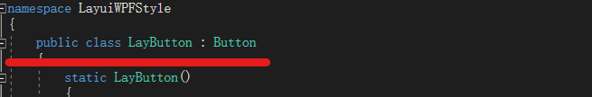
2.双击LayButton让当前类文件继承Button
3.由于按钮由文字内容以及带边框的容器组成,那么我们联想到Border+ContentPresenter组成,Style样式为
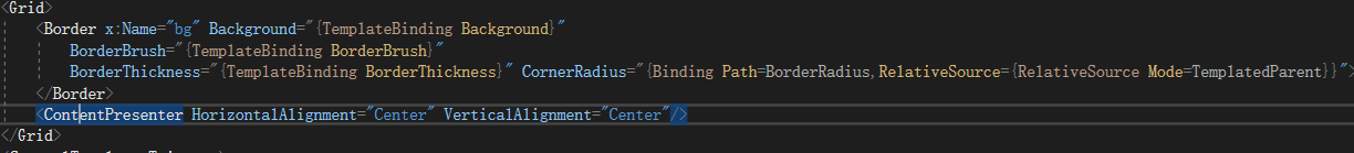


<Style TargetType="{x:Type local:LayButton}">
        <Setter Property="Background" Value="#009688"/>
        <Setter Property="Foreground" Value="White"/>
        <Setter Property="BorderRadius" Value="2"/>
        <Setter Property="Cursor" Value="Hand"/>
        <Setter Property="Template">
            <Setter.Value>
                <ControlTemplate TargetType="{x:Type local:LayButton}">
                    <Grid>
                        <Border x:Name="bg" Background="{TemplateBinding Background}"
                            BorderBrush="{TemplateBinding BorderBrush}"
                            BorderThickness="{TemplateBinding BorderThickness}" CornerRadius="{Binding Path=BorderRadius,RelativeSource={RelativeSource Mode=TemplatedParent}}">
                        </Border>
                        <ContentPresenter HorizontalAlignment="Center" VerticalAlignment="Center"/>
                    </Grid>
                    <ControlTemplate.Triggers>
                        <Trigger Property="IsMouseOver" Value="True">
                            <Setter Property="Opacity" TargetName="bg" Value=".8"/>
                        </Trigger>
                        <Trigger Property="IsPressed" Value="True">
                            <Setter Property="Opacity" TargetName="bg" Value="1"/>
                        </Trigger>
                        <DataTrigger Binding="{Binding RelativeSource={RelativeSource Mode=Self},Path=IsEnabled}" Value="False">
                            <Setter Property="Background" TargetName="bg" Value="#FBFBFB"/>
                            <Setter Property="BorderBrush" TargetName="bg" Value="#ccc"/>
                            <Setter Property="BorderThickness" TargetName="bg" Value="1"/>
                            <Setter Property="Foreground" Value="#ccc"/>
                        </DataTrigger>
                    </ControlTemplate.Triggers>
                </ControlTemplate>
            </Setter.Value>
        </Setter>
    </Style>
    <Style x:Key="LayPrimaryButton"  TargetType="{x:Type local:LayButton}">
        <Setter Property="Background" Value="White"/>
        <Setter Property="BorderBrush" Value="#ccc"/>
        <Setter Property="BorderThickness" Value="1"/>
        <Setter Property="Foreground" Value="Black"/>
        <Setter Property="BorderRadius" Value="2"/>
        <Setter Property="HoverBorderBrush" Value="#009688"/>
        <Setter Property="Cursor" Value="Hand"/>
        <Setter Property="Template">
            <Setter.Value>
                <ControlTemplate TargetType="{x:Type local:LayButton}">
                    <Grid>
                        <Border x:Name="bg" Background="{TemplateBinding Background}"
                            BorderBrush="{TemplateBinding BorderBrush}"
                            BorderThickness="{TemplateBinding BorderThickness}" CornerRadius="{Binding Path=BorderRadius,RelativeSource={RelativeSource Mode=TemplatedParent}}">
                        </Border>
                        <ContentPresenter HorizontalAlignment="Center" VerticalAlignment="Center"/>
                    </Grid>
                    <ControlTemplate.Triggers>
                        <Trigger Property="IsMouseOver" Value="True">
                            <Setter Property="BorderBrush" TargetName="bg" Value="{Binding Path=HoverBorderBrush,RelativeSource={RelativeSource Mode=TemplatedParent}}"/>
                        </Trigger>
                        <DataTrigger Binding="{Binding RelativeSource={RelativeSource Mode=Self},Path=IsEnabled}" Value="False">
                            <Setter Property="Background" TargetName="bg" Value="#FBFBFB"/>
                            <Setter Property="BorderBrush" TargetName="bg" Value="#ccc"/>
                            <Setter Property="BorderThickness" TargetName="bg" Value="1"/>
                            <Setter Property="Foreground" Value="#ccc"/>
                        </DataTrigger>
                    </ControlTemplate.Triggers>
                </ControlTemplate>
            </Setter.Value>
        </Setter>
    </Style>
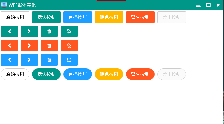
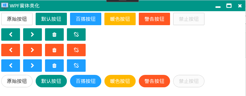
4.组合完成图,Style样式已完成返回LayButtonm.CS文件实现功能
 public class LayButton : Button
    {
        static LayButton()
        {
            DefaultStyleKeyProperty.OverrideMetadata(typeof(LayButton), new FrameworkPropertyMetadata(typeof(LayButton)));
        }


        public CornerRadius BorderRadius
        {
            get { return (CornerRadius)GetValue(BorderRadiusProperty); }
            set { SetValue(BorderRadiusProperty, value); }
        }

        // Using a DependencyProperty as the backing store for BorderRadius.  This enables animation, styling, binding, etc...
        public static readonly DependencyProperty BorderRadiusProperty =
            DependencyProperty.Register("BorderRadius", typeof(CornerRadius), typeof(LayButton));


        public Brush HoverBorderBrush
        {
            get { return (Brush)GetValue(HoverBorderBrushProperty); }
            set { SetValue(HoverBorderBrushProperty, value); }
        }

        // Using a DependencyProperty as the backing store for HoverBorderBrush.  This enables animation, styling, binding, etc...
        public static readonly DependencyProperty HoverBorderBrushProperty =
            DependencyProperty.Register("HoverBorderBrush", typeof(Brush), typeof(LayButton));


    }
5,此时我们的所有样式以及业务代码已完成,返回WPF项目中调用我们的LayButton按钮
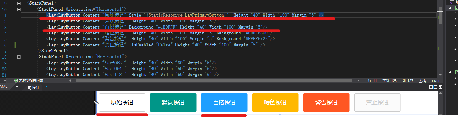
6.运行WPF程序看效果图,该按钮有适当的反馈效果运行点击即可看到