WPF布局
所有WPF的布局容器控件都是派生自抽象基类System.Windows.Controls.Panel,该类具有一些基本的布局成员。在WPF中,有抽象基类panels派生了如下几个布局的面板类。
| 面板名称 | 说明 |
|---|---|
| stackpanel | 使用水平或垂直堆叠的方式放置元素,该面板非常简单,但是非常有用,适合于一些小范围的布局 |
| WarpPanel | 当水平方向时,从左到右的布局子元素,当可用的宽度不够时,则开始一个新的行在进行从左到右的排列当垂直方向时,从上到下排列子元素,当高度不够时,则开启一个新的列从上到下进行排列。 |
| DockPanel | 使子元素依赖于容器的特定边缘,比如左、右、上、下边缘等,该面板通常用于全局布局。比如,在一个Windows上先使用DockPanel划分几个大的区域,然后就可以使用Grid进行详细的布局 |
| Grid | Grid是WPF中最强最好用的布局控件。该控件类似于一个不可见的HTML表格,将于元素放置在特定的行和列中。这是最灵活和最通用的布局控件。 |
| UniformGrid | 放置子元素在一个不可见的表格中,但是强制所有的单元格都具有相同的尺寸,如果要开发一个五子棋游戏, 可以考虑使用这个控件,但是在用户界面的布局中,使用的比较少 |
| Canvas | 使用固定的坐标来绝对定位子元素,这与传统的Windows Forms布局方式类似,但是没有提供Anchoring和Docking特性,在处理图形图像场合,使用这个控件非常有用,但是在动态用户来说,这个控件将会事半功倍 |
| Border | 在一个子元素的周围绘制边框、背景。 |
一,StackPanel 栈面板
按照行或列来顺序排列,但不会换行
排列方式:默认垂直排列(vertical),水平排列(Horizontal)
垂直排列(vertial)默认排列
<Window x:Class="WPF面板.MainWindow"
        xmlns="http://schemas.microsoft.com/winfx/2006/xaml/presentation"
        xmlns:x="http://schemas.microsoft.com/winfx/2006/xaml"
        xmlns:d="http://schemas.microsoft.com/expression/blend/2008"
        xmlns:mc="http://schemas.openxmlformats.org/markup-compatibility/2006"
        xmlns:local="clr-namespace:WPF面板"
        mc:Ignorable="d"
        Title="MainWindow" Height="450" Width="800">
        <StackPanel>
        <Button Content="按钮1"></Button>
        <Button Content="按钮2"></Button>
        <Button Content="按钮3"></Button>
        <Button Content="按钮4"></Button>
        <Button></Button>
    </StackPanel>
</Window>

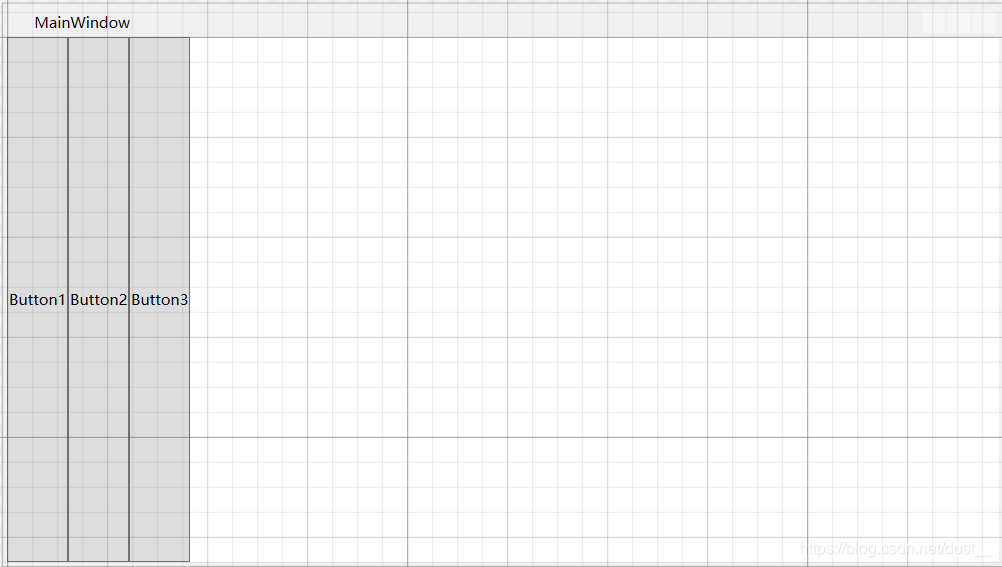
水平排列(Horizontal) 默认靠左
<StackPanel Name="stackpanel1" Orientation="Horizontal">
        <Button Content="Button1"></Button>
        <Button Content="Button2"></Button>
        <Button Content="Button3"></Button>
    </StackPanel>
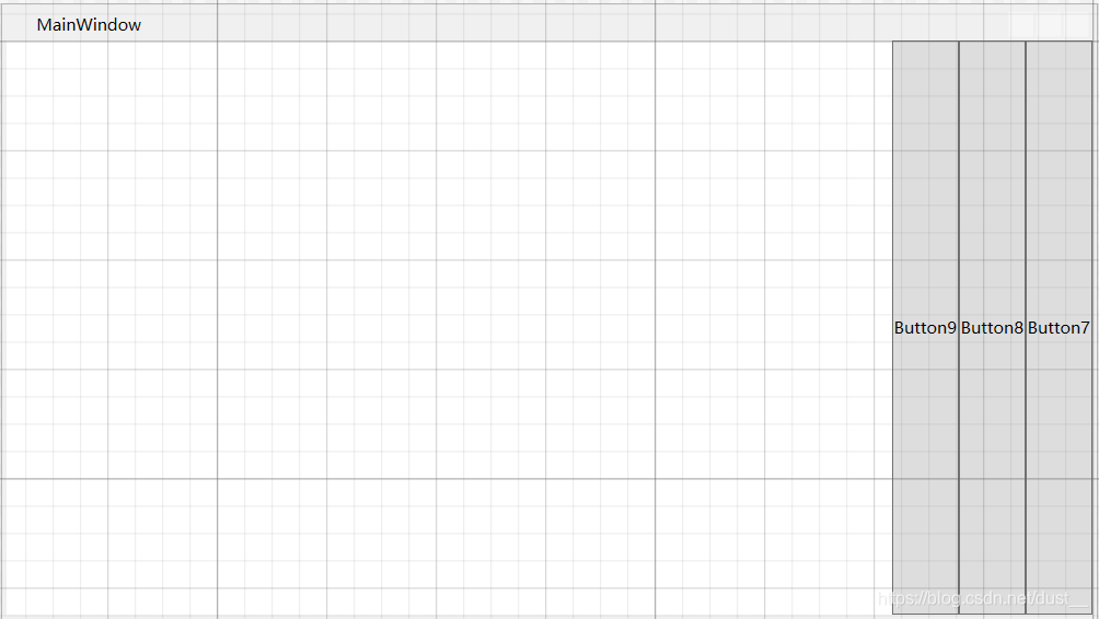
水平排序(Horizontal) 设置靠右( FlowDirection=“RightToLeft”)
    <StackPanel Name="stackpanel3" Orientation="Horizontal" FlowDirection="RightToLeft">
        <Button Content="Button7"></Button>
        <Button Content="Button8"></Button>
        <Button Content="Button9"></Button>
    </StackPanel>
二,WrapPanel 环绕面板
WrapPanel布局面板将各个控件按照一定方向罗列,当长度或高度不够时自动调整进行换行换列。
Orientation=“Horizontal” 时各控件从左至右罗列,当面板长度不够时,子控件就会自动换行,继续按照从左至右的顺序排列。
Orientation=“Vertical” 时各控件从上至下罗列,当面板高度不够时,子控件就会自动换列,继续按照从上至下的顺序排列。
默认水平排列(Horizontal)
<Window x:Class="WPF面板.MainWindow"
        xmlns="http://schemas.microsoft.com/winfx/2006/xaml/presentation"
        xmlns:x="http://schemas.microsoft.com/winfx/2006/xaml"
        xmlns:d="http://schemas.microsoft.com/expression/blend/2008"
        xmlns:mc="http://schemas.openxmlformats.org/markup-compatibility/2006"
        xmlns:local="clr-namespace:WPF面板"
        mc:Ignorable="d"
        Title="MainWindow" Height="450" Width="800">
        <WrapPanel Orientation="Horizontal">
        <Button Content="Button 150" Width="150"></Button>
        <Button Content="Button 200" Width="200"></Button>
        <Button Content="Button 150" Width="150"></Button>
        <Button Content="Button 200" Width="200"></Button>
        <Button Content="Button 150" Width="150"></Button>
        <Button Content="Button 200" Width="200"></Button>
        <Button Content="Button 150" Width="150"></Button>
    </WrapPanel>
</Window>

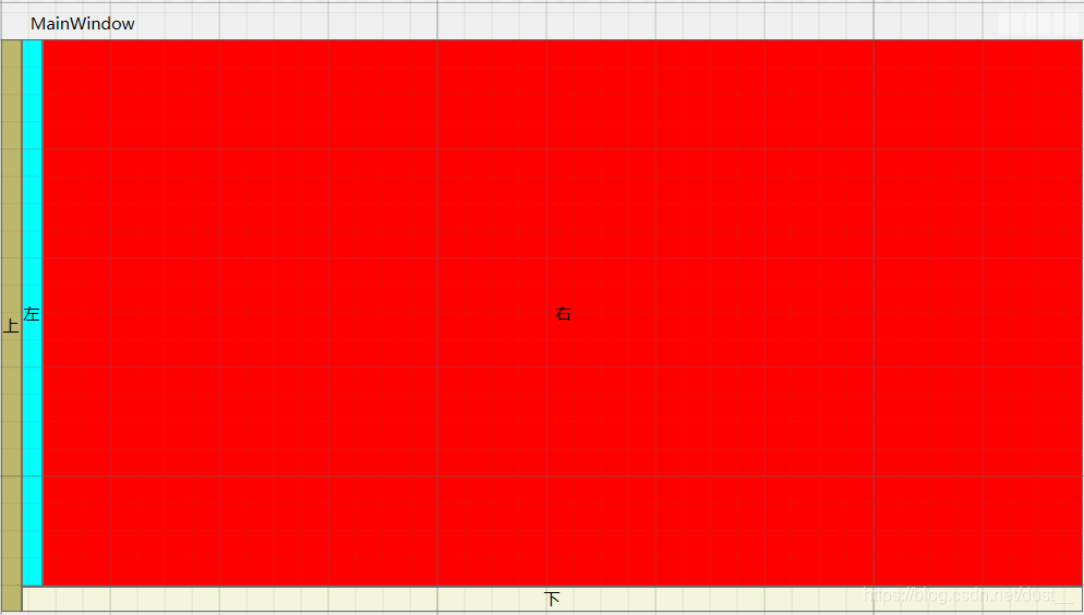
三,DockPanel 停靠面板
DockPanel支持让元素简单地停靠在整个面板的某一条边上,然后拉伸元素以填满全部宽度或高度。它也支持让一个元素填充其他已停靠元素没有占用的剩余空间。
DockPanel有一个Dock附加属性,因此子元素用4个值来控制她们的停靠:Left、Top、Right、Bottom。Dock没有Fill值。作为替代,最后的子元素将加入一个DockPanel并填满所有剩余的空间,除非DockPanel的LastChildFill属性为false,它将朝某个方向停靠。
<Window x:Class="WPF面板.MainWindow"
        xmlns="http://schemas.microsoft.com/winfx/2006/xaml/presentation"
        xmlns:x="http://schemas.microsoft.com/winfx/2006/xaml"
        xmlns:d="http://schemas.microsoft.com/expression/blend/2008"
        xmlns:mc="http://schemas.openxmlformats.org/markup-compatibility/2006"
        xmlns:local="clr-namespace:WPF面板"
        mc:Ignorable="d"
        Title="MainWindow" Height="450" Width="800">
		<DockPanel>
	        <Button Content="上" DockPanel.Dock="Left" Background="DarkKhaki"></Button>
	        <Button Content="下" DockPanel.Dock="Bottom" Background="Beige"></Button>
	        <Button Content="左" DockPanel.Dock="Left" Background="Aqua"></Button>
	        <Button Content="右" DockPanel.Dock="Right" Background="red"></Button>
    </DockPanel>
</Window>
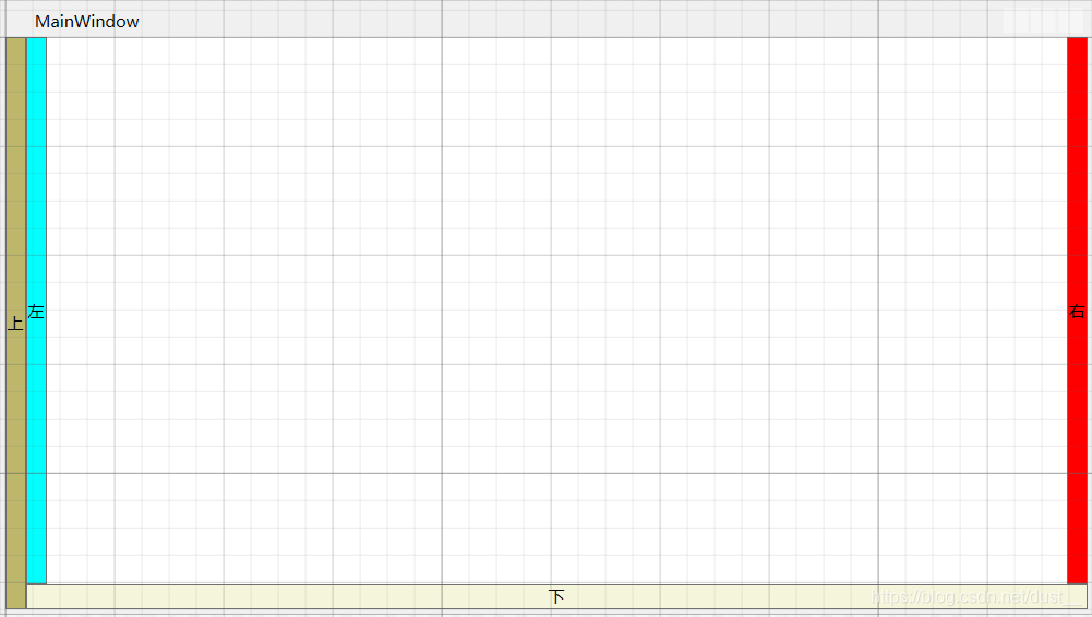
设置LastChildFill属性为false
	<DockPanel LastChildFill="False">
        <Button Content="上" DockPanel.Dock="Left" Background="DarkKhaki"></Button>
        <Button Content="下" DockPanel.Dock="Bottom" Background="Beige"></Button>
        <Button Content="左" DockPanel.Dock="Left" Background="Aqua"></Button>
        <Button Content="右" DockPanel.Dock="Right" Background="red"></Button>
    </DockPanel>
四,Canvas 画布
Canvas是一个类似于坐标系的面板,所有的元素通过设置坐标来决定其在坐标系中的位置。具体表现为使用Left、Top、Right、 Bottom附加属性在Canvas中定位控件。
<Window x:Class="WPF面板.MainWindow"
        xmlns="http://schemas.microsoft.com/winfx/2006/xaml/presentation"
        xmlns:x="http://schemas.microsoft.com/winfx/2006/xaml"
        xmlns:d="http://schemas.microsoft.com/expression/blend/2008"
        xmlns:mc="http://schemas.openxmlformats.org/markup-compatibility/2006"
        xmlns:local="clr-namespace:WPF面板"
        mc:Ignorable="d"
        Title="MainWindow" Height="450" Width="800">
	<Canvas>
        <Button Canvas.Left="50" Canvas.Top="50" Content="Button 1"></Button>
        <Button Canvas.Right="50" Canvas.Top="50" Content="Button 2"></Button>
        <Button Canvas.Left="50" Canvas.Bottom="50" Content="Button 3"></Button>
        <Button Canvas.Right="50" Canvas.Bottom="50" Content="Button 4"></Button>
    </Canvas>
</Window>

五,Grid 网格面板
Grid.RowDefinitions 行数
Grid.ColumnDefinitions 列数
Grid.Column=“行数” 第几行(索引数)
Grid.Row=“列数” 第几列(索引数)
Grid.RowSpan=“行数” 合并行数(跨行数)
Grid.ColumnSpan=“列数” 合并列数(跨列数)
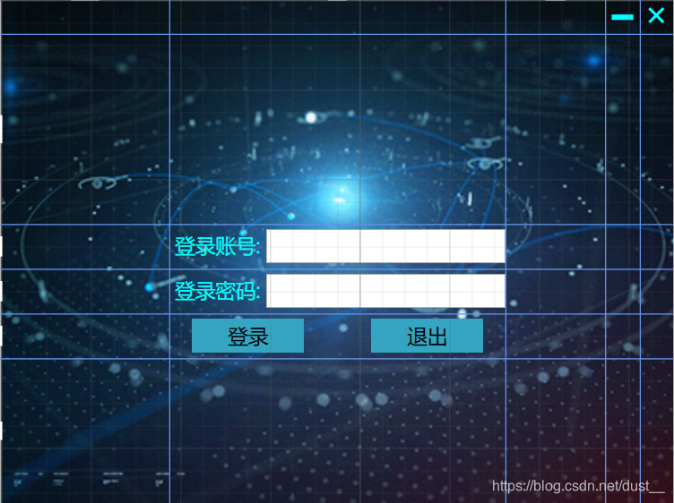
系统登录界面Demo
<Window x:Class="StudentManage.FrmLogin"
        xmlns="http://schemas.microsoft.com/winfx/2006/xaml/presentation"
        xmlns:x="http://schemas.microsoft.com/winfx/2006/xaml"
        xmlns:d="http://schemas.microsoft.com/expression/blend/2008"
        xmlns:mc="http://schemas.openxmlformats.org/markup-compatibility/2006"
        xmlns:local="clr-namespace:StudentManage"
        mc:Ignorable="d"
        Title="登录" Height="450" Width="600" WindowStartupLocation="CenterScreen" WindowStyle="None" ResizeMode="NoResize" Icon="/img/ico/deng.ico">
    <Grid>
        <Grid.Background>
            <ImageBrush ImageSource="img/bg/log.png" ></ImageBrush>
        </Grid.Background>
        <!--行-->
        <Grid.RowDefinitions>
            <RowDefinition Height="30"></RowDefinition>
            <RowDefinition Height="170"></RowDefinition>
            <RowDefinition Height="40"></RowDefinition>
            <RowDefinition Height="40"></RowDefinition>
            <RowDefinition Height="40"></RowDefinition>
            <RowDefinition></RowDefinition>
        </Grid.RowDefinitions>
        <!--列-->
        <Grid.ColumnDefinitions>
            <ColumnDefinition Width="150"></ColumnDefinition>
            <ColumnDefinition></ColumnDefinition>
            <ColumnDefinition Width="90"></ColumnDefinition>
            <ColumnDefinition Width="30"></ColumnDefinition>
            <ColumnDefinition Width="30"></ColumnDefinition>
        </Grid.ColumnDefinitions>
        <!--关闭-->
		<Button Name="btnClose" Grid.Column="4" Background="Transparent" BorderThickness="0" Click="btnClose_Click">
            <Label Content="×" FontSize="30" Foreground="Cyan" Margin="0,-8,0,0" Padding="0,0,0,0"></Label>
        </Button>
        <!--最小化-->
        <Button Name="btnMin" Grid.Column="3" Background="Transparent" BorderThickness="0" Click="btnMin_Click">
            <Label Content="▁" FontSize="30" Foreground="Cyan" Margin="0,-30,0,0" Padding="0,0,0,0"></Label>
        </Button>
        <!--账号-->
        <DockPanel Grid.Column="1" Grid.Row="2">
            <Label Content="登录账号:" Foreground="Cyan" FontSize="18" VerticalContentAlignment="Center"></Label>
            <TextBox x:Name="txtLogID"  Height="30" FontSize="24" VerticalAlignment="Center"></TextBox>
        </DockPanel>
        <!--密码-->
        <DockPanel Grid.Column="1" Grid.Row="3">
            <Label Content="登录密码:" Foreground="Cyan" FontSize="18" VerticalContentAlignment="Center"></Label>
            <PasswordBox x:Name="txtLogPwd" Height="30" FontSize="24" VerticalAlignment="Center"></PasswordBox>
        </DockPanel>
        <DockPanel Grid.Column="1" Grid.Row="4" LastChildFill="False">
            <Border Width="20"></Border>
            <!--登录-->
            <Button x:Name="btnLoin" Background="#34A6C3" IsDefault="true" BorderThickness="0" Content="登录" FontSize="18" Width="100" DockPanel.Dock="Left" Height="30" Click="btnLoin_Click"></Button>
            <Border Width="20" DockPanel.Dock="Right"></Border>
            <!--退出-->
            <Button x:Name="btnExit" Background="#34A6C3" BorderThickness="0" Content="退出" FontSize="18" Width="100" DockPanel.Dock="Right" Height="30" Click="btnClose_Click"></Button>
        </DockPanel>
    </Grid>
</Window>
还有别的WPF布局,本文章只介绍了常用的五种布局
文章参考https://www.cnblogs.com/laizhenghong2012/p/8832562.html