Echarts版本
以下效果实现使用的echarts版本为 4.X
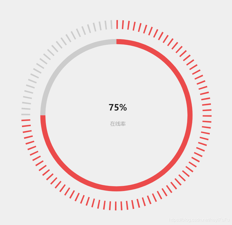
带刻度的饼图
实现效果:
实现代码:
const labelItemArr = [];
for (let i = 0; i < 100; ++i) {


    labelItemArr.push({


        value: 1,
        name: i,
        itemStyle: {

     normal: {

     color: i < 75 ? '#EB4B4B' : '#ccc' } }
    }, {


        value: 3,
        name: '',
        itemStyle: {


            normal: {


                label: {

     show: false },
                labelLine: {

     show: false },
                color: 'rgba(0, 0, 0, 0)',
                borderColor: 'rgba(0, 0, 0, 0)',
                borderWidth: 0
            }
        }
    });
}
option = {


    title: [{


        text: '75%',
        x: '50%',
        y: '45%',
        textAlign: 'center',
        textStyle: {


            fontSize: '30',
            fontWeight: '600',
            color: 'rgba(0,0,0,0.90)',
            textAlign: 'center',
        },
    }, {


        text: '在线率',
        left: '50%',
        top: '52%',
        textAlign: 'center',
        textStyle: {


            fontSize: '18',
            fontWeight: '400',
            color: 'rgba(0,0,0,0.40)',
            textAlign: 'center',
        },
    }],
    polar: {


        radius: ['61%', '57%'],
        center: ['50%', '50%'],
    },
    angleAxis: {


        max: 100,
        show: false,
        startAngle: 0,
    },
    radiusAxis: {


        type: 'category',
        show: true,
        axisLabel: {

     show: false },
        axisLine: {

     show: false },
        axisTick: {

     show: false },
    },
    series: [
        {


            hoverAnimation: false,
            type: 'pie',
            z: 2,
            data: labelItemArr,
            radius: ['68%', '75%'],
            zlevel: -2,
            label: {


                normal: {


                    position: 'inside',
                    show: false,
                }
            },
        },
        {


            type: 'pie',
            radius: ['56%', '60%'],
            center: ['50%', '50%'],
            data: [{


                hoverOffset: 1,
                value: 75,
                name: '',
                itemStyle: {

     color: '#EB4B4B ' },
                label: {

     show: false },
                labelLine: {


                    normal: {


                        smooth: true,
                        lineStyle: {


                            width: 0
                        }
                    }
                },
                hoverAnimation: false,
            }, {


                label: {

     show: false },
                labelLine: {


                    normal: {


                        smooth: true,
                        lineStyle: {

     width: 0 }
                    }
                },
                value: 100-75,
                hoverAnimation: false,
                itemStyle: {


                    color: '#ccc',
                },
            }]
        },
    ]
};
- 内层饼图就是两组数据实现,itemStyle分别设置不同的颜色
- 外层的饼图实现原理跟内层一样,只是数据项多一些,并且设置部分itemStyle的颜色为透明色,这样饼图的每一项看上去就像有间隔一样,就类似刻度盘。
- 如果希望刻度之间的间隔更大,就设置itemStyle为透明的数据项 value 值更大一些,反过来想设置刻度更细就设置非透明的数据项 value 值更小
- 主要就是添加多个数据项,每个数据项设置不同颜色就可以实现带刻度的饼图
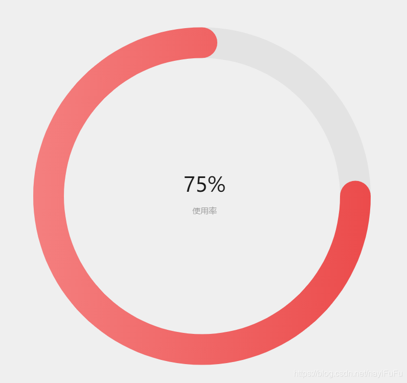
极坐标+条形图实现饼图
实现效果:
实现代码:
option = {


    color: ['#EB4B4B', 'rgb(245,245,245)'],
    title: [{


        text: '75%',
        x: '50%',
        y: '45%',
        textAlign: 'center',
        textStyle: {


            fontSize: '40',
            fontWeight: '500',
            color: 'rgba(0,0,0,0.90)',
            textAlign: 'center',
        },
    }, {


        text: '使用率',
        left: '50%',
        top: '52%',
        textAlign: 'center',
        textStyle: {


            fontSize: '16',
            fontWeight: '400',
            color: 'rgba(0,0,0,0.40)',
            textAlign: 'center',
        },
    }],
    polar: {


        radius: ['75%', '60%'],
        center: ['50%', '50%'],
    },
    angleAxis: {


        max: 100,
        show: false,
        startAngle: 0,
    },
    radiusAxis: {


        type: 'category',
        show: true,
        axisLabel: {


            show: false,
        },
        axisLine: {


            show: false,

        },
        axisTick: {


            show: false
        },
    },
    series: [
        {


            name: '',
            type: 'bar',
            roundCap: true,
            barWidth: 60,
            showBackground: true,
            data: [75],
            coordinateSystem: 'polar',
            itemStyle: {


                normal: {


                    color: new echarts.graphic.LinearGradient(1, 0, 0, 0, [{


                        offset: 0,
                        color: '#EB4B4B'
                    }, {


                        offset: 1,
                        color: '#F47F7F'
                    }]),
                }
            }
        },
    ]
};
- 这样实现的饼图跟其他饼图一点点不一样的地方就在于两端是有弧度的圆,type 为 pie 的饼图两端为 矩形没有弧度
- 一定是在极坐标下,如果坐标系没有设置,就还是普通的条形图
- 一定要设置 angleAxis 配置的 max 值,不设置就会出现不管 bar 的 data 值为多少,一定是完整的饼图,100% 的状态
最近项目画图比较多,之前用echarts用的都比较简单,最近参考社区中共享的echarts图之后,才发现自己使用的太死板,还是要多多的学习,继续多研究 echarts 的这些配置项,灵活使用。
欢迎大家多分享,相互学习!
学到老,活到老