Python自带的plt是深度学习最常用的库之一,在发表文章时必然得有图作为支撑,plt为深度学习必备技能之一。作为深度学习入门,只需要掌握一些基础画图操作即可,其他等要用到的时候看看函数API就行。
1 导入plt库(名字长,有点难记)
import matplotlib.pyplot as plt
先随便画一个图,保存一下试试水:
plt.figure(figsize=(12,8), dpi=80)
plt.plot([1,2,6,4],[4,5,6,9])
plt.savefig('./plt_png/test1.png') #必须要放在show()前面,show()之后会自动释放图表内存
plt.show()
2 创建数据,画一个标准的图
import random
#创建一个小时内温度随时间变化的曲线(以分钟计算,温度在15到20之间)
#1.准备数据
x = range(60)
y = [random.uniform(15,20)for i in x]

#2.创建画布
plt.figure( figsize=(12,8), dpi=80 )
plt.plot(x,y)

#3 设置刻度及步长
z = range(40)
x_label = ['11:{}'.format(i) for i in x]
plt.xticks( x[::5], x_label[::5])
plt.yticks(z[::5])  #5是步长

#4 添加网格信息
plt.grid(True, linestyle='--', alpha=0.5) #默认是True,风格设置为虚线,alpha为透明度

#5 添加标题(中文在plt中默认乱码,不乱码的方法在本文最后说明)
plt.xlabel('Time')
plt.ylabel('Temperature')
plt.title('Curve of Temperature Change with Time')

#6 保存图片,并展示
plt.savefig('./plt_png/test1.2.png')
plt.show()

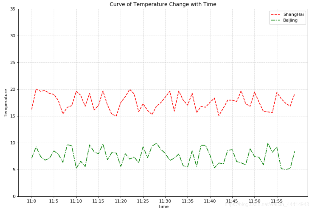
3 画两条曲线的图
#3 创建另一个曲线的数据
y_another = [random.uniform(5,10)for i in x]

#输入两个曲线的信息
plt.figure( figsize=(12,8), dpi=80 )
plt.plot(x, y, color='r', linestyle='--', label = 'ShangHai')
plt.plot(x, y_another, color='g', linestyle='-.', label = 'BeiJing')

#显示图例
plt.legend() #默认loc=Best

#设置刻度及步长
z = range(40)
x_label = ['11:{}'.format(i) for i in x]
plt.xticks( x[::5], x_label[::5])
plt.yticks(z[::5])  #5是步长

#添加网格信息
plt.grid(True, linestyle='--', alpha=0.5) #默认是True,风格设置为虚线,alpha为透明度

#添加标题
plt.xlabel('Time')
plt.ylabel('Temperature')
plt.title('Curve of Temperature Change with Time')

plt.savefig('./plt_png/test1.3.png')
plt.show()
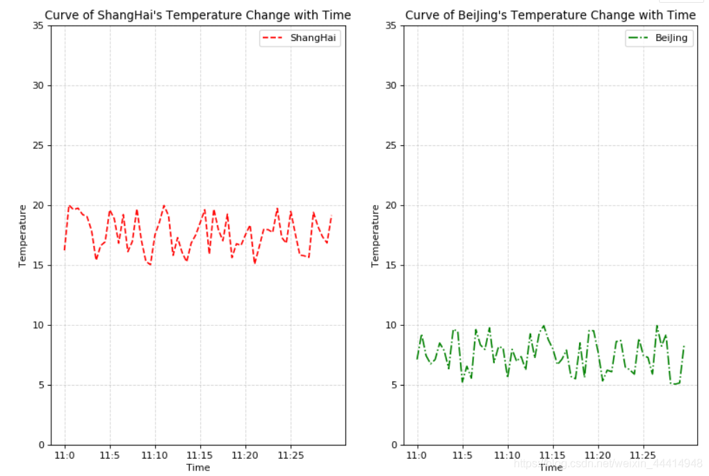
4 多个绘图区域画不同的图
#4 创建多个绘图区

#输入两个曲线的信息
#plt.figure( figsize=(12,8), dpi=80 )
figure, axes = plt.subplots( nrows=1, ncols=2, figsize=(12,8), dpi=80 )
axes[0].plot(x, y, color='r', linestyle='--', label = 'ShangHai')
axes[1].plot(x, y_another, color='g', linestyle='-.', label = 'BeiJing')

#显示图例
axes[0].legend() #默认loc=Best
axes[1].legend()

#设置刻度及步长
z = range(40)
x_label = ['11:{}'.format(i) for i in x]
#axes[0].set_xticks( x[::5], x_label[::5]) #set_xticks()不支持字符串,只支持布尔值
#axes[1].set_yticks(z[::5])  #5是步长 #set_yticks()不支持字符串,只支持布尔值
axes[0].set_xticks( x[::10]) #设置步长
axes[0].set_xticklabels(x_label[::5]) #设置字符串名
axes[0].set_yticks(z[::5])
axes[1].set_xticks( x[::10]) #设置步长
axes[1].set_xticklabels(x_label[::5]) #设置字符串名
axes[1].set_yticks(z[::5])


#添加网格信息
axes[0].grid(True, linestyle='--', alpha=0.5) #默认是True,风格设置为虚线,alpha为透明度
axes[1].grid(True, linestyle='--', alpha=0.5)

#添加标题
axes[0].set_xlabel('Time')
axes[0].set_ylabel('Temperature')
axes[0].set_title("Curve of ShangHai's Temperature Change with Time")
axes[1].set_xlabel('Time')
axes[1].set_ylabel('Temperature')
axes[1].set_title("Curve of BeiJing's Temperature Change with Time")

plt.savefig('./plt_png/test1.4.png')
plt.show()
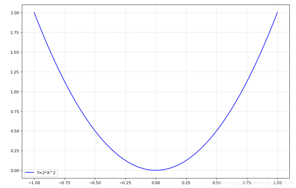
5 绘制简单数学函数图像
import numpy as np
#准备数据
x = np.linspace(-1,1,1000) #在-1至1之间等距生成1000个数
y = 2*x*x
#绘制画布
#折线图plot
plt.figure(figsize=(12,8), dpi=80)
plt.plot( x, y, color='b', label='Y=2*X^2' )
plt.legend()
plt.grid(True, linestyle='--', alpha=0.5)

plt.savefig('./plt_png/test1.5.png')
plt.show()
6 散点图、柱状图、双柱状图、直方图、饼图
6.1 散点图
#散点图scatter
x = np.linspace(-1,1,20)
y = 2*x*x
plt.figure(figsize=(12,8), dpi=80)
plt.scatter( x, y, color='b', label='Y=2*X^2' ) #主要是这里plot换成scatter,下面的根据需要修改
plt.legend()
plt.grid(True, linestyle='--', alpha=0.5)

plt.savefig('./plt_png/test1.6.png')
plt.show()

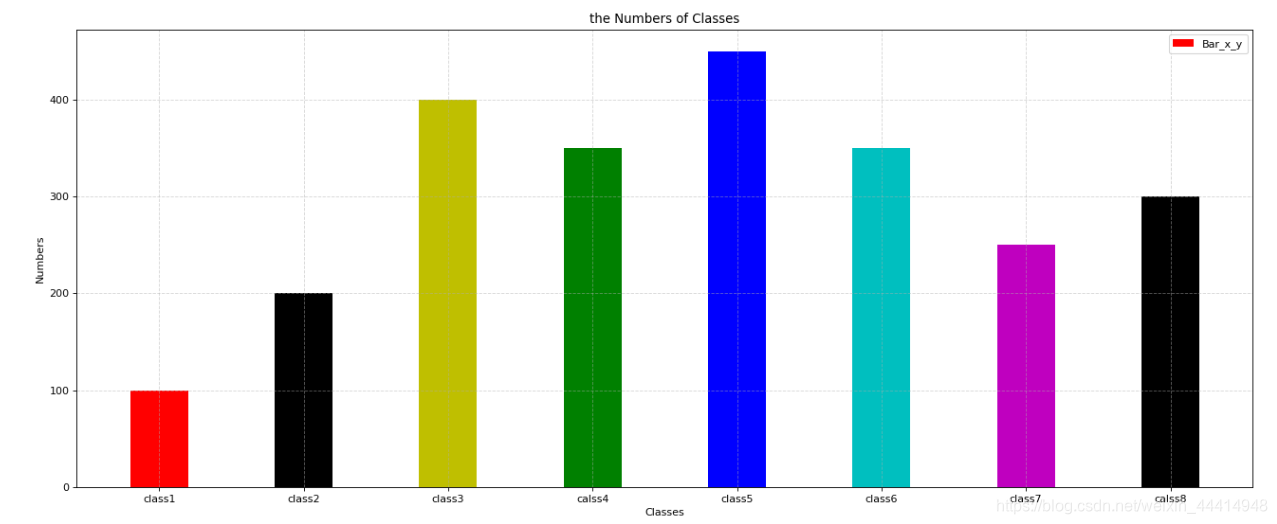
6.2 柱状图
#柱状图bar
x = range(8)
y = [100,200,400,350,450,350,250,300]
plt.figure(figsize=(20,8), dpi=80)
plt.bar( x, y, width=0.4, color=['r', 'k', 'y', 'g', 'b', 'c', 'm', 'k'], label='Bar_x_y' ) #这里是bar()函数
plt.legend()
plt.grid(True, linestyle='--', alpha=0.5)
#修改x刻度名字
plt.xticks(x, ['class1','class2','class3','calss4','class5','class6','class7','calss8'])
#设置xy标签
plt.xlabel('Classes')
plt.ylabel('Numbers')
plt.title('the Numbers of Classes')

plt.savefig('./plt_png/test1.7.png')
plt.show()
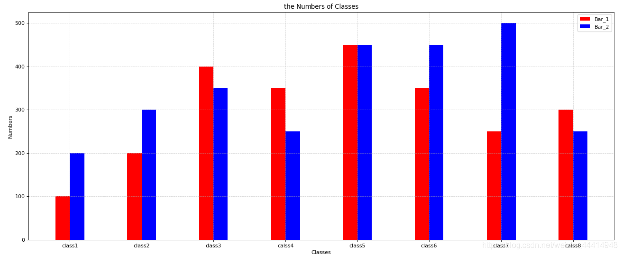
6.3 对比柱状图(双柱状图)
#对比柱状图bar
x = range(8)
y = [100,200,400,350,450,350,250,300]
z = [200,300,350,250,450,450,500,250]
plt.figure(figsize=(20,8), dpi=80)
plt.bar( x, y, width=0.2, color='r', label='Bar_1' )
#加一个柱状图,[i+0.2 for i in x]为间距生成式
plt.bar( [i+0.2 for i in x], z, width=0.2, color='b', label='Bar_2' )
plt.legend()
plt.grid(True, linestyle='--', alpha=0.5)
#修改x刻度名字
plt.xticks([i+0.1 for i in x], ['class1','class2','class3','calss4','class5','class6','class7','calss8'])
#设置xy标签
plt.xlabel('Classes')
plt.ylabel('Numbers')
plt.title('the Numbers of Classes')

plt.savefig('./plt_png/test1.8.png')
plt.show()
6.4 直方图
#直方图histogram
x_1 = range(80)
number = np.random.randint(50,200,[80])
print(max(number),min(number))
bins = int((max(number) - min(number))//10)
plt.figure(figsize=(20,8), dpi=80)
plt.hist( number, bins=bins, color='b', label='Histogram' ) #y轴可以是频数,也可以是频率
plt.legend()
plt.grid(True, linestyle='--', alpha=0.5)

plt.xticks(range(min(number), max(number), 10))

plt.savefig('./plt_png/test1.9.png')
plt.show()

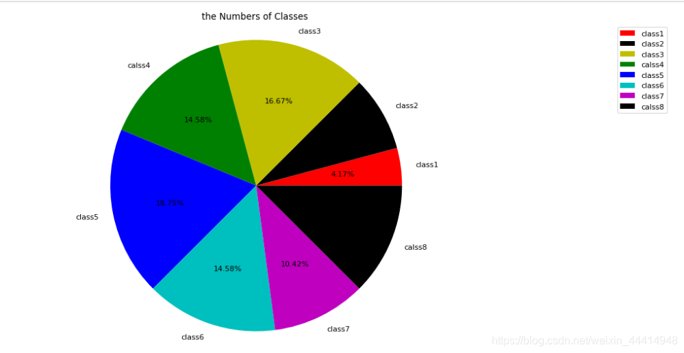
6.5 饼图
#饼图pie ,超过9个类别不适合用饼图
import matplotlib.pyplot as plt
x3 = range(8)
y3 = [100,200,400,350,450,350,250,300]
z3 = ['class1','class2','class3','calss4','class5','class6','class7','calss8']
plt.figure(figsize=(20,8), dpi=80)
plt.pie( y3, labels=z3, colors=['r', 'k', 'y', 'g', 'b', 'c', 'm', 'k'], autopct='%1.2f%%' )
plt.legend()

plt.title('the Numbers of Classes')

plt.axis('equal') #调节饼图长轴短轴的比例,以及整图布局

plt.savefig('./plt_png/test1.10.png')
plt.show()
注:plt不能显示中文的解决方法
导入plt时顺便加上下面两行代码即可
import matplotlib.pyplot as plt
plt.rcParams['font.sans-serif'] = ['SimHei'] #显示中文
plt.rcParams['axes.unicode_minus']=False #用来正常显示负号