CSS黑魔法,可以理解为。你用它的情况很少,但是在你需要黑魔法来实现一下CSS布局或者效果的时候,你会发现它非常好用。
以下,是我在工作中,用到的黑魔法。写下来是方便以后查阅。
撑起图片高度
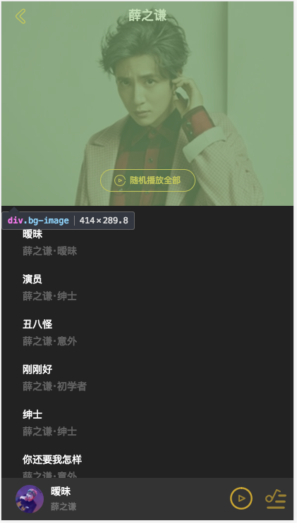
它的实现效果利用该元素的 position:relative 和 padding-top 的值来设置。但是,得有前提条件设置这个元素的 width: 100%;height: 0。
最后,设置 padding-top 的值,就会根据 width:100% 的百分比来计算。比如,如果你 padding-top: 70% 其实就 width 的百分之七十
代码如下:
<div class="bg-img"></div>
.bg-img
    position: relative
    padding-top: 70%;
    width: 100%
    height: 0
    background-image: url('xxx')
    backgorund-size: cover
子元素垂直居中
简单介绍一下: 这种方法是把父元素变成display: table,就是此元素将以块级表格来显示。子元素变成display: table-cell,此元素会作为一个表格单元格显示。
子元素就利用单元格的属性: vertical-align: middle,来进行居中。
1.利用 display:table
<div class="parent">
    <div class="child">
        垂直居中
    </div>
</div>

<style>
    .parent{
        display:table;
        width:500px;
        height:500px;
    }
    .child{
        display: table-cell;
        vertical-align: middle;
    }
</style>2.利用display: flex
<div class="parent">
    <div class="child">
        垂直居中
    </div>
</div>

<style>
    .parent{
       display: flex
       justify-content: center
       align-items: center
    }
    .child {

     }
</style>
1像素边框
1.用height:1px的div,然后根据媒体查询设置transform: scaleY(0.5);,
  div
    height:1px
    background:#000
    -webkit-transform: scaleY(0.5)
    -webkit-transform-origin:0 0
    overflow: hidden
2.用::after设置border:1px solid #000; width:200%; height:200%,然后再缩放scaleY(0.5); 优点可以实现圆角,京东就是这么实现的,缺点是按钮添加active比较麻烦。
.div::after
    content: ''
    width: 200%
    height: 200%
    position: absolute
    top: 0
    left: 0
    border: 1px solid #bfbfbf
    border-radius: 4px
    -webkit-transform: scale(0.5,0.5)
    transform: scale(0.5,0.5)
    -webkit-transform-origin: top left
3.伪类 + transform 实现
对于老项目,有没有什么办法能兼容1px的尴尬问题了,个人认为伪类+transform是比较完美的方法了。原理是把原先元素的 border 去掉,然后利用 :before 或者 :after 重做 border ,并 transform 的 scale 缩小一半,原先的元素相对定位,新做的 border 绝对定位。
.scale-1px
    position: relative
    border:none

.scale-1px:after
    content: ''
    position: absolute
    bottom: 0 // top left right 来控制位置 ==> 上边框或者下边框
    background: #000
    width: 100%
    height: 1px
    -webkit-transform: scaleY(0.5)
    transform: scaleY(0.5)
    -webkit-transform-origin: 0 0
    transform-origin: 0 0
    -webkit-transform-origin: 0 0
4.参照sell-app的1像素边框
个人觉得最好,因为还做dpr的兼容性
border-1px($color)
  position: relative
  &:after
    display: block
    position: absolute
    left: 0
    bottom: 0
    width: 100%
    border-top: 1px solid $color
    content: ' '

/**
 * 最需要的元素加上 class ==> border-1px
 */

@media (-webkit-min-device-pixel-ratio: 1.5),(min-device-pixel-ratio: 1.5)
  .border-1px
    &::after
      -webkit-transform: scaleY(0.7)
      transform: scaleY(0.7)

@media (-webkit-min-device-pixel-ratio: 2),(min-device-pixel-ratio: 2)
  .border-1px
    &::after
      -webkit-transform: scaleY(0.5)
      transform: scaleY(0.5)
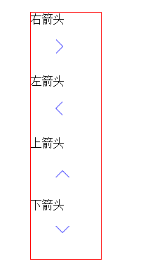
用CSS伪类写上下左右空心箭头
<!DOCTYPE html>
<html lang="en">
<head>
    <meta charset="UTF-8">
    <title>css制作空心的上下左右的箭头</title>
    <style type="text/css">
        *{
            padding:0;
            margin:0;
        }
        .box{
            width:100px;
            height:500px;
            margin:0 auto;
            border:1px solid red;
            background:white;
        }
        .arrow-box{
            width:30px;
            height:30px;
            margin:20px auto;
            position:relative;
        }
        /*右箭头*/
        .right{
            width:20px;
            height:20px;
            position:absolute;
            left:0;
            top:0;
            border:1px solid blue;
        }
        .right-arrow1,.right-arrow2{
            width:0;
            height:0;
            display:block;
            position:absolute;
            left:0;
            top:0;
            border-top:10px transparent dashed;
            border-right:10px transparent dashed;
            border-bottom:10px transparent dashed;
            border-left:10px white solid;
            overflow:hidden;
        }
        .right-arrow1{
            left:1px;/*重要*/
            border-left:10px blue solid;
        }
        .right-arrow2{
            border-left:10px white solid;
        }
        /*左箭头*/
        .left{
            width:20px;
            height:20px;
            position:absolute;
            left:0;
            top:0;
            z-index: 2;/*兼容ie8-*/
            border:1px solid blue;
        }
        .left-arrow1,.left-arrow2{
            width:0;
            height:0;
            display:block;
            position:absolute;
            left:0;
            top:0;
            z-index:5;/*兼容ie8-*/
            border-top:10px transparent dashed;
            border-left:10px transparent dashed;
            border-bottom:10px transparent dashed;
            border-right:10px white solid;
            overflow:hidden;
        }
        .left-arrow1{
            border-right:10px blue solid;
        }
        .left-arrow2{
            left:1px;/*重要*/
            border-right:10px white solid;
        }
        /*上箭头*/
        .top{
            width:20px;
            height:20px;
            position:absolute;
            left:0;
            top:0;
            z-index: 2;/*兼容ie8-*/
            border:1px solid blue;
        }
        .top-arrow1,.top-arrow2{
            width:0;
            height:0;
            display:block;
            position:absolute;
            left:0;
            top:0;
            z-index: 5;/*兼容ie8-*/
            border-top:10px transparent dashed;
            border-left:10px transparent dashed;
            border-right:10px transparent dashed;
            border-bottom:10px white solid;
            overflow:hidden;
        }
        .top-arrow1{
            border-bottom:10px blue solid;
        }
        .top-arrow2{
            top:1px;/*重要*/
            border-bottom:10px white solid;
        }
        /*下箭头*/
        .bottom{
            width:20px;
            height:20px;
            position:absolute;
            left:0;
            top:0;
            z-index: 2;/*兼容ie8-*/
            border:1px solid blue;
        }
        .bottom-arrow1,.bottom-arrow2{
            width:0;
            height:0;
            display:block;
            position:absolute;
            left:0;
            top:0;
            z-index: 5;/*兼容ie8-*/
            border-bottom:10px transparent dashed;
            border-left:10px transparent dashed;
            border-right:10px transparent dashed;
            border-top:10px white solid;
            overflow:hidden;
        }
        .bottom-arrow1{
            top:1px;/*重要*/
            border-top:10px blue solid;
        }
        .bottom-arrow2{
            border-top:10px white solid;
        }
    </style>

<body>
<div class="box">
    <p> 右箭头</p>
    <div class="arrow-right arrow-box">
        <b class="right"><i class="right-arrow1"></i><i class="right-arrow2"></i></b>
    </div>
    <p> 左箭头</p>
    <div class="arrow-left arrow-box" >
        <b class="left"><i class="left-arrow1"></i><i class="left-arrow2"></i></b>
    </div>
    <p> 上箭头</p>
    <div class="arrow-top arrow-box" >
        <b class="top"><i class="top-arrow1"></i><i class="top-arrow2"></i></b>
    </div>
    <p> 下箭头</p>
    <div class="arrow-bottom arrow-box" >
        <b class="bottom"><i class="bottom-arrow1"></i><i class="bottom-arrow2"></i></b>
    </div>
</div>
</body>
</html>
效果如下:
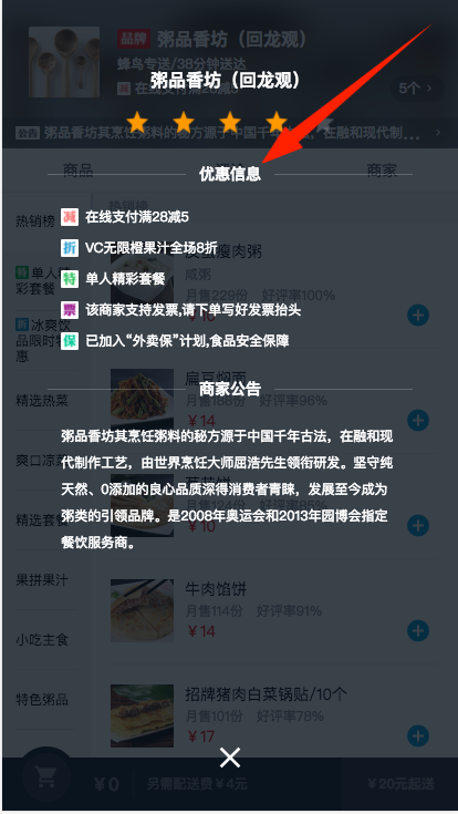
CSS写横线,中间可以添加任何元素
<div class="title">
  <div class="line"></div>
  <div class="text">优惠信息</div>
  <div class="line"></div>
</div>

.title
    display: flex
    width: 80%
    margin: 28px auto 24px auto
    .line
        flex: 1
        position: relative
        top: -6px
        border-bottom: 1px solid rgba(255,255,255,0.2)
    .text
        padding: 0 12px
        font-weight: 700
        font-size: 14px
效果图如下: