一般调用组件是在各个页面上用标签的形式添加组件,但有时这样会比较麻烦,所以可以使用vue.extend实现,github地址:https://github.com/xyouzi/MessageBox
效果图:
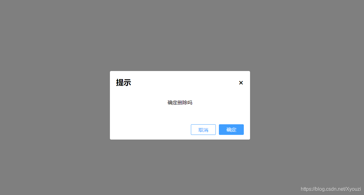
按钮都可用
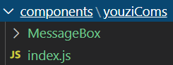
目录结构:
MessageBox组件的vue文件:
<template>
  <div class="mask">
    <div class="messageBox">
      <h2 class="title">
        <p>{

    {

    title}}</p>
        <span @click="handleCancel">×</span>
      </h2>
      <div class="content">{

    {

    content}}</div>
      <div class="btns">
        <div class="btn-ok" @click="handleOk">{

    {

    ok}}</div>
        <div class="btn-cancel" @click="handleCancel">{

    {

    cancel}}</div>
      </div>
    </div>
  </div>
</template>

<script>
export default {

    };
</script>

<style scoped>
* {


  box-sizing: border-box;
  padding: 0;
  margin: 0;
}
.mask {


  width: 100vw;
  height: 100vh;
  position: fixed;
  top: 0;
  left: 0;
  bottom: 0;
  right: 0;
  background: rgba(0, 0, 0, 0.5);
}
.messageBox {


  width: 450px;
  height: 220px;
  border-radius: 4px;
  background: #fff;
  position: absolute;
  top: 50%;
  left: 50%;
  transform: translate(-50%, -50%);
  overflow: hidden;
  padding: 20px;
}
.title {


  display: flex;
  justify-content: space-between;
  /* 强制不换行 */
  white-space: nowrap;
  overflow: hidden;
  /* 多余文字显示省略号 */
  text-overflow: ellipsis;
}
.title span {


  cursor: pointer;
}
.content {


  height: 100px;
  overflow-y: auto;
  padding: 5px;
  display: flex;
  justify-content: center;
  align-items: center;
}
.btns {


  display: flex;
  flex-direction: row-reverse;
  margin-top: 20px;
  text-align: center;
  line-height: 34px;
}

.btn-cancel,
.btn-ok {


  width: 80px;
  height: 34px;
  border: none;
  outline: none;
  color: #fff;
  background-color: #409eff;
  border-color: #409eff;
  margin-left: 10px;
  border-radius: 3px;
  cursor: pointer;
}
.btn-cancel {


  color: #409eff;
  border: 1px solid #409eff;
  background-color: #fff;
}
.btn-ok:hover {


    background-color: rgb(0, 146, 238);
}
.btn-cancel:hover {


    color: #fff;
    background-color: rgb(0, 164, 255);
}
</style>
js文件:
import Vue from 'vue';
import MessageBox from './MessageBox';

export let messageBox = (function () {


    let defaults = {

     // 默认值
        title: '',
        content: '',
        cancel: '取消',
        ok: '确定',
        handleCancel: null,
        handelOk: null
    };
    let MyComponent = Vue.extend(MessageBox);
    return function (opts) {

     // 配置参数
        for (let attr in opts) {


            defaults[attr] = opts[attr];
        }
        let vm = new MyComponent({


            el: document.createElement('div'),
            data: {


                title: defaults.title,
                content: defaults.content,
                cancel: defaults.cancel,
                ok: defaults.ok
            },
            methods: {


                handleCancel() {


                    defaults.handleCancel && defaults.handleCancel.call(this);
                    document.body.removeChild(vm.$el);
                },
                handleOk() {


                    defaults.handleOk && defaults.handleOk.call(this);
                    document.body.removeChild(vm.$el);
                }
            }
        });
        document.body.appendChild(vm.$el);
    }
})()
可以在main中全局注册,这里我在页面中调用:
<template>
  <div id="app"></div>
</template>

<script>
import {

     messageBox } from "@/components/youziComs";
export default {


  name: "App",
  components: {

    },
  mounted() {


    messageBox({


      title: "提示",
      content: "确定删除吗",
      handleCancel() {


        console.log(1);
      },
      handleOk() {


        console.log(2);
      }
    });
  }
};
</script>

<style>
</style>