目录
最终效果(含使用方法)
this.$info('你成功啦!')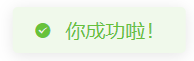
this.$info('小心!','warning')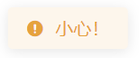
this.$info('报错啦!','error')
实现方案
新建文件夹src/plugins/SUI/info
1. 在文件夹info中新建文件 s-info.vue
自定义消息弹窗组件(可以根据需求,自行改造成其他效果)
<template>
    <transition name="fade">
        <div v-if="show" class="s-info" :style="style" :class="`info-${type}`">
            <!--消息前的图标-->
            <div class="info-icon">
                <i v-if="type==='ok'" class="iconfont icon-iconfontgou2"></i>
                <i v-if="type==='warning'" class="iconfont icon-72jingshi"></i>
                <i v-if="type==='error'" class="iconfont icon-cuowu"></i>
            </div>
            <!--消息的内容-->
            <div v-html="content"></div>
        </div>
    </transition>
</template>
<script>
    export default {
        data() {
            return {
                style: {}, // 消息弹窗的样式
                show: false,// 消息弹窗是否隐藏,默认隐藏
                type: 'ok',// 消息类型,默认为绿色效果的成功消息
                content: "", // 消息的内容
                autoClose: true,// 弹窗是否自动关闭,默认自动关闭
                showTime: 1000,// 弹窗展示时间,默认1s
                x: null,//鼠标点击的x坐标
                y: null,//鼠标点击的y坐标
            }
        },
        mounted() {
            if (this.autoClose) {
                setTimeout(() => {
                    this.close();
                }, this.showTime);
            }
            if (this.x && this.y) {
                this.$set(this.style, 'top', this.y - 60 + 'px')
                this.$set(this.style, 'left', this.x + 'px')
            }
        },
        methods: {
            close() {
                this.show = false;
            },
        }
    };
</script>
<style scoped>
    .s-info {
        position: fixed;
        z-index: 8888;
        top: 40px;
        left: 50%;
        transform: translateX(-50%);
        padding: 8px 16px;
        display: flex;
        align-items: center;
        border-radius: 4px;
        box-sizing: border-box;
        box-shadow: 0 2px 12px 0 rgba(0, 0, 0, .1);
    }

    /*成功的消息样式*/
    .info-ok {
        background-color: #f0f9eb;
        border-color: #e1f3d8;
        color: #67c23a;
    }

    /*警示的消息样式*/
    .info-warning {
        background-color: #fdf6ec;
        border-color: #faecd8;
        color: #E6A23C;
    }

    /*报错的消息样式*/
    .info-error {
        background-color: #fef0f0;
        border-color: #fde2e2;
        color: #F56C6C;
    }

    .info-icon {
        margin-right: 10px;
    }

    /*渐变过渡*/
    .fade-enter, .fade-leave-active {
        opacity: 0;
    }

    .fade-enter-active, .fade-leave-active {
        transition: opacity 0.35s;
    }
</style>
2. 在文件夹info中新建文件 index.js
自定义消息弹窗组件的安装方法 install
import Vue from 'vue'
import InfoComponent from './s-info.vue'

// 基于封装好的组件 s-info.vue 用Vue.extend()创建一个Vue子类构造器
const Info = Vue.extend(InfoComponent)

// 为构造器Info自定义 install 方法(install可以自定义为任意方法名)
Info.install = function (options,type) {
   // 倘若直接传入字符串或数字,则重新封装为对象,并将传入的内容放入content属性
   //  若传入两个参数,则第二个参数用于指定消息类型,默认为成功消息
   if (typeof options === 'string' || typeof options === 'number') {
        options = {
            content: options,
            type:type?type:'ok'
        }
    }

    // 根据构造器Info创建一个实例instance,并在内存中渲染
    // $mount()不带参数,会将组件在内存中渲染
    // $mount()带参数,会将组件渲染后,替换掉参数对应的元素,如$mount('#app')
    let instance = new Info({
        data: options
    }).$mount()

    // 将实例instance手动挂载到body标签的末尾
    document.body.appendChild(instance.$el)

    // 待所有DOM节点加载完成后,将实例instance的show变量设置为true,确保组件能正常显示
    Vue.nextTick(() => {
        instance.show = true
    })
}

// 对外输出构造器Info
export default Info
3. 在main.js中定义全局指令$info
执行this.$info时,便会执行自定义消息组件的install方法,创建自定义消息组件实例并渲染挂载到页面中
import Info from './plugins/SUI/info'
Vue.prototype.$info = Info.install;
参考资料
https://blog.csdn.net/weixin_44883642/article/details/105655954