一、基本格式设置
Matplotlib:python中一个数据可视化的库,可绘制2D图形,也就是说图形中包含x轴和y轴,因此在进行画图时需要传入x和y值。下面是一些关于绘图中的格式参数的介绍:
① 设置图片大小:通过画布大小改变图片大小
plt.figure(figsize=(4,4),dpi=100)
figsize:画布大小,是一个包括长和宽的列表
dpi:设置分辨率,dpi=100表示没一英寸有100个像素点
② 设置坐标轴刻度:
x_ticks_label=[’{}:00’.format(i)for i in x]#设置x轴刻度显示的描述文本
plt.xticks(x,x_ticks_label)
③ 显示中文字符:
from matplotlib import font_manager
font=font_manager.FontProperties(fname=‘C:/Windows/Fonts/simhei.ttf’,size=10)#默认不支持中文,这里要从自己电脑上找到喜欢的字体
④ 设置坐标轴标签和标题:
plt.xlabel(‘时间’,fontproperties=font)
plt.ylabel(‘温度’,rotation=0,fontproperties=font)
plt.title(‘今日气温’,fontproperties=font,color=‘green’)
⑤ 设置图例:
首先在plot中添加label: plt.plot(x,y,color=‘green’,alpha=0.3,linestyle=’–’,linewidth=3,marker=‘o’,label=‘2020-12-18’)
显示图例:plt.legend(prop=font,loc=‘upper right’)
loc可选参数:upper right、lower_left、center_left、upper_center
⑥ 绘制网格线:
plt.grid(alpha=0.3)
⑦ 保存图片:
plt.savefig(‘D:/zwz/zxt.png’)
savefig要放在plot后边、show前边,因为show()运行后,图片已被展示,figure会被释放,再保存的只是一张空图片。
二、各种图形绘制及其参数
1.折线图:分析数据的趋势
① 修改折线图颜色、样式:plt.plot(x,y,color=‘red’,alpha=0.5,linestyle, linewidth=3)在color中输入想要的颜色,alpha表示透明度,控制颜色深浅程度,取值[0,1],值越大透明度越小,越清晰。Linestyle表示线的样式:-实线,–短线,-.短点相间线,:虚点线。Linewidth改变线的宽度。
② 标记折点:marker:可选值包括:o、h、v、*等
#设置画布大小
plt.figure(figsize=(8,8),dpi=100)
#折线图
x=range(0,20,2)
y=[1,4,5,7,8,11,10,9,7,3]
plt.plot(x,y,color='green',alpha=0.3,linestyle='--',linewidth=3,marker='o',label='2020-12-18')

#设置坐标轴轴刻度标签
x_ticks_label=['{}:00'.format(i)for i in x]
plt.xticks(x,x_ticks_label)
y_ticks_label=['{}℃'.format(i)for i in range(min(y),max(y)+1)]
plt.yticks(range(min(y),max(y)+1),y_ticks_label)
#设置中文字符
from matplotlib import font_manager
font=font_manager.FontProperties(fname='C:/Windows/Fonts/simhei.ttf',size=10)#默认不支持中文,这里要从自己电脑上找到喜欢的字体
plt.xlabel('时间',fontproperties=font)
plt.ylabel('温度',rotation=0,fontproperties=font)
plt.title('今日气温',fontproperties=font,color='green')
plt.legend(prop=font,loc='upper right')
#绘制网格线
plt.grid(alpha=0.3)
#保存图片
plt.savefig('D:/zwz/zxt.png')
plt.show()

2.散点图:判断变量之间的关联关系、相关关系等,可以用来识别离群点
散点图绘制核心语句:plt.scatter(x,y)
#散点图
#设置画布大小
plt.figure(figsize=(8,8),dpi=100)
plt.scatter(x=df.tenure,y=df.TotalCharges)
#设置中文字符
from matplotlib import font_manager
font=font_manager.FontProperties(fname='C:/Windows/Fonts/simhei.ttf',size=10)#默认不支持中文,这里要从自己电脑上找到喜欢的字体
#设置标签和标题
plt.xlabel('使用月份',fontproperties=font)
plt.ylabel('总消费额',rotation=0,fontproperties=font)
plt.title("使用月份与总消费额关系",fontproperties=font,color='blue')
plt.legend(prop=font,loc='upper right')
#绘制网格线
plt.grid(alpha=0.3)
#保存图片
plt.savefig('D:/zwz/zxt.png')
plt.show()

#条形图
#设置画布大小
plt.figure(figsize=(8,8),dpi=100)
x=['qz','dj','bc','xlh']
y=[55,30,45,60]
#条形图
plt.bar(range(len(x)),y,width=0.2,color='blue',alpha=0.4)
#设置坐标轴轴刻度标签
plt.xticks(range(len(x)),x,fontproperties=font)
plt.yticks(range(0,61,2))
#设置中文字符
from matplotlib import font_manager
font=font_manager.FontProperties(fname='C:/Windows/Fonts/simhei.ttf',size=10)#默认不支持中文,这里要从自己电脑上找到喜欢的字体
#设置标签和标题
plt.xlabel('时间',fontproperties=font)
plt.ylabel('销量(kg)',rotation=90,fontproperties=font)
plt.title('今日蔬菜销量',fontproperties=font,color='black')
#绘制网格线
plt.grid(alpha=0.3)
plt.show()

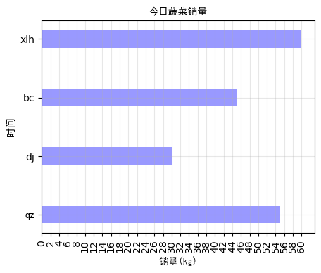
横向条形图:使用plt.barh()制作横向条形图,并要将plt.xticks()和plt.yticks()内参数互换。且设置条形图时的宽度参数要用height。
#横向条形图
plt.figure(figsize=(8,8),dpi=100)
x=['qz','dj','bc','xlh']
y=[55,30,45,60]
#条形图
plt.barh(range(len(x)),y,height=0.3,color='blue',alpha=0.4)
#设置坐标轴轴刻度标签

plt.xticks(range(0,61,2))
plt.yticks(range(len(x)),x,fontproperties=font)

#设置中文字符
from matplotlib import font_manager
font=font_manager.FontProperties(fname='C:/Windows/Fonts/simhei.ttf',size=10)#默认不支持中文,这里要从自己电脑上找到喜欢的字体
#设置标签和标题
plt.ylabel('时间',fontproperties=font)
plt.xlabel('销量(kg)',rotation=0,fontproperties=font)
plt.title('今日蔬菜销量',fontproperties=font,color='black')
#绘制网格线
plt.grid(alpha=0.3)
plt.show()
堆积条形图:利用两次plt.bar()实现,在第二个bar中要添加参数bottom=y1
#InternetService_Churn
InternetService_Churn=pd.pivot_table(data=df,values='customerID',index='InternetService',columns='Churn',aggfunc='count')
ax=fig.add_subplot(1,1,1)
print(InternetService_Churn)

plt.figure(figsize=(5,5),dpi=100)
index=range(3)
x=['DSL ','Fiber optic ','No']
y1=InternetService_Churn.iloc[:,0]
y2=InternetService_Churn.iloc[:,1]
#条形图
plt.bar(x,y1,alpha=0.9, width=0.3,color='steelblue')
plt.bar(x, y2, alpha=0.9, width=0.3, color='palevioletred',bottom=y1)

#设置中文字符
from matplotlib import font_manager
font=font_manager.FontProperties(fname='C:/Windows/Fonts/simhei.ttf',size=10)#默认不支持中文,这里要从自己电脑上找到喜欢的字体
#设置标签和标题
plt.xlabel('InternetService',fontproperties=font)
plt.title('用户流失与InternetService关系',fontproperties=font,color='black')
#绘制网格线
plt.grid(alpha=0)
ax.set_xticklabels(x,rotation=0,fontproperties=font)
#设置图例
legend=plt.legend(labels=['No','Yes'],loc='upper right')
plt.show()
plt.show()

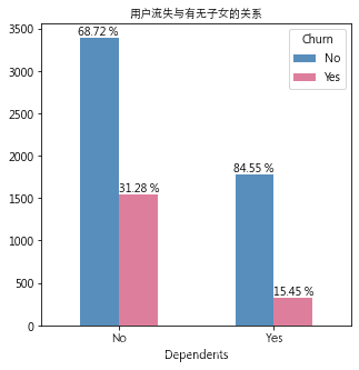
簇状条形图:数据使用的是来自kaggle的 https://www.kaggle.com/blastchar/telco-customer-churn
from matplotlib import font_manager
font=font_manager.FontProperties(fname='C:/Windows/Fonts/STXIHEI.ttf',size=10)
#根据性别与是否流失进行透视
Dependents_Churn=pd.pivot_table(data=df,values='customerID',index='Dependents',columns='Churn',aggfunc='count')
ax=fig.add_subplot(1,1,1)
print(Dependents_Churn)
fig,ax=plt.subplots(1,1,figsize=(5, 5))
Dependents_Churn.plot.bar(ax=ax,color=['steelblue','palevioletred'],alpha=0.9)
#标注比例
ax.set_title('用户流失与有无子女的关系',fontproperties=font)
ax.set_xticklabels(['No','Yes'],rotation=0,fontproperties=font)

ax.text(x=0,y=Dependents_Churn.iloc[0,0]+30,s='%.2f %%' % (Dependents_Churn.iloc[0,0]/Dependents_Churn.iloc[0,:].sum()*100),horizontalalignment='right')
ax.text(x=0,y=Dependents_Churn.iloc[0,1]+30,s='%.2f %%' % (Dependents_Churn.iloc[0,1]/Dependents_Churn.iloc[0,:].sum()*100),horizontalalignment='left')
ax.text(x=1,y=Dependents_Churn.iloc[1,0]+30,s='%.2f %%' % (Dependents_Churn.iloc[1,0]/Dependents_Churn.iloc[1,:].sum()*100),horizontalalignment='right')
ax.text(x=1,y=Dependents_Churn.iloc[1,1]+30,s='%.2f %%' % (Dependents_Churn.iloc[1,1]/Dependents_Churn.iloc[1,:].sum()*100),horizontalalignment='left')
plt.show()
直方图与条形图区别:直观上看,条形图的相邻柱子之间是不挨着的,直方图的柱子是连在一起的。条形图一般用来做离散型数据的数量、频数统计对比,直方图一般用来展示连续数据的分布情况展示。例:用条形图可视化购买/不购买(是具体的一个值或一个类)某商品的顾客数的对比,用直方图可视化购买10-30件/30-50件/50-100件(是一个区间)商品的顾客分布情况。
#直方图
plt.figure(figsize=(4,4),dpi=100)
x=[23,25,33,34,35,45,46,47,48,56,57,58,59,60,56,66,57,68,58,69,80,70,77,78,38,39,58,24,24]
plt.hist(x,bins=8)#bins是分组数
#设置坐标轴轴刻度标签
plt.xticks(range(min(x),max(x),10)[::2])
#设置中文字符
from matplotlib import font_manager
font=font_manager.FontProperties(fname='C:/Windows/Fonts/simhei.ttf',size=10)#默认不支持中文,这里要从自己电脑上找到喜欢的字体
#设置标签和标题
plt.xlabel('销量',fontproperties=font)
plt.ylabel('数量(kg)',rotation=90,fontproperties=font)
plt.title('销量图',fontproperties=font,color='black')
#绘制网格线
plt.grid(alpha=0.3)
plt.show()

Size:各部分占比
explode:各部分突出长度
colors:各部分颜色
labels:各部分标签
labeldistance:标签距圆心距离(n倍半径)
autopct:文本保留几位小数
shadow:是否设置阴影
startangle:起始角度,默认从0逆时针
pctdistance:圆内文本距圆心距离
#饼图
size=[10,40,20,30]
labellist=['美国','中国','日本','西班牙']
patchea,l_text,p_text=plt.pie(size,explode=[0,0.06,0,0],colors=['blue','red','grey','green'],labels=labellist,labeldistance=1.1,autopct="%1.1f%%",shadow=True,startangle=90,pctdistance=0.5)
for t in l_text:
    t.set_fontproperties(font)#设置圆内中文字体
plt.axis("equal")
plt.legend(prop=font)#设置图例中文字体
plt.show()
其中for t in l_text:
t.set_fontproperties(font)是用来设置圆内中文字体的

圆环图:圆环图的实质是将饼图的中心挖去,使其成环状
df['Churn'].value_counts()
# 流失数
count_of_cust_churn_yes = df['Churn'].value_counts()[1]
# 未流失数
count_of_cust_churn_no = df['Churn'].value_counts()[0]
# 流失百分比
percent_of_cust_churn_yes = round((count_of_cust_churn_yes / df['Churn'].value_counts().sum() * 100),2)
# 未流失百分比
percent_of_cust_churn_no = round((count_of_cust_churn_no / df['Churn'].value_counts().sum() * 100 ),2)
fig, ax = plt.subplots(figsize=(5, 5), subplot_kw=dict(aspect="equal"))
ax=fig.add_subplot(1,1,1)
per=[percent_of_cust_churn_yes,percent_of_cust_churn_no]
plt.pie(per,colors=['palevioletred','steelblue'], autopct='%1.1f%%', wedgeprops=dict(width=0.3, edgecolor='w'))
# 设置等比例轴,x和y轴等比例
plt.axis('equal')
ax.set_title('用户流失比例',fontproperties=font)
#设置图例
legend=plt.legend(labels=['Yes','No'],loc='upper right')
plt.show()

双层圆环图:这里是将用户流失和不流失分开,放进一张圆环图中,其本质是设置两个半径不同的圆环使其重叠
bu=Contract_Churn.iloc[:,0]
liu=Contract_Churn.iloc[:,1]
data1=[Contract_Churn.iloc[0,0]/Contract_Churn.iloc[:,0].sum(),Contract_Churn.iloc[1,0]/Contract_Churn.iloc[:,0].sum(),Contract_Churn.iloc[2,0]/Contract_Churn.iloc[:,0].sum()]
data2=[Contract_Churn.iloc[0,1]/Contract_Churn.iloc[:,1].sum(),Contract_Churn.iloc[1,1]/Contract_Churn.iloc[:,1].sum(),Contract_Churn.iloc[2,1]/Contract_Churn.iloc[:,1].sum()]

fig, ax = plt.subplots(figsize=(10, 5), subplot_kw=dict(aspect="equal"))
ax=fig.add_subplot(1,1,1)

plt.pie(data1,radius=1,wedgeprops=dict(width=0.3, edgecolor='w'),colors=['palevioletred','steelblue','purple'],autopct='%1.1f%%',pctdistance=0.9)
plt.pie(data2,radius=0.7,wedgeprops=dict(width=0.3, edgecolor='w'),colors=['palevioletred','steelblue','purple'],autopct='%1.1f%%',pctdistance=0.5)

# 设置等比例轴,x和y轴等比例
plt.axis('equal')
ax.set_title('用户套餐选择',fontproperties=font)
#设置图例
legend=plt.legend(labels=['Month-to-month','One year','Two year'],loc='best')
plt.show()

以下所有图表使用数据均来自kaggle的 https://www.kaggle.com/blastchar/telco-customer-churn
from matplotlib import font_manager
font=font_manager.FontProperties(fname='C:/Windows/Fonts/STXIHEI.ttf',size=10)#默认不支持中文,这里要从自己电脑上找到喜欢的字体
num_features = ['tenure', 'MonthlyCharges', 'TotalCharges']
fig, ax = plt.subplots(figsize=(5, 5))
ax = plt.subplot(111)
plt.legend(prop=font,loc='upper right')
plt.subplots_adjust(hspace=0.3)

ax.set_title("使用月份分布",fontproperties=font)
ax.set_ylabel('Density',fontproperties=font)
ax.set_xlabel('tenure')
sns.kdeplot(df[df['Churn'] == 1]['tenure'], color= 'palevioletred', label= 'Churn: Yes', ax=ax)
sns.kdeplot(df[df['Churn'] ==0]['tenure'], color= 'steelblue', label= 'Churn: No', ax=ax)
plt.show()

from matplotlib import font_manager
font=font_manager.FontProperties(fname='C:/Windows/Fonts/STXIHEI.ttf',size=10)
fig,axes=plt.subplots(1,1,figsize=(5, 5),sharey=True)
sns.boxplot(x='InternetService',y='MonthlyCharges',data=df,palette='BuPu',ax=axes)
axes.set_title('月消费额与InternetService的关系',fontproperties=font)

#总缴费分布
fig,ax=plt.subplots(1,1,figsize=(5, 5))
sns.violinplot(x='Churn',y='TotalCharges',data=df,palette='BuPu',showmeans=False,showmedians=True,ax=ax)
ax.set_title('总缴费分布')
ax.set_xticklabels(['未流失','流失'],rotation=0,fontproperties=font)
ax.set_title('总消费金额分布',fontproperties=font)