前言
本系列主要整理前端面试中需要掌握的知识点。本节介绍CSS3新增特性。
文章目录
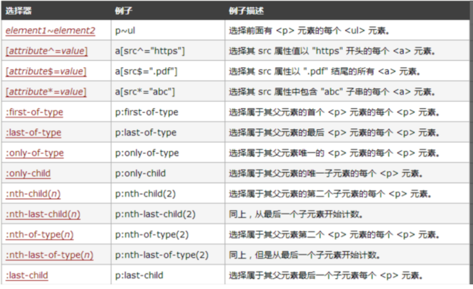
一、选择器
css3中新增了一些选择器
二、新样式
1、边框
border-radius:创建圆角边框;
box-shadow:添加阴影;
border-image:使用图片绘制边框
2、背景
background-clip:确定背景画区;
background-origin:当我们设置背景图片时,图片是会以左上角对齐,但是是以border的左上角对齐还是以padding的左上角或者content的左上角对齐? border-origin正是用来设置这个的;
background-size:用来调整背景图片的大小;
background-break:元素可以被分成几个独立的盒子(如使内联元素span跨越多行),background-break 属性用来控制背景怎样在这些不同的盒子中显示。
3、文字
word-wrap:normal:使用浏览器默认的换行;break-all:允许在单词内换行。
text-overflow:当文本超过盒子大小时,是修建文本,还是省略号表示。
text-shadow:设置文本阴影。
4、颜色
rgba:颜色和透明度;
hala:色相+饱和度+亮度+透明度。
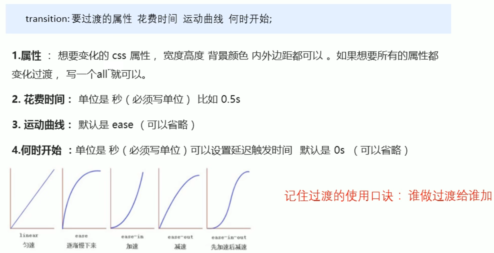
三、transition过渡(一般和:hover搭配使用)
<head>
	<style>
        .box {


            width: 200px;
            height: 100px;
            background-color: pink;
            /* transition: width 1s, height 2s; */
            transition: all 1s;
        }
        .box:hover {


            width: 400px;
            height: 500px;
            background-color: skyblue;
        }
    </style>
</head>
<body>
    <div class="box"></div>
</body>
四、transform转换
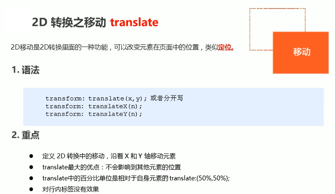
- translate移动
.box {


    width: 200px;
    height: 100px;
    background-color: pink;
    transform: translate(100px,200px);
}
定位+transform: translate(-50%,-50%)可以实现元素居中
- rotate旋转
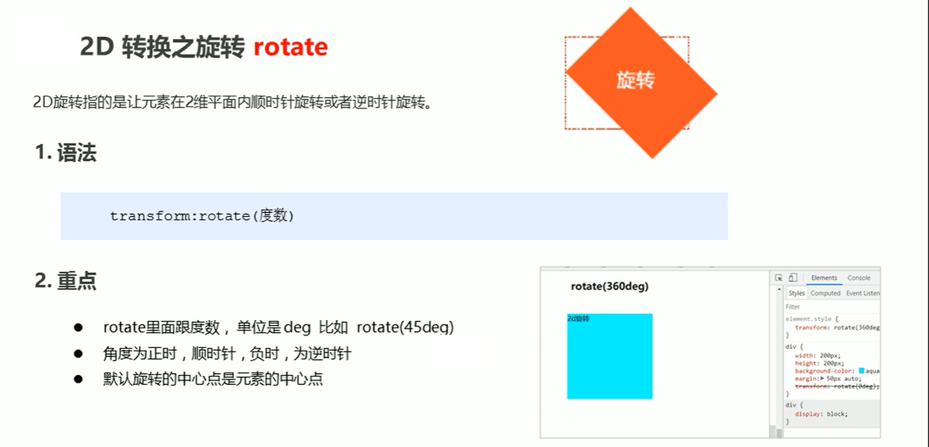
img {


    width: 200px;
    transform: rotate(45deg);
}
设置转换中心点 transform-origin
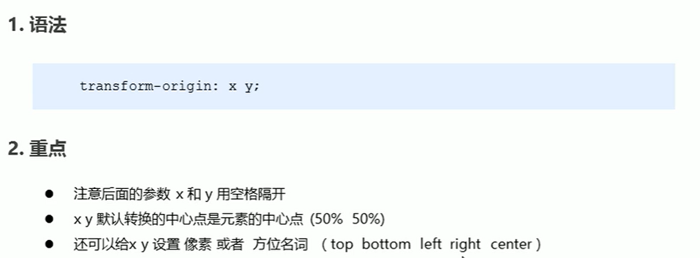
img {


    width: 200px;
    transform-origin: top right;
    transform: rotate(45deg);
}
- scale缩放
.box2 {


    width: 200px;
    height: 100px;
    background-color: pink;
    transform: scale(2,1.5)
}
- skew倾斜
.box2 {


    width: 200px;
    height: 100px;
    background-color: black;
    transform: skew(30deg,20deg)
}
五、animation动画
- animation-name:动画名称;
- animation-duration:动画持续时间;
- animation-timing-function:动画时间函数;
- animation-delay:动画延迟时间;
- animation-iteration-count:动画执行次数,可以设置为一个整数,也可以设置为infinite,意思是无限循环;
- animation-direction:动画执行方向;
- animation-paly-state:动画播放状态;
- animation-fill-mode:动画填充模式。
六、颜色渐变
- 线行渐变
background: linear-gradient(to right top,pink,blue);
- 径向渐变
background: linear-gradient(25deg,red,green);
七、弹性布局+网络布局
见博客:https://blog.csdn.net/weixin_44337386/article/details/124735779?spm=1001.2014.3001.5502