题目点评
CSS3的特性那么多该从哪里说起了?很显然这道题目是有陷阱的,你不可能将所有的特性一个不漏的说出来,就算你说出来,别人还认为你是背的了!所以你主要讲一下在项目中经常用到的Css3的属性就可以,以第一人称来回答这个问题,例如:在我们的项目中经常用CSS3中的XX属性来实现XX特效。
题目解析
在项目开发中我们采用的CSS3新特性有
1.CSS3的选择器
1)E:last-child 匹配父元素的最后一个子元素E。
2)E:nth-child(n)匹配父元素的第n个子元素E。
3)E:nth-last-child(n) CSS3 匹配父元素的倒数第n个子元素E。
2. @Font-face 特性
Font-face 可以用来加载字体样式,而且它还能够加载服务器端的字体文件,让客户端显示客户端所没有安装的字体。
@font-face { font-family: BorderWeb; src:url(BORDERW0.eot); } @font-face { font-family: Runic; src:url(RUNICMT0.eot); } .border { FONT-SIZE: 35px; COLOR: black; FONT-FAMILY: "BorderWeb" } .event { FONT-SIZE: 110px; COLOR: black; FONT-FAMILY: "Runic" } @font-face { font-family: iconfont; src: url(//at.alicdn.com/t/font_1465189805_4518812.eot); }3. 圆角
border-radius: 15px;4. 多列布局 (multi-column layout)
<div class="mul-col"> <div> <h3>新手上路</h3> <p>新手专区 消费警示 交易安全 24小时在线帮助 免费开店</p> </div> <div> <h3>付款方式</h3> <p>快捷支付 信用卡 余额宝 蚂蚁花呗 货到付款</p> </div> <div> <h3>淘宝特色</h3> <p>手机淘宝 旺信 大众评审 B格指南</p> </div></div>.mul-col{ column-count: 3; column-gap: 5px; column-rule: 1px solid gray; border-radius: 5px; border:1px solid gray; padding: 10px ;}兼容性不好,还不够成熟。还不能用在实际项目中。
5.阴影(Shadow)
.class1{ text-shadow:5px 2px 6px rgba(64, 64, 64, 0.5); } 
OPPO官网的阴影特效 http://www.oppo.com/cn/products.html
6.CSS3 的渐变效果
background-image:-webkit-gradient(linear,0% 0%,100% 0%,from(#2A8BBE),to(#FE280E));
7.css弹性盒子模型
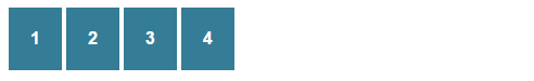
<div class="boxcontainer"> <div class="item">1</div> <div class="item">2</div> <div class="item">3</div> <div class="item">4</div></div>.boxcontainer { width: 1000px; display: -webkit-box; display: -moz-box; -webkit-box-orient: horizontal; -moz-box-orient: horizontal; } .item { background: #357c96; font-weight: bold; margin: 2px; padding: 20px; color: #fff; font-family: Arial, sans-serif; }效果图
8. CSS3制作特效
1) Transition 对象变换时的过渡效果
- transition-property 对象参与过渡的属性
- transition-duration 过渡的持续时间
- transition-timing-function 过渡的类型
- transition-delay 延迟过渡的时间
缩写方式:
transition:border-color .5s ease-in .1s, background-color .5s ease-in .1s, color .5s ease-in .1s;拆分方式:
transition-property:border-color, background-color, color;transition-duration:.5s, .5s, .5s;transition-timing-function:ease-in, ease-in, ease-in;transition-delay:.1s, .1s, .1s;示例代码
<style type="text/css"> .main{ position: relative; margin: 0 auto; height:45px; width: 300px; background-color:lightgray; transition:background-color .6s ease-in 0s; } .main:hover{ background-color: dimgray; }</style><div class="main"></div>
效果显示

2) Transforms 2D转换效果
主要包括 translate(水平移动)、rotate(旋转)、scale(伸缩)、skew(倾斜)
<style type="text/css"> .main{ position: relative; top:200px; margin: 0 auto; height:45px; width: 300px; background-color:dimgray; transition:transform .6s ease 0s; transform: rotate(0deg); } .main:hover{ transform: rotate(180deg); }</style> <div class="main"></div>效果显示

3) Animation动画特效
代码比较多不想解释了,要想弄明白看视频吧!(http://www.chuanke.com/3885380-190205.html)
<style type="text/css"> .main{ position: absolute; left: 10px; top:200px; height:45px; width: 300px; background-color:cadetblue; } .main:hover{ animation: animations 2s ease 0s; } @keyframes animations { 0%{ left: 10px; opacity: 1; } 50%,70%{ left: 50%; opacity: .7; margin-left:-150px; } 100%{ left: 100%; opacity: 0; margin-left:-300px; } }</style> <div class="main"></div>效果显示