可视化是数据描述的图形表示,旨在一目了然地揭示数据中的复杂信息。数据可视化在讲故事中的重要性不言而喻。
在可视化当中,我们常用的方式有点、线、面,或者说这几者组合。部分绘图结果可见下面链接:
Python 画点线图、Python 画柱状图、Python 画柱状图(总结)
在可视化中最为复杂的要数动态图的绘制,动态图能表达出更多的信息(如时间维),包含二维(x,time)、三维(x,y,time)、四维(x,y,z,time)数据中的信息。
同时,动画可以有趣地展示某种现象。相比于静态图表,人们更容易被动画和交互式的图表所吸引。
由于博主本身专业的限制,只重点关注了地学的相关文献、代码,其他专业也可借鉴本文中的相关动态图制作方法。
动图可视化作品举例
在日常学习生活中,可以发现有非常多精彩的动态图可视化作品,这些动态图为工作的展现、数据的说明都起到锦上添花的效果。见下:
Example1:
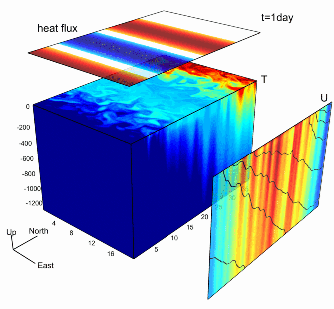
该图基于MITgcm模式输出数据绘制
Example2:
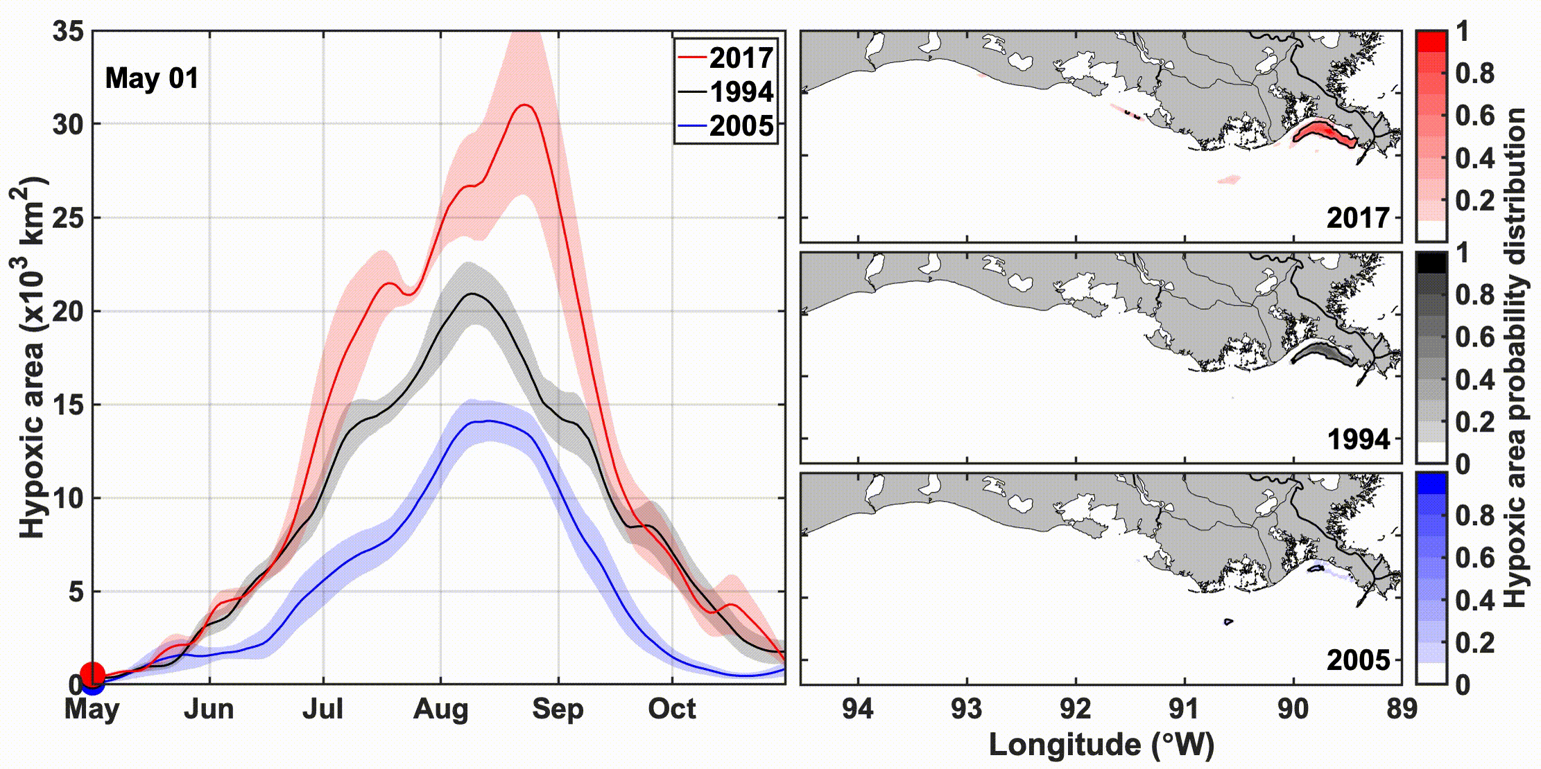
该动图的左边反映的是缺氧区域随时间的变化,右边反映的是空间的变化
Example3:

新冠肺炎初期死亡人数的变化
该项目链接:GitHub bar_chart_race
这种动图也可用pandas_alive绘制,见下
Example4:
This animation shows the transport of air parcels continuously emitted from four point sources inside the canopy during a period of 2.5 hours for the simulation
该动图来源于SCI论文《地形对茂密森林内排放的气体在冠层内运输的影响》 Effects of topography on in-canopy transport of gases emitted within dense forests
接下来重点介绍GIF图的生成,需要注意的是,GIF的生成一般是需要安装imagemagick(图片处理工具),用pillow也行(但相对较有瑕疵)。
举例说明:基于matplotlib中的anamation
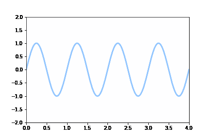
Test1:移动的sin曲线(通过更新数据方式)
import numpy as np
from matplotlib import pyplot as plt
from matplotlib.animation import FuncAnimation
plt.style.use('seaborn-pastel')
fig = plt.figure()
ax = plt.axes(xlim=(0, 4), ylim=(-2, 2)) # 创建了一个图像窗口,设置了坐标轴的范围
line, = ax.plot([], [], lw=3)  # 建了一个空的line对象,之后将通过更新line的数据,实现动画效果。


def init():  # 初始化函数init,这个函数其实什么也没干,给了line对象空的数据
    line.set_data([], [])
    return line,
def animate(i):  # 动画函数animate,入参i是动画帧序号,根据i计算新的sin曲线数据,更新到line对象。
    x = np.linspace(0, 4, 1000)
    y = np.sin(2 * np.pi * (x - 0.01 * i))
    line.set_data(x, y)
    return line,
anim = FuncAnimation(fig, animate, init_func=init,
                               frames=100, interval=20, blit=True)
# 利用之前所说的FuncAnimation()函数创建了对象anim,初始化时传入了figure对象,init()函数和animate()函数,以及帧数和更新时间。
# 循环一个周期,也就是100帧,就可以实现前后相接的循环效果了
anim.save('sine_wave_pillow.gif', writer='pillow')  # writer 根据实际安装可选择
(备注: 这里保存GIF参数选用pillow,坐标轴显示不清晰,可选用imagemagick)
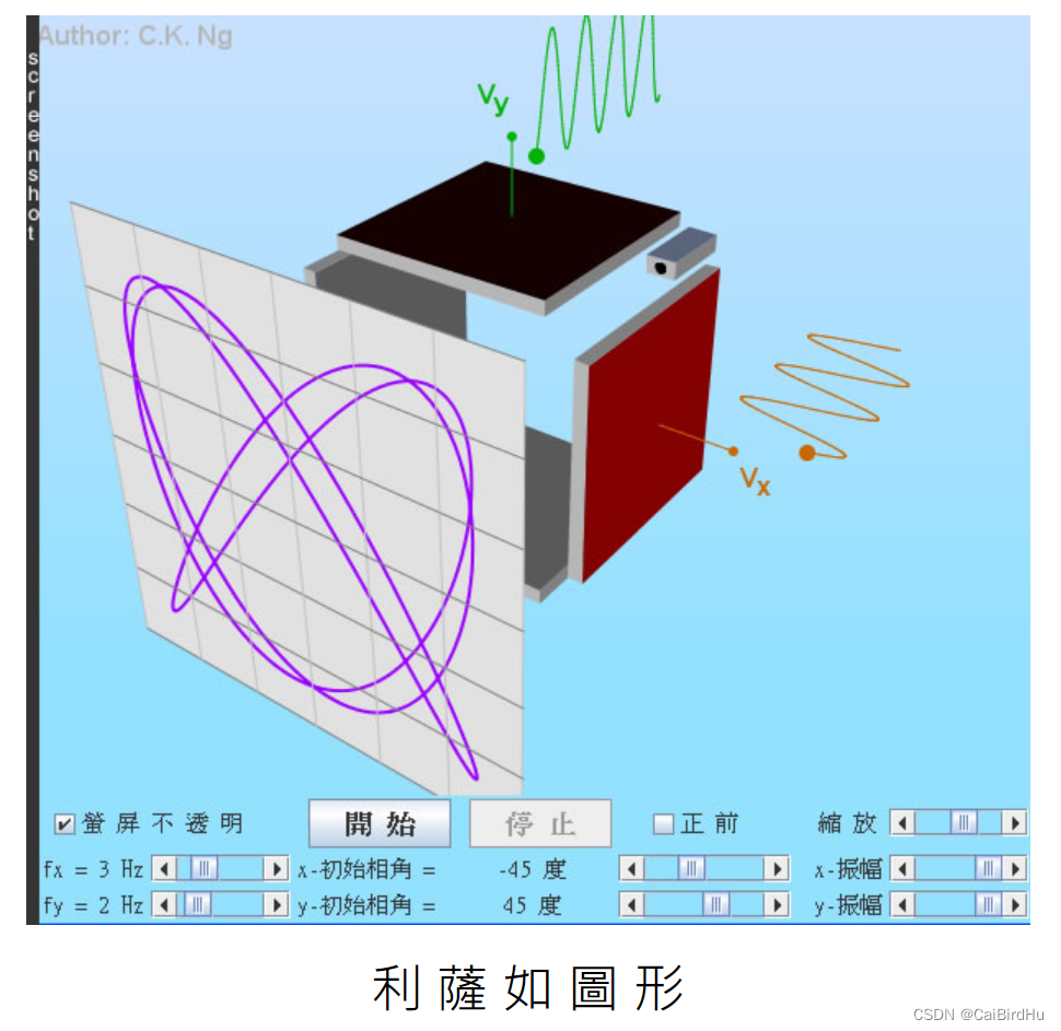
Test2:示波器上的李萨如图形(通过更新数据方式)
李萨如图形见下:
import matplotlib.pyplot as plt
import matplotlib.animation as animation
import numpy as np
plt.style.use('dark_background')
fig = plt.figure()
ax = plt.axes(xlim=(-50, 50), ylim=(-50, 50))
line, = ax.plot([], [], lw=2)
# initialization function
def init():
    # creating an empty plot/frame
    line.set_data([], [])
    return line,
# lists to store x and y axis points
xdata, ydata = [], []
#simulate ghost effect of oscilloscope
def ghostImage(x,y):
    xdata.append(x)
    ydata.append(y)
    if len(xdata)>60:
        del xdata[0]
        del ydata[0]
    return xdata,ydata
# animation function
def animate(i):
    # t is a parameter
    t = i/100.0

    # x, y values to be plotted
    x = 40*np.sin(2*2*np.pi*(t+0.3))
    y = 40*np.cos(3*2*np.pi*t)

    # appending new points to x, y axes points list

    line.set_data(ghostImage(x,y))
    return line,

# setting a title for the plot
plt.title('Creating a Lissajous figure with matplotlib')
# hiding the axis details
plt.axis('off')
# call the animator
anim = animation.FuncAnimation(fig, animate, init_func=init,
                            frames=400, interval=20, blit=True)
# save the animation as gif file
anim.save('figure.gif',writer='pillow')
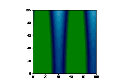
Test3:二维动画绘制(通过叠加图像形式)
预先计算的【图像列表】的动画图像
import numpy as np
import matplotlib.pyplot as plt
import matplotlib.animation as animation


fig = plt.figure()

def f(x, y):
    return np.sin(x) + np.cos(y)

x = np.linspace(0, 2 * np.pi, 120)
y = np.linspace(0, 2 * np.pi, 100).reshape(-1, 1)
# ims is a list of lists, each row is a list of artists to draw in the
# current frame; here we are just animating one artist, the image, in
# each frame
ims = []
for i in range(60):
    x += np.pi / 15.
    y += np.pi / 20.
    im = plt.imshow(f(x, y), animated=True)
    ims.append([im])


ani = animation.ArtistAnimation(fig, ims, interval=50, blit=True,
                                repeat_delay=1000)

ani.save('test_2d.gif', writer='pillow')
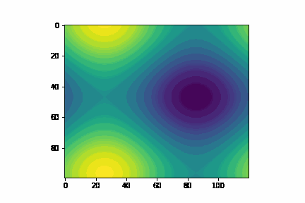
Test4:二维动画绘制(通过替换数据的形式)
import numpy as np
import matplotlib.pyplot as plt
from matplotlib.animation import FuncAnimation   #导入负责绘制动画的接口


fig, ax = plt.subplots()
x = np.linspace(-10*np.pi,10*np.pi,300)
y = np.linspace(-10*np.pi,10*np.pi,300)
X,Y = np.meshgrid(x,y)
img = plt.imshow(np.sin(X),cmap='ocean')
nums = 1000   #需要的帧数


def init():
    ax.set_xlim(0, 100)
    ax.set_ylim(0, 100)
    return img


def update(step):
    z = np.cos((0.5*X*(np.cos(0.01*step)+0.1))+step)+np.sin(0.5*(Y*(np.sin(0.01*step)+0.1))+step)
    # z = np.cos((X*(np.cos(0.01*step)+0.2))+step)+np.sin((Y*(np.sin(0.01*step)+0.2))+step)
    img.set_data(z) #设置新的 x,y
    return img


ani = FuncAnimation(fig, update, frames=nums,     #nums输入到frames后会使用range(nums)得到一系列step输入到update中去
                    init_func=init,interval=100)
# plt.show()
ani.save('example4.gif', writer='pillow')
备注:以上皆是利用matplotlib中的anamation绘制,还可以利用上文提到的pandas_alive进行绘制
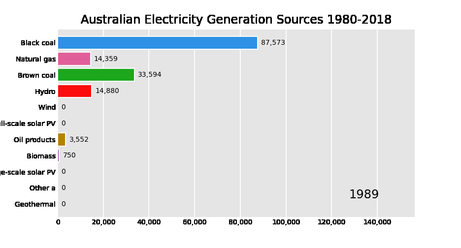
举例说明:基于pandas_alive
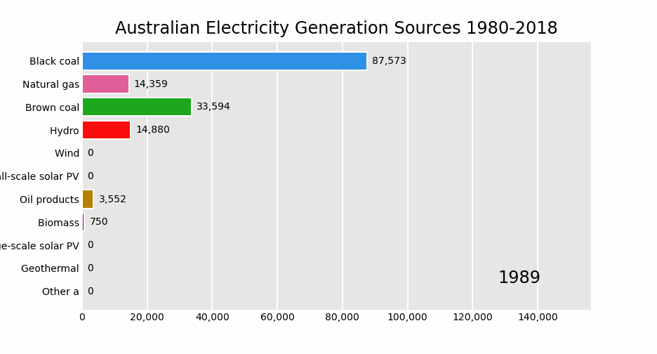
Test5:x轴显示固定
import pandas as pd
import pandas_alive

elec_df = pd.read_csv("data/Aus_Elec_Gen_1980_2018.csv",index_col=0,parse_dates=[0],thousands=',')

elec_df.fillna(0).plot_animated('./fixed-example.gif',period_fmt="%Y",title='Australian Electricity Generation Sources 1980-2018',fixed_max=True,fixed_order=True)
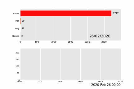
Test6:多子图动态图
import pandas as pd
import pandas_alive

covid_df = pd.read_csv('data/covid19.csv', index_col=0, parse_dates=[0])

animated_line_chart = covid_df.diff().fillna(0).plot_animated(kind='line', period_label=False,add_legend=False)
animated_bar_chart = covid_df.plot_animated(n_visible=10)

pandas_alive.animate_multiple_plots('./example-bar-and-line-chart.gif',
                                    [animated_bar_chart, animated_line_chart], enable_progress_bar=True)