Vue 之 echarts 图表数据可视化的基础使用(简单绘制各种图表、地图)
目录
Vue 之 echarts 图表数据可视化的基础使用(简单绘制各种图表、地图)
一、简单介绍
Vue 开发的一些知识整理,方便后期遇到类似的问题,能够及时查阅使用。
本节介绍,vue 中添加 echarts ,然后在 vue 中简单使用 ,如果有不足之处,欢迎指出,或者你有更好的方法,欢迎留言。
ECharts,一个使用 JavaScript 实现的开源可视化库,可以流畅的运行在 PC 和移动设备上,兼容当前绝大部分浏览器(IE9/10/11,Chrome,Firefox,Safari等),底层依赖矢量图形库 ZRender,提供直观,交互丰富,可高度个性化定制的数据可视化图表。
ECharts 提供了常规的折线图、柱状图、散点图、饼图、K线图,用于统计的盒形图,用于地理数据可视化的地图、热力图、线图,用于关系数据可视化的关系图、treemap、旭日图,多维数据可视化的平行坐标,还有用于 BI 的漏斗图,仪表盘,并且支持图与图之间的混搭。
ECharts 针对移动端交互做了细致的优化,例如移动端小屏上适于用手指在坐标系中进行缩放、平移。 PC 端也可以用鼠标在图中进行缩放(用鼠标滚轮)、平移等。
Echarts 官网文档:Handbook - Apache ECharts
Echarts 函数简介
1、echarts. init
 https://echarts.apache.org/zh/api.html#echarts.init
echarts. init(dom?: HTMLDivElement|HTMLCanvasElement, theme?: Object|string, opts?: {
    devicePixelRatio?: number,
    renderer?: string,
    useDirtyRect?: boolean, // 从 `5.0.0` 开始支持
    ssr?: boolean,          // 从 `5.3.0` 开始支持
    width?: number|string,
    height?: number|string,
    locale?: string         // 从 `5.0.0` 开始支持
}) => ECharts
创建一个 ECharts 实例,返回 echartsInstance,不能在单个容器上初始化多个 ECharts 实例。
参数解释
-
dom实例容器,一般是一个具有高宽的 DIV 元素。只有在设置
opts.ssr开启了服务端渲染后该参数才是可选。也支持直接使用
canvas元素作为容器,这样绘制完图表可以直接将 canvas 作为图片应用到其它地方,例如在 WebGL 中作为贴图,这跟使用 getDataURL 生成图片链接相比可以支持图表的实时刷新。 -
theme应用的主题。可以是一个主题的配置对象,也可以是使用已经通过 echarts.registerTheme 注册的主题名称。参见 ECharts 中的样式简介。
-
opts附加参数。有下面几个可选项:
devicePixelRatio设备像素比,默认取浏览器的值window.devicePixelRatio。renderer渲染模式,支持'canvas'或者'svg'。参见 使用 Canvas 或者 SVG 渲染。ssr是否使用服务端渲染,只有在 SVG 渲染模式有效。开启后不再会每帧自动渲染,必须要调用 renderToSVGString 方法才能得到渲染后 SVG 字符串。useDirtyRect是否开启脏矩形渲染,只有在 Canvas 渲染模式有效,默认为false。参见 ECharts 5 新特性。width可显式指定实例宽度,单位为像素。如果传入值为null/undefined/'auto',则表示自动取dom(实例容器)的宽度。height可显式指定实例高度,单位为像素。如果传入值为null/undefined/'auto',则表示自动取dom(实例容器)的高度。-
locale使用的语言,内置'ZH'和'EN'两个语言,也可以使用 echarts.registerLocale 方法注册新的语言包。目前支持的语言见 src/i18n。
2、echartsInstance. setOption
echartsInstance. setOption(option: Object, notMerge?: boolean, lazyUpdate?: boolean)
or
(option: Object, opts?: {
    notMerge?: boolean;
    replaceMerge?: string | string[];
    lazyUpdate?: boolean;
})
设置图表实例的配置项以及数据,万能接口,所有参数和数据的修改都可以通过 setOption 完成,ECharts 会合并新的参数和数据,然后刷新图表。如果开启动画的话,ECharts 找到两组数据之间的差异然后通过合适的动画去表现数据的变化。
-
option:ECOption图表的配置项和数据,具体见配置项手册。
-
opts
notMerge可选。是否不跟之前设置的option进行合并。默认为false。即表示合并。合并的规则,详见 组件合并模式。如果为true,表示所有组件都会被删除,然后根据新option创建所有新组件。replaceMerge可选。用户可以在这里指定一个或多个组件,如:xAxis,series,这些指定的组件会进行 "replaceMerge"。如果用户想删除部分组件,也可使用 "replaceMerge"。详见 组件合并模式。lazyUpdate可选。在设置完option后是否不立即更新图表,默认为false,即同步立即更新。如果为true,则会在下一个 animation frame 中,才更新图表。silent可选。阻止调用setOption时抛出事件,默认为false,即抛出事件。
组件合并模式
对于一种类型的组件(如:xAxis, series):
- 如果设置
opts.notMerge为true,那么旧的组件会被完全移除,新的组件会根据option创建。 - 如果设置
opts.notMerge为false,或者没有设置opts.notMerge:- 如果在
opts.replaceMerge里指定组件类型,这类组件会进行替换合并。 - 否则,会进行
普通合并。
- 如果在
操作环境:
- win 10
- node v14.20.0
- npm 8.5.3
- @vue/cli 5.0.6
- vue 2.6.14
- echarts 5.3.3
二、环境搭建
1、基础的 node ,npm、vue 的环境搭建
参见博文:Web 前端 之 Vue vue cli 环境的搭建简单整理(简单的一些注意事项)
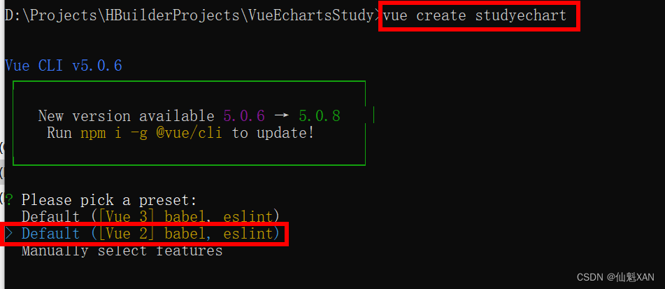
2、创建 vue 工程
命令:vue create project-name,这里选择的是 vue 2
3、工程创建好后,安装 echarts
命令:npm install echarts -S
三、使用 echarts
全局引入 echarts
1、main.js 组件中引入 echarts
// 引入echarts
import * as echarts from 'echarts'
// 设置全局 echarts
Vue.prototype.$echarts = echarts 
2、添加 echart 显示容器
在 HelloWorld.vue 中修改设置一个宽高的容器
<template>
	<div class="hello">
		<div id="myChart" :style="{width: '50%', height: '300px'}"></div>
	</div>
</template>
3、在 HelloWorld.vue 使用全局的 echarts
<script>
export default {
name: 'HelloWorld',
mounted() {
this.drawBar();
},
methods: {
drawBar() {
// 基于准备好的dom,初始化echarts实例
// 全局使用 echarts 初始化(this.$echarts)
let myChart = this.$echarts.init(document.getElementById('myChart'))
// 绘制图表
myChart.setOption({
title: {
text: '在Vue中使用echarts'
},
tooltip: {},
xAxis: {
data: ["衬衫", "羊毛衫", "雪纺衫", "裤子", "高跟鞋", "袜子"]
},
yAxis: {},
series: [{
name: '销量',
type: 'bar',
data: [5, 20, 36, 10, 10, 20]
}]
});
}
}
}
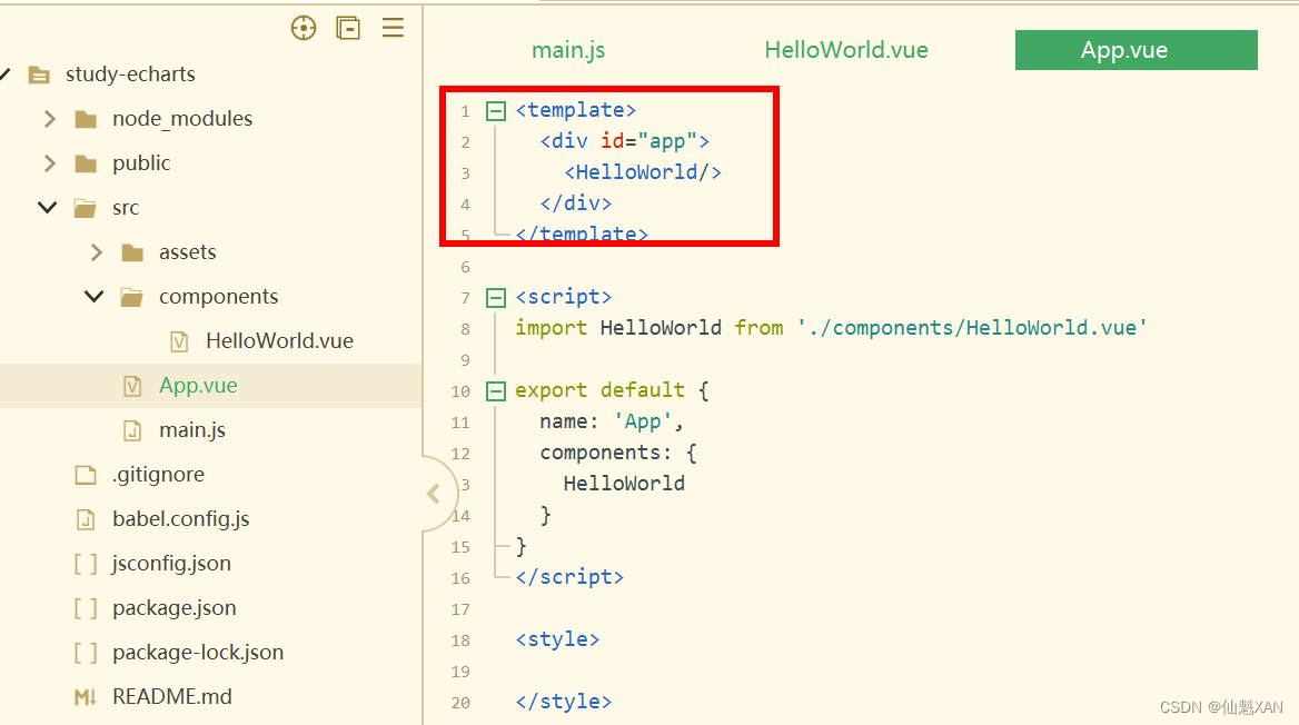
</script>4、在 App.vue 引入 HelloWorld 中去除多余的,保留如图的
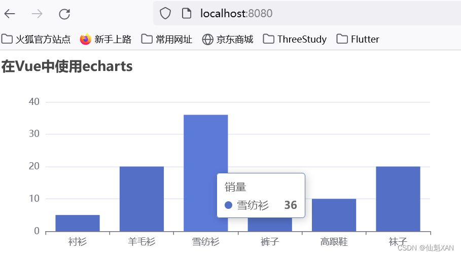
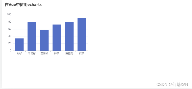
5、回到终端 npm run serve,在浏览器中效果
局部按需引入 echarts
6、修改 HelloWorld.vue 脚本,局部引入 echarts
<script>
	// 引入echarts
	import * as echarts from 'echarts'
	export default {
		name: 'HelloWorld',
		mounted() {
			this.drawBar();
		},
		methods: {
			drawBar() {
				// 基于准备好的dom,初始化echarts实例
				// 全局使用 echarts
				// let myChart = this.$echarts.init(document.getElementById('myChart'))
				// 调用局部的 echarts
				let myChart = echarts.init(document.getElementById('myChart'))
				// 绘制图表
				myChart.setOption({
					title: {
						text: '在Vue中使用echarts'
					},
					tooltip: {},
					xAxis: {
						data: ["衬衫", "羊毛衫", "雪纺衫", "裤子", "高跟鞋", "袜子"]
					},
					yAxis: {},
					series: [{
						name: '销量',
						type: 'bar',
						data: [5, 20, 36, 10, 10, 20]
					}]
				});
			}
		}
	}
</script>
四、自动缩放 echarts
Echarts本身是不支持自动缩放的,但是Echarts为我们提供了resize方法
// 设置该 chart 的 resize 方法
window.addEventListener("resize", myChart.resize);
<script>
// 引入echarts
import * as echarts from 'echarts'
export default {
name: 'HelloWorld',
mounted() {
this.drawBar();
},
methods: {
drawBar() {
// 基于准备好的dom,初始化echarts实例
// 全局使用 echarts
// let myChart = this.$echarts.init(document.getElementById('myChart'))
// 调用局部的 echarts
let myChart = echarts.init(document.getElementById('myChart'))
// 绘制图表
myChart.setOption({
title: {
text: '在Vue中使用echarts'
},
tooltip: {},
xAxis: {
data: ["衬衫", "羊毛衫", "雪纺衫", "裤子", "高跟鞋", "袜子"]
},
yAxis: {},
series: [{
name: '销量',
type: 'bar',
data: [5, 20, 36, 10, 10, 20]
}]
});
// 设置该 chart 的 resize 方法
window.addEventListener("resize", myChart.resize)
}
}
}
</script>五、数据更新,自动刷新 echart 图表
因为Echarts是数据驱动的,这意味着只要我们重新设置数据,那么图表就会随之重新渲染,这是实现本需求的基础。如果想要支持数据的自动刷新,必然需要一个监听器能够实时监听到数据的变化然后告知Echarts重新设置数据。可以使用 Vue 的 watch 为我们进行数据更新监听,从而刷新 echart
1、抽出 option 属性
				option: {
					title: {
						text: '在Vue中使用echarts'
					},
					tooltip: {},
					xAxis: {
						data: ["衬衫", "羊毛衫", "雪纺衫", "裤子", "高跟鞋", "袜子"]
					},
					yAxis: {},
					series: [{
						name: '销量',
						type: 'bar',
						data: [5, 20, 36, 10, 10, 20]
					}]
				}
2、watch 中监听 option 数据的变化,同时更新 echart
		watch:{
			// 监听 option 更新
			option: {
				// 更新处理,也可以 handler(newVal,oldVal)
				handler(newVal){
					if(newVal){
						this.myChart.setOption(newVal)
					}
				},
				//关键,对象内部属性的监听(内部有数据更新,也进行对应的watch触发)
				deep: true
			},
		},
3、简单的数据更新处理函数(实际使用中从后台服务器获取数据更新)
			//添加refreshData方法进行自动更新设置数据
			refreshData() {
				// 更新定时更新函数
				setInterval(() => {
					let sDataLength = this.option.series[0].data.length
					console.log('refreshData')
					let data = []
					// 数据随机值更新
					for (let i = 0; i < sDataLength; i++) {
						data[i] = Math.floor(Math.random() * 100) + 1
					}
					// 更新数据
					this.option.series[0].data = data
				}, 1000)
4、完整代码
<template>
	<div class="hello">
		<div id="myChart" :style="{width: '50%', height: '300px'}"></div>
	</div>
</template>

<script>
	// 引入echarts
	import * as echarts from 'echarts'
	export default {
		name: 'HelloWorld',
		data() {
			return {
				myChart: null,
				option: {
					title: {
						text: '在Vue中使用echarts'
					},
					tooltip: {},
					xAxis: {
						data: ["衬衫", "羊毛衫", "雪纺衫", "裤子", "高跟鞋", "袜子"]
					},
					yAxis: {},
					series: [{
						name: '销量',
						type: 'bar',
						data: [5, 20, 36, 10, 10, 20]
					}]
				}
			}
		},
		watch:{
			// 监听 option 更新
			option: {
				// 更新处理,也可以 handler(newVal,oldVal)
				handler(newVal){
					if(newVal){
						this.myChart.setOption(newVal)
					}
				},
				//关键,对象内部属性的监听(内部有数据更新,也进行对应的watch触发)
				deep: true
			},
		},

		mounted() {
			this.drawBar();
		},
		methods: {
			drawBar() {
				// 基于准备好的dom,初始化echarts实例
				// 全局使用 echarts
				// this.myChart = this.$echarts.init(document.getElementById('myChart'))
				// 调用局部的 echarts
				this.myChart = echarts.init(document.getElementById('myChart'))
				// 绘制图表
				this.myChart.setOption(this.option);

				// 设置该 chart 的 resize 方法
				window.addEventListener("resize", this.myChart.resize)

				// 动态刷线数据
				this.refreshData()
			},

			//添加refreshData方法进行自动更新设置数据
			refreshData() {
				// 更新定时更新函数
				setInterval(() => {
					let sDataLength = this.option.series[0].data.length
					console.log('refreshData')
					let data = []
					// 数据随机值更新
					for (let i = 0; i < sDataLength; i++) {
						data[i] = Math.floor(Math.random() * 100) + 1
					}
					// 更新数据
					this.option.series[0].data = data
				}, 1000)

			}
		}
	}
</script>

<!-- Add "scoped" attribute to limit CSS to this component only -->
<style scoped>

</style>
5、动态更新chart 效果
六、绘制折线图
1、更新 HelloWorld.vue 代码,绘制折线
<template>
	<div class="hello">
		<div id="myChart" :style="{width: '50%', height: '300px'}"></div>
	</div>
</template>

<script>
	// 引入echarts
	import * as echarts from 'echarts'
	export default {
		name: 'HelloWorld',
		data() {
			return {
				myChart: null,
				option: {
					title: {
						text: '曲线',
					},
					tooltip: {
						trigger: 'axis',

					},
					legend: {
						data: ['昨日(11月8日)', '今日(11月9日)']
					},
					grid: {
						left: '1%',
						right: '1%',
						bottom: '3%',
						containLabel: true
					},
					toolbox: {
						show: false,
						feature: {
							dataZoom: {
								yAxisIndex: 'none'
							},
							dataView: {
								readOnly: false
							},
							magicType: {
								type: ['line', 'bar']
							},
							restore: {},
							saveAsImage: {}
						}
					},
					color: ["red", "#CD3333"],
					xAxis: {
						type: 'category',
						boundaryGap: false,
						data: ['1', '2', '3', '4', '5', '6', '7', '8', '9', '10', '11', '12', '13', '14', '15', '16', '17',
							'18', '19', '20', '21', '22', '23', '24'
						]
					},
					yAxis: {
						type: 'value',
						name: '单位(kW)',
						axisLabel: {
							formatter: '{value}'
						}
					},
					series: [{
							name: '昨日(11月8日)',
							type: 'line',
							data: [110, 106, 110, 110, 318, 119, 205, 256, 156, 309, 256, 306, 206, 356, 456, 486,
								565.45, 234, 156, 206, 126, 256, 150, 276
							],

						},
						{
							type: 'line',
							name: '今日(11月9日)',
							data: [210, 136, 120, 120, 118, 219, 195, 176, 156, 329, 356, 346, 406.54, 256, 156],
						}
					]
				}
			}
		},
		watch: {
			// 监听 option 更新
			option: {
				// 更新处理,也可以 handler(newVal,oldVal)
				handler(newVal) {
					if (newVal) {
						this.myChart.setOption(newVal)
					}
				},
				//关键,对象内部属性的监听(内部有数据更新,也进行对应的watch触发)
				deep: true
			},
		},

		mounted() {
			this.drawBar();
		},
		methods: {
			drawBar() {
				// 基于准备好的dom,初始化echarts实例
				// 全局使用 echarts
				// this.myChart = this.$echarts.init(document.getElementById('myChart'))
				// 调用局部的 echarts
				this.myChart = echarts.init(document.getElementById('myChart'))
				// 绘制图表
				this.myChart.setOption(this.option);

				// 设置该 chart 的 resize 方法
				window.addEventListener("resize", this.myChart.resize)

			}
		}
	}
</script>

<!-- Add "scoped" attribute to limit CSS to this component only -->
<style scoped>

</style>
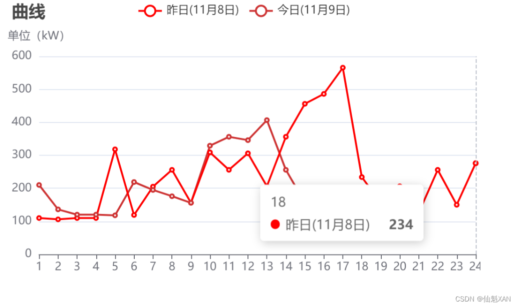
2、效果图
七、绘制饼图
1、更新 HelloWorld .vue 代码,绘制饼图
<template>
	<div class="hello">
		<div id="myChart" :style="{width: '50%', height: '300px'}"></div>
	</div>
</template>

<script>
	// 引入echarts
	import * as echarts from 'echarts'
	export default {
		name: 'HelloWorld',
		data() {
			return {
				myChart: null,
				option: {
					title: {
						text: '某站点用户访问来源',
						subtext: '纯属虚构',
						x: 'center'
					},
					tooltip: {
						trigger: 'item',
						formatter: "{a} <br/>{b} : {c} ({d}%)"
					},
					legend: {
						orient: 'vertical',
						left: 'left',
						data: ['直接访问', '邮件营销', '联盟广告', '视频广告', '搜索引擎']
					},
					series: [{
						name: '访问来源',
						type: 'pie',
						radius: '55%',
						center: ['50%', '60%'],
						data: [{
								value: 335,
								name: '直接访问'
							},
							{
								value: 310,
								name: '邮件营销'
							},
							{
								value: 234,
								name: '联盟广告'
							},
							{
								value: 135,
								name: '视频广告'
							},
							{
								value: 1548,
								name: '搜索引擎'
							}
						],
						itemStyle: {
							emphasis: {
								shadowBlur: 10,
								shadowOffsetX: 0,
								shadowColor: 'rgba(0, 0, 0, 0.5)'
							}
						}
					}],
				},
			}
		},
		watch: {
			// 监听 option 更新
			option: {
				// 更新处理,也可以 handler(newVal,oldVal)
				handler(newVal) {
					if (newVal) {
						this.myChart.setOption(newVal)
					}
				},
				//关键,对象内部属性的监听(内部有数据更新,也进行对应的watch触发)
				deep: true
			},
		},

		mounted() {
			this.drawBar();
		},
		methods: {
			drawBar() {
				// 基于准备好的dom,初始化echarts实例
				// 全局使用 echarts
				// this.myChart = this.$echarts.init(document.getElementById('myChart'))
				// 调用局部的 echarts
				this.myChart = echarts.init(document.getElementById('myChart'))
				// 绘制图表
				this.myChart.setOption(this.option);

				// 设置该 chart 的 resize 方法
				window.addEventListener("resize", this.myChart.resize)

			}
		}
	}
</script>

<!-- Add "scoped" attribute to limit CSS to this component only -->
<style scoped>

</style>
2、效果图

八、绘制全国地图
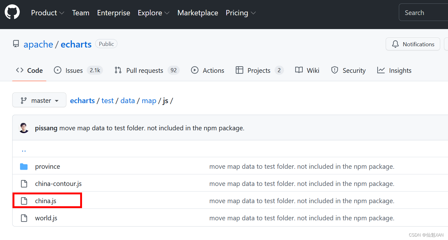
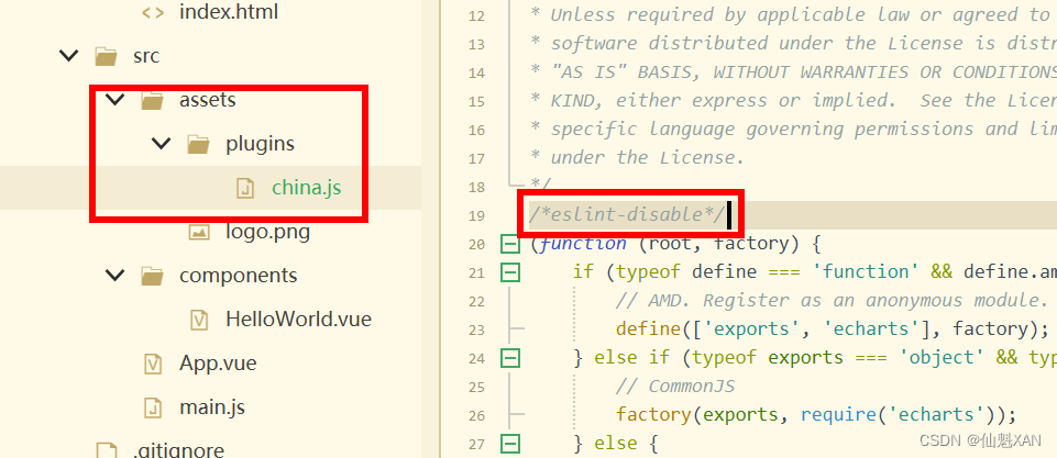
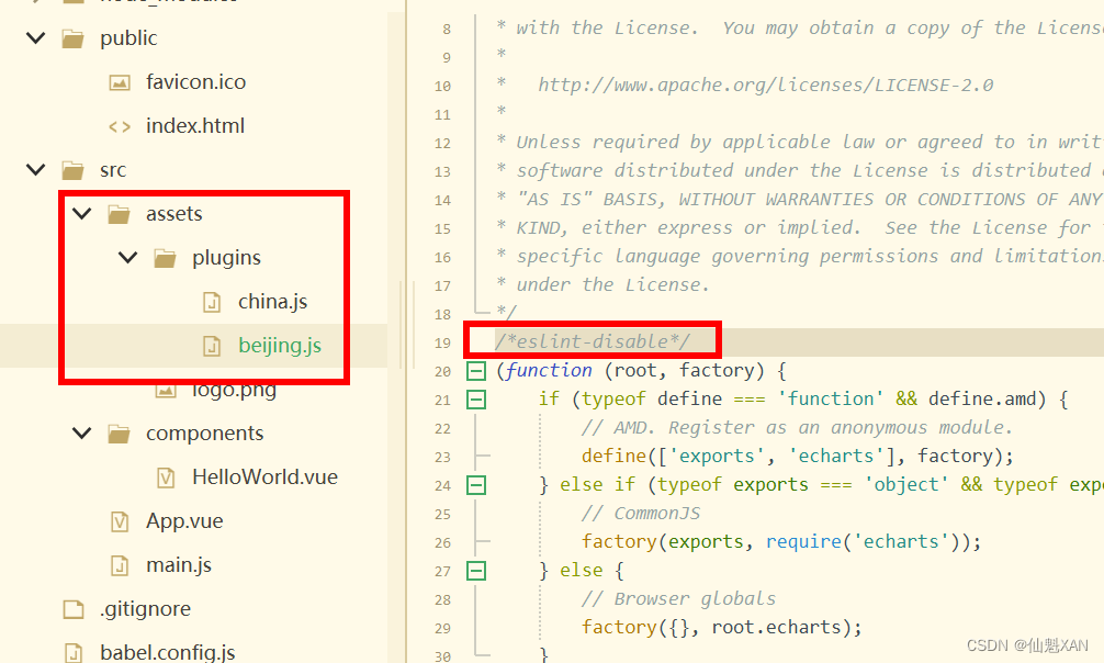
1、下载 china.js ,引入到 assets/plugins/china.js
(注意:如果china,js 报 eslint 错误,可以使用在china.js 文件头添加 /*eslint-disable*/ 忽略 eslint 检查)
china.js 下载地址: echarts/test/data/map/js at master · apache/echarts · GitHub
1、更新 HelloWorld.vue 代码,绘制地图
<template>
	<div class="hello">
		<div id="myChart" :style="{width: '50%', height: '300px'}"></div>
	</div>
</template>

<script>
	// 局部引入 echarts
	import * as echarts from 'echarts'
	// 引入echarts
	//let echarts = require('echarts/lib/echarts')
	// 引入中国地图数据
	import '@/assets/plugins/china.js'
	export default {
		name: 'HelloWorld',
		data() {
			return {
				myChart: null,
				option: {
					title: {
						text: 'iphone销量',
						subtext: '纯属虚构',
						left: 'center'
					},
					tooltip: {
						trigger: 'item'
					},
					legend: {
						orient: 'vertical',
						left: 'left',
						data: ['iphone3', 'iphone4', 'iphone5']
					},
					visualMap: {
						min: 0,
						max: 2500,
						left: 'left',
						top: 'bottom',
						text: ['高', '低'], // 文本,默认为数值文本
						calculable: true
					},
					toolbox: {
						show: false,
						orient: 'vertical',
						left: 'right',
						top: 'center',
						feature: {
							dataView: {
								readOnly: false
							},
							restore: {},
							saveAsImage: {}
						}
					},
					series: [{
						itemStyle: {
							normal: {
								color: function(params) {
									var colorList = [
										'#C1232B', '#B5C334', '#FCCE10', '#E87C25', '#27727B',
										'#FE8463', '#9BCA63', '#FAD860', '#F3A43B', '#60C0DD',
										'#D7504B', '#C6E579', '#F4E001', '#F0805A', '#26C0C0'
									];
									return colorList[params.dataIndex]
								},

							}
						},
						name: 'iphone3',
						type: 'map',
						mapType: 'china',
						roam: false,
						label: {
							normal: {
								show: true
							},
							emphasis: {
								show: true
							}
						},
						data: [{
								name: '北京',
								value: this.randomData()
							},
							{
								name: '天津',
								value: this.randomData()
							},
							{
								name: '上海',
								value: this.randomData()
							},
							{
								name: '重庆',
								value: this.randomData()
							},
							{
								name: '河北',
								value: this.randomData()
							},
							{
								name: '河南',
								value: this.randomData()
							},
							{
								name: '云南',
								value: this.randomData()
							},
							{
								name: '辽宁',
								value: this.randomData()
							},
							{
								name: '黑龙江',
								value: this.randomData()
							},
							{
								name: '湖南',
								value: this.randomData()
							},
							{
								name: '安徽',
								value: this.randomData()
							},
							{
								name: '山东',
								value: this.randomData()
							},
							{
								name: '新疆',
								value: this.randomData()
							},
							{
								name: '江苏',
								value: this.randomData()
							},
							{
								name: '浙江',
								value: this.randomData()
							},
							{
								name: '江西',
								value: this.randomData()
							},
							{
								name: '湖北',
								value: this.randomData()
							},
							{
								name: '广西',
								value: this.randomData()
							},
							{
								name: '甘肃',
								value: this.randomData()
							},
							{
								name: '山西',
								value: this.randomData()
							},

							{
								name: '内蒙古',
								value: this.randomData()
							},
							{
								name: '陕西',
								value: this.randomData()
							},

							{
								name: '吉林',
								value: this.randomData()
							},
							{
								name: '福建',
								value: this.randomData()
							},
							{
								name: '贵州',
								value: this.randomData()
							},
							{
								name: '广东',
								value: this.randomData()
							},
							{
								name: '青海',
								value: this.randomData()
							},
							{
								name: '西藏',
								value: this.randomData()
							},
							{
								name: '四川',
								value: this.randomData()
							},
							{
								name: '宁夏',
								value: this.randomData()
							},
							{
								name: '海南',
								value: this.randomData()
							},
							{
								name: '台湾',
								value: this.randomData()
							},
							{
								name: '香港',
								value: this.randomData()
							},
							{
								name: '澳门',
								value: this.randomData()
							}
						]
					}]
				},
			}

		},
		watch: {
			// 监听 option 更新
			option: {
				// 更新处理,也可以 handler(newVal,oldVal)
				handler(newVal) {
					if (newVal) {
						this.myChart.setOption(newVal)
					}
				},
				//关键,对象内部属性的监听(内部有数据更新,也进行对应的watch触发)
				deep: true
			},
		},

		mounted() {
			this.drawBar();
		},
		methods: {
			drawBar() {
				// 基于准备好的dom,初始化echarts实例
				// 全局使用 echarts
				// this.myChart = this.$echarts.init(document.getElementById('myChart'))
				// 调用局部的 echarts
				this.myChart = echarts.init(document.getElementById('myChart'))
				// 绘制图表
				this.myChart.setOption(this.option);

				// 设置该 chart 的 resize 方法
				window.addEventListener("resize", this.myChart.resize)
			},

			randomData() {
				return Math.round(Math.random() * 1000);
			}
		}
	}
</script>

<!-- Add "scoped" attribute to limit CSS to this component only -->
<style scoped>

</style>
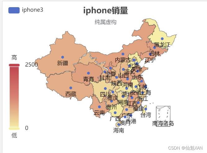
3、效果图
九、绘制省地图(北京为例)
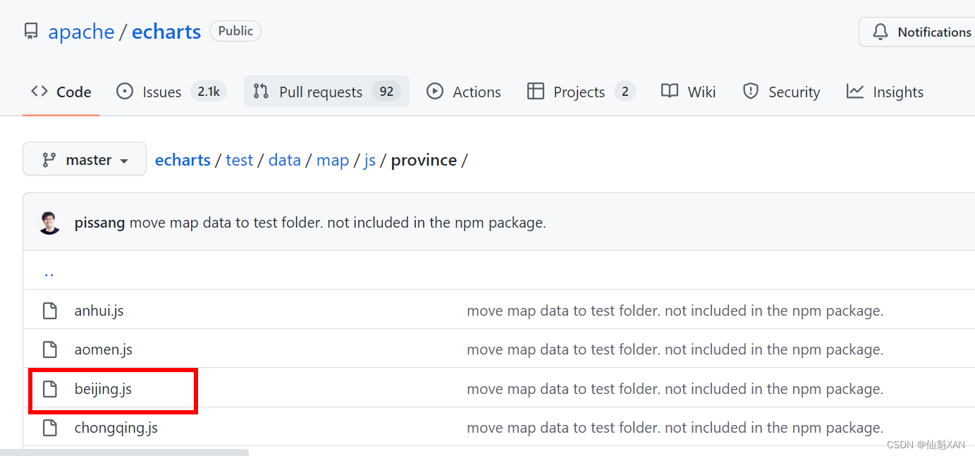
1、下载beijing.js ,添加到assets/plugins/beijing.js
(注意:如果beijing,js 报 eslint 错误,可以使用在china.js 文件头添加 /*eslint-disable*/ 忽略 eslint 检查)
下载beijing.js地址:
echarts/test/data/map/js/province at master · apache/echarts · GitHub
2、更新 HelloWorld.vue 代码,绘制北京地图
<template>
	<div class="hello">
		<div id="myChart" :style="{width: '50%', height: '400px'}"></div>
	</div>
</template>

<script>
	// 局部引入 echarts
	import * as echarts from 'echarts'
	// 引入echarts
	//let echarts = require('echarts/lib/echarts')
	// 引入中国地图数据
	import '@/assets/plugins/beijing.js'
	export default {
		name: 'HelloWorld',
		data() {
			return {
				myChart: null,
				option: {
					title: {
						text: '北京地图',
						subtext: '-。-'
					},
					tooltip: {
						trigger: 'item',
						formatter: function(a) {
							return a[2];
						}
					},
					legend: {
						orient: 'vertical',
						x: 'right',
						data: ['数据名称']
					},
					dataRange: {
						min: 0,
						max: 1000,
						color: ['orange', 'yellow'],
						text: ['高', '低'], // 文本,默认为数值文本
						calculable: true
					},
					series: [{
						name: '数据名称',
						type: 'map',
						mapType: '北京',
						selectedMode: 'single',
						itemStyle: {
							normal: {
								label: {
									show: true
								}
							},
							emphasis: {
								label: {
									show: true
								}
							}
						},
						data: [{
								name: '怀柔区',
								value: Math.round(Math.random() * 1000)
							},
							{
								name: '延庆县',
								value: Math.round(Math.random() * 1000)
							},
							{
								name: '密云县',
								value: Math.round(Math.random() * 1000)
							},
							{
								name: '昌平区',
								value: Math.round(Math.random() * 1000)
							},
							{
								name: '平谷区',
								value: Math.round(Math.random() * 1000)
							},
							{
								name: '顺义区',
								value: Math.round(Math.random() * 1000)
							},
							{
								name: '门头沟区',
								value: Math.round(Math.random() * 1000)
							},
							{
								name: '海淀区',
								value: Math.round(Math.random() * 1000)
							},
							{
								name: '朝阳区',
								value: Math.round(Math.random() * 1000)
							},
							{
								name: '石景山区',
								value: Math.round(Math.random() * 1000)
							},
							{
								name: '西城区',
								value: Math.round(Math.random() * 1000)
							},
							{
								name: '东城区',
								value: Math.round(Math.random() * 1000)
							},
							{
								name: '宣武区',
								value: Math.round(Math.random() * 1000)
							},
							{
								name: '丰台区',
								value: Math.round(Math.random() * 1000)
							},
							{
								name: '房山区',
								value: Math.round(Math.random() * 1000)
							},
							{
								name: '通州区',
								value: Math.round(Math.random() * 1000)
							},
							{
								name: '大兴区',
								value: Math.round(Math.random() * 1000)
							},

						]
					}]
				},
			}

		},
		watch: {
			// 监听 option 更新
			option: {
				// 更新处理,也可以 handler(newVal,oldVal)
				handler(newVal) {
					if (newVal) {
						this.myChart.setOption(newVal)
					}
				},
				//关键,对象内部属性的监听(内部有数据更新,也进行对应的watch触发)
				deep: true
			},
		},

		mounted() {
			this.drawBar();
		},
		methods: {
			drawBar() {
				// 基于准备好的dom,初始化echarts实例
				// 全局使用 echarts
				// this.myChart = this.$echarts.init(document.getElementById('myChart'))
				// 调用局部的 echarts
				this.myChart = echarts.init(document.getElementById('myChart'))
				// 绘制图表
				this.myChart.setOption(this.option);

				// 设置该 chart 的 resize 方法
				window.addEventListener("resize", this.myChart.resize)
			},
		}
	}
</script>

<!-- Add "scoped" attribute to limit CSS to this component only -->
<style scoped>

</style>
3、效果图

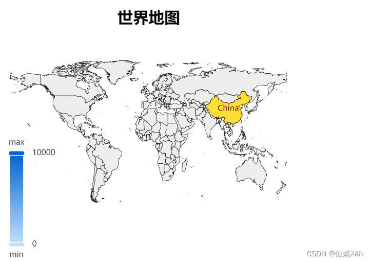
十、绘制世界地图
注意:也可以在:
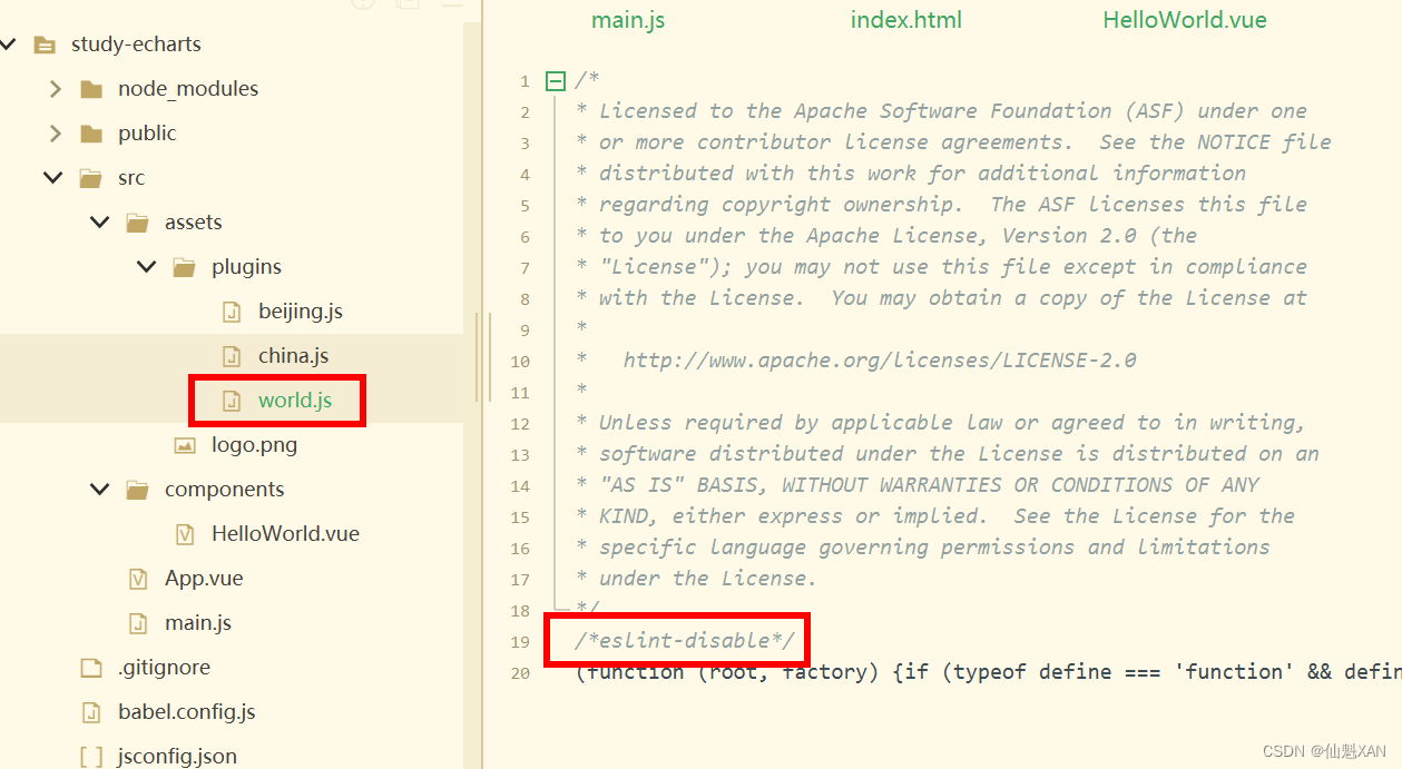
1、下载 world.js,添加到assets/plugins/world.js
(注意:如果world,js 报 eslint 错误,可以使用在china.js 文件头添加 /*eslint-disable*/ 忽略 eslint 检查)
下载world.js地址: echarts/world.js at master · apache/echarts · GitHub
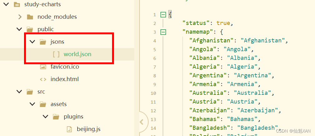
2、在 public中添加一个 jsons/world.json,然后,更新 HelloWorld.vue 代码,绘制地图
这里添加了一个 axios 进行 json 加载(npm install axios -S)
<template>
	<div class="hello">
		<div id="myChart" :style="{width: '50%', height: '400px'}"></div>
	</div>
</template>

<script>
	// 局部引入 echarts
	import * as echarts from 'echarts'
	// 引入echarts
	//let echarts = require('echarts/lib/echarts')
	// 引入中国地图数据
	import '@/assets/plugins/world.js'
	import axios from 'axios'
	export default {
		name: 'HelloWorld',
		data() {
			return {
				myChart: null,
				option: {

				}
			}
		},
		watch: {
			// 监听 option 更新
			option: {
				// 更新处理,也可以 handler(newVal,oldVal)
				handler(newVal) {
					if (newVal) {
						this.myChart.setOption(newVal)
					}
				},
				//关键,对象内部属性的监听(内部有数据更新,也进行对应的watch触发)
				deep: true
			},
		},

		mounted() {
			this.getWorld();
		},
		methods: {
			getWorld() {

				axios.get('jsons/world.json').then((res) => {
					let namemap = res.data.namemap
					let dataArr = res.data.dataArr
					this.drawMap(namemap, dataArr)
				})
			},
			drawMap(name, data) {
				// 基于准备好的dom,初始化echarts实例
				let chart = echarts.init(document.getElementById('myChart'))
				// 监听屏幕变化自动缩放图表
				window.addEventListener('resize', function() {
					chart.resize()
				})
				// 绘制图表
				chart.setOption({
					// 图表主标题
					title: {
						text: '世界地图', // 主标题文本,支持使用 \n 换行
						top: 10, // 定位 值: 'top', 'middle', 'bottom' 也可以是具体的值或者百分比
						left: 'center', // 值: 'left', 'center', 'right' 同上
						textStyle: { // 文本样式
							fontSize: 24,
							fontWeight: 600,
							color: '#000'
						}
					},
					grid: {
						width: '100%',
						height: '100%',
						left: '0%',
						right: '0%',
						bottom: '0%',
						containLabel: true
					},
					// 提示框组件
					tooltip: {
						trigger: 'item', // 触发类型, 数据项图形触发,主要在散点图,饼图等无类目轴的图表中使用
						// 提示框浮层内容格式器,支持字符串模板和回调函数两种形式
						// 使用函数模板  传入的数据值 -> value: number | Array
						formatter: function(val) {
							if (val.data == null) return;
							return val.data.name + ': ' + val.data.value
						}
					},
					// 视觉映射组件
					visualMap: {
						min: 0,
						max: 10000,
						text: ['max', 'min'],
						realtime: false,
						calculable: true,
						color: ['#0064d0', '#c3e0ff'],
					},
					series: [{
						type: 'map', // 类型
						// 系列名称,用于tooltip的显示,legend 的图例筛选 在 setOption 更新数据和配置项时用于指定对应的系列
						name: '世界地图',
						mapType: 'world', // 地图类型
						// 是否开启鼠标缩放和平移漫游 默认不开启 如果只想要开启缩放或者平移,可以设置成 'scale' 或者 'move' 设置成 true 为都开启
						roam: true,
						// 图形上的文本标签
						label: {
							show: false // 是否显示对应地名
						},
						zoom: 1.2,
						// 地图区域的多边形 图形样式
						itemStyle: {
							// areaColor: '#7B68EE', // 地图区域的颜色 如果设置了visualMap,areaColor属性将不起作用
							borderWidth: 0.5, // 描边线宽 为 0 时无描边
							borderColor: '#000', // 图形的描边颜色 支持的颜色格式同 color,不支持回调函数
							borderType: 'solid' // 描边类型,默认为实线,支持 'solid', 'dashed', 'dotted'
						},
						// 高亮状态下的多边形和标签样式
						emphasis: {
							label: {
								show: true, // 是否显示标签
								color: '#fff' // 文字的颜色 如果设置为 'auto',则为视觉映射得到的颜色,如系列色
							},
							itemStyle: {
								areaColor: '#FF6347' // 地图区域的颜色
							}
						},
						// 自定义地区的名称映射
						nameMap: name,
						// 地图系列中的数据内容数组 数组项可以为单个数值
						data: data
					}]
				})

			},
		}
	}
</script>

<!-- Add "scoped" attribute to limit CSS to this component only -->
<style scoped>

</style>
3、效果图