一、文章前言
小程序底部导航栏是很常见的一个功能,如果你的小程序是一个多tab的应用,那么我们就可以通过配置tabBar来实现切换tab时显示对应的页面。
二、使用默认的tabBar
2.1:创建一个小程序,打开app.json文件,找到里面的tabBar节点。
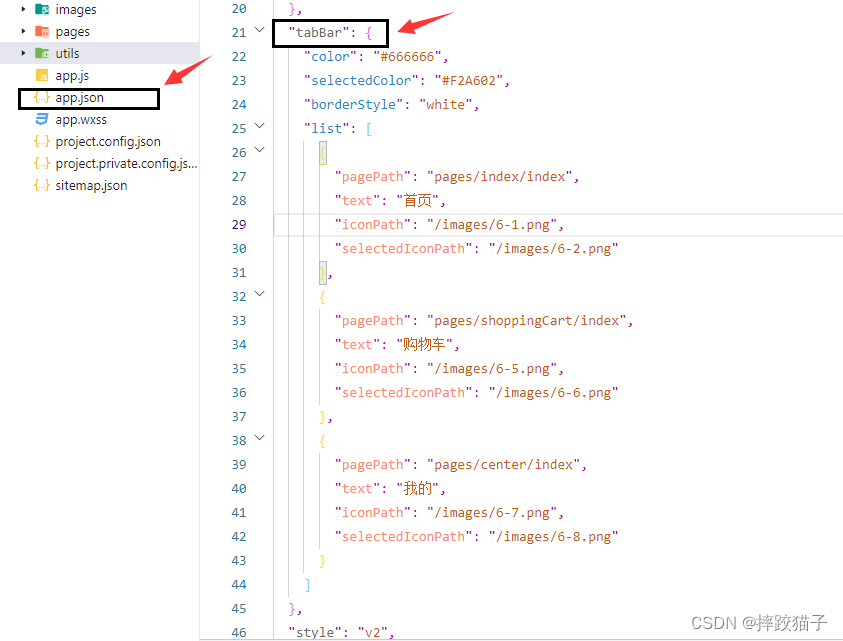
2.2:根据不同的属性值进行对应的配置,即可指定不同tab栏的表现。其中 list 接受一个数组,只能配置最少 2 个、最多 5 个 tab。tab 按数组的顺序排序,每个项都是一个对象。
一些注意事项:
1、list属性里面的pagePath必须是已经创建好的页面,而不是一个不存在的页面。
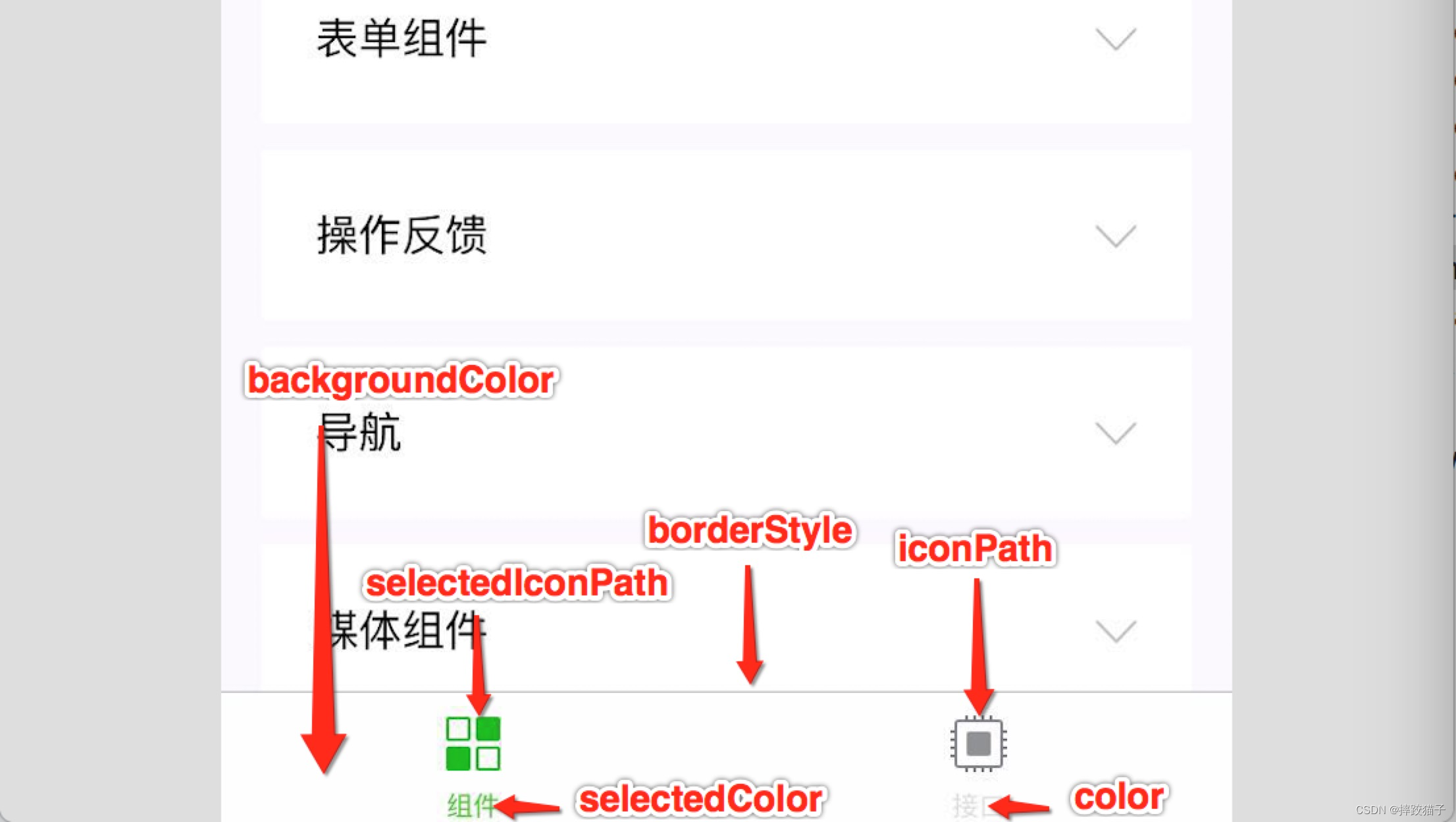
2、iconPath和selectedIconPath属性对应的是tabBar选中前以及选中后的图片显示,图片需存放在小程序文件夹。
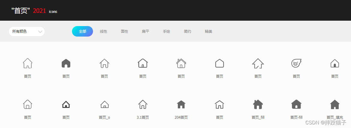
3、需要下载对应图标的可以去阿里巴巴矢量图标库。
| 属性 | 类型 | 必填 | 默认值 | 描述 | 最低版本 |
|---|---|---|---|---|---|
| color | HexColor | 是 | tab 上的文字默认颜色,仅支持十六进制颜色 | ||
| selectedColor | HexColor | 是 | tab 上的文字选中时的颜色,仅支持十六进制颜色 | ||
| backgroundColor | HexColor | 是 | tab 的背景色,仅支持十六进制颜色 | ||
| borderStyle | string | 否 | black | tabbar 上边框的颜色, 仅支持 black / white | |
| list | Array | 是 | tab 的列表,详见 list 属性说明,最少 2 个、最多 5 个 tab | ||
| position | string | 否 | bottom | tabBar 的位置,仅支持 bottom / top | |
| custom | boolean | 否 | false | 自定义 tabBar | 2.5.0 |
| 属性 | 类型 | 必填 | 说明 |
|---|---|---|---|
| pagePath | string | 是 | 页面路径,必须在 pages 中先定义 |
| text | string | 是 | tab 上按钮文字 |
| iconPath | string | 否 | 图片路径,icon 大小限制为 40kb,建议尺寸为 81px * 81px,不支持网络图片。当 position 为 top 时,不显示 icon。 |
| selectedIconPath | string | 否 | 选中时的图片路径,icon 大小限制为 40kb,建议尺寸为 81px * 81px,不支持网络图片。当 position 为 top 时,不显示 icon。 |
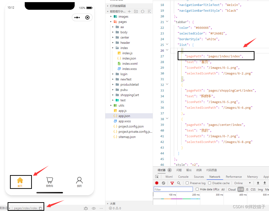
2.3、简单操作下来就能得到一个美观实用的tabBar导航栏啦
三、使用自定义tarBar
3.1:自定义 tabBar 可以让开发者更加灵活地设置 tabBar 样式,以满足更多个性化的场景。官方默认的tabbar限制了栏目的数量,展示样式也比较传统,对于爱挑战的开发者们来说,自定义tabBar无疑是更好的选择。

3.2:使用流程
扫描二维码关注公众号,回复: 14530702 查看本文章
(1)配置信息
- 在 app.json 中的 tabBar 项指定 custom 字段,同时其余 tabBar 相关配置也补充完整。
- 所有 tab 页的 json 里需声明 usingComponents 项,也可以在 app.json 全局开启。
{


  "tabBar": {


    "custom": true,
    "color": "#000000",
    "selectedColor": "#000000",
    "backgroundColor": "#000000",
    "list": [{


      "pagePath": "page/component/index",
      "text": "组件"
    }, {


      "pagePath": "page/API/index",
      "text": "接口"
    }]
  },
  "usingComponents": {

    }
}
(2)添加 tabBar 代码文件,在代码根目录下添加入口文件
custom-tab-bar/index.js
custom-tab-bar/index.json
custom-tab-bar/index.wxml
custom-tab-bar/index.wxss
(3)编写 tabBar 代码,用自定义组件的方式编写即可,该自定义组件完全接管 tabBar 的渲染。另外,自定义组件新增 getTabBar 接口,可获取当前页面下的自定义 tabBar 组件实例。
四、实现代码
<view class="tabbar_box {

    {isIphoneX?'iphoneX-height':''}}" style="background-color:{

    {tabbar.backgroundColor}}">
  <block wx:for="{

    {tabbar.list}}" wx:key="{

    {item.pagePath}}">

    <navigator wx:if="{

    {item.isSpecial == true}}" class="tabbar_nav" hover-class="none" url="{

    {item.pagePath}}" style="color:{

    {tabbar.selectedColor}}" open-type="navigate">
      <view class='special-wrapper'><image class="tabbar_icon" src="{

    {item.iconPath}}"></image></view>
      <image class='special-text-wrapper'></image>
      <text>{

    {

    item.text}}</text>
    </navigator>

    <navigator wx:else class="tabbar_nav" hover-class="none" url="{

    {item.pagePath}}" style="color:{

    {item.selected ? tabbar.selectedColor : tabbar.color}}" open-type="switchTab">
      <image class="tabbar_icon" src="{

    {item.selected ? item.selectedIconPath : item.iconPath}}"></image>
      <text>{

    {

    item.text}}</text>
    </navigator>
  </block>
</view>
// tabBarComponent/tabBar.js
const app = getApp();
Component({


  /**
   * 组件的属性列表
   */
  properties: {


    tabbar: {


      type: Object,
      value: {


        "backgroundColor": "#ffffff",
        "color": "#979795",
        "selectedColor": "#1c1c1b",
        "list": [
          {


            "pagePath": "/pages/index/index",
            "iconPath": "icon/icon_home.png",
            "selectedIconPath": "icon/icon_home_HL.png",
            "text": "首页"
          },
          {


            "pagePath": "/pages/classify/classify",
            "iconPath": "icon/icon_home.png",
            "selectedIconPath": "icon/icon_home_HL.png",
            "text": "分类"
          },
          {


            "pagePath": "/pages/middle/middle",
            "iconPath": "icon/icon_release.png",
            "isSpecial": true,
            "text": "发布"
          },
          {


            "pagePath": "/pages/car/car",
            "iconPath": "icon/icon_mine.png",
            "selectedIconPath": "icon/icon_mine_HL.png",
            "text": "购物车"
          },
          {


            "pagePath": "/pages/mine/mine",
            "iconPath": "icon/icon_mine.png",
            "selectedIconPath": "icon/icon_mine_HL.png",
            "text": "我的"
          }
        ]
      }
    }
  },

  /**
   * 组件的初始数据
   */
  data: {


    isIphoneX: app.globalData.systemInfo.model.search('iPhone X') != -1 ? true : false
  },

  /**
   * 组件的方法列表
   */
  methods: {


  }
})
.tabbar_box{


    display: flex;
    flex-direction: row;
    justify-content: space-around;
    position: fixed;
    bottom: 0;
    left: 0;
    z-index: 999;
    width: 100%;
    height: 98rpx;
    box-shadow: 0 0 2px rgba(0, 0, 0, 0.1);
}
.tabbar_box.iphoneX-height{


    padding-bottom: 66rpx;
}
.middle-wrapper{


  position: absolute;
  right: 310rpx;
  bottom: 0;
  background-color: #fff;
  width: 120rpx;
  height: 120rpx;
  border-radius: 50%;
  border-top: 2rpx solid #f2f2f3;
}
.middle-wrapper.iphoneX-height{


  bottom: 66rpx;
}
.tabbar_nav{


    flex: 1;
    display: flex;
    flex-direction: column;
    justify-content: center;
    align-items: center;
    font-size: 20rpx;
    height: 100%;
    position: relative;
}
.tabbar_icon{


    width: 56rpx;
    height: 56rpx;
}
.special-wrapper{


  position: absolute;
  top: -36rpx;
  width: 96rpx;
  height: 96rpx;
  border-radius: 50%;
  border-top: 2rpx solid #f2f2f3;
  background-color: #fff;
  text-align: center;
  box-sizing: border-box;
  padding: 6rpx;
}
.special-wrapper .tabbar_icon{


    width: 84rpx;
    height: 84rpx;
}
.special-text-wrapper{


  width: 56rpx;
  height: 56rpx;
}