1.Component简介
Component是可重用的、封装的、具有良好定义的接口的QML类型。
组件通常由组件文件(即.qml文件)定义。Component类型本质上允许在QML文档中内联定义QML组件,而不是作为一个单独的QML文件。这对于在QML文件中重用小组件或定义在逻辑上属于文件中其他QML组件的组件可能很有用。
属性:
progress:加载组件的进度,从 0.0(未加载)到 1.0(已完成)。
- Component.Null:没有可用的组件数据
- Component.Ready:组件已加载,可用于创建实例。
- Component.Loading:当前正在加载组件
- Component.Error:加载组件时发生错误
url:用于构造组件的 URL。
信号:
- completed():组件加载完成发出信号
- destruction() :组件销毁时发出信号
2.Loader简介
Loader用于动态加载QML组件。
Loader可以加载QML文件(使用source属性)或Component对象(使用sourceComponent属性)。
常用属性:
信号:
loaded():该信号在status变为Loader.Ready,或初始加载成功。
3.示例
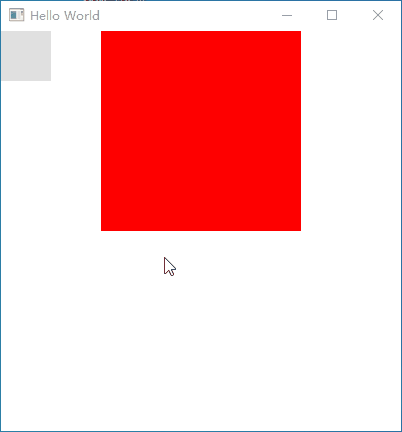
示例1:动态加载和销毁Component
Loader动态加载组件,使用sourceComponent属性或者source,当状态改变的时候触发onStatusChanged槽,做了一个销毁组件的Button,点击的时候销毁。
import QtQuick 2.6
import QtQuick.Window 2.2
import QtQuick.Controls 2.1

Window {
    visible: true
    width: 400
    height: 400
    title: qsTr("Hello World")

    //销毁
    Button{
        width: 50
        height: 50
        onClicked: {
            loader.sourceComponent = null
        }
    }

    Component{
        id:com
        Rectangle{
            x:100
            width: 200
            height: 200
            color: "red"

            Component.onCompleted: {
                console.log("onCompleted ",width,height,color);
            }
            Component.onDestruction: {
                console.log("onDestruction ",width,height,color);
            }
        }
    }

    Loader{
        id:loader
        //source:"qrc:/WRectangle.qml"
        sourceComponent: com
        onStatusChanged: {
            console.log("loader status = ",status)
        }
    }
}
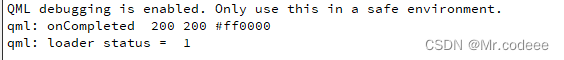
程序一开始打印信息如下。
当点击Button后,销毁组件。

示例2:动态改变组件
使用Loader的item这个属性来改变。
Window {
    visible: true
    width: 400
    height: 400
    title: qsTr("Hello World")

    //销毁
    Button{
        width: 50
        height: 50
        onClicked: {
            loader.item.width = 50
            loader.item.height = 50
            loader.item.color = "black"
        }
    }

    Component{
        id:com
        Rectangle{
            x:100
            width: 200
            height: 200
            color: "red"

            Component.onCompleted: {
                console.log("onCompleted ",width,height,color);
            }
            Component.onDestruction: {
                console.log("onDestruction ",width,height,color);
            }
        }
    }

    Loader{
        id:loader
        //source:"qrc:/WRectangle.qml"
        sourceComponent: com
        onStatusChanged: {
            console.log("loader status = ",status)
        }
    }
}