1.Button简介
Button表示用户可以按下或单击的按钮控件。按钮通常用于执行一个动作,或回答一个问题。典型的按钮有确定、应用、取消、关闭、是、否和帮助。
Button继承自AbstractButton,提供了以下几种信号。
- void canceled() //当按钮在被按下时失去鼠标抓取时发出此信号
- void clicked() //点击发出信号
- void doubleClicked() //双击发出信号
- void pressAndHold() //当用户交互式地按下并按住按钮时
- void pressed() //按下发出信号
- void released() //松开发出信号
- void toggled() //切换checkable按钮时,会发出此信号
常用属性:
- autoExclusive : bool //是否启用自动排他性
- checkable : bool //是否按钮是支持可选中
- checked : bool //保存按钮是否被选中
- autoRepeat: bool //此属性保存按钮在按下并按住时是否重复pressed()、released()和clicked()信号
- text : string //文本描述。
- icon://图片
2.示例
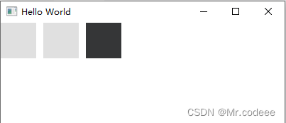
示例1:自我排他
如果没有设置autoExclusive属性为true,则可以check所有的按钮。

Window {
    visible: true
    width: 400
    height: 400
    title: qsTr("Hello World")

    Button{
        id:b1
        width: 50
        height: 50
        checkable: true
        autoExclusive: true
        onCheckedChanged: {
            console.log("check = ",b1.checked)
        }
    }
    Button{
        width: 50
        height: 50
        x:60
        checkable: true
        autoExclusive: true
    }
    Button{
        width: 50
        height: 50
        x:120
        checkable: true
        autoExclusive: true
    }
}
设置好了true之后,任意时刻只有一个按钮能被选中
示例2:自动重复发出pressed()、released()和clicked()信号
当鼠标点击按钮不放时,会自动重复以下信号。

Window {
    visible: true
    width: 400
    height: 400
    title: qsTr("Hello World")

    Button{
        id:b1
        width: 50
        height: 50
        autoRepeat: true
        autoRepeatDelay: 3000   //第一次按钮到触发下面的信号需要的时间
        autoRepeatInterval: 1000    //每隔多少时间触发下面的信号

        onClicked: {
            console.log("clicked")
        }
        onPressed: {
            console.log("onPressed")
        }
        onReleased: {
            console.log("onReleased")
        }
    }
}
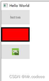
示例3:添加背景色,边框大小,文字,图片
Window {
    visible: true
    width: 400
    height: 400
    title: qsTr("Hello World")

    Button{
        id:b1
        width: 100
        height: 50
        text: "button"
    }

    Button{
        id:b2
        width: 100
        height: 50
        y:60
        background: Rectangle{
            color:"red"
            border.color: "black"
            border.width: 4
        }
    }

    Button{
        id:b3
        width: 100
        height: 50
        y:120
        icon.source: "qrc:/1.jpeg"
        icon.color: "transparent"
    }
}
示例4:设置文字属性,颜色、大小、粗体等。

Window {
    visible: true
    width: 400
    height: 400
    title: qsTr("Hello World")

    Button{
        id:b1
        width: 100
        height: 50
        text: "button"

        contentItem: Text{
            id:text
            text: b1.text
            font.bold: true
            font.italic: true
            font.pointSize: 20
            color: "red"
        }
    }
}