版权声明:本文为博主原创文章,未经博主允许不得转载。 https://blog.csdn.net/qq_21078557/article/details/86063632
写在前面:
正如标题所说,本博客实现的是自定义 qml 中的Button。
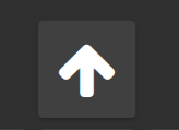
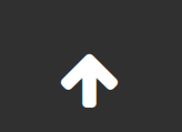
一:实现效果
1、Button设置 flat 属性为false
2、Button 设置 flat 属性为 true
二、实现总结:
除了和原生qml自带的Button的外边框不一样外,其他的都是一样的,给需要的朋友参考一下。
三、代码下载地址:
点击这里下载代码
四、如何使用
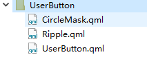
4.1、文件结构
4.2 调用代码:
        UserButton{
            width: parent.height * 0.5 - 5
            height: parent.height * 0.5 - 5
            anchors.horizontalCenter: parent.horizontalCenter
            icon: "\uf062"
            family: defaultIconFamily //这里使用的是FontAwesome字体库
            btnColor: "white"
            flat: true
            onClicked: {
             	console.log("this is UserButton Cliecked...")
            }
        }
五、各个文件实现:
1、首先需要实现按钮的水波纹效果,代码如下(Ripple.qml):
/*
 * This file is part of Fluid.
 *
 * Copyright (C) 2018 Pier Luigi Fiorini <[email protected]>
 * Copyright (C) 2018 Michael Spencer <[email protected]>
 *
 * $BEGIN_LICENSE:MPL2$
 *
 * This Source Code Form is subject to the terms of the Mozilla Public
 * License, v. 2.0. If a copy of the MPL was not distributed with this
 * file, You can obtain one at http://mozilla.org/MPL/2.0/.
 *
 * $END_LICENSE$
 */

import QtQuick 2.10
//import Fluid.Core 1.0
//import Fluid.Controls 1.0 as FluidControls
//import Fluid.Effects 1.0

/*!
   \qmltype Ripple
   \inqmlmodule Fluid.Controls
   \ingroup fluidcontrols

   \brief Represents a Material Design ripple ink animation used in various touchable components.

   This component is useful for including in Material Design-specific components, which should be implemented using the +material file selector. Eventually this should be upstreamed to QtQuick
   Controls 2.

    For more information you can read the
    \l{https://material.io/guidelines/motion/material-motion.html#material-motion-how-does-material-move}{Material Design guidelines}.
 */
MouseArea {
    id: ripple

    /*!
        \qmlproperty color color

        The color of the ripple. Defaults to black with 12% opacity.
    */
    property color color: Qt.rgba(0,0,0,0.12)

    /*!
        \qmlproperty bool circular

        Set to \c true if the ripple is used on a circular component, such as a button in an
        action bar or a floating action button.
    */
    property bool circular: false

    /*!
        \qmlproperty bool centered

        Set to \c true if the ripple should be centered regardless of where the mouse/touch
        input came from.
    */
    property bool centered: false

    /*!
        \qmlproperty bool focused

        Set to \c true if the component is focused and should display a focus ripple.
    */
    property bool focused

    /*!
        \qmlproperty color focusColor

        The color of the focus ripple. Also used to determine the color of the focus background
        behind the ripple.

        \sa Ripple::focused
    */
    property color focusColor: "transparent"

    /*!
        \qmlproperty int focusWidth

        The width of the focus ripple.

        \sa Ripple::focused
    */
    property int focusWidth: width - 32

    /*!
        \qmlproperty Item control

        Control that that needs the ripple effect.
    */
    property Item control

    clip: true
    hoverEnabled: false

    Connections {
        target: control

        onPressedChanged: {
            if (!control.pressed)
                __private.removeLastCircle()
        }
    }

    onPressed: {
        __private.createTapCircle(mouse.x, mouse.y)

        if (control)
            mouse.accepted = false
    }

    onReleased: __private.removeLastCircle()
    onCanceled: __private.removeLastCircle()

    QtObject {
        id: __private

        property int startRadius: circular ? width/10 : width/6
        property int endRadius
        property bool showFocus: true

        property Item lastCircle

        function createTapCircle(x, y) {
            endRadius = centered ? width/2 : radius(x, y) + 5
            showFocus = false

            lastCircle = tapCircle.createObject(ripple, {
                "circleX": centered ? width/2 : x,
                "circleY": centered ? height/2 : y
            })
        }

        function removeLastCircle() {
            if (lastCircle)
                lastCircle.removeCircle()
        }

        function radius(x, y) {
            var dist1 = Math.max(dist(x, y, 0, 0), dist(x, y, width, height))
            var dist2 = Math.max(dist(x, y, width, 0), dist(x, y, 0, height))

            return Math.max(dist1, dist2)
        }

        function dist(x1, y1, x2, y2) {
            var distX = x2 - x1
            var distY = y2 - y1

            return Math.sqrt(distX * distX + distY * distY)
        }
    }

    Rectangle {
        id: focusBackground
        objectName: "focusBackground"

        width: parent.width
        height: parent.height

        color: focusColor.a > 0
                ? Qt.rgba(0,0,0,0.2) : Qt.rgba(0,0,0,0.1)

        opacity: __private.showFocus && focused ? 1 : 0

        Behavior on opacity {
            NumberAnimation { duration: 500; easing.type: Easing.InOutQuad }
        }
    }

    Rectangle {
        id: focusCircle
        objectName: "focusRipple"

        property bool focusedState

        x: (parent.width - width)/2
        y: (parent.height - height)/2

        width: focused
                ? focusedState ? focusWidth
                               : Math.min(parent.width - 8, focusWidth + 12)
                : parent.width/5
        height: width

        radius: width/2

        opacity: __private.showFocus && focused ? 1 : 0

        color: focusColor.a === 0 ? Qt.rgba(1,1,1,0.4) : focusColor

        Behavior on opacity {
            NumberAnimation { duration: 500; easing.type: Easing.InOutQuad }
        }

        Behavior on width {
            NumberAnimation { duration: focusTimer.interval; }
        }

        Timer {
            id: focusTimer
            running: focused
            repeat: true
            interval: 800

            onTriggered: focusCircle.focusedState = !focusCircle.focusedState
        }
    }

    Component {
        id: tapCircle

        Item {
            id: circleItem
            objectName: "tapRipple"

            property bool done

            property real circleX
            property real circleY

            property bool closed

            width: parent.width
            height: parent.height

            function removeCircle() {
                done = true

                if (fillSizeAnimation.running) {
                    fillOpacityAnimation.stop()
                    closeAnimation.start()

                    circleItem.destroy(500);
                } else {
                    __private.showFocus = true
                    fadeAnimation.start();

                    circleItem.destroy(300);
                }
            }

            Item {
                id: circleParent

                width: parent.width
                height: parent.height

                visible: !circular

                Rectangle {
                    id: circleRectangle

                    x: circleItem.circleX - radius
                    y: circleItem.circleY - radius

                    width: radius * 2
                    height: radius * 2

                    opacity: 0
                    color: ripple.color

                    NumberAnimation {
                        id: fillSizeAnimation
                        running: true

                        target: circleRectangle; property: "radius"; duration: 500;
                        from: __private.startRadius; to: __private.endRadius;
                        easing.type: Easing.InOutQuad

                        onStopped: {
                            if (done)
                                __private.showFocus = true
                        }
                    }

                    NumberAnimation {
                        id: fillOpacityAnimation
                        running: true

                        target: circleRectangle; property: "opacity"; duration: 300;
                        from: 0; to: 1; easing.type: Easing.InOutQuad
                    }

                    NumberAnimation {
                        id: fadeAnimation

                        target: circleRectangle; property: "opacity"; duration: 300;
                        from: 1; to: 0; easing.type: Easing.InOutQuad
                    }

                    SequentialAnimation {
                        id: closeAnimation

                        NumberAnimation {
                            target: circleRectangle; property: "opacity"; duration: 250;
                            to: 1; easing.type: Easing.InOutQuad
                        }

                        NumberAnimation {
                            target: circleRectangle; property: "opacity"; duration: 250;
                            from: 1; to: 0; easing.type: Easing.InOutQuad
                        }
                    }
                }
            }

            CircleMask {
                anchors.fill: parent
                source: circleParent
                visible: circular
            }
        }
    }
}
2、实现背景遮挡遮罩(CircleMask.qml):
/*
 * This file is part of Fluid.
 *
 * Copyright (C) 2018 Pier Luigi Fiorini <[email protected]>
 * Copyright (C) 2018 Michael Spencer <[email protected]>
 *
 * $BEGIN_LICENSE:MPL2$
 *
 * This Source Code Form is subject to the terms of the Mozilla Public
 * License, v. 2.0. If a copy of the MPL was not distributed with this
 * file, You can obtain one at http://mozilla.org/MPL/2.0/.
 *
 * $END_LICENSE$
 */

import QtQuick 2.10
import QtGraphicalEffects 1.0

/*!
  \qmltype CircleMask
  \inqmlmodule Fluid.Effects
  \ingroup fluideffects

  \brief Circular mask.
*/
Item {
    id: item

    /*!
        \qmlproperty variant source

        This property defines the source item that is going to be masked.
    */
    property alias source: mask.source

    Rectangle {
        id: circleMask

        width: parent.width
        height: parent.height

        smooth: true
        visible: false

        radius: Math.max(width/2, height/2)
    }

    OpacityMask {
        id: mask

        width: parent.width
        height: parent.height

        maskSource: circleMask
    }
}
3、实现自定义按钮(UserButton.qml):
import QtQuick 2.9
import QtQuick.Controls 2.3
import QtQuick.Layouts 1.3
import QtQuick.Controls.Material 2.3

/**
 * @Title: 子菜单按钮
 * @FileName: UserButton.qml
 * @Description: 子菜单按钮布局
 * @Autor: zhanghao [email protected]
 * @date: 2019-01-07 10:48:52
 * @update_author
 * @update_time
 * @version V1.0
*/

Pane {
    contentWidth: width
    contentHeight: height
    padding: 0
    Material.elevation: 2

    id: root
    property string icon    // 图标
    property string toolTipStr    // 文本指示字符串
    property string family  // 字体协议族名字
    property string backColor: "grey" //按钮背景颜色
    property double backOpacity: 0.2 //按钮背景透明度
    property bool flat: false //是否显示外边框
    property bool isToolTip: false // 是否显示提示信息
    signal clicked()  // 点击事件
    property string btnColor: "#616161"    // 按钮颜色

    property double tempopacity: 0.2
    onFlatChanged: {
        if(flat){
            Material.elevation = 0
            tempopacity = 0
        }else{
            Material.elevation = 1
            tempopacity = 0.2
        }
    }

    Rectangle{
        id: back
        anchors.fill: parent
        color: backColor//Material.background
        opacity: tempopacity
        radius: 5

        NumberAnimation{
            id: enterAnimation
            target: back
            property: "opacity"
            easing.type: Easing.OutQuad
            from: tempopacity
            to: backOpacity + tempopacity
        }

        NumberAnimation{
            id: exitAnimation
            target: back
            property: "opacity"
            duration: 500
            easing.type: Easing.OutQuad
            from: backOpacity + tempopacity
            to: tempopacity
        }

    }

    // 图标
    Text {
        anchors.fill: parent
        font.family: family
        verticalAlignment: Text.AlignVCenter
        horizontalAlignment: Text.AlignHCenter
        color: btnColor
        text: icon
        Component.onCompleted: font.pointSize = parent.height / 2
    }
    ToolTip {
        id: tooltip
        text: toolTipStr
    }

    MouseArea {
        anchors.fill: parent
        hoverEnabled: true
        Component.onCompleted: {
            this.clicked.connect(root.clicked)
        }
        // 水波纹
        Ripple {
            anchors.fill: parent
            color: Material.rippleColor
            control: parent
            focused: false
        }
        onEntered: {
            if(isToolTip)
                tooltip.visible = true
            back.color = backColor
            enterAnimation.start()
        }
        onExited: {
            if(isToolTip)
                tooltip.visible = false
            exitAnimation.start()
        }
    }
}