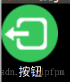
(方法一)效果图:点击的时候文字也会动
(1-1)将button单独变成一个qml,用于后续使用。MyButton.qml
import QtQuick 2.0
import QtQml 2.2
import QtQuick.Controls 2.0
Button {
    id: control
    property alias buttonText: control.text

    contentItem: Item {
        Text {
            anchors.top: parent.bottom
            anchors.topMargin: 5
            anchors.horizontalCenter: parent.horizontalCenter
            width: contentWidth
            text: control.text
            color: "#ffffff"
            font.pixelSize: 12
        }
    }

    background: Image {

        source: pressed ? "qrc:/leave_click.png" : "qrc:/leave.png"
    }
}
(1-2)在main.qml中
import QtQuick 2.0
import QtQuick.Window 2.2
Window {
visible: true
width: 500
height: 500
color: "black"
MyButton
{
id:nu
buttonText:qsTr("按钮")
}
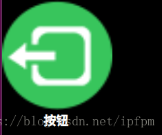
}(方法二)效果图:单击的时候文字不能动
(2-1)MyButton.qml
import QtQuick 2.0
import QtQuick.Layouts 1.3
import QtQuick.Controls 1.4
import QtQuick.Controls.Styles 1.4

Button{
    id: nButton
    Layout.alignment: Qt.AlignHCenter

    style: ButtonStyle {
        background:Rectangle{
            implicitHeight: 80
            implicitWidth:  80
            color: "transparent"
            BorderImage{
                anchors.fill: parent
                source: control.pressed ? "qrc:/leave_click.png" : "qrc:/leave.png";
                //source: control.hovered ? (control.pressed ? pressPic : hoverPic) : nomerPic;
            }
        }
    }
    Text {
        id: ButtonText
        anchors.top: parent.bottom
        anchors.horizontalCenter: parent.horizontalCenter
        width: contentWidth
        text: qsTr("按钮")
        color: "white"
        font.pointSize: 13
        font.bold: true
    }

}
(2-2)main.qml
import QtQuick 2.0
import QtQuick.Window 2.2

Window {
    visible: true
    width: 500
    height: 500
    color: "black"

    MyButton
    {
        id:nu
    }

}
注意:可以在button组件的前端定义Property string normalPic跟pressedpic,用于外部调用MyButton并赋值这两个变量值