本组件基于 @vuepic/vue-datepicker 插件进行了二次封装,以便更适合日常使用!
官方文档:https://vue3datepicker.com/installation/
除了年、月、时分秒选择器以外,其余选择的日期(v-model:date)均已调整为返回时间戳!
可自定义设置以下二次封装属性(也可根据官方文档设定相应属性,组件已设置继承所有属性):
-
日期选择器宽度(width),类型:number,默认 180px
-
选择器模式(mode),类型:string,默认 'date',可选:时间time,日期date,周week,月month,年year
-
是否增加时间选择(showTime),默认 false
-
是否展示”今天“按钮(showToday),默认 false
-
当前选中日期(v-model:date),类型:number | number[] | {month:number,year:number} | {hours:number,minutes:number,seconds:number},默认 0
常用官方属性举例(更多使用方式还请查阅官方文档,功能设计非常全面,各部分主题颜色也均可自定义修改!):
-
日期展示格式(format),类型:string,默认 'yyyy-MM-dd',可选(y: 年, M: 月, d: 天, H: 时, m: 分, s: 秒)
-
范围选择器是否使用双日期面板(multiCalendars),类型:boolean,默认 false
-
定义选择顺序(flow),类型:array,默认 [],可选 ("calendar" | "time" | "month" | "year" | "minutes" | "hours" | "seconds")[]
-
样式主题是否使用黑色(dark),类型:boolean,默认 false
-
是否展示秒选择(enable-seconds),类型:boolean,默认 false
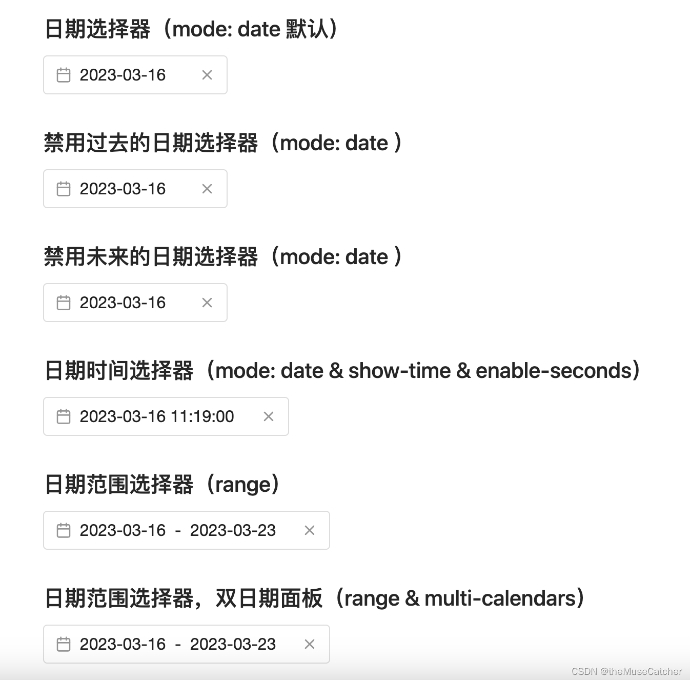
效果如下图:

①创建日期选择器组件DatePicker.vue:
<script setup lang="ts">
import VueDatePicker from '@vuepic/vue-datepicker'
import '@vuepic/vue-datepicker/dist/main.css'
import { ref, computed, watch } from 'vue'

interface Props {
  inheritAttrs?: boolean, // 默认值:true
  width?: number, // 日期选择器宽度
  mode?: string, // 选择器模式,可选:时间time,日期date,周week,月month,年year
  // format?: string, // 日期展示格式,(y: 年, M: 月, d: 天, H: 时, m: 分, s: 秒)
  showTime?: boolean, // 是否增加时间选择
  showToday?: boolean, // 是否展示”今天“按钮
  // multiCalendars?: boolean, // 范围选择器是否使用双日期面板
  // flow?: any[], // 定义选择顺序 ("calendar" | "time" | "month" | "year" | "minutes" | "hours" | "seconds")[]
  // dark?: boolean, // 样式主题是否使用黑色
  date?: number|number[]|{month:number,year:number}|{hours:number,minutes:number,seconds:number} // (v-model)当前选中日期
}
const props = withDefaults(defineProps<Props>(), {
  inheritAttrs: false,
  width: 180,
  mode: 'date',
  // format: 'yyyy-MM-dd',
  showTime: false,
  showToday: false,
  // multiCalendars: false,
  // flow: () => [],
  // dark: false,
  date: 0
})
const date = ref(props.date)
watch(date, (to) => {
  // console.log('s to:', to)
  emit('update:date', to)
})
const emit = defineEmits(['update:date'])
const modelType = computed(() => {
  if (['time', 'month', 'year'].includes(props.mode)) {
    return ''
  } else {
    return 'timestamp'
  }
})
const time = computed(() => {
  return props.mode === 'time'
})
const week = computed(() => {
  return props.mode === 'week'
})
const month = computed(() => {
  return props.mode === 'month'
})
const year = computed(() => {
  return props.mode === 'year'
})
// const format = (date: Date) => {
//   const day = date.getDate()
//   const month = date.getMonth() + 1
//   const year = date.getFullYear()
//   return `${year}-${month}-${day}`
// }
</script>
<template>
  <div class="m-datepicker" :style="`width: ${width}px;`">
    <VueDatePicker
      v-model="date"
      locale="zh-CN"
      :month-change-on-scroll="false"
      :enable-time-picker="showTime"
      :time-picker="time"
      :week-picker="week"
      :month-picker="month"
      :year-picker="year"
      :show-now-button="showToday"
      auto-apply
      text-input
      :model-type="modelType"
      :day-names="['一', '二', '三', '四', '五', '六', '七']"
      now-button-label="今天"
      v-bind="$attrs">
    </VueDatePicker>
  </div>
</template>
<style lang="less" scoped>
.m-datepicker {
  display: inline-block;
  box-sizing: border-box;
}
.dp__theme_dark { // dark theme
  --dp-background-color: #212121;
  --dp-text-color: #ffffff;
  --dp-hover-color: #484848;
  --dp-hover-text-color: #ffffff;
  --dp-hover-icon-color: #959595;
  --dp-primary-color: #005cb2;
  --dp-primary-text-color: #ffffff;
  --dp-secondary-color: #a9a9a9;
  --dp-border-color: #2d2d2d;
  --dp-menu-border-color: #2d2d2d;
  --dp-border-color-hover: #aaaeb7;
  --dp-disabled-color: #737373;
  --dp-scroll-bar-background: #212121;
  --dp-scroll-bar-color: #484848;
  --dp-success-color: #00701a;
  --dp-success-color-disabled: #428f59;
  --dp-icon-color: #959595;
  --dp-danger-color: #e53935;
  --dp-highlight-color: rgba(0, 92, 178, 0.2);
}
.dp__theme_light { // light theme
  --dp-background-color: #ffffff;
  --dp-text-color: #212121;
  --dp-hover-color: #f3f3f3;
  --dp-hover-text-color: #212121;
  --dp-hover-icon-color: #959595;
  --dp-primary-color: #1976d2;
  --dp-primary-text-color: #f8f5f5;
  --dp-secondary-color: #c0c4cc;
  --dp-border-color: #ddd;
  --dp-menu-border-color: #ddd;
  --dp-border-color-hover: #aaaeb7;
  --dp-disabled-color: #f6f6f6;
  --dp-scroll-bar-background: #f3f3f3;
  --dp-scroll-bar-color: #959595;
  --dp-success-color: #76d275;
  --dp-success-color-disabled: #a3d9b1;
  --dp-icon-color: #959595;
  --dp-danger-color: #ff6f60;
  --dp-highlight-color: rgba(25, 118, 210, 0.1);
}
</style>
②在要使用的页面引入:
<script setup lang="ts">
import { DatePicker } from './DatePicker.vue'
import { ref, watch } from 'vue'
import { endOfMonth, endOfYear, startOfMonth, startOfYear, subMonths } from 'date-fns'
const dateValue = ref(1678936740000)
const rangeValue = ref<number[]>([1678936740000, 1679541540000])
const timeRangeValue = ref([
{
hours: 10,
minutes: 20,
seconds: 30
},
{
hours: 14,
minutes: 20,
seconds: 30
}
])
const presetRanges = ref([
{ label: 'Today', range: [new Date(), new Date()] },
{ label: 'This month', range: [startOfMonth(new Date()), endOfMonth(new Date())] },
{
label: 'Last month',
range: [startOfMonth(subMonths(new Date(), 1)), endOfMonth(subMonths(new Date(), 1))],
},
{ label: 'This year', range: [startOfYear(new Date()), endOfYear(new Date())] }
])
const timeValue = ref({
hours: 10,
minutes: 20
})
const secondsValue = ref({
hours: 10,
minutes: 20,
seconds: 30
})
const weekValue = ref([1678032000000, 1678636799999])
const monthValue = ref({
year: 2023,
month: 0
})
const yearValue = ref(2023)
watch(dateValue, (to) => {
console.log('p to:', to)
})
watch(rangeValue, (to) => {
console.log('p to:', to)
})
watch(timeValue, (to) => {
console.log('p to:', to)
})
watch(weekValue, (to) => {
console.log('p to:', to)
})
watch(monthValue, (to) => {
console.log('p to:', to)
})
watch(yearValue, (to) => {
console.log('p to:', to)
})
</script>
<template>
<div>
<h2 class="mb10">DatePicker 日期选择器基本使用</h2>
<h2 class="mb10">日期选择器(mode: date 默认)</h2>
<DatePicker
placeholder="请选择日期"
v-model:date="dateValue"
mode="date"
show-today
format="yyyy-MM-dd"
:width="180" />
<h2 class="mt30 mb10">禁用过去的日期选择器(mode: date )</h2>
<DatePicker
placeholder="请选择日期"
v-model:date="dateValue"
mode="date"
:min-date="new Date()"
format="yyyy-MM-dd"
:width="180" />
<h2 class="mt30 mb10">禁用未来的日期选择器(mode: date )</h2>
<DatePicker
placeholder="请选择日期"
v-model:date="dateValue"
mode="date"
:max-date="new Date()"
format="yyyy-MM-dd"
:width="180" />
<h2 class="mt30 mb10">日期时间选择器(mode: date & show-time & enable-seconds)</h2>
<DatePicker
placeholder="请选择日期时间"
v-model:date="dateValue"
mode="date"
format="yyyy-MM-dd HH:mm:ss"
:width="240"
show-time
enable-seconds />
<h2 class="mt30 mb10">日期范围选择器(range)</h2>
<DatePicker
placeholder="请选择日期范围"
v-model:date="rangeValue"
range
:preset-ranges="presetRanges"
format="yyyy-MM-dd"
:width="280" />
<h2 class="mt30 mb10">日期范围选择器,双日期面板(range & multi-calendars)</h2>
<DatePicker
placeholder="请选择日期范围"
v-model:date="rangeValue"
mode="range"
format="yyyy-MM-dd"
:width="280"
range
multi-calendars />
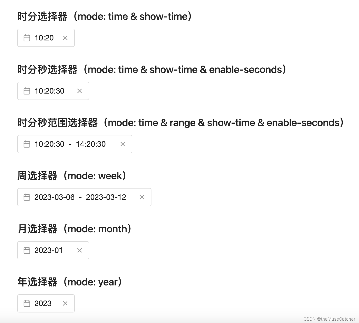
<h2 class="mt30 mb10">时分选择器(mode: time & show-time)</h2>
<DatePicker
placeholder="请选择时间"
v-model:date="timeValue"
mode="time"
show-time
mode-height="120"
format="HH:mm"
:width="120" />
<h2 class="mt30 mb10">时分秒选择器(mode: time & show-time & enable-seconds)</h2>
<DatePicker
placeholder="请选择时间"
v-model:date="secondsValue"
mode="time"
show-time
enable-seconds
mode-height="120"
format="HH:mm:ss"
:width="150" />
<h2 class="mt30 mb10">时分秒范围选择器(mode: time & range & show-time & enable-seconds)</h2>
<DatePicker
placeholder="请选择时间"
v-model:date="timeRangeValue"
mode="time"
show-time
range
enable-seconds
mode-height="120"
format="HH:mm:ss"
:width="240" />
<h2 class="mt30 mb10">周选择器(mode: week)</h2>
<DatePicker
placeholder="请选择周"
v-model:date="weekValue"
mode="week"
format="yyyy-MM-dd"
:width="280" />
<h2 class="mt30 mb10">月选择器(mode: month)</h2>
<DatePicker
placeholder="请选择月"
v-model:date="monthValue"
mode="month"
format="yyyy-MM"
:width="150" />
<h2 class="mt30 mb10">年选择器(mode: year)</h2>
<DatePicker
placeholder="请选择年"
v-model:date="yearValue"
mode="year"
format="yyyy"
:width="120" />
</div>
</template>
<style lang="less" scoped>
</style>