前言
前段时间做移动端的项目,项目中需要一个固定表头和首列的表格,但由于是移动端的,组件库里没有类似的,于是,就去网上找看有没有类似的,结果越找越气,10个文章9个抄,抄也行,你倒是抄个能用的啊,一篇根本就不能用的文章,抄个什么劲?有意义???
没办法,只有自己写一个了。
实现思路
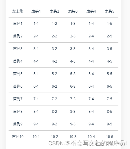
1、首先分为四部分,左上角固定不动的表头,表头部分,首列部分,表格主体部分
2、整个表格添加定位position: relative;左上角表头添加position: fixed;
3、给白色主体部分添加滚动监听事件,在滑动的同时,使首列的scrollLeft等于主体部分的scrollLeft值;使表头的scrollTop值等于主体的scrollTop值;
2021-06-03 最近又对这个表格优化了下,以上操作是第一版,本版本优化了向左滚动同时也可以向上滚动的问题,体验不好;要求是向左右滚动则不允许上下滚动,向上下滚动不允许左右滚动;
思路是如下:
1、通过touchstart记录初始的鼠标点击位置;
2、通过touchmove记录移动时鼠标位置;
3、通过位置的x轴和y轴的差值判断用户手指移动位置;
4、左右滑动时,把盒子的overflowY设为hidden;上下滑动时,把盒子得overflowX设为hidden;
<template>
  <div class="pages">
    <div class="tables">
      <div class="tits">
        <div class="titsLeft">
          <p>左上角</p>
        </div>
        <div class="titsRight" ref="titsRight">
          <div>
            <p v-for="(item, i) in 50" :key="i">表头{

   { i + 1 }}</p>
          </div>
        </div>
      </div>

      <div class="tbody" @scroll="scrollEvent($event)" ref="tbodyRight" @touchstart="touchstart" @touchmove="touchmove" @touchend="touchend">
        <div class="tbodyLeft" ref="tbodyLeft">
          <div ref="tbodyLeftItem">
            <p v-for="(item, i) in 50" :key="i">首列{

   { i + 1 }}</p>
          </div>
        </div>
        <div class="tbodyRight">

          <div v-for="(item, i) in 50" :key="i" class="row">
            <p v-for="(item1, i1) in 50" :key="i1">{

   { i + 1 }}-{

   { i1 + 1 }}</p>
          </div>
        </div>
      </div>
    </div>
  </div>
</template>

<script>
export default {
  name: "tables",
  data() {
    return {
      /* 移动所需参数 */
      startX: 0,
      startY: 0,
      endX: 0,
      endY: 0,
      isMove: false,
    };
  },
  methods: {
    scrollEvent(e) {
      this.$refs.titsRight.style.left = -e.target.scrollLeft + 60 + "px";
      this.$refs.tbodyLeftItem.style.top = -e.target.scrollTop + "px";
    },

    /* 监听滑动开始 */
    touchstart(e) {
      /* 阻止一些默认事件 */
      // e.preventDefault();
      /* 记录初始位置 */
      this.startX = e.touches[0].pageX;
      this.startY = e.touches[0].pageY;
      console.log(this.startX, this.startY);
    },
    /* 监听滑动移动 */
    touchmove(e) {
      /* 判断是否滚动 */
      this.isMove = true;
      /* 监听滑动最终结束的位置 */
      this.endX = e.touches[0].pageX;
      this.endY = e.touches[0].pageY;

      /* 判断移动方向 */
      let X = this.endX - this.startX,
        Y = this.endY - this.startY;
      /* 判断是否移动还是点击 */
      if (this.isMove) {
        if (X > 0 && Math.abs(X) > Math.abs(Y)) {
          //向右
          console.log("向右");
          this.$refs.tbodyRight.style["overflowY"] = "hidden";
          this.$refs.tbodyRight.style["overflowX"] = "auto";
        } else if (X < 0 && Math.abs(X) > Math.abs(Y)) {
          //向左
          console.log("向左");
          this.$refs.tbodyRight.style["overflowY"] = "hidden";
          this.$refs.tbodyRight.style["overflowX"] = "auto";
        } else if (Y > 0 && Math.abs(Y) > Math.abs(X)) {
          //向下
          console.log("向下");
          this.$refs.tbodyRight.style["overflowX"] = "hidden";
          this.$refs.tbodyRight.style["overflowY"] = "auto";
        } else if (Y < 0 && Math.abs(Y) > Math.abs(X)) {
          //向上
          console.log("向上");
          this.$refs.tbodyRight.style["overflowX"] = "hidden";
          this.$refs.tbodyRight.style["overflowY"] = "auto";
        } else {
          //没有
          // console.log("没有");
        }
      } else {
        // console.log("没有");
      }
    },
  },
};
</script>
<style scoped lang="scss">
::-webkit-scrollbar {
  /*隐藏滚轮*/
  display: none;
}
* {
  margin: 0;
  padding: 0;
}
p {
  width: 60px;
  height: 40px;
  text-align: center;
  line-height: 40px;
  flex-shrink: 0;
}
.tables {
  width: 100%; //自定义表格整体宽度
  font-size: 12px;
  overflow: hidden;
  box-sizing: border-box;
  display: flex;
  flex-direction: column;
  position: relative;
  // border-right: 1px solid red;
  // border-bottom: 1px solid red;
  // border-bottom: 1px solid #ccc;
  .tbody {
    height: 400px; //自定义表格内容高度
    overflow: auto;
  }
  > div {
    display: flex;
  }
  div {
    flex-shrink: 0;
  }
  .tits {
    height: 40px;
    padding-left: 60px;
    background-color: #fff;
  }
  .titsLeft,
  .tbodyLeft {
    width: 60px;
  }
  .titsRight,
  .tbodyRight {
    width: 250px; //自定义表头表体内容宽度
  }
  .titsLeft {
    position: absolute;
    top: 0;
    left: 0;
    z-index: 100;
    p {
      width: 60px;
      background-color: #fff;
      border-bottom: 1px solid #ccc;
    }
  }
  .titsRight {
    height: 40px;
    position: absolute;
    top: 0;
    div {
      display: flex;
      right: 17px;
      p {
        background-color: #fff;
        border-bottom: 1px solid #ccc;
      }
    }
  }
  .tbodyLeft {
    // overflow: hidden;
    white-space: nowrap;
    height: 100%;
    background-color: #fff;
    div {
      margin-top: 40px;

      width: 60px;
      background-color: #fff;
      left: 0;
      top: 0px;
      position: absolute;
      overflow: hidden;
      p {
        border-bottom: 1px solid #ccc;
      }
      // padding-top: 40px;
      // bottom: 17px; //避开下方滚动条位置
    }
  }
  .tbodyRight {
    white-space: nowrap;
    background-color: none;
    display: flex;
    flex-direction: column;
    .row {
      display: flex;
      p {
        border-bottom: 1px solid #ccc;
      }
    }
  }
}
</style>
总结
以上就是今日分享的全部内容。希望能对大家的学习有所帮助,小伙伴们评论区留下“管用",记得三联哦。 还有更多知识分享,欢迎拜访链接: 首页