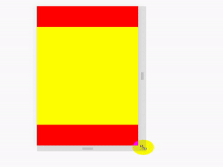
先上效果图:
实现方法:
方法一:
这个最简单,利用css中vh单位和calc() 函数
使用场景:
页面布局
<!DOCTYPE html>
<html lang="en">

<head>
    <meta charset="UTF-8">
    <meta http-equiv="X-UA-Compatible" content="IE=edge">
    <meta name="viewport" content="width=device-width, initial-scale=1.0">
    <title>css上中下布局</title>
    <style>
        body {


            margin: 0;
            padding: 0;
        }

        .top {


            height: 100px;
            background: red;
        }

        .center {


            height: calc(100vh - 200px);
            background: yellow;
        }

        .bottom {


            height: 100px;
            background: red;
        }
    </style>
</head>

<body>
    <div class="top"></div>
    <div class="center"></div>
    <div class="bottom"></div>
</body>

</html>
方法二
利用css定位属性
使用场景:
一般用于某些元素根据屏幕大小适配,这个弹窗上下部分固定,中间部分需要自适应高度时
<!DOCTYPE html>
<html lang="en">

<head>
    <meta charset="UTF-8">
    <meta http-equiv="X-UA-Compatible" content="IE=edge">
    <meta name="viewport" content="width=device-width, initial-scale=1.0">
    <title>css上中下布局</title>
    <style>
        body {


            margin: 0;
            padding: 0;
        }

        .top {


            position: absolute;
            top: 0;
            width: 100%;
            height: 100px;
            background: red;
        }

        .center {


            position: absolute;
            top: 100px;
            bottom: 100px;
            width: 100%;
            height: auto;
            background: yellow;
        }

        .bottom {


            position: absolute;
            height: 100px;
            width: 100%;
            bottom: 0;
            background: red;
        }
    </style>
</head>

<body>
    <div class="top"></div>
    <div class="center"></div>
    <div class="bottom"></div>
</body>

</html>
方法三
使用flex布局,这个时候父元素一定要给高度
使用场景:
同方法二
<!DOCTYPE html>
<html lang="en">

<head>
    <meta charset="UTF-8">
    <meta http-equiv="X-UA-Compatible" content="IE=edge">
    <meta name="viewport" content="width=device-width, initial-scale=1.0">
    <title>css上中下布局</title>
    <style>
        body {


            margin: 0;
            padding: 0;
            display: flex;
            flex-direction: column;
            /* 父元素一定要给高度 */
            height: 100vh;
        }

        .top {


            width: 100%;
            height: 100px;
            background: red;
        }

        .center {


            width: 100%;
            flex: 1;
            background: yellow;
        }

        .bottom {


            width: 100%;
            height: 100px;
            background: red;
        }
    </style>
</head>

<body>
    <div class="top"></div>
    <div class="center"></div>
    <div class="bottom"></div>
</body>

</html>
应该还有很多实现的方法,目前我常用的就是这几种,有更好的方案的同学可以一起交流。
个人水平有限,有问题欢迎大家留言指导,仅供学习和参考。
扫描二维码关注公众号,回复:
14966002 查看本文章

学海无涯!努力二字,共勉!