第一种:采用浮动
1.1首先来看一下网上一个哥们给的代码
<body>
        <div class="left">左</div>
        <div class="right">右</div>
        <div class="center">中</div>

</body>
div{
    height: 200px;
}

.left{
    float: left;
    background: #bfa;
    width: 200px;
}
.right{
    float:right;
    width: 200px;
    background: #baf;
}
.center{
    width: 100%;
    margin: 0 200px;
    margin-right: 100px;
    background: #bdf;
}
效果图如下:

哎!乍一看,好像真的可以,可是当你把右侧的盒子和左侧的盒子删除后你将看到如下画面
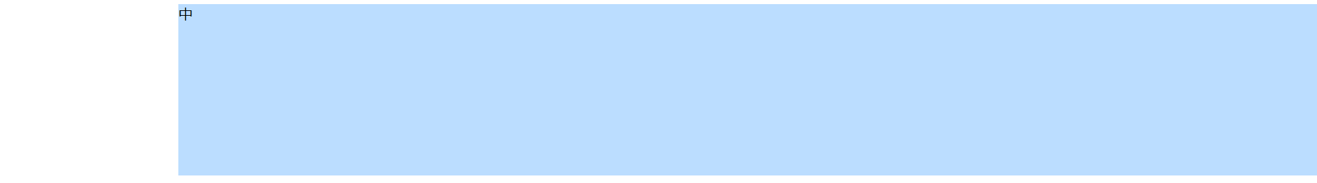
也就是说左侧确实空出了空间,可是右侧的实际情况只是:右盒子覆盖在了中间盒子上面,中间盒子的大小是中间的蓝色加上右侧的紫色部分
对于这个现象我找到了一篇文章:https://blog.csdn.net/u011043843/article/details/28881557
即:margin-right其实有效果的,只是在默认即标准流的情况的下显示不出来效果。
这样就会导致一个问题:虽然文字在中间的盒子中不会受到影响,当时当你在中间的盒子加上一些元素时会发现这个盒子达不到你预期想要的效果
代码如下
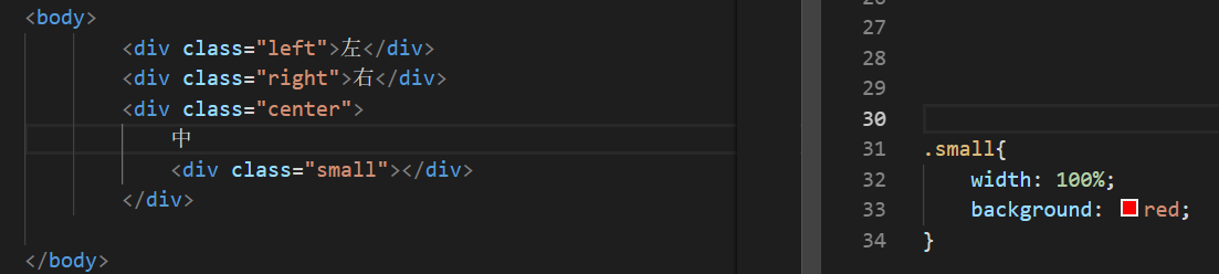
这时small的宽度为:网页宽度-左侧盒子宽度
而不是:网页宽度减去-左侧盒子宽度-右侧盒子宽度 也就是会影响布局
于是我抖了个机灵将margin换成padding
即1.2
相比于上一个的优点即不影响布局,但是该盒子的颜色会“溢出“
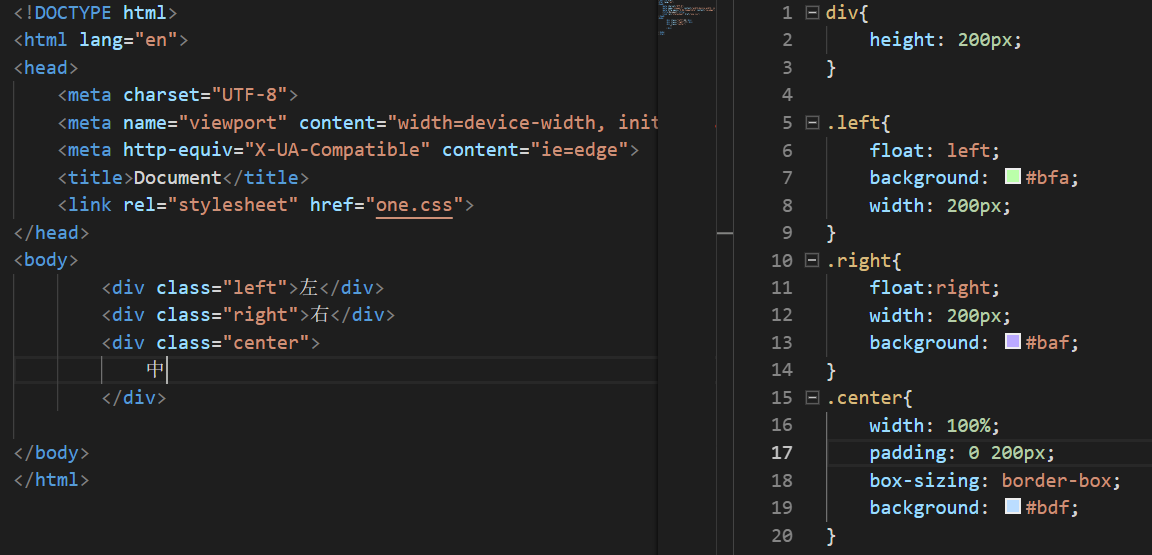
第二种:采用绝对定位
 <div class="left">左</div>
 <div class="right">右</div>
<div class="center">中</div>
.left,.right{
    position: absolute;
    width: 220px;
    height: 250px;
    top: 0;
}
.left{
    background: #bfa;
}
.right{
    right: 0;
    background: #baf;
}
.center{
    width: 100%;
    height: 250px;
    padding: 0 220px;
    box-sizing: border-box;
    margin-top: 0;
    background: #bdf;
}
第三种:弹性布局
利用一个div作为容器,并使其display为flex,另左右宽度固定后设置中间盒子的flex为1即可,代码如下
    <div class="big">
            <div class="left">左</div>
            <div class="center">中</div>
            <div class="right">右</div>
    </div>
.big{
    display: flex;

}
.big div{
    height: 200px;
}
.left{
    width: 200px;
    background: #bfa;
    margin-top: 50px;
}
.right{
    width: 200px;
    background: #baf;
    margin-top: 50px;
}
.center{
    flex:1;
    background: #bdf;
}
优点:简便,且不会有上述的“颜色溢出”的毛病
缺点:flex对低版本的浏览器兼容性不是很好