1.flex布局
思路:将父元素box设为display:flex;可将box设置为弹性盒模型进行布局(如果对flex不了解,可点击打开链接学习)
<!DOCTYPE html>
<html>
<head>
<meta charset="UTF-8">
<title></title>
<style type="text/css">
#box{
width:100%;
height:100px;
display:flex;
margin:10px;
}
#left,#right{
width:200px;
height:100px;
margin:10px;
background-color:#999;
}
#center{
flex:1;
height:100px;
margin:10px;/*左右margin不会叠加*/
background-color:#f00;
}
</style>
</head>
<body>
<div id="box">
<div id="left">left</div>
<div id="center">center</div>
<div id="right">right</div>
</div>
</body>
</html>
2.利用浮动(float)
让左右元素浮动,缺点是中间元素必须置于二者之后,不然right元素会进入下一行
<!DOCTYPE html>
<html>
<head>
<meta charset="UTF-8">
<title></title>
<style type="text/css">
.left,.right{
width:200px;
height:200px;
background-color:#999;
}
.left{
float:left;
}
.right{
float:right;
}
.center{
margin:0 200px;
height:300px;
background-color:#f00;
}
</style>
</head>
<body>
<!--该布局法的好处是受外界影响小,但是不足是 三个元素的顺序,center一定要放在最后,这是
和绝对定位不一样的地方,center占据文档流位置,所以一定要放在最后,左右两个元素位置没有关系。
当浏览器窗口很小的时候,右边元素会被击倒下一行。-->
<div class="left">left</div>
<div class="right">right</div>
<div class="center">center</div>
</body>
</html>
3.利用绝对定位(position)
center居中并利用margin为左右两边留出位置,左右绝对定位
<!DOCTYPE html>
<html>
<head>
<meta charset="UTF-8">
<title>css三列布局</title>
<style type="text/css">
/*左右固定,中间自适应 利用绝对定位*/
.container{
width: 100%;
height: 100%;
position: relative;
}
.left{
position: absolute;
left: 0;
top: 0;
width: 400px;
height: 200px;
background-color: black;
color:#fff;
}
.center{
/*width: auto;*/ /*如果没有这一句,那么,center这个div的文字就不会自动换行*/
margin: 0 400px;
height: 400px;
background-color: yellow;
}
.right{
position: absolute;
top: 0;
right: 0;
width: 400px;
height: 300px;
background-color: red;
}
</style>
</head>
<body>
<div class="container">
<div class="left">left</div>
<div class="center">center</div>
<div class="right">right</div>
</div>
</body>
</html>
4.圣杯布局和双飞翼布局
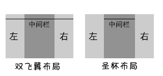
圣杯布局和双飞翼布局基本上是一致的,都是两边固定宽度,中间自适应的三栏布局,其中,中间栏放到文档流前面,保证先行渲染。解决方案大体相同,都是三栏全部float:left浮动,区别在于解决中间栏div的内容不被遮挡上,圣杯布局是中间栏在添加相对定位,并配合left和right属性,效果上表现为三栏是单独分开的(如果可以看到空隙的话),而双飞翼布局是在中间栏的div中嵌套一个div,内容写在嵌套的div里,然后对嵌套的div设置margin-left和margin-right,效果上表现为左右两栏在中间栏的上面,中间栏还是100%宽度,只不过中间栏的内容通过margin的值显示在中间。
效果简图如下:
1、圣杯布局
注意middle写在前面就行了,dom结构如下:

DOM:
<body>
<div id="hd">header</div>
<div id="bd">
  <div id="middle">middle</div>
  <div id="left">left</div>
  <div id="right">right</div>
</div>
<div id="footer">footer</div>
</body>
相对应的CSS内容如下:
<style>
#hd{
    height:50px;
    background: #666;
    text-align: center;
}
#bd{
    /*左右栏通过添加负的margin放到正确的位置了,此段代码是为了摆正中间栏的位置*/
    padding:0 200px 0 180px;
    height:100px;
}
#middle{
    float:left;
    width:100%;/*左栏上去到第一行*/
    height:100px;
    background:blue;
}
#left{
    float:left;
    width:180px;
    height:100px;
    margin-left:-100%;
    background:#0c9;
    /*中间栏的位置摆正之后,左栏的位置也相应右移,通过相对定位的left恢复到正确位置*/
    position:relative;
    left:-180px;
}
#right{
    float:left;
    width:200px;
    height:100px;
    margin-left:-200px;
    background:#0c9;
    /*中间栏的位置摆正之后,右栏的位置也相应左移,通过相对定位的right恢复到正确位置*/
    position:relative;
    right:-200px;
}
#footer{
    height:50px;
    background: #666;
    text-align: center;
}
</style>
2、双飞翼布局
DOM代码如下:
<body>
<div id="hd">header</div>
  <div id="middle">
    <div id="inside">middle</div>
  </div>
  <div id="left">left</div>
  <div id="right">right</div>
  <div id="footer">footer</div>
</body>
双飞翼布局是在middle的div里又插入一个div,通过调整内部div的margin值,实现中间栏自适应,内容写到内部div中。
CSS代码如下:
<style>
#hd{
    height:50px;
    background: #666;
    text-align: center;
}
#middle{
    float:left;
    width:100%;/*左栏上去到第一行*/
    height:100px;
    background:blue;
}
#left{
    float:left;
    width:180px;
    height:100px;
    margin-left:-100%;
    background:#0c9;
}
#right{
    float:left;
    width:200px;
    height:100px;
    margin-left:-200px;
    background:#0c9;
}

/*给内部div添加margin,把内容放到中间栏,其实整个背景还是100%*/
#inside{
    margin:0 200px 0 180px;
    height:100px;
}
#footer{
   clear:both; /*记得清楚浮动*/
   height:50px;
   background: #666;
   text-align: center;
}
</style>