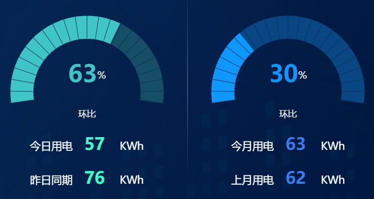
成果图展示

常用配置项
type类型'guage'
代码如下
<template>
    <div class="water-wave">
        <div class="paner" ref="panerEcharts"></div>
    </div>
</template>

<script lang="ts">
import { defineComponent, onMounted, ref } from 'vue';
import * as echarts from 'echarts';


export default defineComponent({
    name: 'guage',
    setup() {
        // 组件逻辑
        const panerEcharts = ref<HTMLElement>();
        onMounted(() => {
            initpanerEcharts();
        });
        const initpanerEcharts = () => {
            let myChart = echarts.init(panerEcharts.value!);
            // let value = 0.6;
            // 把配置和数据放这里
            const dataArr = [
                {
                    value: 91,
                    name: '环比',
                },
            ];
            const color = new echarts.graphic.LinearGradient(0, 0, 1, 0, [
                {
                    offset: 0,
                    color: '#3fc5c5', // 0% 处的颜色
                },
                {
                    offset: 1,
                    color: '#0dd2db', // 100% 处的颜色
                },
            ]);
            const colorSet = [
                [0.91, color],
                [1, '#154e66'],
            ];
            const rich = {
                white: {
                    fontSize: 20,
                    color: '#fff',
                    fontWeight: '500',
                },
                bule: {
                    fontSize: 35,
                    fontFamily: 'DINBold',
                    color: '#fff',
                    fontWeight: '700',
                },
                // radius: {
                //     width: 250,
                //     height: 80,
                //     // lineHeight:80,
                //     borderWidth: 1,
                //     borderColor: '#0092F2',
                //     fontSize: 30,
                //     color: '#fff',
                //     backgroundColor: '#1B215B',
                //     borderRadius: 20,
                //     textAlign: 'center',
                // },
                // size: {
                //     height: 400,
                //     // padding: [100, 0, 0, 0],
                // },
            };
            /* detail: {
                formatter: function (value: number) {
                                var num = Math.round(value);
                                return '{bule|' + num + '}{white|%}';
                            },
                            rich: rich,
                            // offsetCenter: ['0%', '0%'],
                        },*/
            myChart.setOption({

                backgroundColor: "rgb(3, 30, 74)",
                tooltip: {
             formatter: '{a} <br/>{b} : {c}%',
          },

             series: [
        {
            type: 'gauge',
            radius: '100%',
            startAngle: '200',
            endAngle: '-15',
            pointer: {
                show: false,
            },
            detail: {
                formatter: function (value: number) {
                    var num = Math.round(value);
                    return '{bule|' + num + '}{white|%}';
                },
                rich: rich,
                offsetCenter: ['0%', '0%'],
            },

            data: dataArr,
            title: {
                show: true,
                color: '#fff',
                offsetCenter: ['0', '75%'],
                fontSize: 20
            },
            axisLine: {
                show: true,
                lineStyle: {
                    color: colorSet,
                    width: 45,
                    shadowOffsetX: 0,
                    shadowOffsetY: 0,
                    opacity: 1,
                },
            },
            splitLine: { // 分隔线样式。
                        show: true, // 是否显示分隔线。
                        distance: -50, // 分隔线与轴线的距离。
                        length: 50, // 分隔线线长。支持相对半径的百分比。
                        lineStyle: { // { color , width , type , dashOffset , cap , join , miterLimit , shadowBlur , shadowColor , shadowOffsetX , shadowOffsetY , opacity }
                            color: '#031E4A',
                            width: 4
                        }
                    },
    //         axisTick: {
    //             show: false,
    //             length: 635,
    //             lineStyle: {
    //                 color: '#031E4A',
    //                 width: 2,
    //                 type: 'solid',
    //             },
    //         },
    //         splitLine: {
    //     show: true,
    //     length: 380,
    //     lineStyle: {
    //       width: 2,
    //       color: "red",
    //      },
    //    },
    splitNumber: 22, // 刻度的分割段数。
            axisLabel: {
                show: false,
            },
    axisTick: {
                show: false
            },
            // splitLine: {
            //     length: 164,
            //     lineStyle: {
            //         width: 3,
            //         color: "#031E4A"
            //     }
            // },

            // axisLine: {
            //     lineStyle: {
            //         opacity: 0
            //     }
            // },

        },
    ],
            });
        };

        return { panerEcharts };
    },
});
</script>

<style lang="scss" scoped>
.paner {
    margin-left: vw(10);
    margin-top: vh(30);
    width: vw(230);
    height: vh(170);
}
</style>
参考代码如下
参考文档:https://echarts.apache.org/zh/option.html#series-gauge.axisLine
echarts的demo:https://echarts.apache.org/examples/zh/editor.html?c=gauge-stage
import { Pieces } from "./share/pieces";

/**
 * 仪表盘
 * 文档:https://echarts.apache.org/zh/option.html#series-gauge.axisLine
 * demo:https://echarts.apache.org/examples/zh/editor.html?c=gauge-stage
 */
export class Dashboard {
    constructor(myChart) {
        myChart.setOption(this.getOptions());
        this.doRandomStyle(myChart);
    }

    /**
     * 设置随机样式
     */
    doRandomStyle(myChart) {
        let self = this;
        setInterval(function () {
            myChart.setOption({
                series: [
                    {
                        data: [
                            {
                                value: +(Math.random() * 100).toFixed(2)
                            }
                        ],
                        axisLine: {
                            lineStyle: {
                                color: self.getRandomRange(), // 颜色区间设置
                            }
                        }
                    }
                ]
            });
        }, 2000);
    }

    getOptions() {
        return {
            series: [
                {
                    type: 'gauge',
                    center: [ 400, 400 ], // 的中心(圆心)坐标,数组的第一项是横坐标,第二项是纵坐标。
                    // center : ['50%', '50%'], // 支持设置成百分比,设置成百分比时第一项是相对于容器宽度,第二项是相对于容器高度。
                    // radius: '55%', // 仪表盘半径
                    radius: 240, // 仪表盘半径
                    startAngle: 225, // 仪表盘起始角度。圆心 正右手侧为0度,正上方为90度,正左手侧为180度。默认 225
                    endAngle: -45, // 仪表盘结束角度。默认 -45
                    clockwise: true, // 仪表盘刻度是否是顺时针增长。 默认 true
                    splitNumber: 10, // 刻度的分割段数。
                    min: 0, // 最小的数据值,映射到 minAngle。
                    max: 120, // 最大的数据值,映射到 maxAngle。
                    axisLine: { // 仪表盘轴线相关配置。
                        show: true, // 是否显示仪表盘轴线。
                        roundCap: false, // 是否在两端显示成圆形。
                        lineStyle: { // 仪表盘轴线样式。 { color , width , shadowBlur , shadowColor , shadowOffsetX , shadowOffsetY , opacity }
                            width: 30,
                            color: this.getRandomRange(), // 颜色区间设置
                        }
                    },
                    pointer: { // 仪表盘指针。
                        show: true, // 是否显示指针。
                        showAbove: true, // 指针是否显示在标题和仪表盘详情上方。
                        // icon:'none', // ECharts 提供的标记类型包括 circle|rect|roundRect|triangle|diamond|pin|arrow|none,可以通过 'image://url' 设置为图片,其中 URL 为图片的链接,或者 dataURI。
                        offsetCenter: [ 0, 0 ], // 相对于仪表盘中心的偏移位置,数组第一项是水平方向的偏移,第二项是垂直方向的偏移。可以是绝对的数值,也可以是相对于仪表盘半径的百分比。
                        length: '60%', // 指针长度,可以是绝对数值,也可以是相对于半径的半分比。
                        width: 10, // 指针宽度。
                        itemStyle: { // 指针样式。{ color , borderColor , borderWidth , borderType , borderDashOffset , borderCap , borderJoin , borderMiterLimit , shadowBlur , shadowColor , shadowOffsetX , shadowOffsetY , opacity }
                            color: 'auto'
                        }
                    },
                    anchor: { // 表盘中指针的固定点。跟仪表盘指针配置差不多
                        show: true,
                        size: 10,
                        showAbove: true, // 固定点是否显示在指针上面。
                        icon: 'circle', // ECharts 提供的标记类型包括 circle|rect|roundRect|triangle|diamond|pin|arrow|none,可以通过 'image://url' 设置为图片,其中 URL 为图片的链接,或者 dataURI。
                        offsetCenter: [ 0, 0 ], // 相对于仪表盘中心的偏移位置,数组第一项是水平方向的偏移,第二项是垂直方向的偏移。可以是绝对的数值,也可以是相对于仪表盘半径的百分比。
                        itemStyle: { // 指针样式。{ color , borderColor , borderWidth , borderType , borderDashOffset , borderCap , borderJoin , borderMiterLimit , shadowBlur , shadowColor , shadowOffsetX , shadowOffsetY , opacity }
                            color: '#fff'
                        }
                    },
                    splitLine: { // 分隔线样式。
                        show: true, // 是否显示分隔线。
                        distance: -30, // 分隔线与轴线的距离。
                        length: 30, // 分隔线线长。支持相对半径的百分比。
                        lineStyle: { // { color , width , type , dashOffset , cap , join , miterLimit , shadowBlur , shadowColor , shadowOffsetX , shadowOffsetY , opacity }
                            color: '#fff',
                            width: 4
                        }
                    },
                    axisTick: { // 刻度样式。
                        show: true, // 是否显示刻度。
                        splitNumber: 5, // 分隔线之间分割的刻度数。默认 5
                        distance: -30, // 分隔线与轴线的距离。
                        length: 8, // 刻度线长。支持相对半径的百分比。
                        lineStyle: { // { color , width , type , dashOffset , cap , join , miterLimit , shadowBlur , shadowColor , shadowOffsetX , shadowOffsetY , opacity }
                            color: '#fff',
                            width: 2
                        }
                    },
                    axisLabel: {
                        show: true, // 是否轴线显示标签。
                        color: 'auto', // 文字的颜色。 默认 auto 归属区间颜色
                        fontStyle: 'normal', // 文字字体的风格。 normal|italic|oblique
                        fontWeight: 'bold', // 文字字体的粗细。 normal|bold|bolder|lighter
                        distance: 40, // 标签与刻度线的距离。
                        fontSize: 20, // 字体样式相关
                        // formatter: '{value} km/h', // 刻度标签的内容格式器,支持字符串模板和回调函数两种形式。
                        // formatter: function (value) {
                        //     return value + 'km/h';
                        // },
                    },
                    detail: { // 仪表盘详情,用于显示数据。
                        show: true, // 是否显示详情。
                        valueAnimation: true, // 是否开启标签的数字动画。
                        formatter: '{value} km/h', // 格式化函数或者字符串
                        color: 'auto', // 文本颜色,默认取数值所在的区间的颜色。
                        offsetCenter: [ 0, '40%' ], // 相对于仪表盘中心的偏移位置,数组第一项是水平方向的偏移,第二项是垂直方向的偏移。可以是绝对的数值,也可以是相对于仪表盘半径的百分比。
                        // 字体相关样式
                    },
                    data: [
                        {
                            value: 70,
                            itemStyle: { // 数据项的指针样式。
                                color: 'auto', // 图形的颜色。
                                borderWidth: 1, // 描边线宽。为 0 时无描边。
                                borderColor: '#eee',
                            }
                        }
                    ],
                }
            ]
        };
    }

    /**
     * 获取随机颜色区间配置
     * @return [
     *    [ 0.3, '#67e0e3' ],
     *    [ 0.7, '#37a2da' ],
     *    [ 1, '#fd666d' ]
     * ]
     */
    getRandomRange() {
        let arr = Pieces.getRandomPercentByCount(5);
        let res = [];
        let num = 0;
        for (let i = 0; i < arr.length; i++) {
            num += arr[i];
            res.push([ num, Pieces.getColor() ]);
        }
        return res;
    }
}
封装为vue3+ts使用的组件
扫描二维码关注公众号,回复:
14982817 查看本文章

<template></template>
<script lang="ts" setup>
// 1. 引入
import echarts from '@/assets/ts/echarts';
import { nextTick, watch } from 'vue';
import useResizeChart from '@/components/CommonChart/hooks/useResizeChart';
const props = defineProps({
    // 父容器ID
    pid: {
        type: String,
        required: true,
    },
    value: {
        type: Number,
        required: true,
    },
    title: {
        type: String,
        defalut: '',
    },
    // 已完成进度的颜色
    color: {
        type: String,
        required: true,
    },
    // 未完成进度的颜色
    bgColor: {
        type: String,
        required: true,
    },
});
nextTick(() => {
    // 2. 容器
    const container = document.querySelector('#' + props.pid) as HTMLElement;
    if (container) initChart(container);
});

// 3. 初始化 echarts 实例, 将配置添加给 echarts 实例
let myChart: echarts.ECharts | null = null;
const initChart = (container?: HTMLElement) => {
    if (!myChart) {
        myChart = echarts.init(container as HTMLElement);
        useResizeChart(container as HTMLElement, myChart);
    }
    myChart.setOption(option);
};

// 4. 配置项
const option = {
    title: [
        {
            text: '{a|' + props.value + '}{c|%}',
            x: 'center',
            y: '30%',
            textStyle: {
                rich: {
                    a: {
                        fontSize: 48,
                        // color: '#3fc5c5',
                        color: props.color,
                        fontWeight: 'bold',
                    },
                    c: {
                        fontSize: 20,
                        color: '#ffffff',
                    },
                },
            },
        },
        {
            text: props.title,
            x: 'center',
            y: '60%',
            textStyle: {
                color: '#fff',
                fontSize: 18,
                fontWeight: 'normal',
            },
        },
    ],
    series: [
        {
            name: '',
            type: 'pie',
            radius: ['100%', '70%'],
            //图形是否不响应和触发鼠标事件
            silent: true,
            // 饼图的扇区是否是顺时针排布
            clockwise: true,
            // 起始角度,支持范围[0, 360]
            startAngle: (360 * 0.6) / 2 + 80,
            // startAngle: 180,
            z: 0,
            zlevel: 0,
            // 指示
            label: {
                position: 'center',
            },
            data: [
                {
                    value: props.value,
                    name: '',
                    itemStyle: {
                        color: props.color,
                    },
                },
                {
                    value: 100 / 0.6 - (100 / 0.6) * 0.4 - props.value,
                    name: '',
                    label: {
                        show: false,
                    },
                    itemStyle: {
                        color: props.bgColor,
                    },
                },
                {
                    value: (100 / 0.6) * 0.5,
                    name: '',
                    label: {
                        show: false,
                    },
                    itemStyle: {
                        color: 'transparent',
                        // color: '#fff',
                    },
                },
            ],
        },
        {
            name: '',
            // 仪表盘类型
            type: 'gauge',
            // radius: "62.7%",
            // 仪表盘半径
            radius: '120%',
            center: ['50%', '50%'],
            startAngle: '188',
            endAngle: '-8',
            // 仪表盘刻度的分割段数
            splitNumber: 22,
            // hoverAnimation: true,
            // 刻度样式
            axisTick: {
                show: false,
                // show: true,
                length: 15,
            },
            // 分隔线样式
            splitLine: {
                // 分隔线与轴线的距离。
                distance: 15,
                length: 52,
                lineStyle: {
                    width: 1,
                    color: '#0a3150',
                },
            },
            // 刻度标签
            axisLabel: {
                show: false,
            },
            // 仪表盘指针
            pointer: {
                show: false,
            },
            // 仪表盘轴线相关配置
            axisLine: {
                lineStyle: {
                    opacity: 0,
                },
            },
            // 仪表盘详情,用于显示数据
            detail: {
                show: false,
            },
            data: [{ name: '', value: 0 }],
        },
    ],
};

watch(
    () => props.value,
    newVal => {
        option.series[0].data[0].value = newVal;
        option.series[0].data[1].value = 100 / 0.6 - (100 / 0.6) * 0.4 - newVal;

        initChart();
    },
);
</script>
使用组件
    <div class="left">
                    <div class="energy-title">日</div>
                    <div id="left-gauge">
                        <Gauge color="#3fc5c5" bgColor="#154e66" pid="left-gauge" :value="curSiteInfo.dayCompare"
                            title="环比"></Gauge>
                    </div>
                    <div class="info">
                        <p> 今日用电<span>{

   {curSiteInfo.EPIToday}}</span> KWh</p>
                        <p> 昨日同期<span>{

   {curSiteInfo.EPIYesterday}}</span> KWh</p>
                    </div>
                </div>

                <div class="right">

                    <div class="energy-title">月</div>
                    <div id="right-gauge">
                        <Gauge color="#0d97ff" bgColor="#094784" pid="right-gauge" :value="curSiteInfo.monthCompare"
                            title="环比"></Gauge>
                    </div>
                    <div class="info">
                        <p> 今月用电<span>{

   {curSiteInfo.EPIThisMonth}}</span> KWh</p>
                        <p> 上月用电<span>{

   {curSiteInfo.EPILastMonth}}</span> KWh</p>
                    </div>
                </div>
#right-gauge,
#left-gauge {
// width: vw(300);
width: 100%;
height: vh(260);
margin-top: 10%;
}粗略记