版权声明:本文为博主原创文章,转载请带上我的小名嘿嘿嘿 https://blog.csdn.net/qq_37540004/article/details/80456592
<template>
<div>
<div id="highCharts" style="width: 400px; height: 300px;"></div>
</div>
</template>
<script>
// 最主要是这里模块的引入 很坑
import Highcharts from 'highcharts/highstock';
// 这个一定要引入 不然报错
import HighchartsMore from 'highcharts/highcharts-more';
import SolidGauge from 'highcharts/modules/solid-gauge.js'
HighchartsMore(Highcharts)
SolidGauge(Highcharts);
Highcharts.setOptions({
chart: {
type: 'solidgauge'
},
title: null,
pane: {
center: ['50%', '85%'],
size: '140%',
startAngle: -90,
endAngle: 90,
background: {
backgroundColor: (Highcharts.theme && Highcharts.theme.background2) || '#EEE',
innerRadius: '60%',
outerRadius: '100%',
shape: 'arc'
}
},
tooltip: {
enabled: false
},
yAxis: {
stops: [
[0.1, '#55BF3B'], // green
[0.5, '#DDDF0D'], // yellow
[0.9, '#DF5353'] // red
],
lineWidth: 0,
minorTickInterval: null,
tickPixelInterval: 400,
tickWidth: 0,
title: {
y: -70
},
labels: {
y: 16
}
},
plotOptions: {
solidgauge: {
dataLabels: {
y: 5,
borderWidth: 0,
useHTML: true
}
}
}
});
export default {
mounted(){
this.init();
},
data(){
return {
}
},
methods:{
init(){
this.draw();
},
draw(){
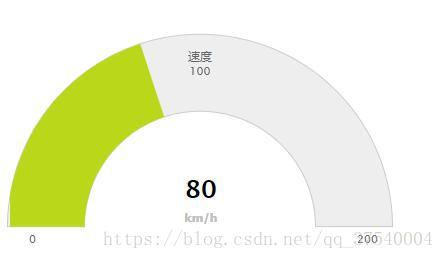
new Highcharts.chart('highCharts', {
yAxis: {
min: 0,
max: 200,
title: {
text: '速度'
}
},
credits: {
enabled: false
},
series: [{
name: '速度',
data: [80],
dataLabels: {
format: '<div style="text-align:center"><span style="font-size:25px;color:' +
((Highcharts.theme && Highcharts.theme.contrastTextColor) || 'black') + '">{y}</span><br/>' +
'<span style="font-size:12px;color:silver">km/h</span></div>'
},
tooltip: {
valueSuffix: ' km/h'
}
}]
});
}
}
}
</script>
<style lang="stylus">
</style>