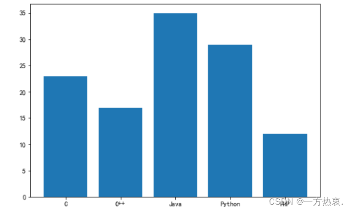
绘制柱状图:
import matplotlib.pyplot as plt
#创建图形对象
fig = plt.figure()
#添加子图区域,参数值表示[left, bottom, width, height ]
ax = fig.add_axes([0,0,1,1])
#准备数据
langs = ['C', 'C++', 'Java', 'Python', 'PHP']
students = [23,17,35,29,12]
#绘制柱状图
ax.bar(langs,students)
plt.show()
result:
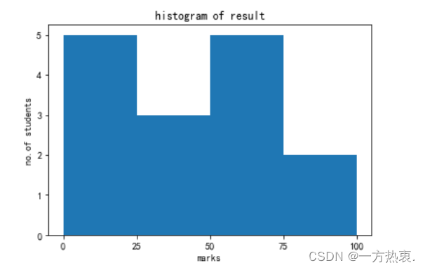
直方图:
from matplotlib import pyplot as plt
import numpy as np
#创建图形对象和轴域对象
fig,ax = plt.subplots(1,1)
a = np.array([22,87,5,43,56,73,55,54,11,20,51,5,79,31,27])
#绘制直方图
ax.hist(a, bins = [0,25,50,75,100])
#设置坐标轴
ax.set_title("histogram of result")
ax.set_xticks([0,25,50,75,100])
ax.set_xlabel('marks')
ax.set_ylabel('no.of students')
plt.show()
result:
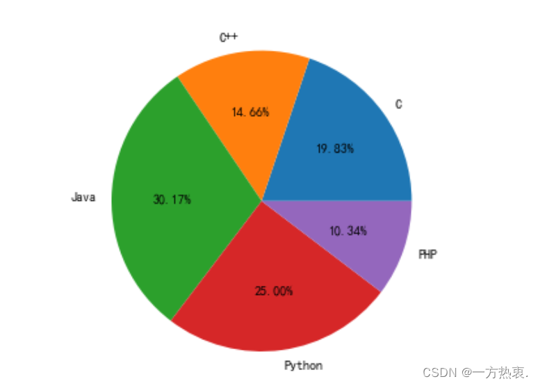
饼状图:
from matplotlib import pyplot as plt
import numpy as np
#添加图形对象
fig = plt.figure()
ax = fig.add_axes([0,0,1,1])
#使得X/Y轴的间距相等
ax.axis('equal')
#准备数据
langs = ['C', 'C++', 'Java', 'Python', 'PHP']
students = [23,17,35,29,12]
#绘制饼状图
ax.pie(students, labels = langs,autopct='%1.2f%%')
plt.show()
result:
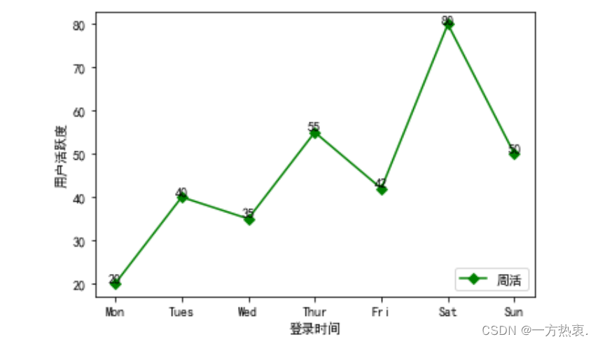
单折线图:
import matplotlib.pyplot as plt
#准备绘制数据
x = ["Mon", "Tues", "Wed", "Thur", "Fri","Sat","Sun"]
y = [20, 40, 35, 55, 42, 80, 50]
# "g" 表示红色,marksize用来设置'D'菱形的大小
plt.plot(x, y, "g", marker='D', markersize=5, label="周活")
#绘制坐标轴标签
plt.xlabel("登录时间")
plt.ylabel("用户活跃度")
#显示图例
plt.legend(loc="lower right")
#调用 text()在图像上绘制注释文本
#x1、y1表示文本所处坐标位置,ha参数控制水平对齐方式, va控制垂直对齐方式,str(y1)表示要绘制的文本
for x1, y1 in zip(x, y):
    plt.text(x1, y1, str(y1), ha='center', va='bottom', fontsize=10)
#保存图片
plt.show()
result:
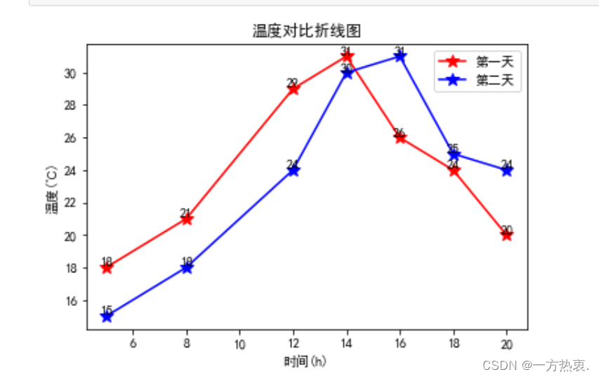
多折线图:
import matplotlib.pyplot as plt
#对比两天内同一时刻温度的变化情况
x = [5, 8, 12, 14, 16, 18, 20]
y1 = [18, 21, 29, 31, 26, 24, 20]
y2 = [15, 18, 24, 30, 31, 25, 24]
#绘制折线图,添加数据点,设置点的大小
# * 表示绘制五角星;此处也可以不设置线条颜色,matplotlib会自动为线条添加不同的颜色
plt.plot(x, y1, 'r',marker='*', markersize=10)
plt.plot(x, y2, 'b', marker='*',markersize=10)
plt.title('温度对比折线图')  # 折线图标题
plt.xlabel('时间(h)')  # x轴标题
plt.ylabel('温度(℃)')  # y轴标题
#给图像添加注释,并设置样式
for a, b in zip(x, y1):
    plt.text(a, b, b, ha='center', va='bottom', fontsize=10)
for a, b in zip(x, y2):
    plt.text(a, b, b, ha='center', va='bottom', fontsize=10)
#绘制图例
plt.legend(['第一天', '第二天'])
#显示图像
plt.show()
results:
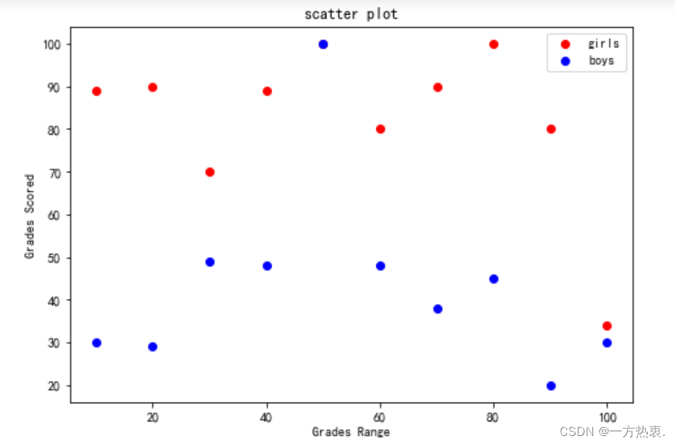
散点图:
import matplotlib.pyplot as plt
girls_grades = [89, 90, 70, 89, 100, 80, 90, 100, 80, 34]
boys_grades = [30, 29, 49, 48, 100, 48, 38, 45, 20, 30]
grades_range = [10, 20, 30, 40, 50, 60, 70, 80, 90, 100]
fig=plt.figure()
#添加绘图区域
ax=fig.add_axes([0,0,1,1])
ax.scatter(grades_range, girls_grades, color='r',label="girls")
ax.scatter(grades_range, boys_grades, color='b',label="boys")
ax.set_xlabel('Grades Range')
ax.set_ylabel('Grades Scored')
ax.set_title('scatter plot')
#添加图例
plt.legend()
plt.show()
result: