css:
style.css
@charset "utf-8";
*{
    margin: 0;
    padding: 0;
}
body{
    /*background:url(../img/preview.png);*/
    max-width: 100%;
    min-width: 100%;
    height: 100%;
    background-size: cover;
    background-repeat:no-repeat;
    background-attachment: fixed;
    background-size: 100% 100%;
    position: absolute;
    margin-left: auto;
    margin-right: auto;
}
li{
    list-style: none;
}
.box{
    width: 200px;
    height: 200px;
    background-size: cover;
    background-repeat: no-repeat;
    background-attachment: fixed;
    background-size: 100% 100%;
    position: absolute;
    margin-left: 42%;
    margin-top: 22%;
    -webkit-transform-style: preserve-3d;
    -webkit-transform: rotateX(13deg);
    -webkit-animation: move 5s linear infinite;
}
.minbox{
    width: 100px;
    height: 100px;
    position: absolute;
    left: 50px;
    top: 30px;
    -webkit-transform-style: preserve-3d;
}
.minbox li{
    width: 100px;
    height: 100px;
    position: absolute;
    left: 0;
    top: 0;

}
.minbox li:nth-child(1){
    background: url("../img/01.jpg")no-repeat 0 0;
    -webkit-transform: translateZ(50px);
}
.minbox li:nth-child(2){
    background: url("../img/02.jpg")no-repeat 0 0;
    -webkit-transform: rotateX(180deg)
    translateZ(50px);
}
.minbox li:nth-child(3){
    background: url("../img/03.jpg")no-repeat 0 0;
    -webkit-transform: rotateX(-90deg)
    translateZ(50px);
}
.minbox li:nth-child(4){
    background: url("../img/04.jpg")no-repeat 0 0;
    -webkit-transform: rotateX(90deg)
    translateZ(50px);
}
.minbox li:nth-child(5){
    background: url("../img/05.jpg")no-repeat 0 0;
    -webkit-transform: rotateY(-90deg)
    translateZ(50px);
}
.minbox li:nth-child(6){
    background: url("../img/06.jpg")no-repeat 0 0;
    -webkit-transform: rotateY(90deg)
    translateZ(50px);
}
.maxbox li:nth-child(1){
    background: url("../img/1.jpg")no-repeat 0 0;
    -webkit-transform: translateZ(50px);
}
.maxbox li:nth-child(2){
    background: url("../img/2.jpg")no-repeat 0 0;
    -webkit-transform: translateZ(50px);
}
.maxbox li:nth-child(3){
    background: url("../img/3.jpg")no-repeat 0 0;
    -webkit-transform: rotateX(-90deg)
    translateZ(50px);
}
.maxbox li:nth-child(4){
    background: url("../img/4.jpg")no-repeat 0 0;
    -webkit-transform: rotateX(90deg)
    translateZ(50px);
}
.maxbox li:nth-child(5){
    background: url("../img/5.jpg")no-repeat 0 0;
    -webkit-transform: rotateY(-90deg)
    translateZ(50px);
}
.maxbox li:nth-child(6){
    background: url("../img/6.jpg")no-repeat 0 0;
    -webkit-transform: rotateX(90deg)
    translateZ(50px);
}
.maxbox{
    width: 800px;
    height: 400px;
    position: absolute;
    left:0;
    top: -20px;
    -webkit-transform-style: preserve-3d;
}
.maxbox li{
    width: 200px;
    height: 200px;
    background: #fff;
    border: 1px solid #ccc;
    position: absolute;
    left: 0;
    top: 0;
    opacity: 0.2;
    -webkit-transition: all 1s ease;
}
.maxbox li:nth-child(1){
    -webkit-transform: translateZ(100px);
}
.maxbox li:nth-child(2){
    -webkit-transform: rotateX(180deg)
    translateZ(100px);
}
.maxbox li:nth-child(3){
    -webkit-transform: rotateX(-90deg)
    translateZ(100px);
}
.maxbox li:nth-child(4){
    -webkit-transform: rotateX(90deg)
    translateZ(100px);
}
.maxbox li:nth-child(5){
    -webkit-transform: rotateY(-90deg)
    translateZ(100px);
}
.maxbox li:nth-child(6){
    -webkit-transform: rotateY(90deg)
    translateZ(100px);
}
.box:hover ol li:nth-child(1){
    -webkit-transform: translateZ(300px);
    width: 400px;
    height: 400px;
    opacity: 0.8;
    left: -100px;
    top: -100px;
}
.box:hover ol li:nth-child(2){
    -webkit-transform: rotateX(180deg)
    translateZ(300px);
    width: 400px;
    height: 400px;
    opacity: 0.8;
    left: -100px;
    top: -100px;
}
.box:hover ol li:nth-child(3){
    -webkit-transform: rotateX(-90deg)
    translateZ(300px);
    width: 400px;
    height: 400px;
    opacity: 0.8;
    left: -100px;
    top: -100px;
}
.box:hover ol li:nth-child(4){
    -webkit-transform: rotateX(90deg)
    translateZ(300px);
    width: 400px;
    height: 400px;
    opacity: 0.8;
    left: -100px;
    top: -100px;
}
.box:hover ol li:nth-child(5){
    -webkit-transform: rotateY(-90deg)
    translateZ(300px);
    width: 400px;
    height: 400px;
    opacity: 0.8;
    left: -100px;
    top: -100px;
}
.box:hover ol li:nth-child(6){
    -webkit-transform: rotateY(90deg)
    translateZ(300px);
    width: 400px;
    height: 400px;
    opacity: 0.8;
    left: -100px;
    top: -100px;
}
@keyframes move {
    0%{
        -webkit-transform: rotateX(13deg) rotateY(0deg);
    }
    100%{
        -webkit-transform: rotateX(13deg) rotateY(360deg);
    }
}

index.html
<!DOCTYPE html>
<html lang="en">
<head>
    <meta charset="UTF-8">
    <title>3d立体</title>
    <link type="text/css" href="css/style.css" rel="stylesheet"/>
</head>
<body>
<div class="box">
    <ul class="minbox">
        <li></li>
        <li></li>
        <li></li>
        <li></li>
        <li></li>
        <li></li>
    </ul>
    <ol class="maxbox">
        <li></li>
        <li></li>
        <li></li>
        <li></li>
        <li></li>
        <li></li>
    </ol>
</div>
<!--<script src="js/three.min.js"></script>-->
<!--<script src="js/TweenMax.min.js"></script>-->
<!--<script src="js/dat.gui.min.js"></script>-->
<!--<script src="js/randomColor.min.js"></script>-->
<!--<script src="js/OrbitControls.js"></script>-->
<!--<script src="js/index.js"></script>-->
</body>
</html>
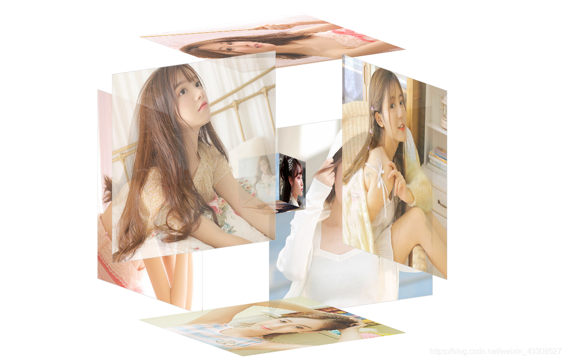
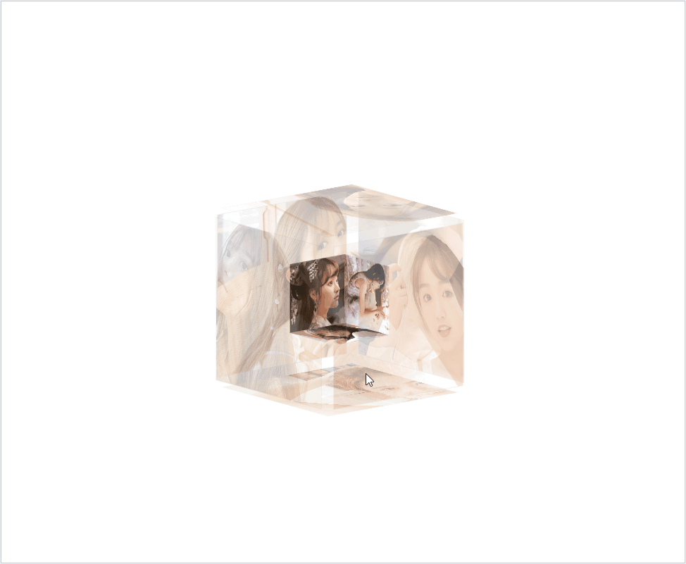
展示效果: