最近接到一个需求,要实现一个带图片的导航栏效果:
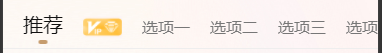

具体的需求有:
1,导航数据中如果选项图片不为空,则显示图片不显示文字;
2,选中项文字凸显,是图片的情况,图片尺寸变大;
3,指示器跟随移动;
接到需求翻了下资料,没找到有现成的框架可以用,基本都是纯文字的导航功能,看来只能自己写一个了。
先上代码结构和样式代码:
<template>
<view ref="tabs" class="tabs">
<view ref="tabsContent" class="tabs-content">
<view
v-for="(item, index) in list"
:ref="'LEl_' + index"
:class="['tabs-item', 'LEl_' + index, index == current ? 'active' : '']"
@click="change(index)"
>
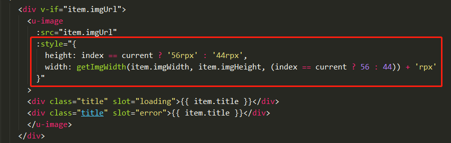
<div v-if="item.imgUrl">
<u-image
:src="item.imgUrl"
:style="{
height: index == current ? '56rpx' : '44rpx',
width: getImgWidth(item.imgWidth, item.imgHeight, (index == current ? 56 : 44)) + 'rpx'
}"
>
<div class="title" slot="loading">{
{ item.title }}</div>
<div class="title" slot="error">{
{ item.title }}</div>
</u-image>
</div>
<div v-else>
{
{item.title}}
</div>
</view>
<!-- 滑块 -->
<view ref="scrollBar" class="u-scroll-bar"></view>
</view>
</view>
</template><style lang="scss" scoped>
.tabs{
box-sizing: border-box;
overflow-x: scroll;
background-color: #fff;
.tabs-content{
position: relative;
width: max-content;
min-width: 100%;
padding: 22rpx 20rpx 20rpx;
display: flex;
align-items: flex-end;
border-bottom: 2rpx solid #EEEEEE;
.tabs-item{
display: flex;
align-items: flex-end;
position: relative;
bottom: 0;
height: 56rpx;
box-sizing: content-box;
margin: 0 20rpx;
font-size: 32rpx;
font-weight: 400;
color: #777;
line-height: 44rpx;
&.active{
font-size: 40rpx;
color: #111;
font-weight: 500;
line-height: 56rpx;
}
.title{
font-size: 32rpx;
font-weight: 400;
color: #777;
line-height: 44rpx;
}
}
}
}
//
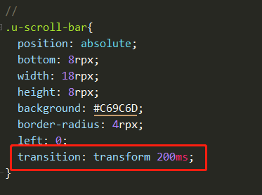
.u-scroll-bar{
position: absolute;
bottom: 8rpx;
width: 18rpx;
height: 8rpx;
background: #C69C6D;
border-radius: 4rpx;
left: 0;
transition: transform 200ms;
}
/deep/ .u-image__error{
background-color: transparent;
}
</style>一,图片尺寸问题
开发过程中遇到的第一个问题,就是图片的大小尺寸问题,后台传过来的选项数据是这样的:
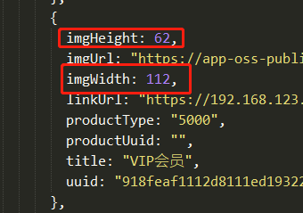
当有图片的时候,会将该图片的实际宽高尺寸一起传过来,如果直接使用传过来的尺寸赋值到图片上,显然是不对的,所以我们必须先对宽高做下转化。
已知图片要显示的高度是固定的,宽度是不固定的,由设计效果决定,那么在已知图片的实际宽高和要显示的高度的情况下,我们就可以很简单的计算出图片应该要显示的宽度:
getImgWidth(w, h, showH){
  let showW = showH *  w / h
  return showW
},
然后又因为选中项的图片高度是要比未选中项高的,所以需要对图片的宽高做下判断处理:
二,滑块指示器跟随点击项移动问题
遇到的第二个问题就是,由于选中项的文字或图片是要比一般的文字或图片大的,导致tabs-content容器层的宽度不是固定的,一般的框架,滑块指示器不能很好的居中对齐,这也是我为什么要自己写一个的主要原因。

那么如何解决呢?这里用到了CSS中的transition属性,和js的getBoundingClientRect()方法。
getBoundingClientRect的返回值是一个DOMRect对象,是dom元素到浏览器可视范围的距离(不包含文档被卷起的部分)
通过getBoundingClientRect方法,有了以下对滑块左坐标的计算公式:
滑块x坐标 = 选中项距屏幕左边距 + (选中项宽度+滑块宽度)的一半 - 选项容器到屏幕的左边距
let _tabs = this.$refs.tabs.$el, // tabs容器,宽度等于屏幕尺寸
_scrollBox = this.$refs.tabsContent.$el, // 选项容器,宽度由内容决定
_tabItem = this.$refs["LEl_"+current][0].$el, // 选中tab项
_tabBar = this.$refs.scrollBar.$el; // 滑块指示器
let _tabsRect = _tabs.getBoundingClientRect(),
_scrollBoxRect = _scrollBox.getBoundingClientRect(),
_tabItemRect = _tabItem.getBoundingClientRect(),
_tabBarRect = _tabBar.getBoundingClientRect();
// 滑块x坐标 = 选中项距屏幕左边距 + (选中项宽度+滑块宽度)的一半 - 选项容器到屏幕的左边距
let barLeft = _tabItemRect.left+(_tabItemRect.width - _tabBarRect.width)/2 - _scrollBoxRect.left
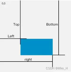
_tabBar.style.transform = "translate3d(" + barLeft + "px,0,0)";三,选中项超过中线后如何滑动到相对屏幕中线的位置?
为了方便理解,我画了下边这张图

选中项的中点位与中线的距离scrolx实际就是我们需要的被卷去的内容宽度,当然,选中项中点位未超过中线的,被卷的距离保持为零。
究竟如何实现呢?贴代码!
// 判断当前tab是否超过中线
        if(barLeft > (_tabsRect.width - _tabBarRect.width)/2){

          // 判断是否已经滑动到最右边,超过可滑动最大值
          if(_tabs.clientWidth + _tabs.scrollLeft >= _tabs.scrollWidth){
          // tabs可视区域宽度 + 被滚动卷去宽度 >= tbas内容宽度的话,滚动位置定位到最右边(最大值)
            let scrollx = _tabs.scrollWidth - _tabs.clientWidth
            _tabs.scrollLeft = scrollx
          }else {
            // 向上取整当前tab与中线的距离,该值为被券去的滚动距离
            let scrollx = Math.ceil(barLeft - _tabsRect.width/2 + _tabBarRect.width/2)

            // 定时器实现滑动效果
            var myMar = setInterval(marquee, 1)

            function marquee(){
              /*
                清除定时器规则:
                1,滚动条位置等于被卷去的距离;
                2,滚动条位置等于可滚动最大值。
              */
              if(_tabs.scrollLeft == scrollx || _tabs.clientWidth + _tabs.scrollLeft == _tabs.scrollWidth) return clearInterval(myMar)

              if(_tabs.scrollLeft < scrollx){
                // 当前滚动条坐标小于需要卷去的距离,向右移动
                _tabs.scrollLeft++
              } else {
                // 当前滚动条坐标大于需要卷去的距离,向左移动
                _tabs.scrollLeft--
              }
            }
          }

        } else {
          // tab未超过中线,滚动距离为0
          _tabs.scrollLeft = 0
        }
至此,一个可滑动居中的导航效果就完成了~