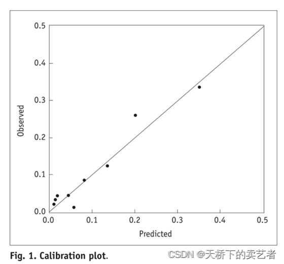
校准曲线图表示的是预测值和实际值的差距,作为预测模型的重要部分,目前很多函数能绘制校准曲线。 一般分为两种,一种是通过Hosmer-Lemeshow检验,把P值分为10等分,求出每等分的预测值和实际值的差距。
我们既往已经通过多篇文章介绍了等分的校准曲线绘制,今天来介绍一下上图这种连续的,线条样的校准曲线绘制
我们先导入R包和数据,继续使用我们的早产数据
library(ggplot2)
library(rms)
bc<-read.csv("E:/r/test/zaochan.csv",sep=',',header=TRUE)
head(bc,6)
##   id low age lwt  race     smoke ptl ht ui ftv  bwt
## 1 85   0  19 182 black nonsmoker   0  0  1   0 2523
## 2 86   0  33 155 other nonsmoker   0  0  0   3 2551
## 3 87   0  20 105 white    smoker   0  0  0   1 2557
## 4 88   0  21 108 white    smoker   0  0  1   2 2594
## 5 89   0  18 107 white    smoker   0  0  1   0 2600
## 6 91   0  21 124 other nonsmoker   0  0  0   0 2622
这是一个关于早产低体重儿的数据(公众号回复:早产数据,可以获得该数据),低于2500g被认为是低体重儿。数据解释如下:low 是否是小于2500g早产低体重儿,age 母亲的年龄,lwt 末次月经体重,race 种族,smoke 孕期抽烟,ptl 早产史(计数),ht 有高血压病史,ui 子宫过敏,ftv 早孕时看医生的次数,bwt 新生儿体重数值。 我们先把分类变量转成因子
bc$race<-ifelse(bc$race=="black",1,ifelse(bc$race=="white",2,3))
bc$smoke<-ifelse(bc$smoke=="nonsmoker",0,1)
bc$race<-factor(bc$race)
bc$ht<-factor(bc$ht)
bc$ui<-factor(bc$ui)
对数据进行比例划分
set.seed(123)
tr1<- sample(nrow(bc),0.6*nrow(bc))##随机无放抽取
bc_train <- bc[tr1,]#60%数据集
bc_test<- bc[-tr1,]#40%数据集
我们先按RMS包的方法来画图,等下做个比较
建立模型
fit1<-lrm(low ~ age + lwt + race + smoke + ptl + ht + ui + ftv,
          x = TRUE, y = TRUE,
         data = bc_train )
绘图
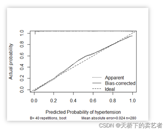
cali <- calibrate(fit1, B = 400)
plot(cali)
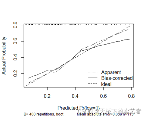
这张图有3条线,ideal就是校准曲线,bisa是对ideal进行的一个校正。下面我们来手动绘制ideal这条校准曲线,我们先用常规方法生成一个模型
fit<-glm(low ~ age + lwt + race + smoke + ptl + ht + ui + ftv,
         family = binomial("logit"),data = bc_train)
options(digits = 3, scipen=999)
生成模型的预测值
predicted <- predict(fit,type = c("response"))
对预测值进行排序,并按区间抽样排列
p <- sort(predicted)
p<-as.numeric(p)
predy <- seq(p[5], p[nrow(bc_train) - 4], length = 50)
把预测值和Y值进行lowess曲线拟合
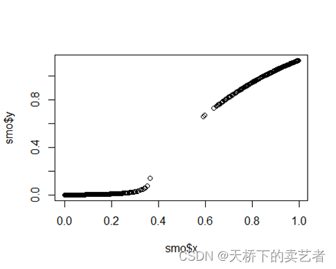
smo <- lowess(predicted, as.numeric(fit$y), iter = 0)
我们可以看一下拟合的情况
plot(smo)
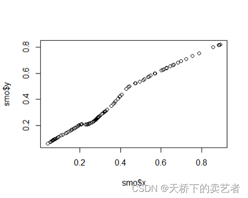
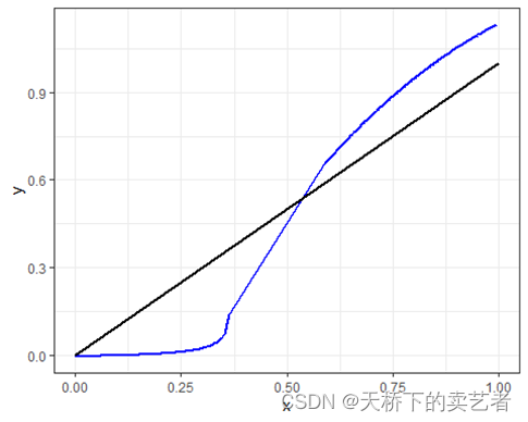
看到了没有,校准曲线已经初具雏形了,现在有两个方法对它进行处理,使用ggplot绘图功能直接拟合或者对这条线进行预测插值。
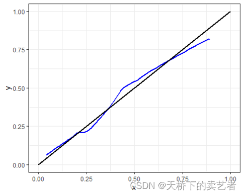
我先使用ggplot绘图绘图试一下,因为ggplot默认就是lowess进行拟合,这个适合数据比较紧凑的数据
plotdat<-as.data.frame(smo)
ggplot(plotdat, aes(x, y))+
  geom_line(aes(x = x, y = y), linewidth=1,col="blue")+
  annotate(geom = "segment", x = 0, y = 0, xend =1, yend = 1,color = "black",size=1)+ theme_minimal()+theme_bw()
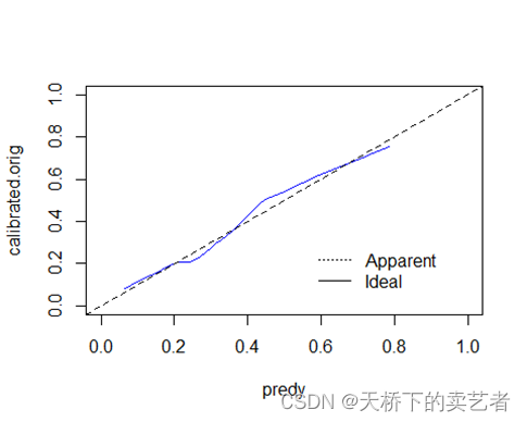
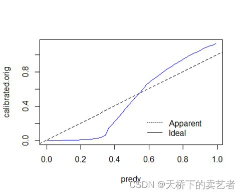
再来就是使用插值法对它插值
calibrated.orig <- approx(smo, xout = predy, ties = function(x) x[1])$y
插值后就可以绘图了
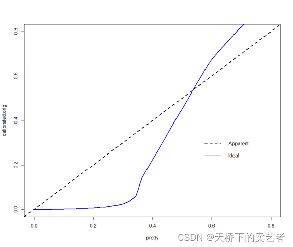
plot(predy, calibrated.orig, type = "l", lty=1, xlim = c(0,1), ylim = c(0,1), col= "blue")
abline(0, 1, lty = 2)
legend <- list(x=0 + .55*diff(c(0,1)), y=0 + .32*diff(c(0,1)))
legend(legend, c("Apparent","Ideal"), lty=c(3,1,2), bty="n")
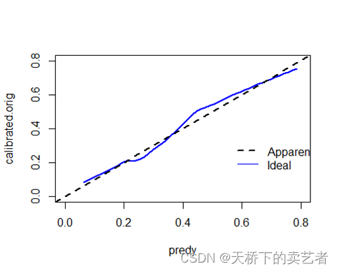
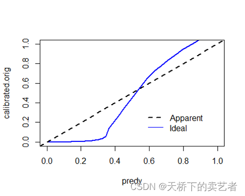
两种画法一样,美化一下
plot(predy, calibrated.orig, type = "l", lty=1,lwd=2, xlim = c(0,0.8), ylim = c(0,0.8), col= "blue")
abline(0,1,col="black",lty=2,lwd=2)
legend(0.55,0.35,
       c("Apparent","Ideal"),
       lty=c(2,1),
       lwd=c(2,1),
       col=c("black","blue"),
       bty="n")
基于这个原理,我们可以应用到其他模型上,比如我们的随机森林模型,我们先导入数据,并对数据进行整理
library(randomForest)
library(pROC)
library(foreign)
bc <- read.spss("E:/r/test/bankloan_cs.sav",
                use.value.labels=F, to.data.frame=T)
bc<-bc[,c(-1:-3,-13:-15,-5)]
head(bc,6)
##   age employ address income debtinc creddebt othdebt default
## 1  28      7       2     44    17.7    2.991    4.80       0
## 2  64     34      17    116    14.7    5.047   12.00       0
## 3  40     20      12     61     4.8    1.042    1.89       0
## 4  30     11       3     27    34.5    1.751    7.56       0
## 5  25      2       2     30    22.4    0.759    5.96       1
## 6  35      2       9     38    10.9    1.462    2.68       1
bc$default<-as.factor(bc$default)
对数据进行7:3划分
set.seed(1)
index <- sample(2,nrow(bc),replace = TRUE,prob=c(0.7,0.3))
traindata <- bc[index==1,]
testdata <- bc[index==2,]
建立随机森林模型
def_ntree<- randomForest(default ~age+employ+address+income+debtinc+creddebt
                         +othdebt,data=traindata,
                         ntree=500,important=TRUE,proximity=TRUE)
生成预测概率,并对Y值概率进行提取
def_pred<-predict(def_ntree, newdata=traindata,type = "prob")##生成概率
def_pred<-as.data.frame(def_pred)
p<-def_pred$`1`
对P值排序并对预测值抽取序列
p1 <- sort(p)
predy <- seq(p1[5], p1[as.numeric(nrow(traindata)) - 4], length = 50)
对预测的X和Y进行lowess回归拟合
smo <- lowess(p, as.numeric(def_ntree$y)-1, iter = 0)
plot(smo)
这个数据不够刚才的连续
plotdat<-as.data.frame(smo)
ggplot(plotdat, aes(x, y))+
  geom_line(aes(x = x, y = y), linewidth=1,col="blue")+
  annotate(geom = "segment", x = 0, y = 0, xend =1, yend = 1,color = "black",size=1)+ theme_minimal()+theme_bw()
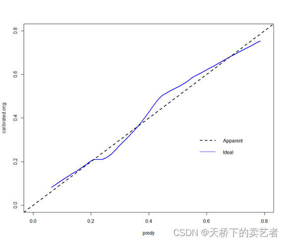
我们使用插值法试一下
calibrated.orig <- approx(smo, xout = predy, ties = function(x) x[1])$y
plot(predy, calibrated.orig, type = "l", lty=1,  col= "blue")
abline(0, 1, lty = 2)
legend <- list(x=0 + .55*diff(c(0,1)), y=0 + .32*diff(c(0,1)))
legend(legend, c("Apparent","Ideal"), lty=c(3,1,2), bty="n")
ties这里使用均值插补也是一样
calibrated.orig <- approx(smo, xout = predy, ties = mean)$y # calibrated.orig
plot(predy, calibrated.orig, type = "l", lty=1,  col= "blue")
abline(0, 1, lty = 2)
legend <- list(x=0 + .55*diff(c(0,1)), y=0 + .32*diff(c(0,1)))
legend(legend, c("Apparent","Ideal"), lty=c(3,1,2), bty="n")

美化一下
plot(predy, calibrated.orig, type = "l", lty=1,lwd=2, xlim = c(0,1), ylim = c(0,1), col= "blue")
abline(0,1,col="black",lty=2,lwd=2)
legend(0.55,0.35,
       c("Apparent","Ideal"),
       lty=c(2,1),
       lwd=c(2,1),
       col=c("black","blue"),
       bty="n")
基于这个方法,我们就可以制作出大部分模型的连续的校准曲线了。
我也随手写了一个gg5小程序,其实也没有什么,就是把过程打包一下,省点你的时间,你按我的方法完全可以复制出来,函数体如下
function(data,p,y,plot=NULL)
和我们的gg2一样,不管模型,我们绘制单独的校准曲线需要data, p, y 这3个指标,就是:数据集,预测概率和结果变量,plot=T的话自动绘图,不然就是生成绘图数据,需要手动绘图。
先绘制第一个数据的图
gg5(bc_train,pr1,bc_train$low,plot=T)
接下来就是随机森林的图
out<-gg5(data=traindata,p=p,y=traindata$default,plot=T)
需要我的gg5自写函数的公众号回复:代码
参考文献:
- rms包说明
- https://mp.weixin.qq.com/s/ISV9l9hLfRux7_3cDLRsXg