利用Matplotlib绘制各类图表
Matplotlib部分
利用Python可视化这里主要介绍matplotlib。
Pyecharts和Seaborn在未来有机会再系统介绍。
Matplotlib安装
方法一:windows环境中命令行安装:pip install matplotlib;mac环境中pip3 install matplotlib。
方法二:使用anaconda环境。
第一次绘图
import matplotlib.pyplot as plt

x=[0,1,2,3,4]
y=[0,1,2,3,4]

plt.plot(x,y)
此时对应{(x,y)=(0,0),(1,1),(2,2),(3,3),(4,4)}
但plt.plot(x,y)只是绘制命令,若要展示则需要加入show语句。
import matplotlib
import matplotlib.pyplot as plt

x=[0,1,2,3,4]
y=[0,1,2,3,4]

plt.plot(x,y)
plt.show()
结果如下:

标题和坐标轴命名
标题命名:plt.title('标题内容')
x轴命名:plt.xlabel('x轴名字')
y轴命名:plt.ylabel('y轴名字')
注意:
这里的plt是import matplotlib.pyplot as plt或from matplotlib import pyplot as plt这里声明的plt,在使用的时候需要如此声明。
若是from matplotlib import pyplot则需要完整写出,例如pyplot.xlabel('x轴名字')
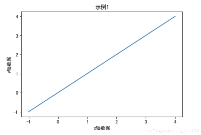
建议使用jupyter编写,在jupyter交互式笔记本下可以不用plt.show()即可展示图形,下面做一个demo:
import matplotlib.pyplot as plt
x=[-1,1,2,3,4]
y=[-1,1,2,3,4]

plt.xlabel('x轴数据')
plt.ylabel('y轴数据')
plt.title('示例1')
plt.plot(x,y)

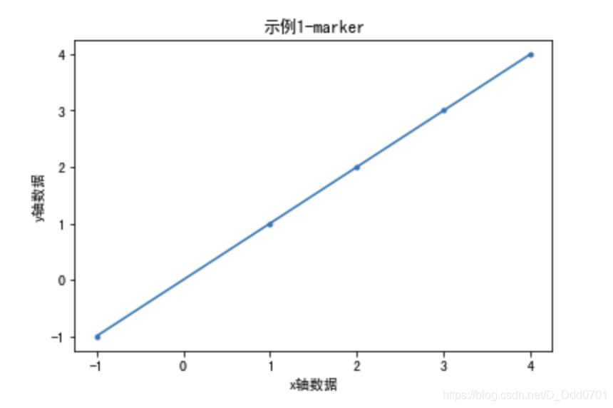
给折线图增加更多细节
marker——数据点标示
from matplotlib import pyplot as plt

x=[-1,1,2,3,4]
y=[-1,1,2,3,4]

plt.xlabel('x轴数据')
plt.ylabel('y轴数据')
plt.title('示例1')
plt.plot(x,y)
工作中绘制折线图往往需要把数据点用不同的细节标示出来,此处则应设置marker参数:
plt.plot(x,y,marker='.')
把刚才的plot语句增加marker参数后:
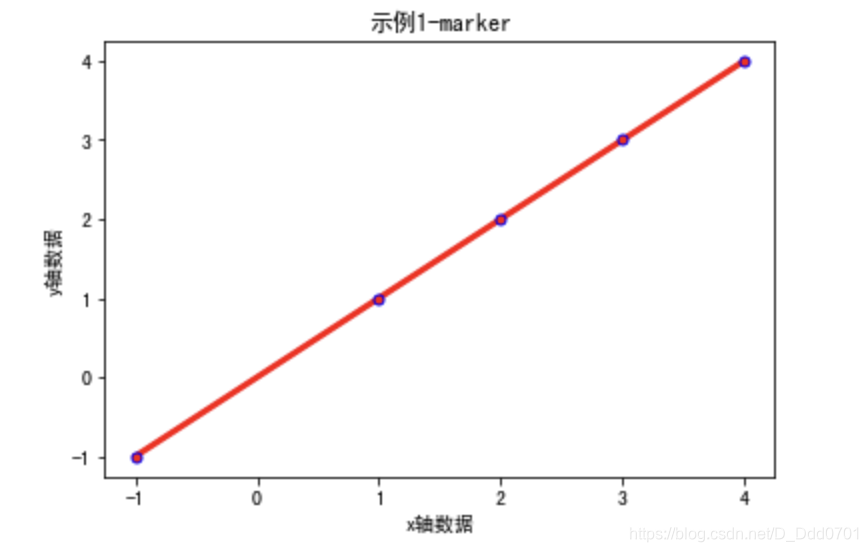
点的大小调节用markersize参数:plt.plot(x,y,marker='.',markersize=10)
点的颜色调节用color参数:plt.plot(x,y,marker='.',color='red'),这里的color可以使用HEX码自行设定,如plt.plot(x,y,marker='.',color='#2614e8')
线对粗细用linewidth参数:plt.plot(x,y,marker='.',linewidth=3)
点边界颜色调节用markeredgecolor参数:plt.plot(x,y,marker='.',markeredgecolor='blue')
线形调节用linestyle参数:plt.plot(x,y,marker='.',linestyle='dashed')
总体效果:
plt.plot(x,y,marker='.',markersize=10,color='red',linewidth=3,markeredgecolor='blue')
绘制多条折线
from matplotlib import pyplot as plt
dev_x = [25, 26, 27, 28, 29, 30, 31, 32, 33, 34, 35]
dev_y = [38496, 42000, 46752, 49320, 53200, 56000, 62316, 64928, 67317, 68748, 73752]
py_dev_y = [45372, 48876, 53850, 57287, 63016,65998, 70003, 70000, 71496, 75370, 83640]
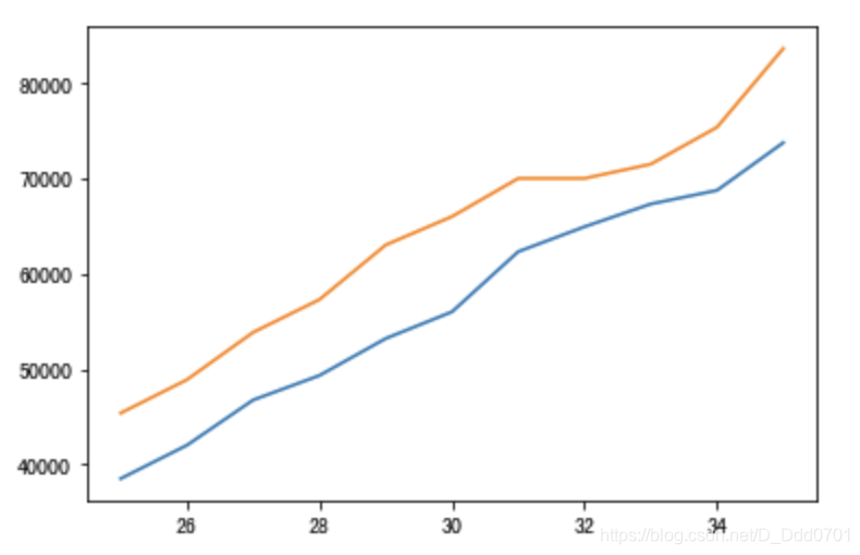
plt.plot(dev_x,dev_y)
plt.plot(dev_x,py_dev_y)
用两个plot语句就能在一张图纸上绘制两个折线图:
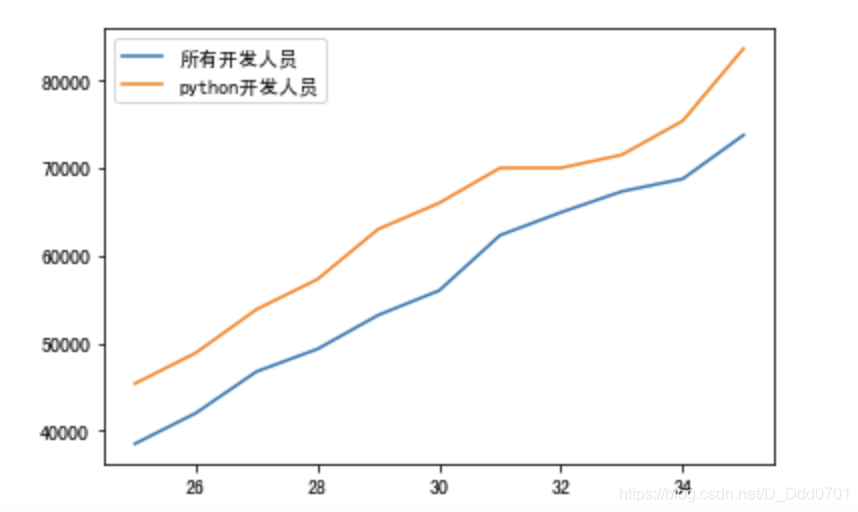
为了让哪条线对应的是哪个数据更加明显,需要增加图示,使用label参数:plt.plot(x轴数据,y轴数据, label='名字')
对上图代码进行补充:
from matplotlib import pyplot as plt
dev_x = [25, 26, 27, 28, 29, 30, 31, 32, 33, 34, 35]
dev_y = [38496, 42000, 46752, 49320, 53200, 56000, 62316, 64928, 67317, 68748, 73752]
py_dev_y = [45372, 48876, 53850, 57287, 63016,65998, 70003, 70000, 71496, 75370, 83640]
plt.plot(dev_x,dev_y,label='所有开发人员')
plt.plot(dev_x,py_dev_y,label='python开发人员')
plt.legend()
注意:使用label参数后要显示图示,需要增加一条plt.legend()语句。由于我是用jupyter notebook编写,可以省略plt.show()语句,如果不是交互式笔记本在运行程序时需要最后增加plt.show()语句才能显示可视化图表。
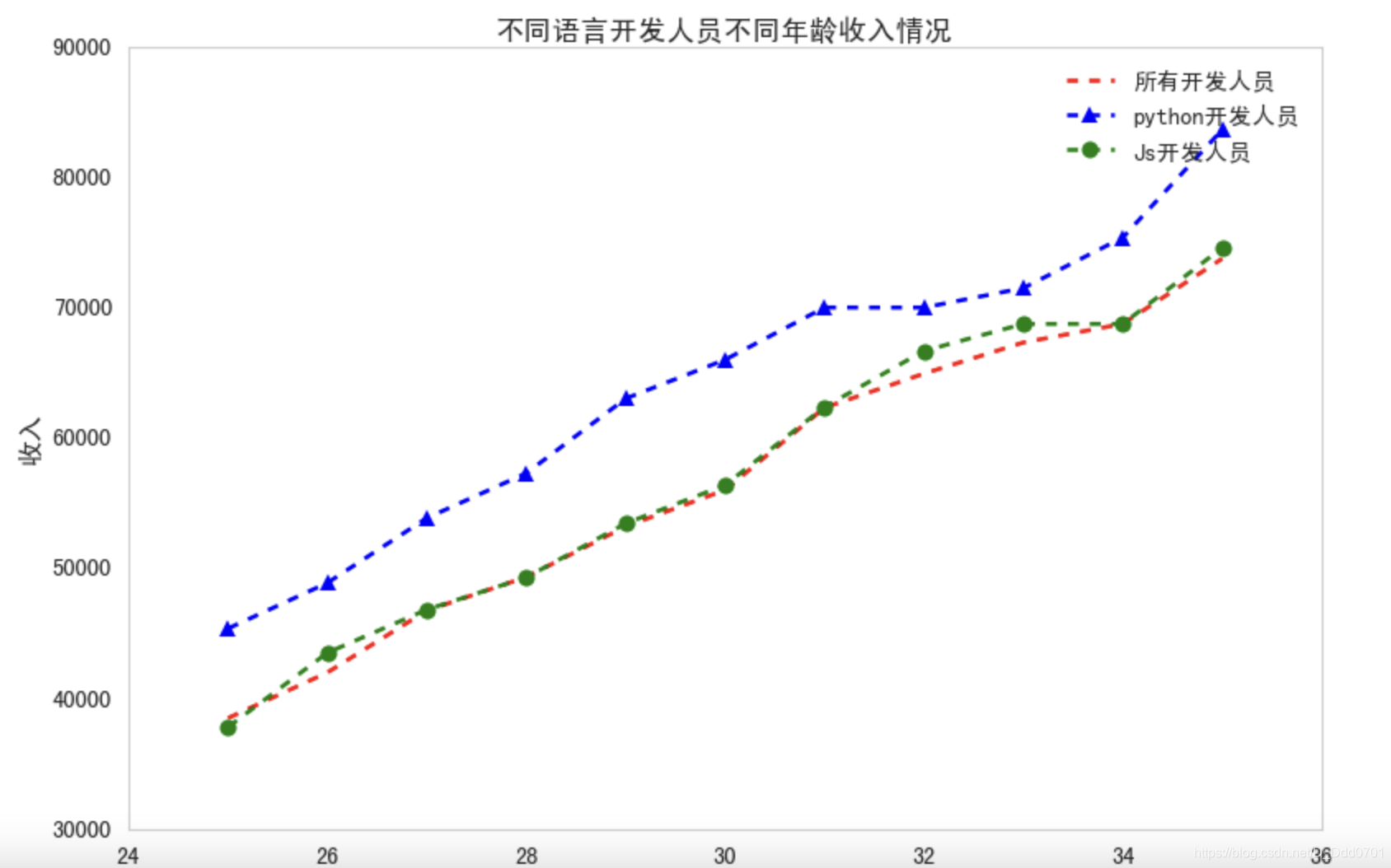
这里增加第三条数据,再用marker优化一下图表:
from matplotlib import pyplot as plt
dev_x = [25, 26, 27, 28, 29, 30, 31, 32, 33, 34, 35]
dev_y = [38496, 42000, 46752, 49320, 53200, 56000, 62316, 64928, 67317, 68748, 73752]
py_dev_y = [45372, 48876, 53850, 57287, 63016,65998, 70003, 70000, 71496, 75370, 83640]
js_dev_y = [37810, 43515, 46823, 49293, 53437,56373, 62375, 66674, 68745, 68746, 74583]
plt.plot(dev_x,dev_y,'r--',label='所有开发人员')
plt.plot(dev_x,py_dev_y,'b^--',label='python开发人员')
plt.plot(dev_x,js_dev_y,'go--',label='Js开发人员')
plt.legend()
plt.title('不同语言开发人员不同年龄收入情况')
plt.xlabel('年龄')
plt.ylabel('收入')
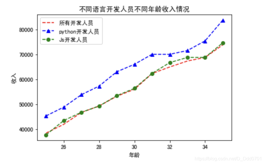
这里使用了简化写法:(fmt模式)
plt.plot(dev_x,dev_y,[fmt],label='所有开发人员')
#  fmt=[颜色][marker][linestyle]
#  'go--'表示color='green',marker='o',linestyle='dashed',linewidth=2,markersize=12
具体可以根据自己matplotlib版本参考官方文档:3.3.2matplotlib.pyplot中plot参数
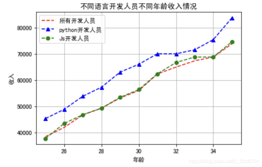
开启网格功能
为了更清晰地获取图片数据信息,需要用grid参数开启网格功能:plt.grid()
from matplotlib import pyplot as plt
dev_x = [25, 26, 27, 28, 29, 30, 31, 32, 33, 34, 35]
dev_y = [38496, 42000, 46752, 49320, 53200, 56000, 62316, 64928, 67317, 68748, 73752]
py_dev_y = [45372, 48876, 53850, 57287, 63016,65998, 70003, 70000, 71496, 75370, 83640]
js_dev_y = [37810, 43515, 46823, 49293, 53437,56373, 62375, 66674, 68745, 68746, 74583]
plt.plot(dev_x,dev_y,'r--',label='所有开发人员')
plt.plot(dev_x,py_dev_y,'b^--',label='python开发人员')
plt.plot(dev_x,js_dev_y,'go--',label='Js开发人员')
plt.legend()
plt.title('不同语言开发人员不同年龄收入情况')
plt.xlabel('年龄')
plt.ylabel('收入')
plt.grid()
利用风格文件美化图表
首先查看一下有什么风格:print(plt.style.available)
[‘Solarize_Light2’, ‘_classic_test_patch’, ‘bmh’, ‘classic’, ‘dark_background’, ‘fast’, ‘fivethirtyeight’, ‘ggplot’, ‘grayscale’, ‘seaborn’, ‘seaborn-bright’, ‘seaborn-colorblind’, ‘seaborn-dark’, ‘seaborn-dark-palette’, ‘seaborn-darkgrid’, ‘seaborn-deep’, ‘seaborn-muted’, ‘seaborn-notebook’, ‘seaborn-paper’, ‘seaborn-pastel’, ‘seaborn-poster’, ‘seaborn-talk’, ‘seaborn-ticks’, ‘seaborn-white’, ‘seaborn-whitegrid’, ‘tableau-colorblind10’]
现在使用一个风格对比一下:
plt.plot(dev_x,dev_y,'r--',label='所有开发人员')
plt.plot(dev_x,py_dev_y,'b^--',label='python开发人员')
plt.plot(dev_x,js_dev_y,'go--',label='Js开发人员')
plt.legend()
plt.title('不同语言开发人员不同年龄收入情况')
plt.xlabel('年龄')
plt.ylabel('收入')
plt.style.use('tableau-colorblind10')
plt.rcParams['font.sans-serif'] = ['SimHei']
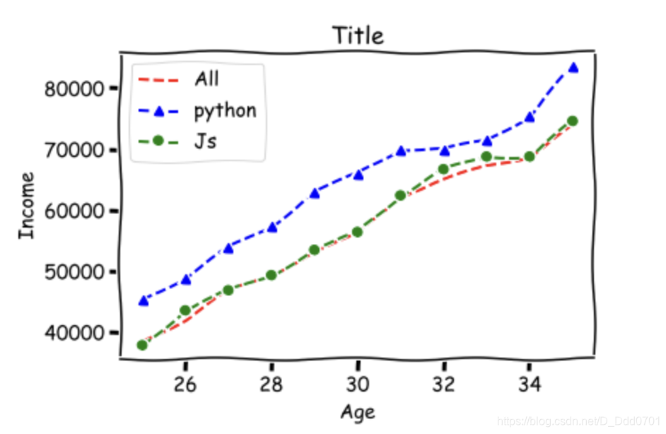
还可以用动漫风格:plt.xkcd(),但要注意 plt.xkcd()没有中文字库,只适用于纯英文图表。
from matplotlib import pyplot as plt
dev_x = [25, 26, 27, 28, 29, 30, 31, 32, 33, 34, 35]
dev_y = [38496, 42000, 46752, 49320, 53200, 56000, 62316, 64928, 67317, 68748, 73752]
py_dev_y = [45372, 48876, 53850, 57287, 63016,65998, 70003, 70000, 71496, 75370, 83640]
js_dev_y = [37810, 43515, 46823, 49293, 53437,56373, 62375, 66674, 68745, 68746, 74583]
plt.xkcd()
plt.plot(dev_x,dev_y,'r--',label='All')
plt.plot(dev_x,py_dev_y,'b^--',label='python')
plt.plot(dev_x,js_dev_y,'go--',label='Js')
plt.grid()
plt.legend()
plt.title('Title')
plt.xlabel('Age')
plt.ylabel('Income')
plt.show()
带阴影的折线图
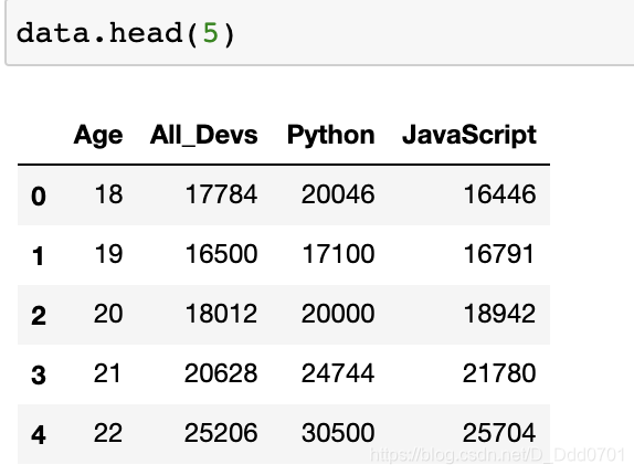
利用Pandas导入数据
import matplotlib.pyplot as plt
import pandas as pd
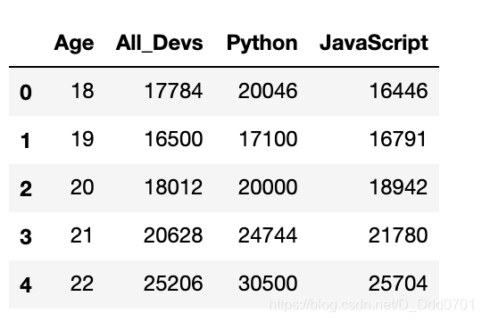
data = pd.read_csv('data.csv')
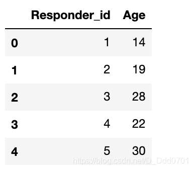
数据结构如图:
绘制折线图
plt.plot(data['Age'],data['All_Devs'],label='All')
plt.plot(data['Age'],data['Python'],label='Python')
plt.legend()
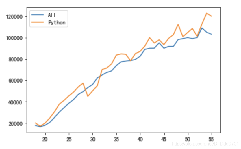
增加阴影
阴影参数:plt.fill_between()
plt.fill_between(data['Age'],data['Python'])
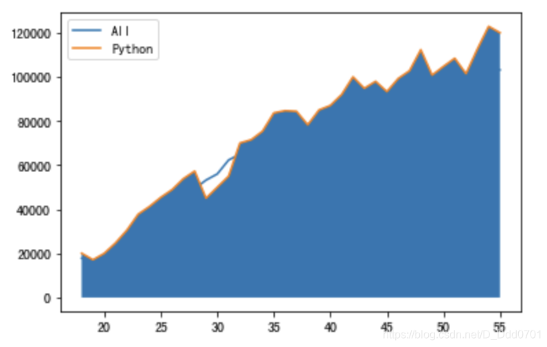
会发现这样反而导致折线图很不清晰,这里可以调整透明度:alpha=0.2
plt.fill_between(data['Age'],data['Python'],alpha=0.2)
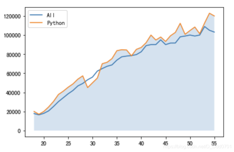
设置临界线
临界线设置为60000:overall_mid=60000
overall_mid=60000
plt.fill_between(data['Age'],data['Python'],overall_mid,alpha=0.2)
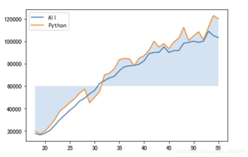
条件语句筛选阴影位置
plt.fill_between(data['Age'],data['Python'],overall_mid,where=(data['Python'] > overall_mid),alpha = 0.2)
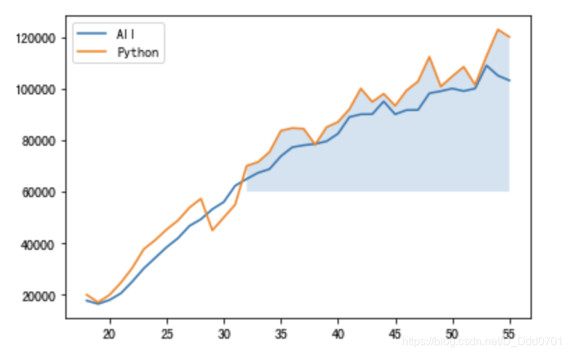
这里看上去有些突兀,可以用渐变参数优化:interpolate=True
plt.fill_between(data['Age'],data['Python'],overall_mid,where=(data['Python'] > overall_mid),interpolate=True,alpha = 0.2)

增加更多细节
可以用color=‘颜色’控制阴影区域颜色,label增加标签。
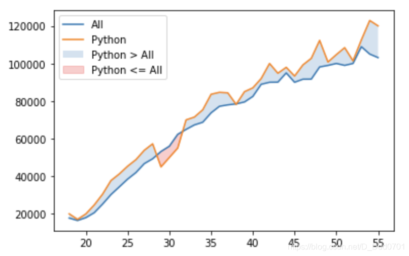
plt.fill_between(data['Age'],data['Python'],data['All_Devs'],where=(data['Python'] > data['All_Devs']),interpolate=True,alpha = 0.2,label='Python > All')
plt.fill_between(data['Age'],data['Python'],data['All_Devs'],where=(data['Python'] <= data['All_Devs']),interpolate=True,alpha = 0.2,color='red',label='Python <= All')
柱状图
利用pandas读取数据
利用pandas从csv文件导入数据:
import pandas as pd
import numpy as np
import matplotlib.pyplot as plt
plt.xkcd()
data = pd.read_csv('data.csv')
data.head()
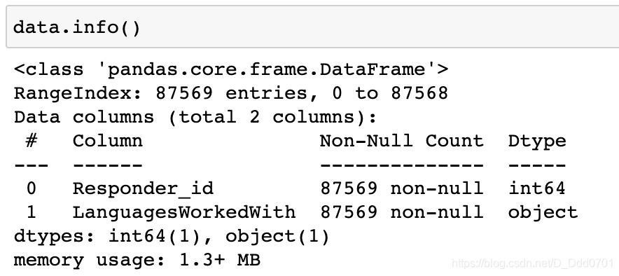
数据结构如图所示:
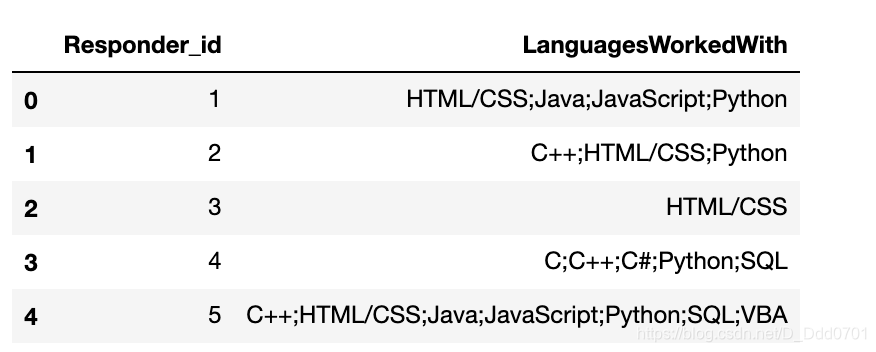
把LanguagesWorkedWith列具体的语言数量统计一下:
from collections import Counter
language_responses=data['LanguagesWorkedWith']
cnt = Counter()
for l in language_responses:
    cnt.update(l.split(';'))
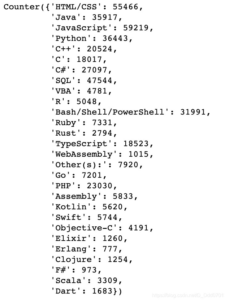
取前15个:cnt.most_common(15)
lang=[]
popularity=[]
for c in cnt.most_common(15):
    lang.append(c[0])
    popularity.append(c[1])
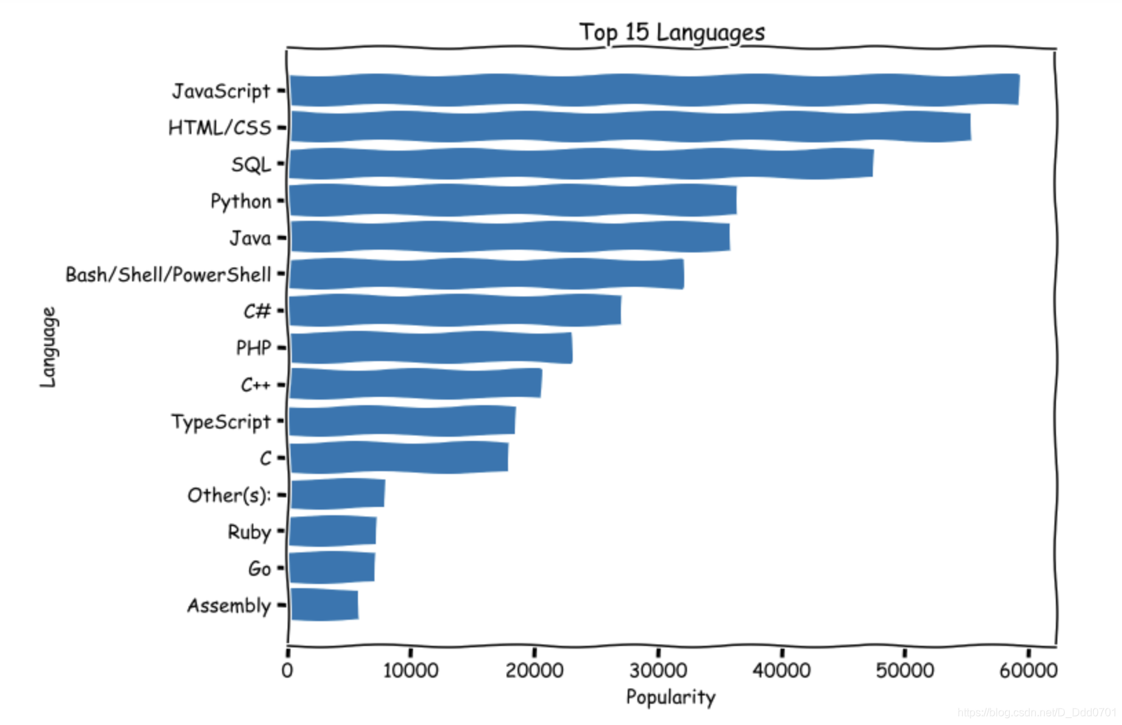
提取后的数据绘制柱状图
绘制柱状图:plt.bar(x,y)
plt.bar(lang,popularity)
plt.title('Top 15 Languages')
plt.xlabel('Language')
plt.ylabel('Popularity')
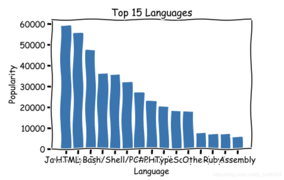
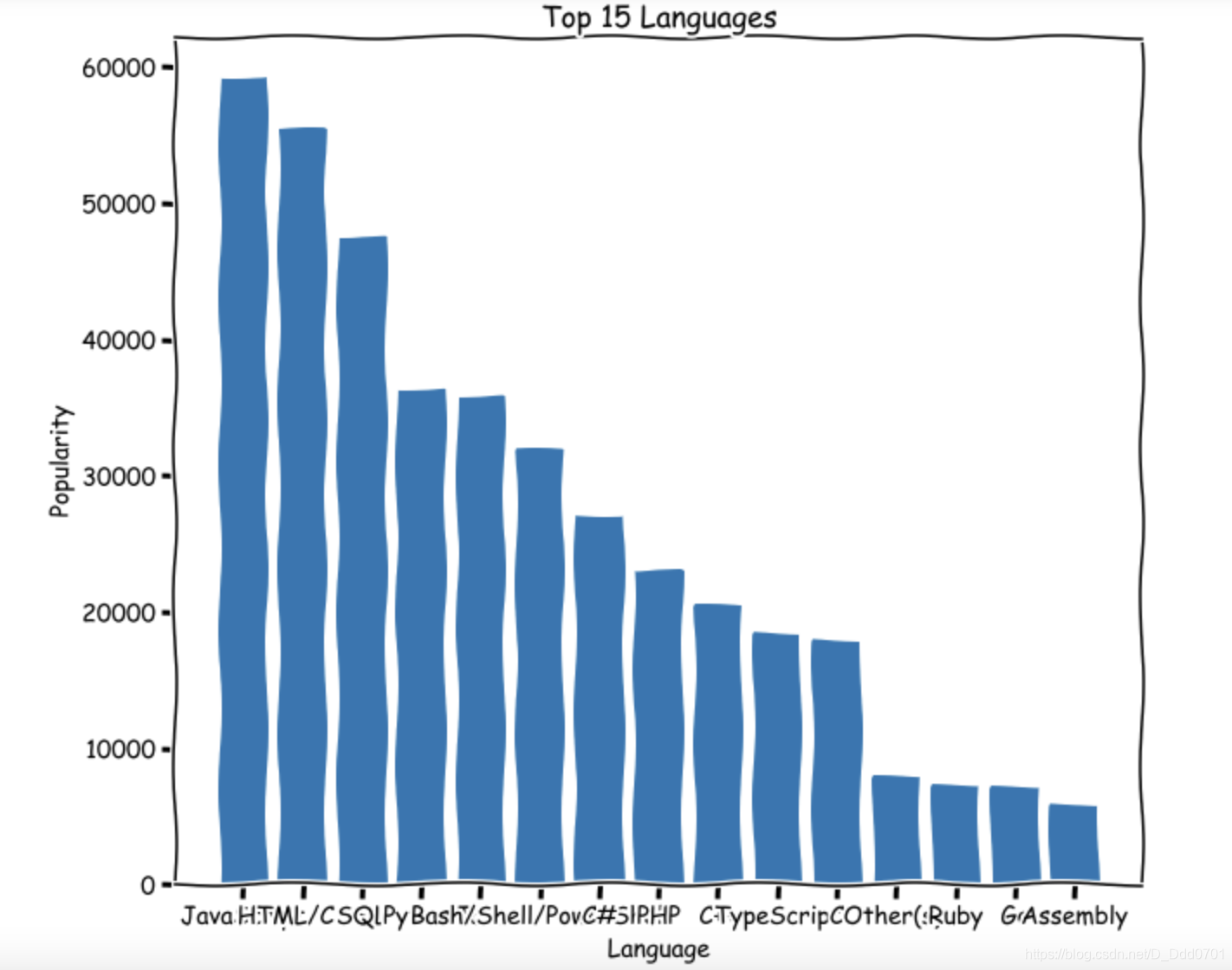
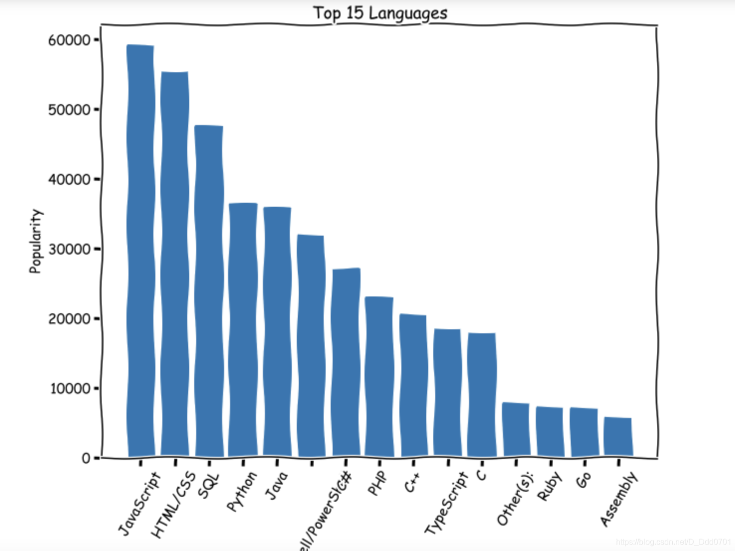
发现x轴数据无法完全展示,这里有三种解决方案:
方案1:放大图表plt.figure(figsize=(10,8))
方案2:x轴文字倾斜60度plt.xticks(rotation=60)
方案3:翻转x,y轴plt.barh(lang,popularity)
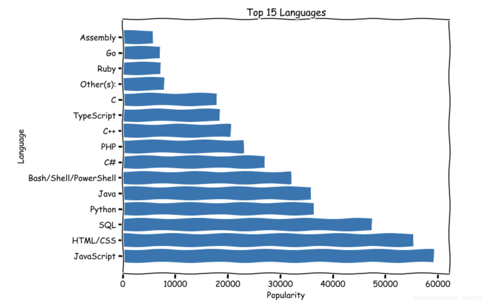
希望可以是从大到小而不是从小到大排列,则需要对数据倒置。
lang.reverse()
popularity.reverse()
堆叠柱状图
导入数据
minutes = [1, 2, 3, 4, 5, 6, 7, 8, 9]

player1 = [1, 2, 3, 3, 4, 4, 4, 4, 5]
player2 = [1, 1, 1, 1, 2, 2, 2, 3, 4]
player3 = [1, 5, 6, 2, 2, 2, 3, 3, 3]
绘制简单堆叠图
plt.bar(minutes, player1)
plt.bar(minutes, player2)
plt.bar(minutes, player3)
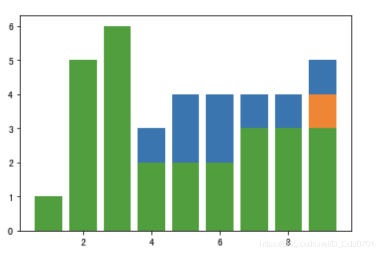
很明显这里的堆叠图存在问题,有一些数据被掩盖无法显示。这里就需要设置索引。
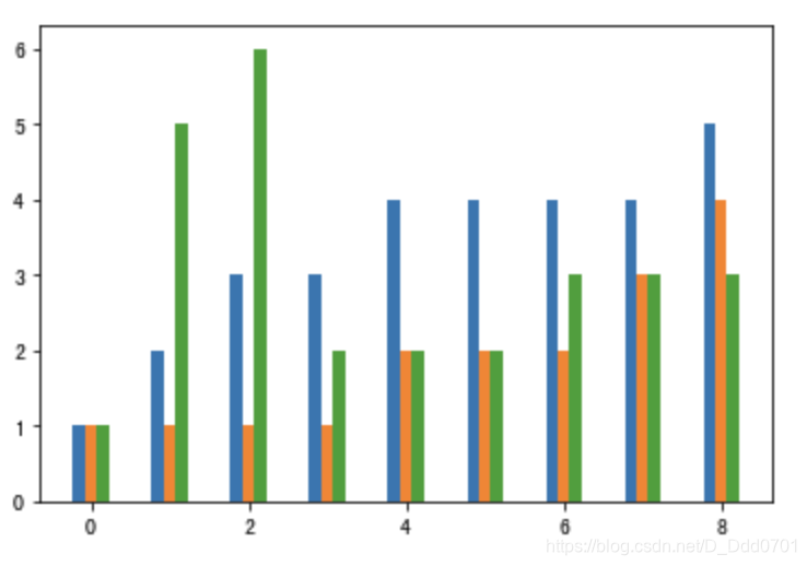
index_x = np.arange(len(minutes))
w= 0.15
plt.bar(index_x-w,player1,width=w)
plt.bar(index_x,player2,width=w)
plt.bar(index_x+w,player3,width=w)
这种堆叠方式需要自行设置宽度,可以选用更简单的方法:stackplot。
plt.stackplot(minutes, player1, player2, player3)
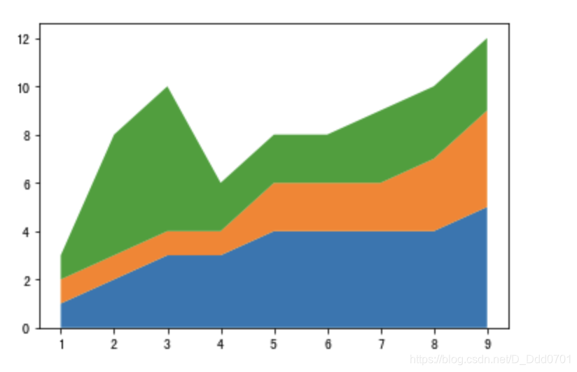
丰富一下细节:
labels=['class1','class2','class3']
colors = ['Blue','Red','Green']
plt.stackplot(minutes,player1,player2,player3,labels=labels,colors=colors)
plt.legend()
显示标签需要加入plt.legend()
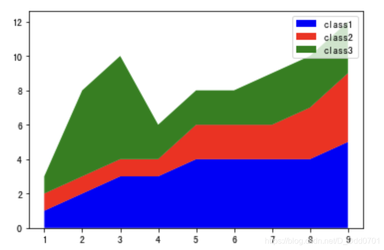
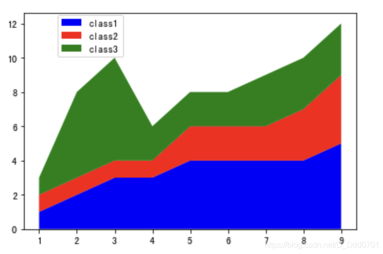
可以修改标签位置,以免与图片内容有重叠部分plt.legend(loc(坐标))
plt.legend(loc=(0.1,0.8))
更多使用方式
ages = [18, 19, 21, 25, 26, 26, 30, 32, 38, 45, 55]
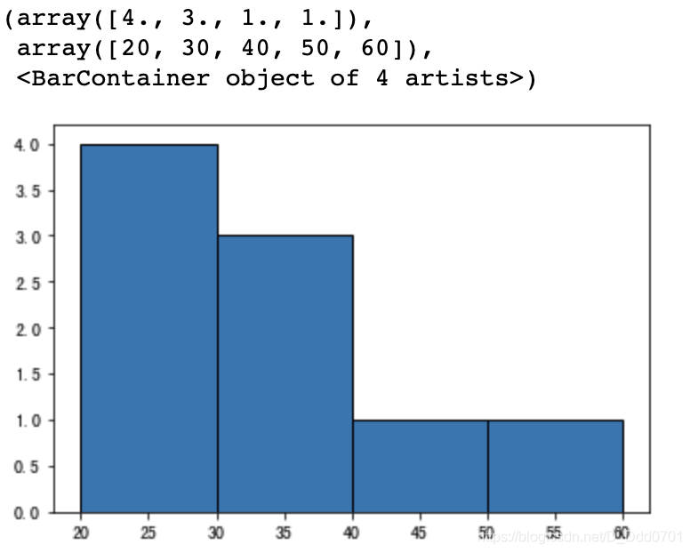
这组数据如果用柱状图绘制,因为没有重复,所以每一个柱子高度都是一致的。这里可以借助分组功能:plt.hist=(数据, bins=频次)
plt.hist(ages,bins=4)
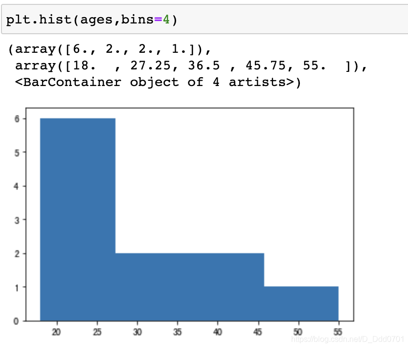
这样就可以把数据均衡的切成四个范围。
这里四个范围是18-27.25,27.25-36.5,36.5-45.75,45.75-55
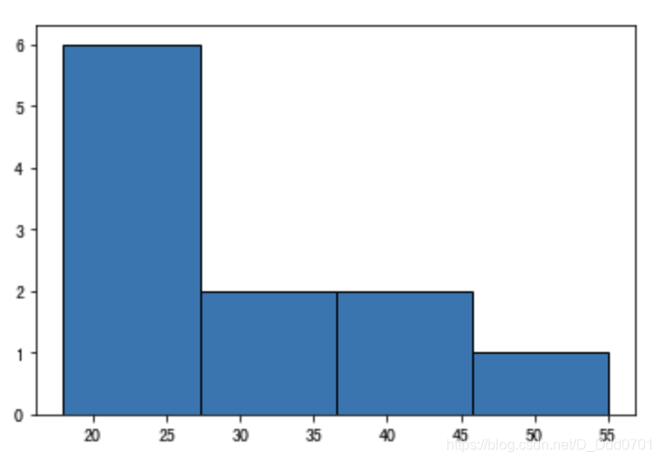
加入分界线会更加明显:edgecolor=‘颜色’
plt.hist(ages,bins=4,edgecolor='black')
当然,这里的bins也可以自己手动输入:
bins=[20,30,40,50,60]
plt.hist(ages,bins,edgecolor='black')
实战案例
从pandas导入数据:
data=pd.read_csv('data.csv')
data.head()
分成五组看看:
plt.hist(data.Age,bins=5,edgecolor='black')
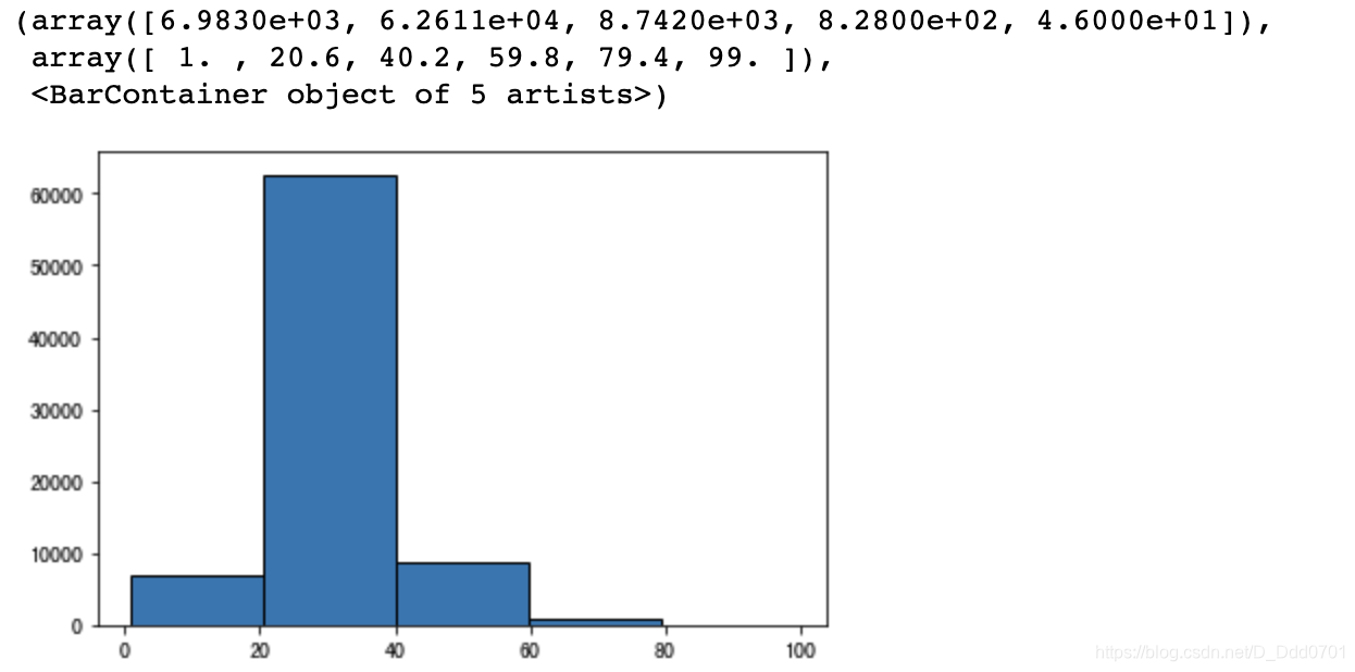
自定分组:
bins=[10,20,30,40,50,60,70,80,90,100]
plt.hist(data.Age,bins,edgecolor='black')
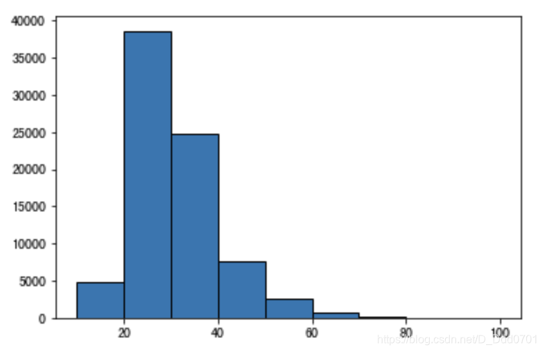
由于y轴数据比较大,这里可以采用科学计数法:log=True
bins=[10,20,30,40,50,60,70,80,90,100]
plt.hist(data.Age,bins,edgecolor='black',log=True)
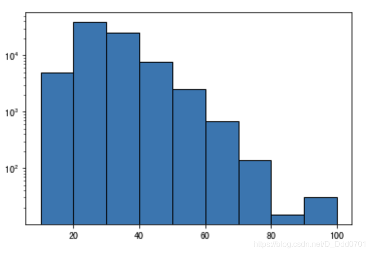
这里可以非常清晰的看到两张图的不同之处,采用科学计数法后可以看到80-90岁比90-100岁的少,而不采用的图在80-100岁区间非常模糊。
增加平均值辅助线
平均值辅助线:plt.axvline=(中位数)
median_age=data.Age.mean()
plt.axvline(median_age,color='red',label='Median')
plt.legend()

Pie饼图
绘制第一张饼图
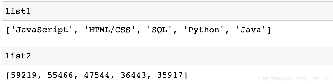
先输入数据:
import matplotlib.pyplot as plt
list1 =['JavaScript','HTML/CSS','SQL','Python','Java']
list2 = [59219,55466,47544,36443,35917]
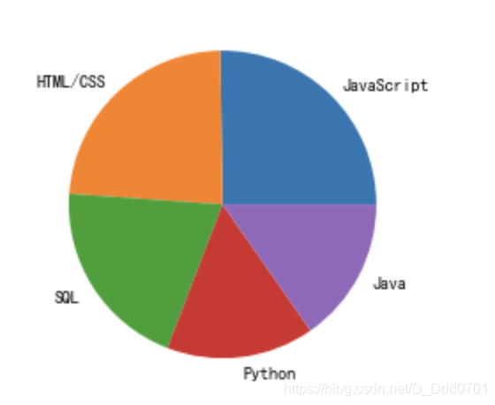
用Pie模式生成饼图:plt.pie(数值类型,labels='对应名称')
plt.pie(list2,labels=list1)
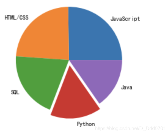
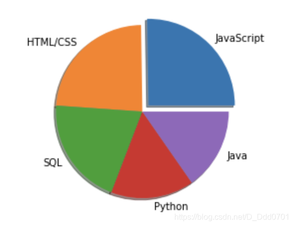
加入爆炸效果
爆炸效果参数:explode=explo
explo = [0,0,0,0.1,0]
# 选择排名第4的数据
plt.pie(list2,labels=list1,explode=explo)
explo = [0.1,0,0,0.1,0]
# 选择排名第一和第三的数据
plt.pie(list2,labels=list1,explode=explo)

加入阴影
阴影参数:shadow=True
explo = [0.1,0,0,0,0]
plt.pie(list2,labels=list1,explode=explo,shadow=True)
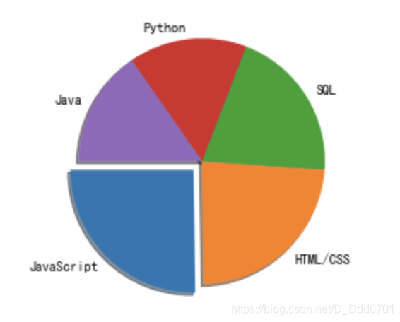
修改第一块的位置
自定义位置参数:startangle=0,以逆时针方向旋转。
当startangle=90时,第一块的位置在左上角: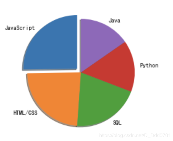
当startangle=180时,第一块的位置在左下角:
当startangle=270时,第一块的位置在右下角:

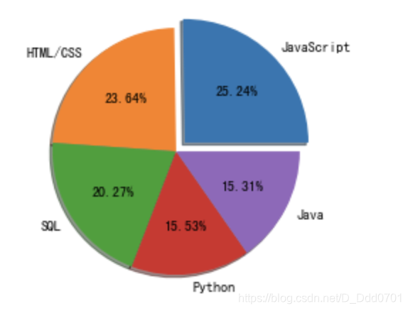
显示百分比
百分比参数:autopct='%1.2f%%'
这里的%1.2f表示小数点后2位精度,%%表示显示百分号(第一个百分号是转译符)
explo = [0.1,0,0,0,0]
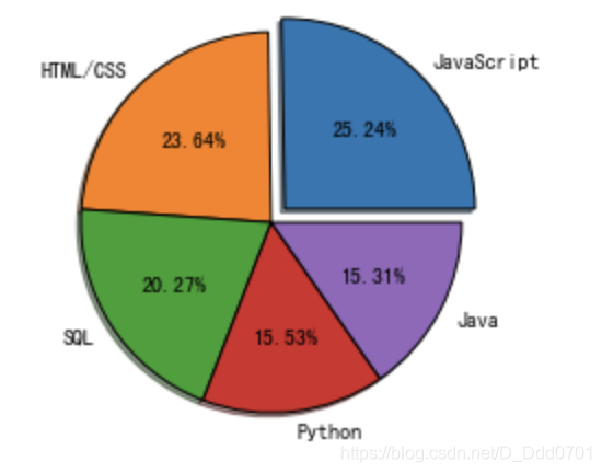
plt.pie(list2,labels=list1,explode=explo,shadow=True,startangle=0,autopct='%1.2f%%')
改变图片边界
边界控制参数:wedgeprops={'edgecolor':'black'}
该写法表示边界颜色用黑色勾勒。
explo = [0.1,0,0,0,0]
plt.pie(list2,labels=list1,explode=explo,shadow=True,startangle=0,autopct='%1.2f%%',wedgeprops={

    'edgecolor':'black'})
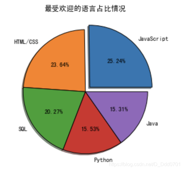
增加标题
标题和其他图一样plt.title('标题')
为了让标题更适应移动端显示,可以加入plt.tight_layout()开启紧致模式
explo = [0.1,0,0,0,0]
plt.pie(list2,labels=list1,explode=explo,shadow=True,startangle=0,autopct='%1.2f%%',wedgeprops={

    'edgecolor':'black'})
plt.title('最受欢迎的语言占比情况')
plt.tight_layout()
从数据导入开始绘制Pie饼图
利用Pandas导入数据
import pandas as pd
import numpy as np
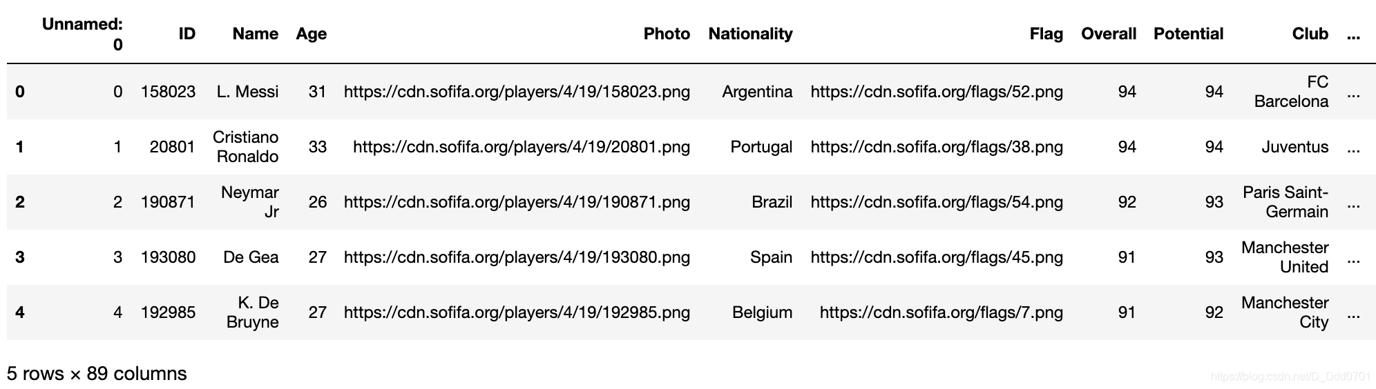
fifa = pd.read_csv('fifa_data.csv')
fifa.head()
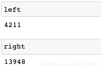
筛选出喜欢用左脚、右脚踢球球员数量:
left = fifa.loc[fifa['Preferred Foot']=='Left'].count()[0]
right = fifa.loc[fifa['Preferred Foot']=='Right'].count()[0]
绘制饼图
plt.pie([left,right])
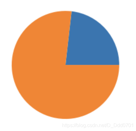
接着开始美化:
labels = ['Left','Right']
explo=[0.1,0]
plt.pie([left,right],labels=labels,explode=explo,shadow=True,startangle=0,autopct='%1.2f%%',wedgeprops={

    'edgecolor':'black'})

对有字符串的Weight数据绘制
先看看数据:
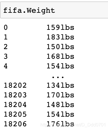
直接用带有’lbs’字符串的数据绘制饼图显然不行,这里提供两种思路:
1、.strip('lbs')
2、.replace('lbs','')
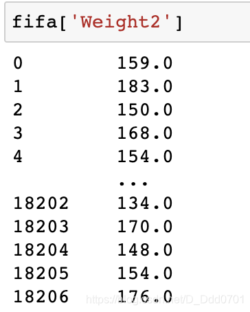
用思路1具体处理一下:
def func1(d1):
    if type(d1)==str:
        return int(d1.strip('lbs'))
fifa['Weight2']=fifa.Weight.apply(func1)
对不同Weight分类
class1=fifa.loc[fifa.Weight2 < 125].count()[0]
class2 = fifa.loc[(fifa.Weight2 >= 125) & (fifa.Weight2 < 150)].count()[0]
class3 = fifa.loc[(fifa.Weight2 >= 150) & (fifa.Weight2 < 175)].count()[0]
class4 = fifa.loc[(fifa.Weight2 >= 175) & (fifa.Weight2 < 200)].count()[0]
class5 = fifa.loc[fifa.Weight2 > 200].count()[0]
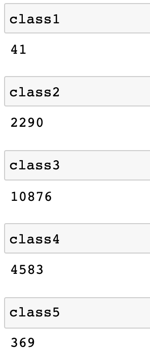
数据存入列表list= [class1,class2,class3,class4,class5]
对处理后对数据绘制饼图
labels = ['< 125 ','125-150','150-175','175-200', '> 200']
explo=[0.4,0.2,0,0,0.4]
plt.pie(list,labels=labels,explode=explo,shadow=True,startangle=0,autopct='%1.2f%%',wedgeprops={

    'edgecolor':'black'})
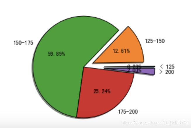
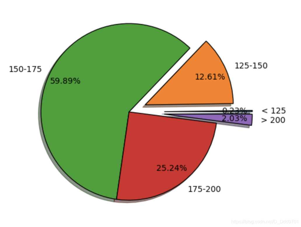
这里发现最小的比例太小,显示不明显,可以修改画布大小
plt.figure(figsize=(8,5),dpi = 100)
再用pctdistance=0.8控制间距
plt.pie(list,labels=labels,explode=explo,pctdistance=0.8,shadow=True,startangle=0,autopct='%1.2f%%',wedgeprops={

    'edgecolor':'black'})
散点图
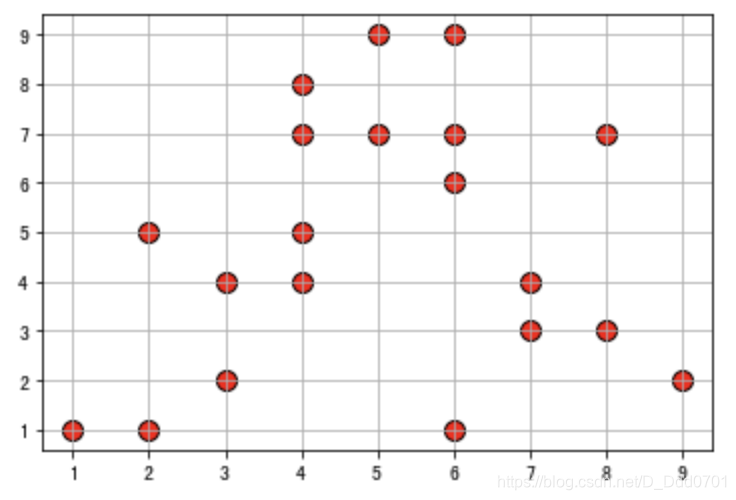
散点图绘制:plt.scatter(x数据,y数据)
plt.scatter(x,y,s=100,color='red',edgecolor='black',alpha=0.8)
# s是size,点的大小
plt.grid()
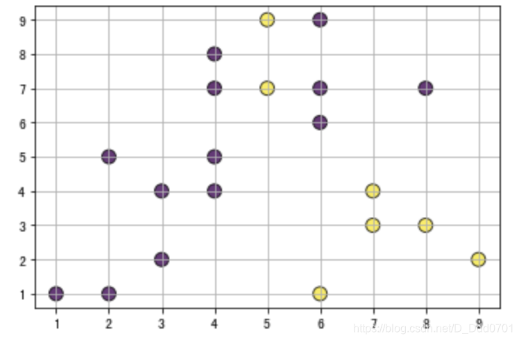
还可以用不同颜色聚类:
x = [5, 7, 8, 5, 6, 7, 9, 2, 3, 4, 4, 4, 2, 6, 3, 6, 8, 6, 4, 1]
y = [7, 4, 3, 9, 1, 3, 2, 5, 2, 4, 8, 7, 1, 6, 4, 9, 7, 7, 5, 1]
colors = [447, 445, 449, 447, 445, 447, 442, 5, 3, 7, 1, 2, 8, 1, 9, 2, 5, 6, 7, 5]
plt.scatter(x,y,s=100,c=colors,edgecolor='black',alpha=0.8)
plt.grid()
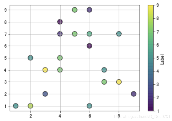
如果颜色不直观,或者混乱,还可以增加更多图示细节:
x = [5, 7, 8, 5, 6, 7, 9, 2, 3, 4, 4, 4, 2, 6, 3, 6, 8, 6, 4, 1]
y = [7, 4, 3, 9, 1, 3, 2, 5, 2, 4, 8, 7, 1, 6, 4, 9, 7, 7, 5, 1]
colors = [7, 5, 9, 7, 5, 7, 2, 5, 3, 7, 1, 2, 8, 1, 9, 2, 5, 6, 7, 5]
plt.scatter(x,y,s=100,c=colors,edgecolor='black',alpha=0.8)
plt.grid()
cbar = plt.colorbar()
cbar.set_label('Label')
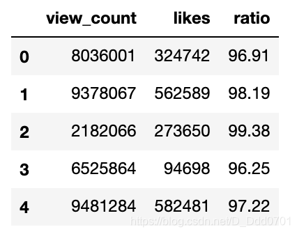
从Pandas导入数据
先看看数据结构:
df = pd.read_csv('2019-05-31-data.csv')
df.head()
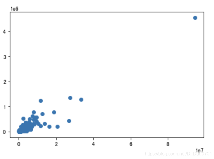
绘制散点图:plt.scatter(df.view_count,df.likes)
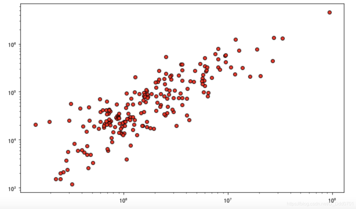
细节优化
plt.figure(figsize=(10,6))
plt.scatter(df.view_count,df.likes,c='red',edgecolors='black',linewidths=1,alpha=0.9)
plt.xscale('log')
# 数据堆叠在一起,采用对数坐标更加明显
plt.yscale('log')
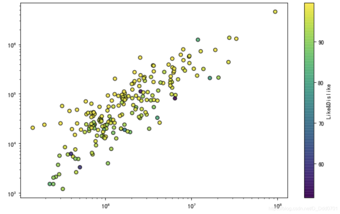
但这里想把df.ratio元素加入到散点图内:
plt.figure(figsize=(10,6))
plt.scatter(df.view_count,df.likes,c=df.ratio,edgecolors='black',linewidths=1,alpha=0.9)
plt.xscale('log')
plt.yscale('log')
cbar = plt.colorbar()
cbar.set_label('Like&Dislike')
时间序列数据处理
传统字符串表现效果
import matplotlib.pyplot as plt
from datetime import datetime,timedelta
# 因为是时间序列,所以需要使用datetime
x = ['2019-5-24','2019-5-25','2019-5-26','2019-5-27','2019-5-28','2019-5-29','2019-5-30','2019-6-30']
y = [0,1,3,4,6,5,7,3]
plt.plot(x,y)
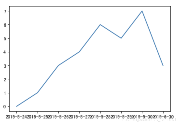
如果是用plt.plot这种传统方式绘制,下方时间看着比较乱,原因是因为plt.plot默认用字符串str的方式。除此之外,字符串还存在一个最重要的问题:2019-5-30到2019-6-30实际上间隔了一个月,但是在折线图上是相邻的两个单元。
采用plt.plot_date方式
x = [
    datetime(2019,5,24),
    datetime(2019,5,25),
    datetime(2019,5,26),
    datetime(2019,5,27),
    datetime(2019,5,28),
    datetime(2019,5,29),
    datetime(2019,5,30),
    ]
y = [0,1,3,4,6,5,7,3]
plt.plot_date(x2,y)
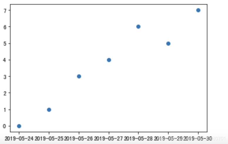
乍一看好像没有不同,只是x轴数据的属性是datetime,不是str而已。现在把点用折线连接起来。
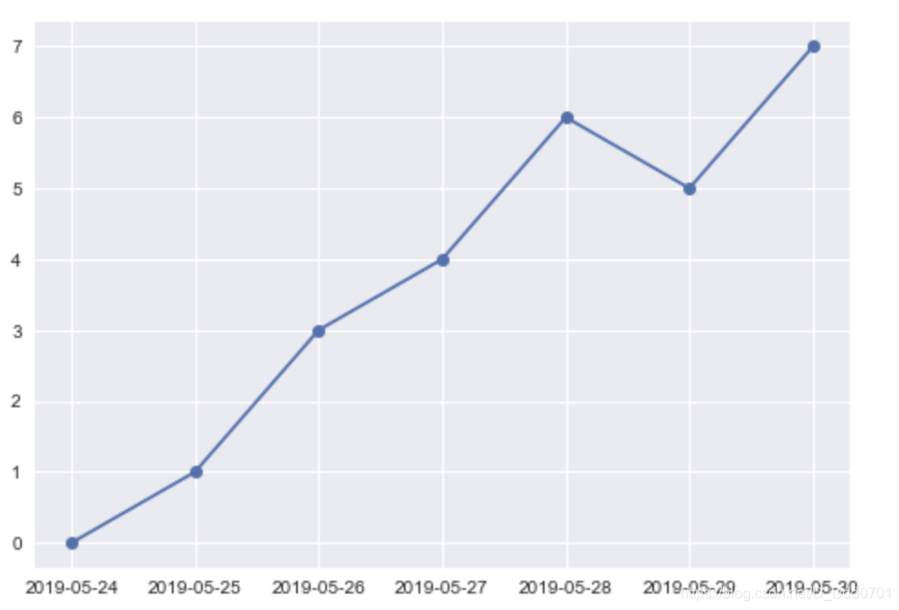
plt.style.use('seaborn')
plt.plot_date(x,y,linestyle='solid')
但是数据量变大,x轴数据依然会存在模糊不清的问题,例如:
x2 = [
    datetime(2019,5,24),
    datetime(2019,5,25),
    datetime(2019,5,26),
    datetime(2019,5,27),
    datetime(2019,5,28),
    datetime(2019,5,29),
    datetime(2019,5,30),
    datetime(2019,6,24),
    datetime(2019,6,25),
    datetime(2019,6,26),
    datetime(2019,6,27),
    datetime(2019,6,28),
    datetime(2019,6,29),
    datetime(2019,6,30),
    ]
y2 = [0,1,3,4,6,5,7,0,1,3,4,6,5,7]
plt.plot_date(x2,y2,linestyle='solid')
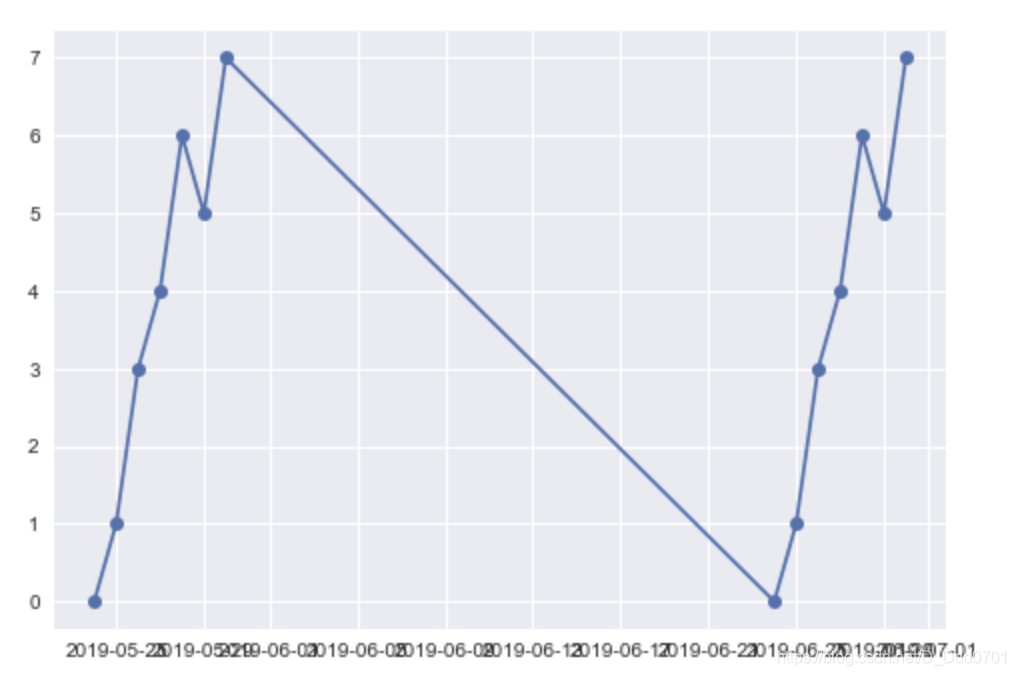
虽然这里解决了时间间隔一个月,折线图会显示出一个月的间隔期,但这里x轴的问题就非常明显了。接下来开始讨论解决办法:
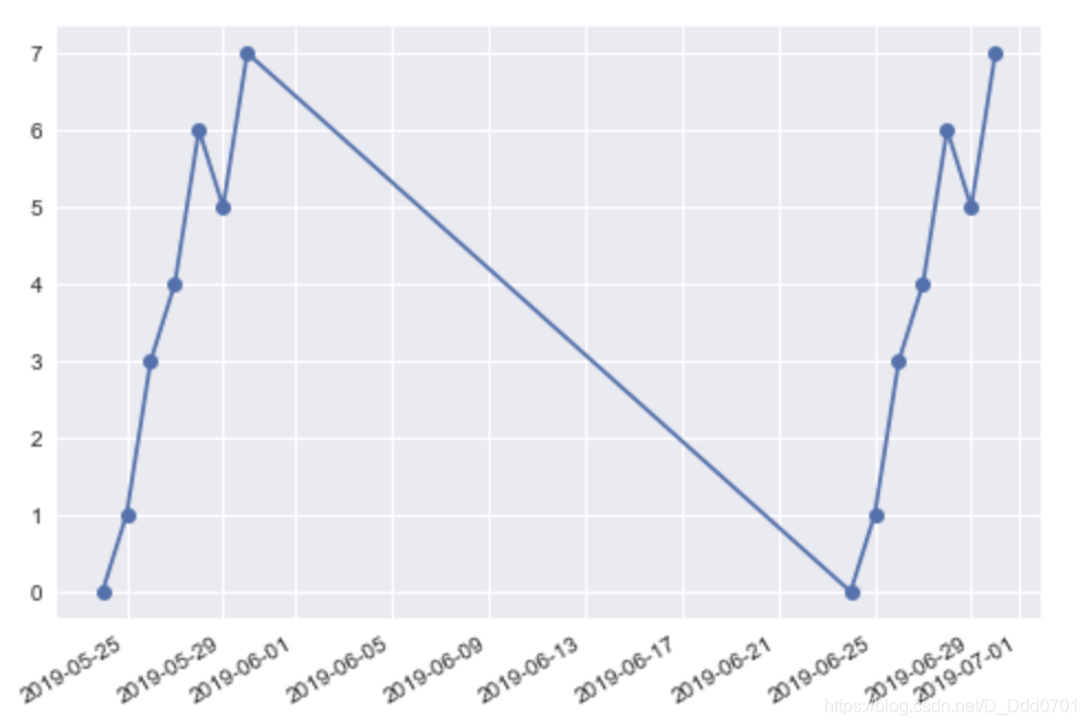
x轴显示模糊解决办法
plt.plot_date(x2,y2,linestyle='solid')
plt.gcf().autofmt_xdate()
# gcf是获得图表的控制权,gca是获得坐标轴控制权
# plt.gcf().autofmt_xdate()可以自动调整x轴日期格式
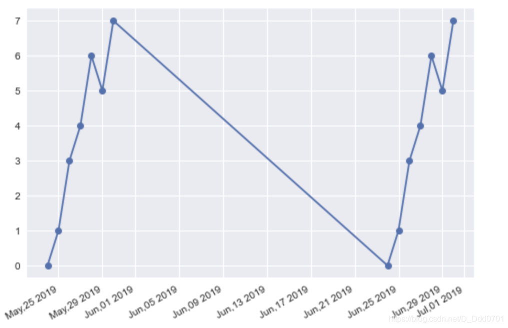
当然,也可以自己设置日期格式:
from matplotlib import dates as mpl_dates
plt.plot_date(x2,y2,linestyle='solid')
plt.gcf().autofmt_xdate()
date_format=mpl_dates.DateFormatter('%b,%d %Y')
# 用月份-日期-年份格式
plt.gca().xaxis.set_major_formatter(date_format)
利用Pandas导入金融数据分析
import pandas as pd
import matplotlib.pyplot as plt
from datetime import datetime,timedelta
from matplotlib import dates as mpl_dates
df = pd.read_csv('data.csv')
df.head()
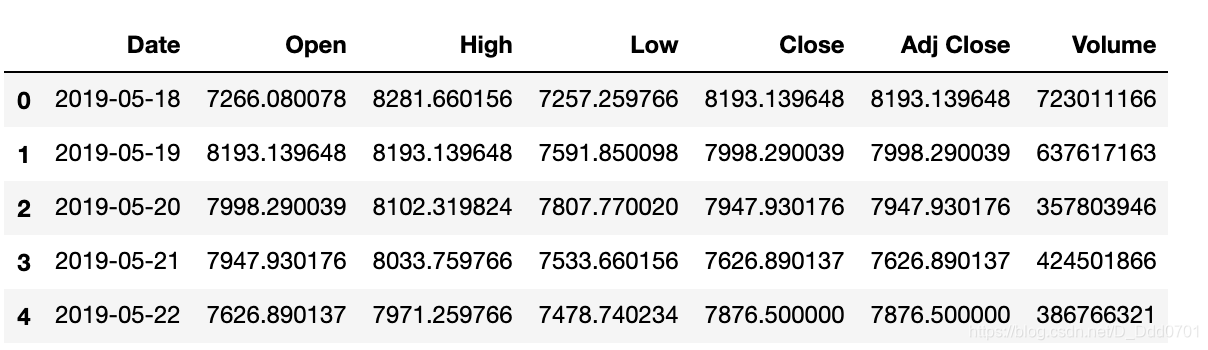
注意,这里的时间并不一定是datetime格式,需要查看一下
df.info()
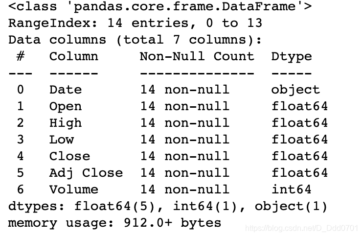
果然,是字符串格式,需要调整格式到datetime:
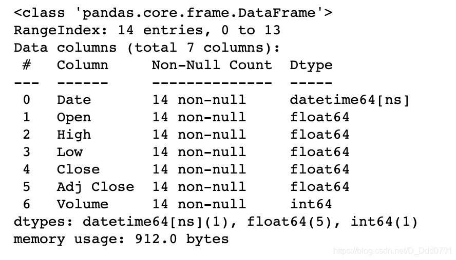
df.Date = pd.to_datetime(df.Date)
df.info()
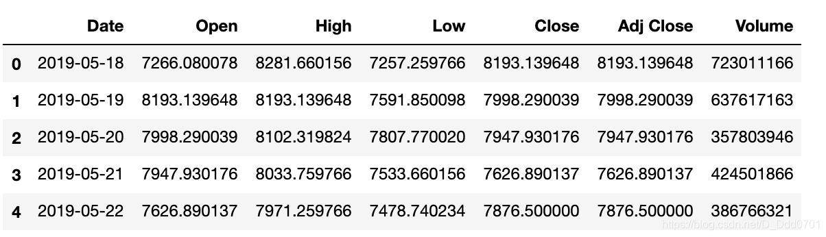
把时间序列排序看一下有没有问题
df.sort_values('Date',inplace=True)
df.head()
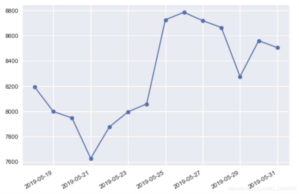
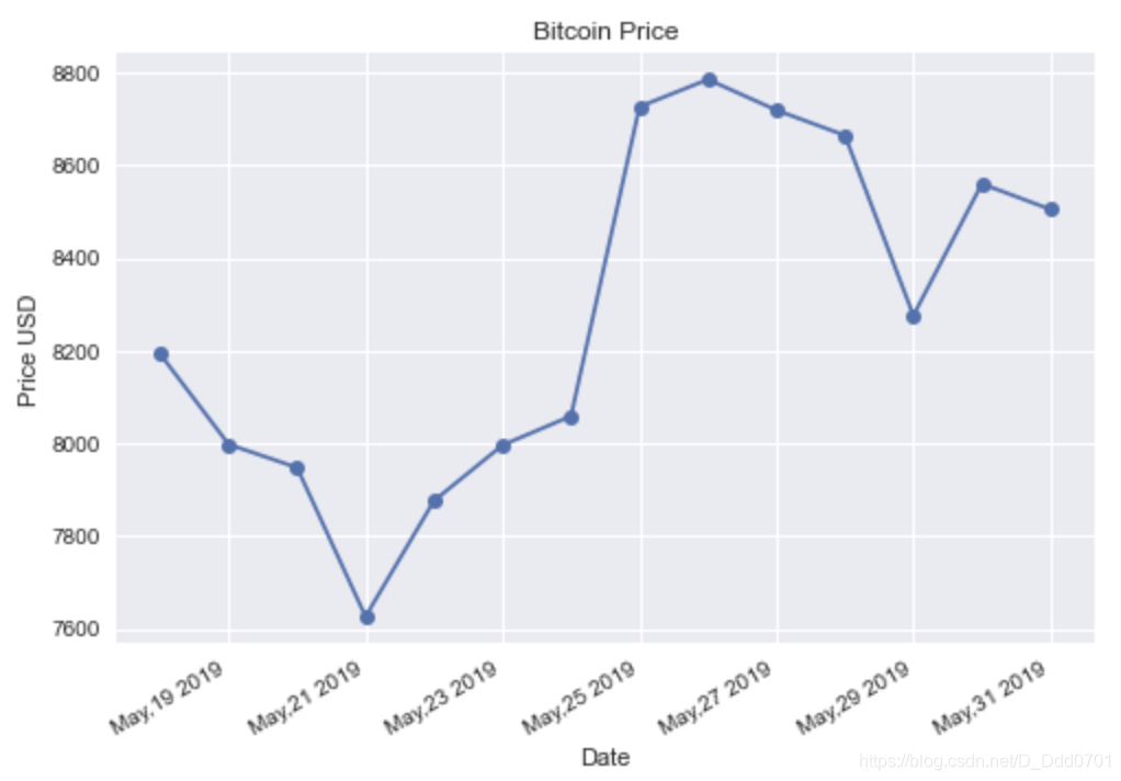
接下来开始绘制走势图:
plt.plot_date(df.Date,df.Close,linestyle='solid')
plt.gcf().autofmt_xdate()
丰富更多细节:
plt.plot_date(df.Date,df.Close, linestyle='solid')
plt.gcf().autofmt_xdate()
date_format = mpl_dates.DateFormatter('%b,%d %Y')
plt.gca().xaxis.set_major_formatter(date_format)
plt.title('Bitcoin Price')
plt.xlabel('Date')
plt.ylabel('Price USD')
实时数据处理
传统绘制方式
import pandas as pd
import matplotlib.pyplot as plt
plt.style.use('fivethirtyeight')
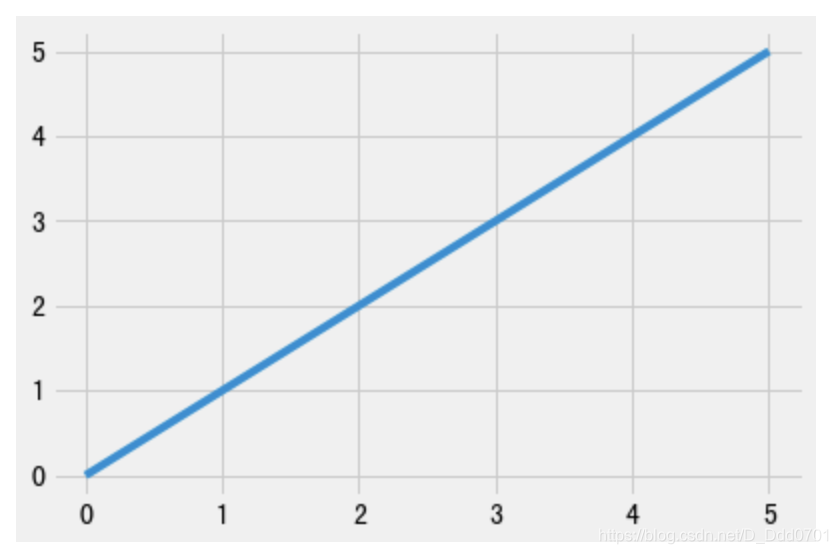
x = [0,1,2,3,4,5]
y = [0,1,2,3,4,5]
plt.plot(x,y)
对于这一类已经给定的数据是可以这么绘制的,但如果是实时数据,例如股票,传感器回馈数据等,应该如何处理?
使用迭代器设置一个实时数据
import random
from itertools import count
index = count()
x1=[]
y1=[]
def animate(i):
    x1.append(next(index)) #next(index)是一个计数器,0,1,2...
    y1.append(random.randint(0,50))
    plt.plot(x1,y1)
for i in range(50):
    animate(i)

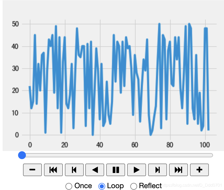
让程序自动化运行
import pandas as pd
import matplotlib.pyplot as plt
from IPython.display import HTML
from itertools import count
import random
from matplotlib.animation  import FuncAnimation
plt.style.use('fivethirtyeight')
index = count()
x1=[]
y1=[]
def animate(i):
    x1.append(next(index)) #next(index)是一个计数器,0,1,2...
    y1.append(random.randint(0,50))
    plt.cla() #plt.cla()可以控制实时图线条颜色不变化
    plt.plot(x1,y1)
ani = FuncAnimation(plt.gcf(),animate,interval=1000)
# plt.gcf()获取控制权
# 调用animate函数
# interval=1000:间隔1000毫秒(1秒)
HTML(ani.to_jshtml())
获取实时数据存入文件再载入notebook
上述案例的数据源来自于random和count函数,那么如果是载入外部接口或者实时获取的数据源呢?
设计一个实时获取数据的外部文件
import csv
import random
import time
x_value = 0
y1 = 1000
y2 = 1000
fieldname=["x","y1","y2"]
with open('data.txt','w') as csvfile:
    csv_w = csv.DictWriter(csvfile,fieldnames=fieldname)
    csv_w.writeheader() #写入表头
while True:
    with open('data.txt','a') as csvfile:
        csv_w = csv.DictWriter(csvfile,fieldnames=fieldname)
        info = {


            "x" : x_value,
            "y1" : y1 ,
            "y2" : y2 ,
        }
        x_value += 1
        y1 = y1 + random.randint(-6,10)
        y2 = y2 + random.randint(-4,5)
        csv_w.writerow(info)
    time.sleep(1) #设置运行间隔1s
只要这个程序运行,就会每间隔1s生成一组实时数据储存在data.txt文件内。
接下来读取该文件数据绘制连续变化的实时数据图:
import pandas as pd
import matplotlib.pyplot as plt
from itertools import count
import random
from matplotlib.animation  import FuncAnimation
plt.style.use('fivethirtyeight')
def animate2(i):
    dfa = pd.read_csv('data.txt')
    x = dfa.x
    y1 = dfa.y1
    y2 = dfa.y2
    plt.cla()
    plt.plot(x,y1,label='Stock1')
    plt.plot(x,y2,label='Stock2')
    plt.legend()
ani2 = FuncAnimation(plt.gcf(),animate2,interval=1000)
# plt.gcf()获取控制权
# 调用animate函数
# interval=1000:间隔1000毫秒(1秒)
plt.show()
建议在pycharm中运行,jupyter notebook只能显示100个数据。
图表多重绘制
在一些情况下需要在一个fig中绘制a、b、c图,所以需要图表的多重绘制
传统方法绘制
import pandas as pd
import matplotlib.pyplot as plt
plt.style.use('seaborn')
data = pd.read_csv('data.csv')
data.head()
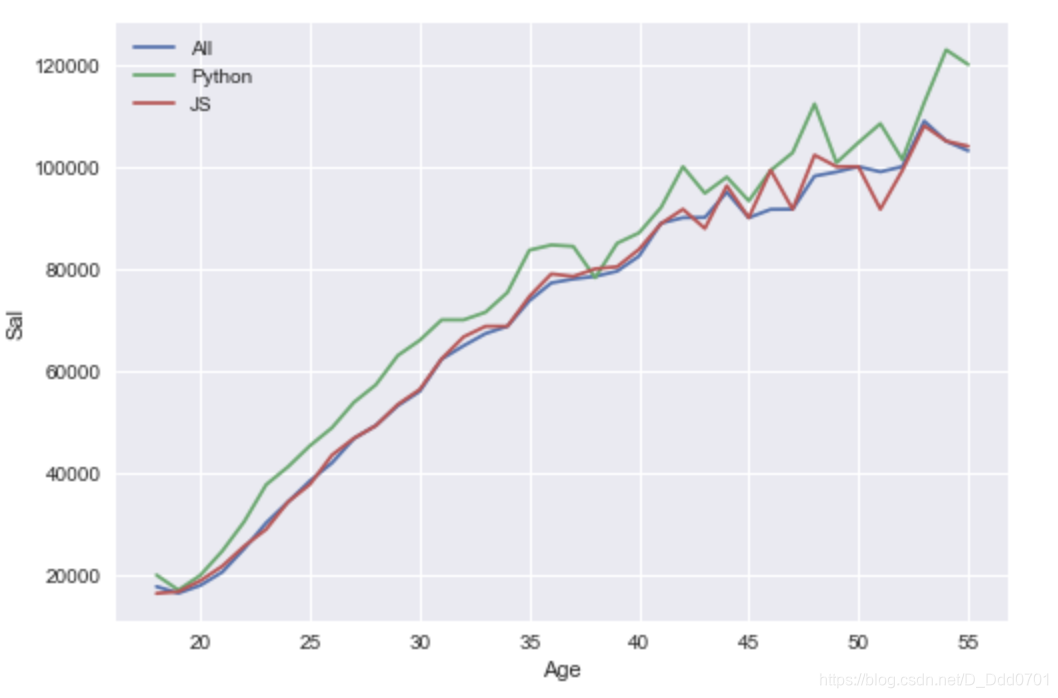
把数据提取出来并绘制图表:
ages = data.Age
all_dev = data.All_Devs
py= data.Python
js = data.JavaScript
plt.plot(ages,all_dev,label='All')
plt.plot(ages,py,label='Python')
plt.plot(ages,js,label='JS')
plt.legend()
plt.xlabel('Age')
plt.ylabel('Sal')
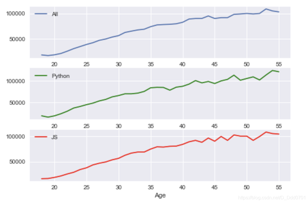
那么如何把这一幅图三条信息分别绘制成图呢?
开启多重图表
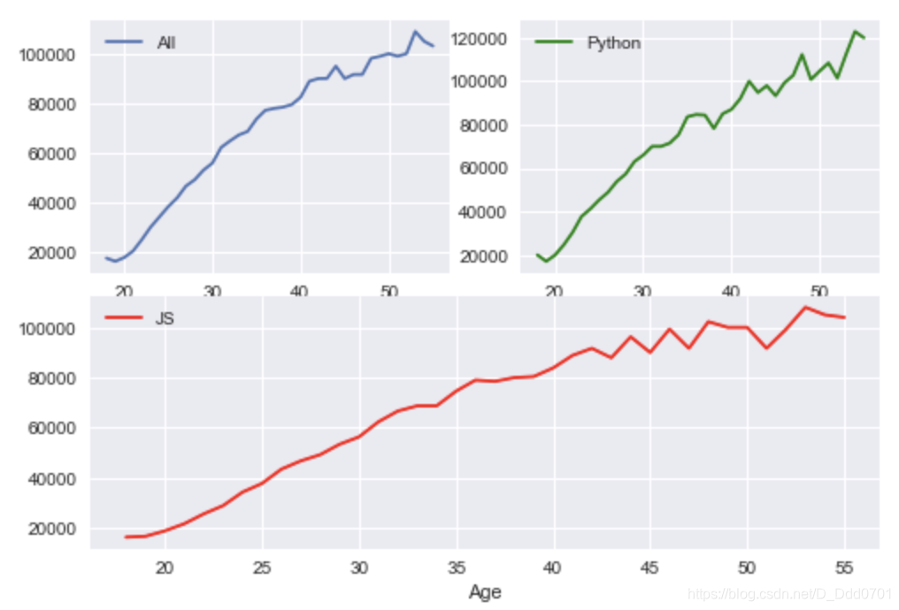
fig,ax=plt.subplots(nrows=2,ncols=1)
# 一个fig存在2行1列的小图
为了更好识别这两张图,用ax1和ax2分别命名:
fig,(ax1,ax2)=plt.subplots(nrows=2,ncols=1)
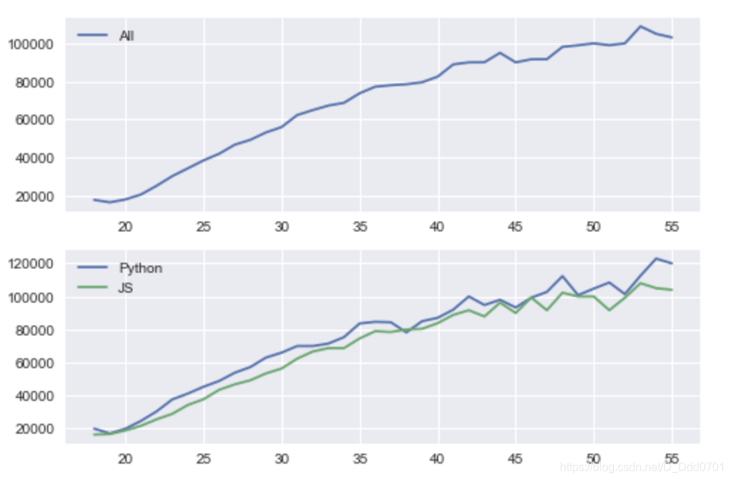
把数据导入多重图表
导入图表的方式:把plt改为图片名
fig,(ax1,ax2)=plt.subplots(nrows=2,ncols=1)
ax1.plot(ages,all_dev,label='All')
ax2.plot(ages,py,label='Python')
ax2.plot(ages,js,label='JS')
ax1.legend()
ax2.legend()
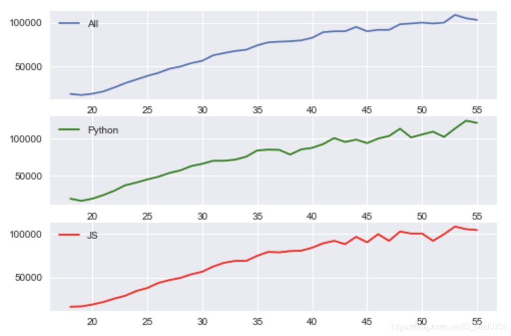
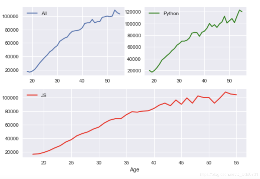
同理,如果是三张图:
fig,(ax1,ax2,ax3)=plt.subplots(nrows=3,ncols=1)
ax1.plot(ages,all_dev,label='All')
ax2.plot(ages,py,label='Python',color='g')
ax3.plot(ages,js,label='JS',color='r')
ax1.legend()
ax2.legend()
ax3.legend()
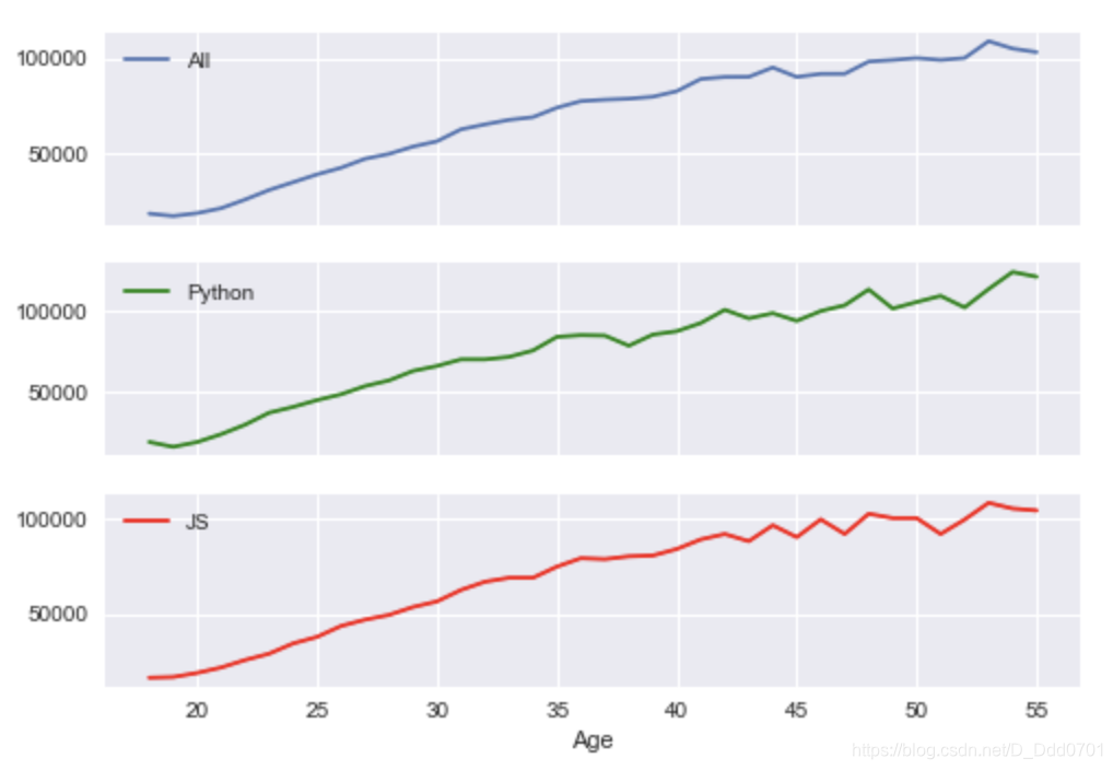
共享x轴
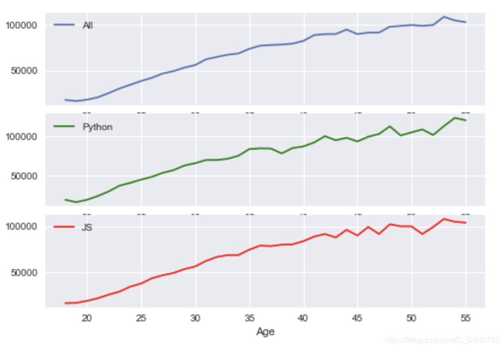
由于三幅图的x轴数据相同,所以可以共享x轴,使图表看起来更简洁:sharex=True
fig,(ax1,ax2,ax3)=plt.subplots(nrows=3,ncols=1,sharex=True)
ax1.plot(ages,all_dev,label='All')
ax2.plot(ages,py,label='Python',color='g')
ax3.plot(ages,js,label='JS',color='r')
ax1.legend()
ax2.legend()
ax3.legend()
ax3.set_xlabel('Age')
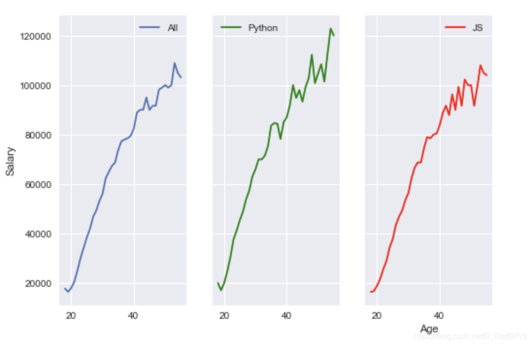
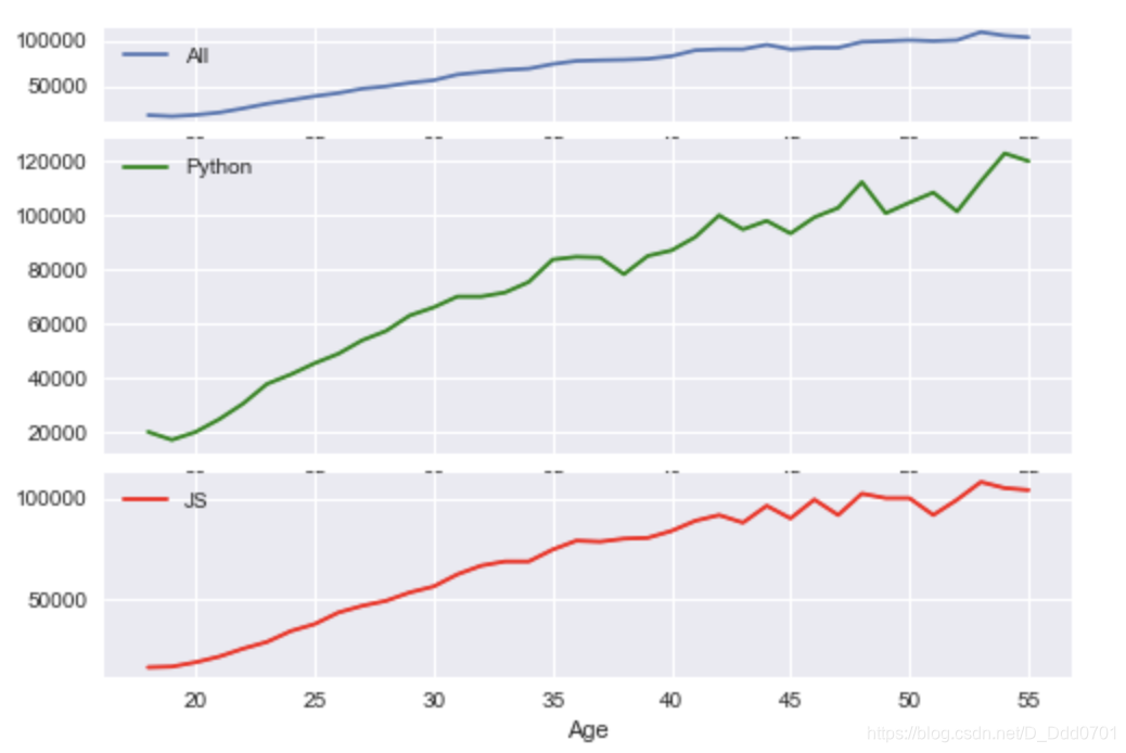
共享y轴
fig , (ax1,ax2,ax3) = plt.subplots(nrows=1,ncols=3,sharey=True)
ax1.plot(ages,all_dev,label='All')
ax2.plot(ages,py,label='Python',color='g')
ax3.plot(ages,js,label='JS',color='r')
ax1.legend()
ax2.legend()
ax3.legend()
ax3.set_xlabel('Age')
ax1.set_ylabel('Salary')
动态加载
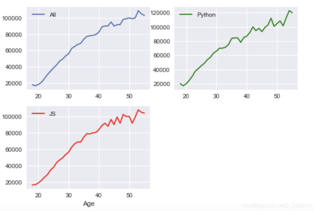
如果在绘制图表之前并不知道几行几列,设置nrows和ncols显然不可取,此时可以采用动态加载写法。
fig = plt.figure()
ax1 = fig.add_subplot(311)
# 311代表3行1列第1个
ax2 = fig.add_subplot(312)
# 312代表3行1列第2个
ax3 = fig.add_subplot(313)
# 313代表3行1列第3个
ax1.plot(ages,all_dev,label='All')
ax2.plot(ages,py,label='Python',color='g')
ax3.plot(ages,js,label='JS',color='r')
ax1.legend()
ax2.legend()
ax3.legend()
ax3.set_xlabel('Age')
换一个参数:
ax1 = fig.add_subplot(221)
ax2 = fig.add_subplot(222)
ax3 = fig.add_subplot(223)
可以根据需求继续更改:
ax1 = fig.add_subplot(221)
ax2 = fig.add_subplot(222)
ax3 = fig.add_subplot(212)
网格模式绘制更加复杂的布局
ax1 = plt.subplot2grid((6,1),(0,0),rowspan=2,colspan=1)
# 设置一个6行1列的布局
# ax1从0行0列开始跨越2行,1列
ax2 = plt.subplot2grid((6,1),(2,0),rowspan=2,colspan=1)
# ax2从2行0列开始跨越2行,1列
ax3 = plt.subplot2grid((6,1),(4,0),rowspan=2,colspan=1)
# ax3从4行0列开始跨越2行,1列
ax1.plot(ages,all_dev,label='All')
ax2.plot(ages,py,label='Python',color='g')
ax3.plot(ages,js,label='JS',color='r')
ax1.legend()
ax2.legend()
ax3.legend()
ax3.set_xlabel('Age')
继续设计更加自定义的分布:
ax1 = plt.subplot2grid((6,1),(0,0),rowspan=1,colspan=1)
ax2 = plt.subplot2grid((6,1),(1,0),rowspan=3,colspan=1)
ax3 = plt.subplot2grid((6,1),(4,0),rowspan=2,colspan=1)
绘制成之前示例的样子:
ax1 = plt.subplot2grid((4,2),(0,0),rowspan=2,colspan=1)
ax2 = plt.subplot2grid((4,2),(0,1),rowspan=2,colspan=1)
ax3 = plt.subplot2grid((4,2),(2,0),rowspan=2,colspan=2)