面试时经常会被用到你了解CSS3新特性嘛,针对此问题,特整理如下~

背景相关
background-size:用于设置背景图的尺寸
可选属性值有 length、percentage、cover、contain、auto
length用长度值规定背景图片大小,若有两值,则第一个为宽度,第二个为高度,若为一个值,则为宽度,高度为auto
percentage表示相对于背景定位区域的百分比,若有两值,则第一个为宽度,第二个为高度,若为一个值,则为宽度,高度为auto
cover表示保持图像的纵横比并将图像缩放成将完全覆盖背景定位区域的最小大小(图片有可能展示不全)。
contain表示保持图像的纵横比并将图像缩放成将适合背景定位区域的最大大小(会导致部分区域无背景图片)。
auto表示背景图片的原本大小(默认值)
.box {
      width: 100px;
      height: 100px;
      background-color: antiquewhite;
      background-image: url('./1686880776718.jpg');
      padding: 20px;
      background-size: 40px; /* 宽度为40px 高度为auto*/
      background-repeat: no-repeat;
} 
.box {
      width: 100px;
      height: 100px;
      background-color: antiquewhite;
      background-image: url('./1686880776718.jpg');
      padding: 20px;
      background-size: 70% 50%; /* 宽度为背景的70% 高度为背景的50%*/
      background-repeat: no-repeat;
    }
 .box {
      width: 100px;
      height: 100px;
      background-color: antiquewhite;
      background-image: url('./1686880776718.jpg');
      padding: 20px;
      background-size: contain;
/* 图片等比缩放,直到背景图片的宽与容器的宽相等,或者背景图片的高与容器的高相等*/
      background-repeat: no-repeat;
    }
.box {
      width: 100px;
      height: 100px;
      background-color: antiquewhite;
      background-image: url('./1686880776718.jpg');
      padding: 20px;
      background-size: cover; /* 图片等比缩放,直到完全覆盖容器,图片会尽可能全的显示在元素上*/
      background-repeat: no-repeat;
    }
background-origin:用于设置背景图的原点(背景图的起始位置),
可选属性值有padding-box| border-box | content-box
padding-box表示从padding区域开始显示(默认值)
border-box表示从border区域开始显示
content-box表示从content区域开始显示
.box {
      width: 200px;
      height: 200px;
      background-color: antiquewhite;
      background-image: url('./1686880776718.jpg');
      padding: 20px;
      border: 10px dotted red;
      background-repeat: no-repeat;
      background-origin: padding-box;
    }

background-clip用于指定背景绘制区域
可选属性值有 border-box | padding-box | content-box | text
border-box表示从border区域开始向外裁掉背景(默认值)
padding-box表示从padding区域开始向外裁剪背景
content-box表示从content区域开始向外裁剪背景
text表示将背景只呈现在文字上(目前使用时要加前缀-webkit-)
.box {
      width: 200px;
      height: 200px;
      background-color: antiquewhite;
      background-image: url('./1686880776718.jpg');
      padding: 20px;
      border: 10px dotted red;
      background-repeat: no-repeat;
      background-origin: padding-box;
      background-clip: content-box;
    }

.box {
      width: 100px;
      height: 100px;
      background-color: antiquewhite;
      color: transparent; /* 将字体设为透明  */
      font-size: 50px;
      background-image: url('./1686880776718.jpg');
      padding: 20px;
      border: 10px dotted red;
      background-repeat: no-repeat;
      background-origin: padding-box;
      -webkit-background-clip: text;
    }

文本属性
text-shadow: 给文本添加阴影
可选值有:h-shadow v-shadow blur color,其中h-shadow与v-shadow是必填值;
.box {
      width: 100px;
      height: 100px;
      font-size: 30px;
      text-shadow: 2px 2px 10px red;
    }
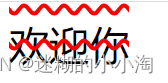
white-space:用于设置文本换行方式
可选值有:normal(默认值)、pre(原样输出)、pre-wrap(在pre效果的基础上,超出自动换行)、pre-line(在pre效果的基础上,超出自动换行,忽略换行)、nowrap(不换行)
<div class="box">欢迎你来到学习频道</div> .box {
width: 100px;
height: 100px;
font-size: 20px;
background-color: rgb(248, 248, 60);
white-space: nowrap;
}
text-overflow:用于设置文本溢出时的呈现模式
可选值有:clip(裁剪,默认值)、ellipsis(溢出部分替换为....)
要使该属性生效,需要定义overflow为非visible值,white-space设为nowrap
.box {
      width: 100px;
      height: 100px;
      font-size: 20px;
      background-color: rgb(248, 248, 60);
      overflow: hidden;
      white-space: nowrap;
      text-overflow: ellipsis;
    }
text-decoration:文本修饰符合属性,包含text-decoration-line、text-decoration-style以及text-decoration-color
text-decoration-line表示文本修饰线的位置,可选值有none(默认)、underline(下划线)、overline(上划线)、line-through(贯穿线);-----必填项
text-decoration-style表示文本修饰线的形状,可选值有solid(默认)、double(双线)、dotted(点状)、dashed(虚线)、wavy(波浪线);
text-decoration-color表示文本修饰线的颜色
无顺序要求
.box {
      width: 100px;
      height: 100px;
      font-size: 20px;
      text-decoration: overline;
} 
.box {
      width: 100px;
      height: 100px;
      font-size: 20px;
      text-decoration: line-through red;
    }
 .box {
      width: 100px;
      height: 100px;
      font-size: 20px;
      text-decoration: red underline wavy;
} 
.box {
      width: 100px;
      height: 100px;
      font-size: 20px;
      text-decoration: line-through overline red wavy;
    }
text-stroke-width:表示文本描边的宽度;
text-stroke-color:表示文本描边的颜色;
text-stroke:复合属性,设置文本描边的宽度和颜色
注意:文本描边属性仅支持webkit内核浏览器,目前使用时前面都要加上-webkit-前缀
.box {
   width: 100px;
   height: 100px;
   font-size: 20px;
   -webkit-text-stroke-width: 1px;
   -webkit-text-stroke-color: rgba(244, 143, 20, 0.932);
} 
渐变函数
渐变分为线性渐变、径向渐变
线性渐变(linear-gradient)有两种方式设置渐变形式(一种通过方向关键词):
linear-gradient(direction,color-stop1,color-stop2,...., color-stopn),direction的可选值可以有to right(从左到右)、to left(从右到左)、to bottom right(从左上角到右下角)、to bottom top(从左下角到右上角)、to top(从下到上)、to bottom(从上到下),默认方向为从上到下渐变;
.box {
      width: 100px;
      height: 100px;
      background-image: linear-gradient(red, yellow) /* 从上到下由红变黄渐变 */
    }
 .box {
      width: 100px;
      height: 100px;
      background-image: linear-gradient(to right, red, yellow, blue) /* 从左到右由红变黄变蓝渐变 */
} 
 .box {
      width: 100px;
      height: 100px;
      background-image: linear-gradient(to right top,red, yellow, blue) /* 从左下角到右上角由红变黄变蓝渐变 */
    }
设置线性渐变形式(一种通过角度)
linear-gradient(angle,color-stop1,color-stop2,...., color-stopn)表示从指定角度开始渐变,默认为0
角度是如下图所示,即0deg将创建一个从下到上的渐变,90deg将创建一个从左到右的渐变;

 .box {
      width: 100px;
      height: 100px;
      background-image: linear-gradient(0deg,red, yellow, blue) /* 从下到上由红变黄变蓝渐变 */
    }
.box {
      width: 100px;
      height: 100px;
      background-image: linear-gradient(45deg,red, yellow, blue) /* 从顺时针45度(即从左下角到右上角)由红变黄变蓝渐变 */
} 
.box {
      width: 100px;
      height: 100px;
      background-image: linear-gradient(-45deg,red, yellow, blue) /* 从逆时针45度(即从右下角到左上角)由红变黄变蓝渐变 */
    }
可以在颜色后面设置颜色开始渐变的位置,可用像素值表示或用%表示
 .box {
      width: 100px;
      height: 100px;
      background-image: linear-gradient(to top,red 0px, yellow 50px, blue 100px)
      /* 从下到上由红变黄变蓝渐变, 距离底部0px红色,距离底部50px 黄色,距离底部100px为蓝色 */
    }
.box {
      width: 100px;
      height: 100px;
      background-image: linear-gradient(to top,red, yellow 50%, blue 100%)
      /* 从下到上由红变黄变蓝渐变, 距离底部高度的0%红色,距离底部高度的50% 黄色,距离底部高度的100%为蓝色 */
    }
还可以通过径向渐变(radial-gradient)设置渐变效果:
radial-gradient(shape size at position,start-color,color-stop2,...., color-stopn),默认渐变的中心是center,形状是ellipse,渐变的大小是farthest-corner,表示到最远的位置;
shape可选值为 :circle、ellipse(椭圆形)
size 定义了四个可选值: closest-side、farthest-side、closest-corner、farthest-corner
.box {
      width: 200px;
      height: 100px;
      background-image: radial-gradient(red, yellow, blue)
} 
.box {
      width: 200px;
      height: 100px;
      background-image: radial-gradient(circle, red, yellow, blue)
} 
.box {
      width: 200px;
      height: 100px;
      background-image: radial-gradient(at 100px 20px, red, yellow, blue)
      /* 在宽100px 高20px的地方开始径向渐变,即为圆心 */
} 
 .box {
      width: 200px;
      height: 100px;
      background-image: radial-gradient(closest-side at 100px 20px, red, yellow, blue)
} 
线性渐变与径向渐变都可以设置重复渐变:
重复线性渐变repeat-linear-gradient()
重复径向渐变repeat-radial-gradient()
重复是指在没有发生渐变的区域开始渐变
.box {
      width: 200px;
      height: 100px;
      background-image: repeating-radial-gradient(red 10px, yellow 50px, blue 100px)
    }
.box {
      width: 200px;
      height: 100px;
      background-image: repeating-linear-gradient(red 10px, yellow 50px, blue 100px)
    }
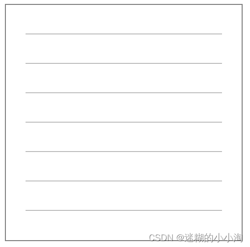
  .box {
      width: 200px;
      height: 200px;
      border: 1px solid gray;
      margin: 0 auto;
      padding: 20px;
      background-image: repeating-linear-gradient(transparent 0px, transparent 29px, gray 30px );
      background-clip: content-box
    }