效果:

第一步:custom-class="publishDialog" 新起一个类名
<el-dialog title="发布配置" custom-class="publishDialog" :visible.sync="publishDialogVisible" width="800px" :append-to-body="true"
:before-close="publishHandleClose">
<avue-form :option="option" v-model="publishForm" ref="publishForm" @submit="handleSubmit">
<template slot-scope="{}" slot="layerNameLabel">
<span>图层别名 </span>
<el-tooltip class="item" effect="dark" content="仅支持输入字母、数字" placement="top-start">
<i class="el-icon-warning"></i>
</el-tooltip>
</template>
<template slot-scope="{size}" slot="menuForm" style="text-align: right;">
<el-button :size="size" @click="publishHandleClose">取 消</el-button>
<el-button type="primary" :size="size" @click="$refs.publishForm.submit()">确 定</el-button>
</template>
</avue-form>
</el-dialog>第二步:
定义触发loading的方法
let loadingInstance = Loading.service(
{
target: '.publishDialog', (dialog的新类名 也就loading遮罩的dom)
lock: true,
text: '加载中',
}
);
关闭loading的方法
loadingInstance.close();
  handleSubmit(form, done) {
            let loadingInstance = Loading.service(
                {
                    target: '.publishDialog',
                    lock: true,
                    text: '加载中',
                }
            );
            release().then(res => {
                if (res.data.code == 200) {
                    this.$message({
                        type: 'success',
                        message: '发布成功!'
                    });
                    loadingInstance.close();
                    this.publishDialogVisible = false
                    done()
                } else {
                    loadingInstance.close();
                }
            })
},补充:avue-form 表单插槽
效果: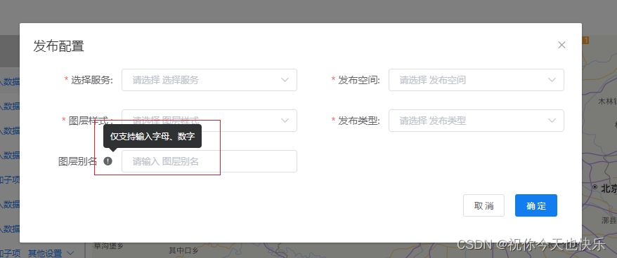
第一步:slot="layerNameLabel"
<avue-form :option="option" v-model="publishForm" ref="publishForm" @submit="handleSubmit">
<template slot-scope="{}" slot="layerNameLabel">
<span>图层别名 </span>
<el-tooltip class="item" effect="dark" content="仅支持输入字母、数字" placement="top-start">
<i class="el-icon-warning"></i>
</el-tooltip>
</template>
</avue-form>第二步:labelslot: true
                   {
                        label: "图层别名",
                        prop: "layerName",
                        labelslot: true,
                        rules: [{
                            required: false,
                            message: "请输入数据库名",
                            trigger: "blur"
                        }, {
                            message: "只能输入字母、数字",
                            pattern: /^[a-zA-Z0-9]+$/,
                            trigger: "blur"
                        }
                        ],
                    },