
原文链接:Hexo:Butterfly主题魔改之头部导航栏 | Elvin
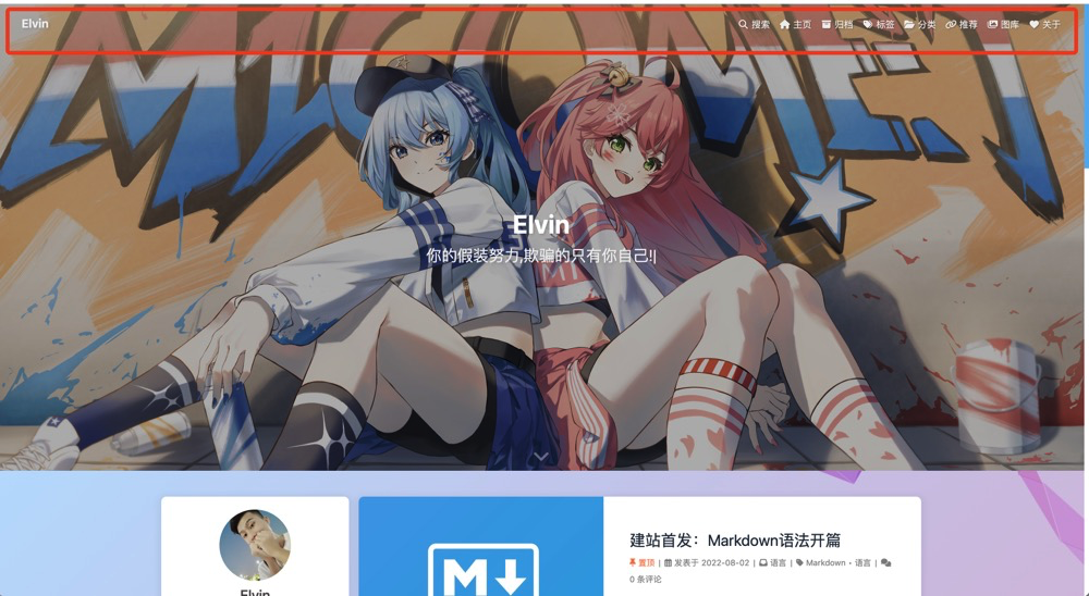
一、初始效果
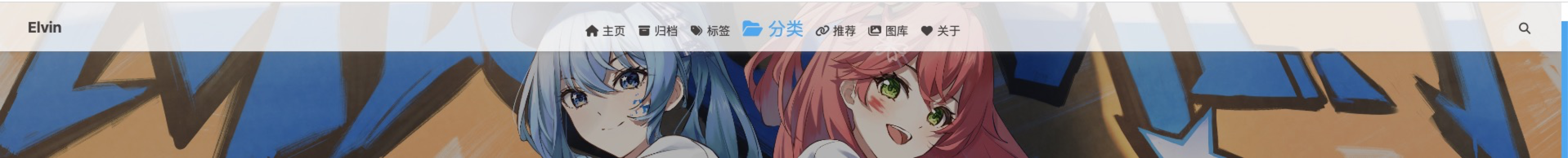
二、搜索按钮调整
调整方案:
- 将搜索字样去除
- 将搜索图标(也就是搜索功能键)移动到最右边
调整措施:
修改butterfly主题的 blog/themes/butterfly/layout/includes/header/nav.pug文件
修改如下:+:代表新引入的行;-:需要删除的行;`//- span=’ '+_p(‘search.title’)去除搜索字样,只保留图标
nav#nav
  span#blog_name
    a#site-name(href=url_for('/')) #[=config.title]

  #menus
+  !=partial('includes/header/menu_item', {

    }, {

    cache: true})
+  #nav-right
    if (theme.algolia_search.enable || theme.local_search.enable)
      #search-button
        a.site-page.social-icon.search
          i.fas.fa-search.fa-fw
+          //- span=' '+_p('search.title')
-    !=partial('includes/header/menu_item', {

    }, {

    cache: true})

    #toggle-menu
      a.site-page
        i.fas.fa-bars.fa-fw
❗️❗️❗️注意:使用时记得不要把➕号也放到代码里
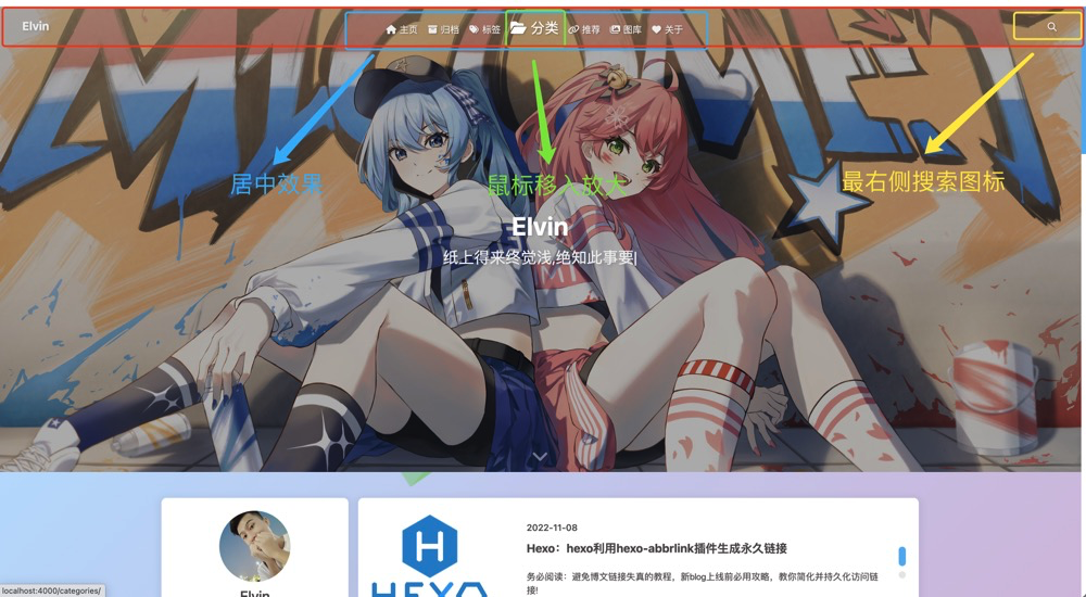
三、居中导航栏
调整方案:
将除了搜索的所有菜单放在中间位置
调整措施:
自定义css样式文件,不知道怎么自定义的可以看这篇文章Hexo:Butterfly主题引入自定义CSS与JS文件
添加如下css样式即可获得居中的菜单效果
/* 导航栏做居中处理 */
#nav-right{


    flex:1 1 auto;
    justify-content: flex-end;
    margin-left: auto;
    display: flex;
    flex-wrap:nowrap;
}
四、鼠标移入菜单效果
调整方案:
- 原移入效果为选项底部出现蓝条提示,改为移入后选项放大提示
- 去除底部提示蓝条,增加放大提示效果
调整措施:
还是在自定义的css样式文件中加入样式,如下:
/* 去除导航栏选项中底下的蓝条 */
#nav *::after{


    background-color: transparent!important;
}

/* 导航栏菜单鼠标移入字体放大 */
#nav #site-name:hover,
#nav .menus_item:hover,
#nav #search-button:hover{


    font-size:28px;
}
五、最终效果
借鉴链接
更多知识持续更新中!!!
声明
借鉴部分均注明了原文出处,可在文章的借鉴链接处获取原文出处
文中若内容有涉及原版权,请邮件联系[email protected],涉及的相关文章或内容将会及时更改或取消发布