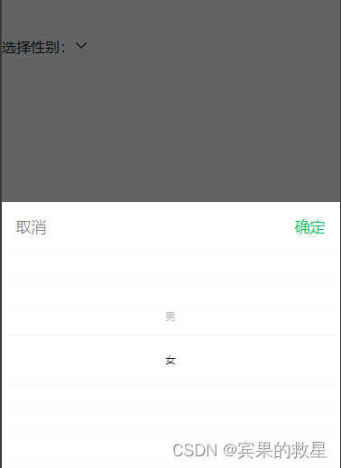
选择性别
<view style="display: flex; align-items: center;">
  选择性别:
  <picker header-text="选择性别" bindchange="bindChange" value="{

   {sex}}" range-key="sex_name" range="{

   {sex_list}}">
    <view class="picker">
      {

   {sex}} <van-icon name="arrow-down" />
    </view>
  </picker>
</view>
data:{
sex:'',
sex_list:[
{
id: 5,
sex_name: "男"
},{
id: 10,
sex_name: "女"
}
],
}bindChange(e) {
const res = this.data.sex_list[e.detail.value]
this.setData({
sex: res.sex_name
})
},picker修改
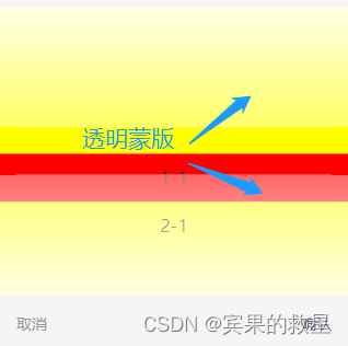
刚开始使用的是vantweap的picker,但是居然有蒙版还无法自定义样式。
<van-picker
    show-toolbar
    columns="{

   { list }}"
    bind:cancel="onClose"
    bind:confirm="onChange"
    custom-class="picker"
    active-class="active"
    column-class="column"
/>
.van-picker__toolbar {
position: absolute;
bottom: 0;
width: 100%;
z-index: 9;
background-color: transparent!important;
display: flex;
align-items: center;
justify-content: space-around;
}
.picker {
height: 55vh;
width: 100vw;
background: transparent!important;
margin-top: 180rpx;
}
.active {
background: red!important;
}
.column {
background-color: yellow;
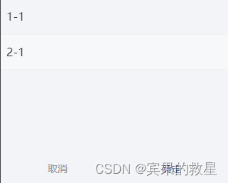
}list: [
{
text: '1-1'
},
{
text: '2-1'
}
],onChange(e) {
this.setData({
id: e.detail.value.id
})
},苦恼ing。最后看到原生组件有自定义蒙版样式,豁然开朗~
<view style="height: 55vh; position: relative;">

  <picker-view
    indicator-style="height: 50px; background: rgba(255,255,255,0.4);position: relative; "
    style="width: 100%; height: 270px;background: rgab(255,255,255,0.1);color: #333;"
    mask-style="background: transparent"
    value="{

   {active}}"
    bindchange="onChange"
>
    <picker-view-column>
      <view wx:for="{

   {list}}"
          wx:key="index"
          style="line-height: 50px; text-align: left; padding: 0 20rpx; white-space:nowrap;text-overflow:ellipsis;overflow:hidden">{

   {item.text}}</view>
    </picker-view-column>

  </picker-view>

  <view  class="btn">
    <view class="cancel" bind:tap="onClose">取消</view>
    <view class="sure" bind:tap="onConfirm">确定</view>
  </view>

</view>
激活项的蒙版在文字上方
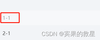
利用relative的层级z-index:-1展示在文字下方。
indicator-style="position: relative; z-index: -1;" onChange(e) {
let idx = e.detail.value[0]
this.setData({
idx
})
},
onConfirm() {
this.setData({
id: this.data.list[this.data.idx].id,
})
},