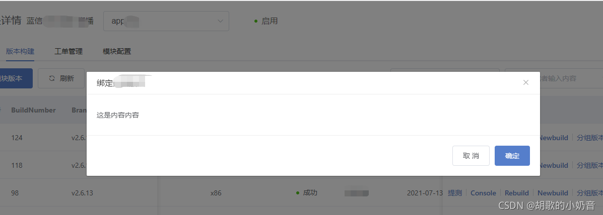
实现效果
组件封装
<template>
  <el-dialog
    :title="title"
    :width="width"
    :visible.sync="dialogVisible"
    :close-on-click-modal="false"
    v-if="dialogVisible"
    v-bind="$attrs"
  >
    <slot></slot>
    <div slot="footer">
      <el-button @click="handleCancel">取 消</el-button>
      <el-button type="primary" @click="handleConfirm">
        {

    {

     confirmText }}
      </el-button>
    </div>
  </el-dialog>
</template>

<script>
export default {


  props: {


    title: String,
    width: {


      type: String,
      default: '900px'
    },
    visible: {


      type: Boolean,
      default: false
    },
    confirmText: {


      type: String,
      default: '确定'
    }
  },
  computed: {


    dialogVisible: {


      get() {


        return this.visible;
      },
      set(value) {


        this.$emit('update:visible', value);
      }
    }
  },
  methods: {


    handleConfirm() {


      this.$emit('confirm');
      this.$emit('update:visible', false);
    },
    handleCancel() {


      this.$emit('cancel');
      this.$emit('update:visible', false);
    }
  }
};
</script>
组件使用
<basic-dialog :visible.sync="showGroupVersionDialog" title="绑定分组版本">
  <div>这是内容内容</div>
</basic-dialog>