前言: 在之前在React中使用的类组件来封装 Echarts 中的图表实例,现在越用越觉得类组件封装的这个东西真麻烦,一点都不好用,还是函数组件香一点,本篇文章就用 函数组件来简单的封装一个渐变色的堆叠面积图。
一、在项目中安装 echarts-for-react 和 Echarts
npm install --save echarts-for-react 或者 yarn add echarts-for-react
npm install echarts 或者 yarn add echarts
二、实际上手完成一个堆叠面积图的渐变形式。
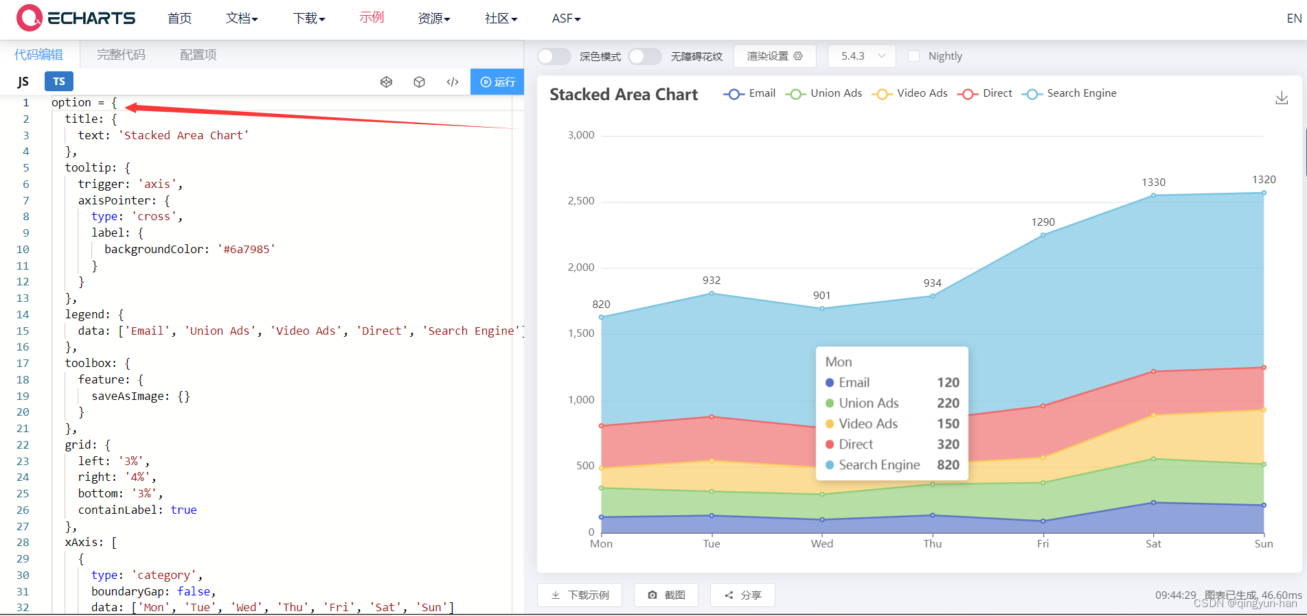
先初始化在Echarts中引入一个基础的面积图形,复制基础数据 option引入到你封装的组件或者页面中。
完整实际代码:(函数组件形式)
import ReactECharts  from "echarts-for-react"
import * as echarts from "echarts"
//定义组件可传参数
type DomProps={
    wight?:string;
    height?:string;
}
const EchartsDom=(props:DomProps)=>{
    const  option = {
        title: {
          text: 'Stacked Area Chart'
        },
        tooltip: {
          trigger: 'axis',
          axisPointer: {
            type: 'cross',
            label: {
              backgroundColor: '#6a7985'
            }
          }
        },
        legend: {
          data: ['Email', 'Union Ads', 'Video Ads', 'Direct', 'Search Engine']
        },
        toolbox: {
          feature: {
            saveAsImage: {}
          }
        },
        grid: {
          left: '3%',
          right: '4%',
          bottom: '3%',
          containLabel: true
        },
        xAxis: [
          {
            type: 'category',
            boundaryGap: false,
            data: ['Mon', 'Tue', 'Wed', 'Thu', 'Fri', 'Sat', 'Sun']
          }
        ],
        yAxis: [
          {
            type: 'value'
          }
        ],
        series: [
          {
            name: 'Email',
            type: 'line',
            stack: 'Total',
            areaStyle: {},
            emphasis: {
              focus: 'series'
            },
            data: [120, 132, 101, 134, 90, 230, 210]
          },
          {
            name: 'Union Ads',
            type: 'line',
            stack: 'Total',
            areaStyle: {},
            emphasis: {
              focus: 'series'
            },
            data: [220, 182, 191, 234, 290, 330, 310]
          },
          {
            name: 'Video Ads',
            type: 'line',
            stack: 'Total',
            areaStyle: {},
            emphasis: {
              focus: 'series'
            },
            data: [150, 232, 201, 154, 190, 330, 410]
          },
          {
            name: 'Direct',
            type: 'line',
            stack: 'Total',
            areaStyle: {},
            emphasis: {
              focus: 'series'
            },
            data: [320, 332, 301, 334, 390, 330, 320]
          },
          {
            name: 'Search Engine',
            type: 'line',
            stack: 'Total',
            label: {
              show: true,
              position: 'top'
            },
            areaStyle: {},
            emphasis: {
              focus: 'series'
            },
            data: [820, 932, 901, 934, 1290, 1330, 1320]
          }
        ]
      };

    return (
        <ReactECharts  option={option} style={

   {width:`${props?.wight}`,height:`${props?.height}`}} ></ReactECharts>
    )

}
export  default EchartsDom;
三、引入效果(不是封装组件,则不需要这一步)
import React from 'react';
import EchartsDom from '@components/EchartsDom';
import './index.css';
const nweflie = () => {
    return (
            <div className='centre'>
                <EchartsDom wight='800px' height='500px'></EchartsDom>
            </div>
    );
};
export default nweflie;
当前效果图:
四、修改样式调整为渐变
查看 echarts 的渐变示例,我们直接给自己需要修改的图形上色即可:
在 option的 series 修改部分如下:
// 第一组数据的
{
name: 'Email',
type: 'line',
stack: 'Total',
// 区域填充样式。
areaStyle: {
// 这里提供一个颜色的变量 transparent 透明色
// 在线性渐变中的 LinearGradient中的前四个数值代表方向。
// 分别为 右 下 左 上,取值范围 0~1
color: new echarts.graphic.LinearGradient(0,0,0,1,[
// 0 0 0 1 代表从上到下绘色
{ offset: 0, color: 'rgba(253, 201, 141, 1)'}, //0 %的颜色
{ offset: 0.5, color: 'rgba(253, 201, 141, 0.6)'}, // 50% 的颜色
{ offset: 1, color: 'rgba(253, 201, 141, 0)' } //100% 的颜色
])
},
emphasis: {
focus: 'series'
},
data: [120, 132, 101, 134, 90, 230, 210]
},
// 第二组数据的样式
{
name: 'Union Ads',
type: 'line',
stack: 'Total',
areaStyle: {
// 径向渐变 RadialGradient的前三个参数代表 圆心和y、x的半径
// 分别为 圆心从左到右的位置,圆心在从上到下的位置,圆心的半径 取值为 0~1
color:new echarts.graphic.RadialGradient(0.5,0.5,0.8,[
{ offset: 0, color: 'rgba(185, 299, 164, 1)'}, // 0% 的颜色
{ offset: 0.5, color: 'rgba(185, 299, 164, 0.5)'}, //50% 的颜色
])
},
emphasis: {
focus: 'series'
},
data: [220, 182, 191, 234, 290, 330, 310]
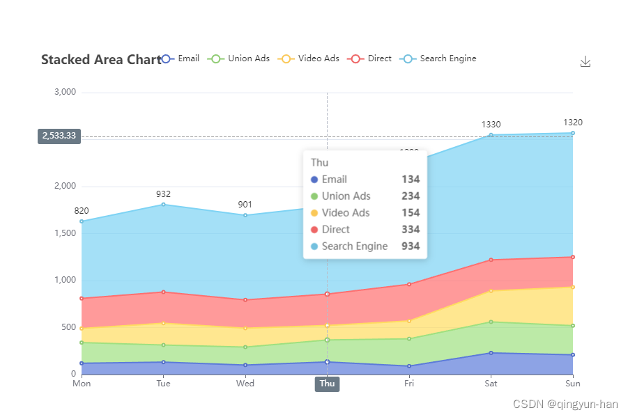
},暂时就修改两个面积数据的样式,这两个的效果图如下:

五、扩展,数据传递。
在封装使用Echarts的时候,最基础的还是得有数据,用React中的函数组件来封装Echarts并监听数据传参的话,可以直接通过 useEffect 来监听 props的变化,并重绘图表。
示例:
//先在封装的函数组件中引入 :
import { useEffect } from "react";
//在你的传参配置信息中加入 data;

type DomProps={
    wight?:string;
    height?:string;
    //参数名和参数类型
    data?:any;
}

// 在函数组价中加入以下
const EchartsDom=(props:DomProps)=>{
  //真实数据直接给到你的 option 数据组里
  const [data,setdata]:any=useState([])
  //当props发生变化时,执行以下方法
     useEffect(()=>{
      setdata(props?.data)
  },[props])
  .......略
在组件中定义好传参之后,就可以在使用你的组件的时候直接传递数据了。
例如:
<div className='centre'>
       {/* Data  传递你真实的数据*/}
      <EchartsDom wight='800px' height='500px' data={Data}></EchartsDom>
</div>
如此定义之后,只要你传递的 Data数据发送改变,对应的图表就会自动重绘。
本文只是简单记录的一个React向 Echarts 搭桥使用的方法,Echarts的配置中,还有很多有趣的设置,大家可以继续探索。本文结束!