目录
一.字体
1.字体的设置
通过font-family设置字体样式,通过font-size设置字体大小
<head>
    <meta charset="UTF-8">
    <meta name="viewport" content="width=device-width, initial-scale=1.0">
    <title>Document</title>
    <link rel="stylesheet" href="csspassage/html02.css">
</head>
<body>
    <!--  -->
    <div>
        龙年大吉!
    </div>
</body>


body div{
    font-family: 'Microsoft YaHei';
    font-size: 30px;
}

2.字体的颜色
有三种展示方式
2.1预定义的颜色值
直接用对应的单词
body div{
    font-family: 'Microsoft YaHei';
    font-size: 30px;
    color: red;
}
2.2十六进制
#ff0000表示红色,ff转成十进制就是255,一共有六位,每两位对应三原色中的一个,顺序是红绿蓝,每个颜色最多取到255,可以简写成#f00
2.3rgb表示法
color: rgb(255, 0, 0);
3.字体粗细及样式
字体粗细有四种预定样式
normal默认值,粗细为400
bold粗700
bolder更粗 lighter更细

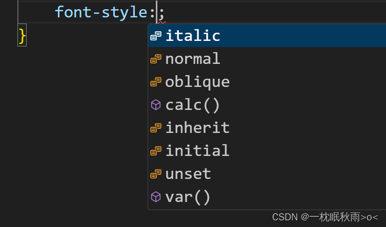
那么字体样式也有四种
normal默认样式
italic斜体
oblique倾斜
inherit继承父元素的字体样式
4.文本
4.1text-align
控制文本靠左靠右居中
4.2text-indent
控制首行缩进,以em为单位代表缩进N个字符
4.3text-decoration
文本装饰
underline加下划线
line-through加中线
overline加上划线
none去下划线
line-height行高,控制行间距

h1{
font-family: 'Microsoft YaHei';
font-size: 25px;
text-align: left;
}
h2{
font-family: 'Microsoft YaHei';
font-size: 25px;
text-align: center;
}
h3{
font-family: 'Microsoft YaHei';
font-size: 25px;
text-align: right;
}
div p{
font-size: 25px;
text-indent: 2em;
text-decoration: underline;
line-height: 50px;
}
二.背景属性
background-color指定背景颜色
background-image:url()添加背景图片
background-repeat指定背景的排列方式
background-position指定背景的位置
background-size指定背景的尺寸

body{
background-color:rgb(71, 209, 209);
background-image: url(https://img2.baidu.com/it/u=1737199380,1768433982&fm=253&fmt=auto&app=120&f=JPEG?w=1067&h=800);
background-size: cover;
}
p{
font-size: 50px;
font-family: "Microsoft YaHei";
color: aliceblue;
text-align: center;
}
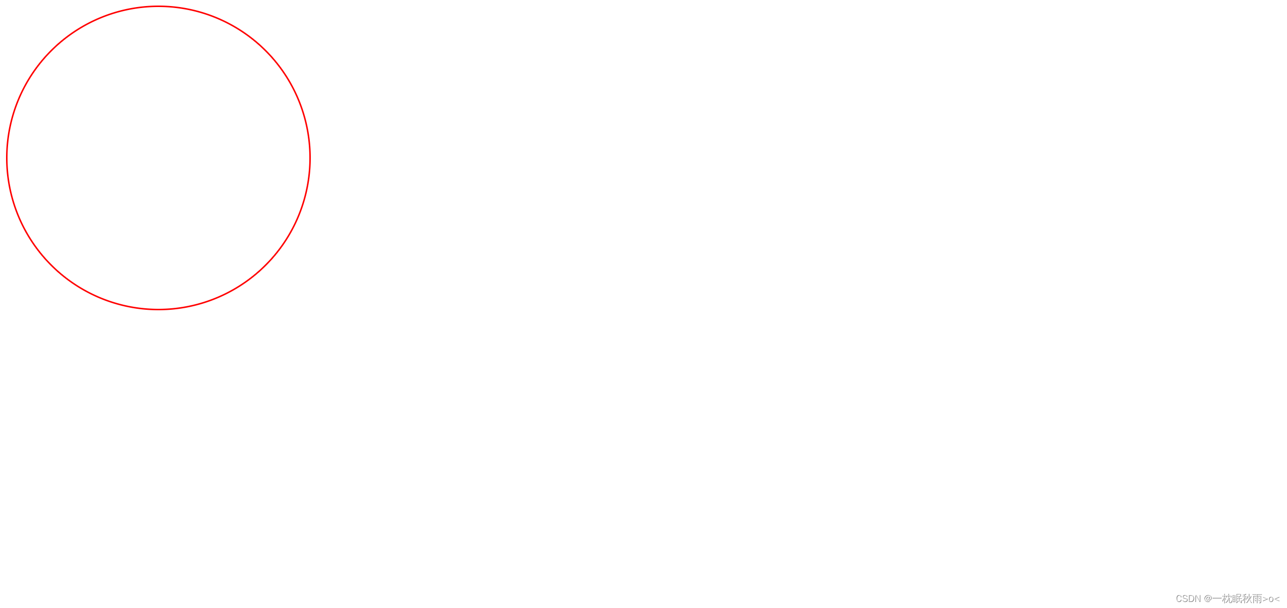
三.圆角矩形

div{
width: 400px;
height: 300px;
border: 2px red solid;
border-radius: 20%;
}
div{
width: 400px;
height: 400px;
border: 2px red solid;
border-radius: 50%;
}
四.元素显示模式
元素显示分为块级元素和行内元素
块级元素有div,h1-h6,p等等
行内元素有a,span,strong等等
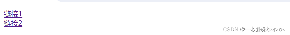
在实际开发应用中,我们通常将行内元素转换
例如
定义两个行内元素,假设定义两个a标签
<!DOCTYPE html>
<html lang="en">
<head>
<meta charset="UTF-8">
<meta name="viewport" content="width=device-width, initial-scale=1.0">
<title>Document</title>
<link rel="stylesheet" href="csspassage/html02.css">
<style>
a{
display: block;
}
</style>
</head>
<body>
<!-- -->
<a href="">链接1</a>
<a href="">链接2</a>
</body>
</html>
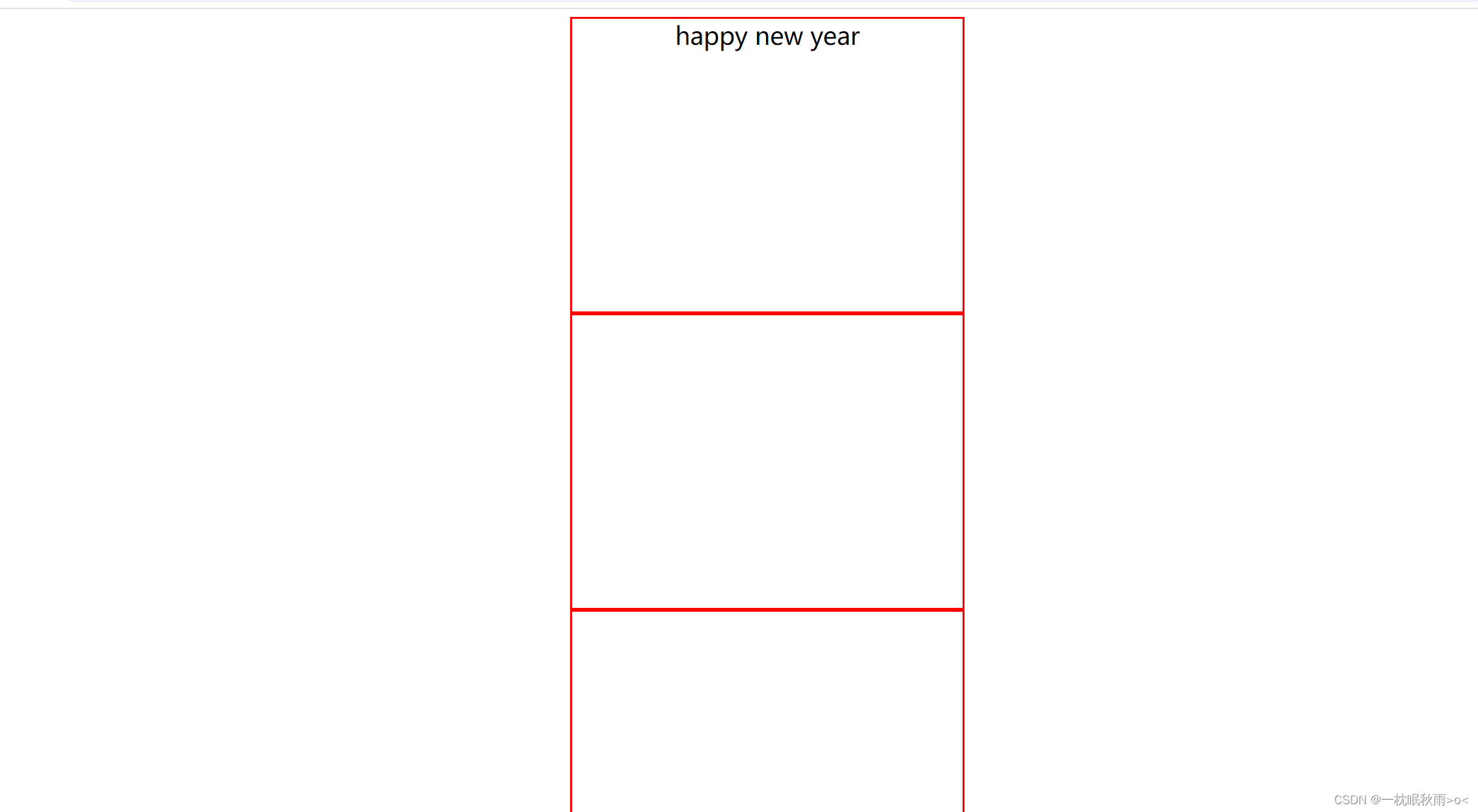
五.盒模型
border边框
padding内边距
margin内边距
content内容
<!DOCTYPE html>
<html lang="en">
<head>
<meta charset="UTF-8">
<meta name="viewport" content="width=device-width, initial-scale=1.0">
<title>Document</title>
<link rel="stylesheet" href="csspassage/html02.css">
<style>
div{
width: 400px;
height: 300px;
border: 2px red solid;
padding: auto;
margin: auto;
font-size: 25px;
font-family: "Microsoft YaHei";
text-align: center;
}
</style>
</head>
<body>
<!-- -->
<div>happy new year</div>
<div></div>
<div></div>
</body>
</html>
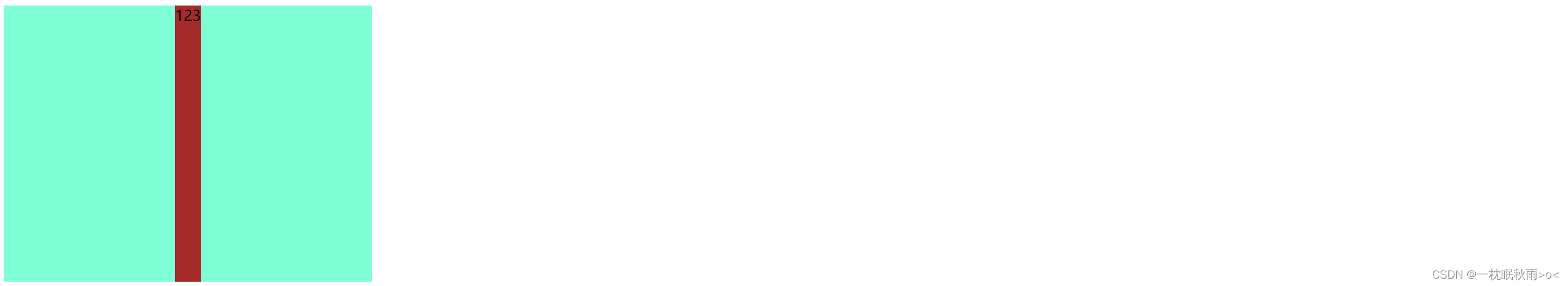
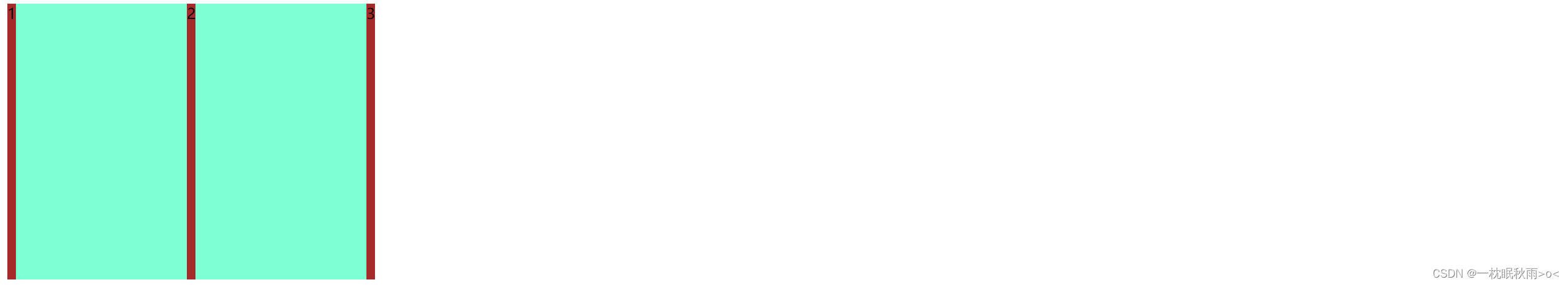
六.弹性布局
display: flex进入弹性布局模式

<!DOCTYPE html>
<html lang="en">
<head>
<meta charset="UTF-8">
<meta name="viewport" content="width=device-width, initial-scale=1.0">
<title>Document</title>
<link rel="stylesheet" href="csspassage/html02.css">
<style>
div{
width: 400px;
height: 300px;
display: flex;
background-color: aquamarine;
justify-content: start;
}
div span{
background-color: brown;
}
</style>
</head>
<body>
<!-- -->
<div>
<span>1</span>
<span>2</span>
<span>3</span>
</div>
</body>
</html>
这是浏览器的默认模式,主轴为start

以上两种分别为center/end
这是space-between模式,每个弹性盒之间都有空隙

<style>
div{
width: 400px;
height: 300px;
display: flex;
background-color: aquamarine;
justify-content: space-around;
align-items: center;
}
div span{
height :100px;
width :100px;
background-color: brown;
}
</style>
这是对于副轴做出的调整
七.Chrome调试工具
打开一个网页

按F12键打开开发者工具

选中elements这是HTML文件

选中console这是控制台,用于后续调试JavaScript代码

选中network,这是前后端交互的接口