背景图像效果
1.渐变效果:背景图片是一条的可以实现垂直平铺,水平平铺,或者不平铺
background: url("picture/01bg.png") no-repeat;//不平铺
background: url("") repeat-x;//水平平铺
background: url("") repeat-y;//垂直平铺
显示一张图片不用<img src="" alt="">,在css样式里面使用背景不平铺
#branding{
    width: 700px;
    height: 200px;
    background: url("") no-repeat left center;//并且指出图片出现的位置(定位在元素的左边且垂直居中,这里垂直居中还可以写:0 50%)
}
注意:不要将像素px和百分数%等单位与关键字混合使用,可能使css失效
2.圆角框
空————————
①固定宽度的圆角框
②山顶角(多个背景图像/border-radius(前缀-moz-border-radius/-webkit-border-radius)/border-image)
③投影
④不透明度
.alert{
    width: 300px;
    height: 100px;
    line-height: 30px;
    text-align: center;
    background: #000;
    color: white;
    border-radius: 2em;
    opacity: 0.8;
    filter:alpha(opacity=80);
}
<div class="alert">Here is Johnney</div>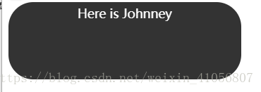
css不透明度的主要问题是,除了对背景生效外,应用它的元素的内容也会继承它。
针对不透明度低,框的内容难以辨认,用RGBa
RGBa是一种同时设置颜色和不透明度的机制,RGB为红绿蓝,a代表alpha透明度
background-color: rgba(0,0,0,0.8);前三个代表颜色,0.8代表背景不透明度80%,即透明度为20%a的值为1 表示100%不透明,值为0表示完全透明
⑤css视差效果
⑥图像替换(FIR/Phark/sIFR)
PNG透明度:滤镜
filter:progid:DXImageTransform.Microsoft.AlphaImageLoader空————————