FittedBox
FittedBox 是一个Layout widget,它自己的大小调整其子widget的大小和位置。
构造函数
const FittedBox({
    Key key,
    this.fit = BoxFit.contain,
    this.alignment = Alignment.center,
    Widget child,
  })
参数
- alignment -> AlignmentGeometry 此参数来设置子项与其父项的边界对齐方式
- fit -> BoxFit 用于将child放到自己布局时的空间分配的。
BoxFit
enum BoxFit {fill, contain,cover, fitWidth,fitHeight, none,scaleDown,}
下面看下每一项所产生的效果
new Container(
color: Colors.amberAccent,
alignment: Alignment.center,
width: double.infinity,
height: double.infinity,
child: new Container(
color: Colors.grey,
width: 300, //可以根据参数看效果
height: 300,//可以根据参数看效果
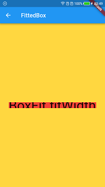
child: new FittedBox(
fit: BoxFit.fitWidth, //可以根据参数看效果
alignment: Alignment.center,
child: new Container(
color: Colors.red,
child: new Text(
"BoxFit.fitWidth",
style: const TextStyle(fontSize: 20.0),
),
),
),
),
);
-
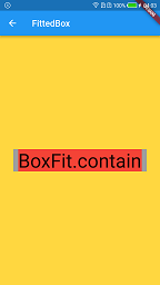
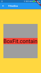
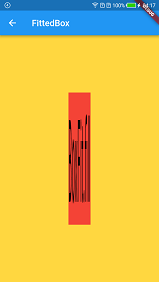
contain →const BoxFit
尽可能大,同时仍然完全包含目标框内的源。

-
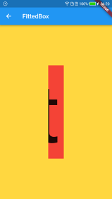
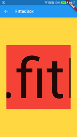
fitWidth →const BoxFit
确保显示源的整个宽度,无论这是否意味着源垂直溢出目标框。

-
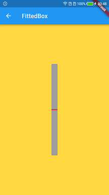
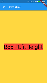
fitHeight →const BoxFit
确保显示源的完整高度,无论这是否意味着源水平溢出目标框。

-
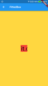
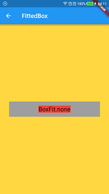
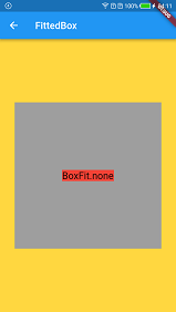
none →const BoxFit
对齐目标框内的源(默认情况下,居中)并丢弃位于框外的源的任何部分。
源图像未调整大小。


-
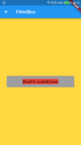
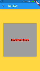
scaleDown →const BoxFit
对齐目标框内的源(默认情况下,居中),并在必要时缩小源以确保源适合框内。
这与contain缩小图像的情况相同,否则与图像相同none。


-
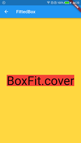
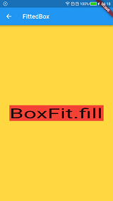
fill →const BoxFit
通过扭曲源的纵横比来填充目标框。


-
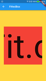
cover →const BoxFit
尽可能小,同时仍覆盖整个目标盒