一、导入需要的工具包
import tensorflow as tf
from tensorflow import keras
import numpy as np
import matplotlib.pyplot as plt
二、准备数据
fashion_mnist数据由60000张(服饰图)训练数据和10000张测试数据组成,每条数据的labels由10类, image size是28x28
#定义一个数组,内容是每一个类别的名称,一共有10个类别
class_names = ['T-shirt/top', 'Trouser', 'Pullover', 'Dress', 'Coat',
               'Sandal', 'Shirt', 'Sneaker', 'Bag', 'Ankle boot']
fashion_mnist = keras.datasets.fashion_mnist
(train_images, train_labels), (test_images, test_labels) = fashion_mnist.load_data()
print(train_images.shape) #(60000, 28, 28)
print(len(train_labels)) #60000
#对数据进行预处理
train_images = train_images / 255.0
test_images = test_images / 255.0
#展示前25张图片
plt.figure(figsize=(15,15))
for i in range(25):
    plt.subplot(5,5,i+1)
    plt.xticks([])
    plt.yticks([])
    plt.grid(False)
    plt.imshow(train_images[i], cmap=plt.cm.binary)
    plt.xlabel(class_names[train_labels[i]])

第三步、创建并训练模型
#定义浅层神经网络模型
model = keras.Sequential([
	keras.layers.Flatten(input_shape={28, 28)),
	keras.layers.Dense(128, activation=tf.nn.relu),
	keras.layers.Dense(64, activation=tf.nn.relu),
	keras.layers.Dense(10, activation-tf.nn.softmax)
])
#对模型进行编译
model.compile(optimizer = tf.train.AdamOptimizer,
	loss = 'sparse_categorical_crossentropy',
	metrics = ['accuracy']
)
#训练模型
model.fit(train_images, train_labels, epochs=50)
最终输出:
Epoch 50/50
60000/60000 [==============================] - 5s 79us/step - loss: 0.1015 - acc: 0.9626
可以看出,最终准确率为0.9626
第四步、评估模型
test_loss, test_acc = model.evaluate(test_images, test_labels)
print('Test accuracy:', test_acc)#Test accuracy: 0.8892,可以看出模型有些过拟合
第五步、预测并可视化
#批量预测
predictions = model.predict(test_images)
print(predictions.shape)#输出(10000, 10)
print(np.argmax(predictions[0]))#9,说明第一张图片的预测结果为类别9
print(predictions[0])#[1.5336354e-13 1.5920932e-17 1.3684552e-17 5.4927953e-18 2.0991999e-13 4.8152828e-07 4.4211198e-13 2.3735786e-06 9.4550773e-16 9.9999714e-01],可以看出predictions[0][9]最大
对预测结果可视化
- 先定义两个个函数
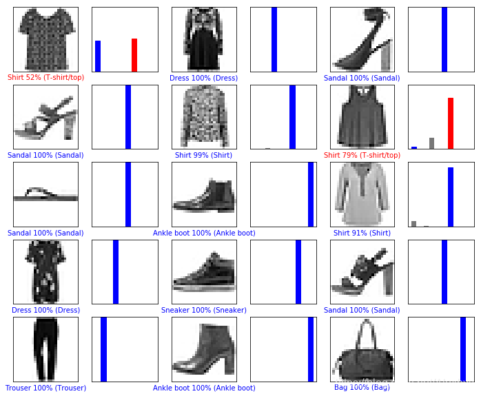
#对图片进行展示,xlabel表示预测的值,如果预测的正确,则为蓝色,否则为红色,数字表示预测标签的百分比,可以理解为置信度
def plot_image(i, predictions_array, true_label, img):
  predictions_array, true_label, img = predictions_array[i], true_label[i], img[i]
  plt.grid(False)
  plt.xticks([])
  plt.yticks([])
  plt.imshow(img, cmap=plt.cm.binary)
  predicted_label = np.argmax(predictions_array)
  if predicted_label == true_label:
    color = 'blue'
  else:
    color = 'red'

  plt.xlabel("{} {:2.0f}% ({})".format(class_names[predicted_label],
                                100*np.max(predictions_array),
                                class_names[true_label]),
                                color=color)
#对预测的概率分布绘制条形图,蓝色代表预测正确,红色代表预测错误
def plot_value_array(i, predictions_array, true_label):
  predictions_array, true_label = predictions_array[i], true_label[i]
  plt.grid(False)
  plt.xticks([])
  plt.yticks([])
  thisplot = plt.bar(range(10), predictions_array, color="#777777")
  plt.ylim([0, 1])
  predicted_label = np.argmax(predictions_array)

  thisplot[predicted_label].set_color('red')
  thisplot[true_label].set_color('blue')
- 对第1000-1015个预测结果进行可视化
num_rows = 5
num_cols = 3
num_images = num_rows*num_cols
plt.figure(figsize=(2*2*num_cols, 2*num_rows))
for i in range(num_images):
  plt.subplot(num_rows, 2*num_cols, 2*i+1)
  #因为前15张都预测正确了,所以把i加了1000,展示第1000-1015的预测结果,
  plot_image(i+1000, predictions, test_labels, test_images)
  plt.subplot(num_rows, 2*num_cols, 2*i+2)
  plot_value_array(i+1000, predictions, test_labels)
输出: