在SharePoint服务器端webpart开发中,我们可以在webpart的属性编辑器中自定义webpart的属性,来配置webpart。在使用SharePoint Framework创建的客户端webpart中,一样可以方便的自定义webpart的属性编辑面板,添加新的属性来配置我们的webpart。
在创建完成一个webpart项目之后,webpart属性编辑面板中会默认添加一个属性description:

这个description属性,是在webpart中,通过如下代码添加的。首先在webpart的属性中,定义description:
export interface IPropertyPaneWebPartProps {
  description: string;
}
然后在“getPropertyPaneConfiguration”方法中,定义这个属性的编辑控件,从名字"PropertyPaneTextField"可以看出来,这是一个文本框:

以上代码就是定义description属性,并且在属性编辑面板里展示一个文本框。当用户修改文本框中的值的时候,webpart会将新的值保存起来,作为webpart的配置,这样我们在webpart开发中就可以使用this.properties.description获取属性值了。
先来看属性编辑面板,这个属性编辑面板包含如下三个部分:

1, 页面(page)
页面包含header属性,用来作为page的标题或者描述,也包含组,一个组是一些属性控件的集合。在pages这个数组中可以添加多个页面,如果指定了多个页面,会自动分页显示各个页面。
2,组(group)
组包含一个groupName属性,用来指定组的名字,组是属性控件的集合,可以将不同的属性控件放在不同的组里。在groups这个数组中可以添加多个组。
关于页面和组的其他属性,可以参考使用SharePoint Framework开发webpart的一些技巧汇总
3, 属性控件(field)
属性控件用来展示和编辑属性值。在groupFields这个数组中配置。除了这个“PropertyPaneTextField”属性控件之外,目前SharePoint Framework提供的开箱即用的属性控件有:
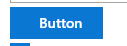
- Button
- Checkbox
- Choice group
- Dropdown
- Horizontal rule
- Label
- Link
- Slider
- Textbox
- Multi-line Textbox
- Toggle
- Custom (用于自定义属性控件)
在使用它们之前,首先需要导入这些控件:
import {
  BaseClientSideWebPart,
  IPropertyPaneConfiguration,
  PropertyPaneTextField,
  PropertyPaneButton,
  PropertyPaneCheckbox,
  PropertyPaneChoiceGroup,
  PropertyPaneDropdown,
  PropertyPaneLabel,
  PropertyPaneLink,
  PropertyPaneSlider,
  PropertyPaneToggle,
  PropertyPaneDynamicField
} from '@microsoft/sp-webpart-base';
下面来看一下如何使用这些控件。每一个控件都需要两个参数,一个是target,指定对应的webpart属性;一个是控件的属性,告诉控件如何展示。例如展示description属性的PropertyPaneTextField控件的定义是这样的:
PropertyPaneTextField('description', {
    label: 'Description Field'
})
第一个参数指定description,说明这个控件对应的webpart属性是description。第二个属性指定文本框的label属性,也就是这个文本框的标题。对于PropertyPaneTextField,可以指定的属性除了label之外,还有description, value等等
以下是各个基础控件属性的总结,方便查阅使用:
| 控件 | 控件属性 (?表示不是必须的属性) | 控件属性所在的接口 |
| PropertyPaneButton 按钮 |
text: string 指定按钮文本 buttonType?:PropertyPaneButtonType 按钮类型 icon?:string 按钮图标 description?: string 按钮描述 disabled?: boolean 是否禁用 ariaLabel?: string ariaDescription?: string onClick: (value: any) => any 按钮点击事件 |
|
|
|
 |
|
| PropertyPaneCheckbox 勾选框 |
text?: string 指定勾选框文本 checked?: boolean; 是否被勾选 disabled? boolean; 是否禁用 |
|
 |
 |
|
| PropertyPaneChoiceGroup 单选组 |
options: IPropertyPaneChoiceGroupOption[] 选项集合 label?: string ChoiceGroup的标题 其中每一个选项的属性在接口IPropertyPaneChoiceGroupOption中定义,包含: key: string | number 选项key text: string 选项文本 iconProps?:IPropertyPaneChoiceGroupOptionIconProps 图标 imageSrc?: string 图片链接 selectedImageSrc?: string 选中的图片的链接 imageSize?: { width: number; height: number; } 图片的大小 disabled?: boolean 是否禁用 checked?: boolean 是否勾选 |
|
 |
 |
|
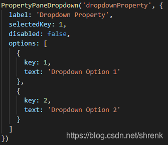
| PropertyPaneDropdown 下拉菜单 |
label: string 下拉菜单的标题 selectedKey?: string | number 选中的key options?: IPropertyPaneDropdownOption[] 选项集合 disabled?: boolean 是否禁用 ariaLabel?: string ariaPositionInSet?: number ariaSetSize?: number calloutProps?: IPropertyPaneDropdownCalloutProps; |
|
 |
 |
|
| PropertyPaneLabel 标签 |
text: string 标签文本 required?: boolean 提示是否必填,会显示一个红色星号在右侧 |
|
 |
 |
|
| PropertyPaneLink 链接 |
text: string 链接文本 href: string 链接目标 target?: string 链接打开方式 popupWindowProps?: IPopupWindowProps 弹出框属性 disabled: boolean 是否禁用 |
|
 |
 |
|
| PropertyPaneSlider 滑块 |
label?: string 指定标题 value?: number 初始值,默认为min min: number 最小值 max: number 最大值 step?: number 滑动间隔,默认为1 showValue?: boolean 是否显示当前值 ariaLabel?: string disabled?: boolean 是否禁用 |
|
 |
 |
|
| PropertyPaneTextField 文本框 |
multiline?: boolean 指定是否允许多行文本 resizable?: boolean 是否可以改变大小,默认true underlined?: boolean 是否为文本添加下划线 label?: string 文本框标题 description?: string 文本框描述 value?: string 初始值(当manifest文件里没有指定属性值,或者值为null的时候显示的值) errorMessage?: string 指定错误信息,只有当onGetErrorMessage方法返回空的时候,这个才会显示 onGetErrorMessage?: (value: string) => string | Promise<string> 这个方法用来验证值并且返回验证信息。当返回值是字符串时,如果验证通过,则返回空字符,如果验证不通过,则返回错误信息。当返回值是Promise的时候resolved字符串(通过为空字符串,否则错误信息),如果rejected,则抛出错误。 deferredValidationTime?: number 指定验证延迟时间,默认200毫秒 ariaLabel?: string placeholder?: string 显示在文本框中的提示信息,当用户输入的时候会自动消失 disabled?: boolean 是否禁用 rows?: number 指定文本行数(仅在多行文本时生效) maxLength?: number 文本包含的最大字符数,如果指定负数,则抛错 validateOnFocusIn?: boolean 是否在文本框获得焦点的时候验证 validateOnFocusOut?: boolean 是否在文本框失去焦点时验证 logName?: { moduleName: string; controlName: string; } 用于记录log,比如记录文本改变等 |
|
 |
 |
|
| PropertyPaneToggle 开关 |
key?: string | number 指定开关的key label: string 开关标题 onText?: string 开关开启文本 offText?: string 开关关闭文本 checked?: boolean 是否check disabled?: boolean 是否禁用 onAriaLabel?: string offAriaLabel?: string |
|
 |
 |
|
