在数据分析中常用的图表可以使用使用 python语言的 matplotlib 和 seaborn 库选择要显示的可视化对象。
一、Matplotlib![]()
Matplotlib 是一个 Python 的 2D绘图库,通过 Matplotlib,开发者可以仅需要几行代码,便可以生成绘图,直方图,功率谱,条形图,错误图,散点图等。
-
用于创建出版质量图表的绘图工具库
-
目的是为Python构建一个Matlab式的绘图接口
-
import matplotlib.pyplot as plt -
pyploy模块包含了常用的matplotlib API函数

figure
-
Matplotlib的图像均位于figure对象中
-
创建figure:
fig = plt.figure()
示例代码:
# 引入matplotlib包
import matplotlib.pyplot as plt
import numpy as np %matplotlib inline #在jupyter notebook 里需要使用这一句命令 # 创建figure对象 fig = plt.figure()
运行结果:
<matplotlib.figure.Figure at 0x11a2dd7b8>
subplot
fig.add_subplot(a, b, c)
-
a,b 表示将fig分割成 a*b 的区域
-
c 表示当前选中要操作的区域,
-
注意:从1开始编号(不是从0开始)
-
plot 绘图的区域是最后一次指定subplot的位置 (jupyter notebook里不能正确显示)
示例代码:
# 指定切分区域的位置
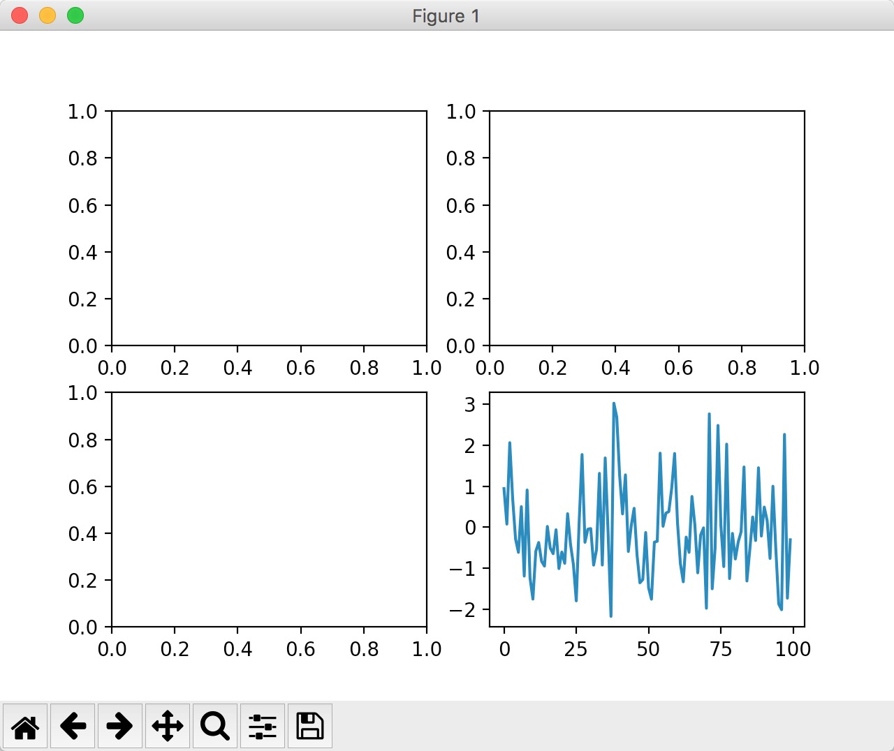
ax1 = fig.add_subplot(2,2,1)
ax2 = fig.add_subplot(2,2,2) ax3 = fig.add_subplot(2,2,3) ax4 = fig.add_subplot(2,2,4) # 在subplot上作图 random_arr = np.random.randn(100) #print random_arr # 默认是在最后一次使用subplot的位置上作图,但是在jupyter notebook 里可能显示有误 plt.plot(random_arr) # 可以指定在某个或多个subplot位置上作图 # ax1 = fig.plot(random_arr) # ax2 = fig.plot(random_arr) # ax3 = fig.plot(random_arr) # 显示绘图结果 plt.show() 运行结果:

直方图:hist
示例代码:
import matplotlib.pyplot as plt
import numpy as np

plt.hist(np.random.randn(100), bins=10, color='b', alpha=0.3) plt.show()
运行结果:


散点图:scatter
示例代码:
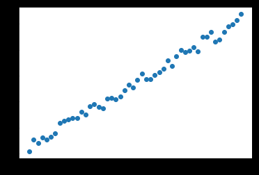
import matplotlib.pyplot as plt
import numpy as np

# 绘制散点图 x = np.arange(50) y = x + 5 * np.random.rand(50) plt.scatter(x, y) plt.show()
运行结果:

柱状图:bar
示例代码:
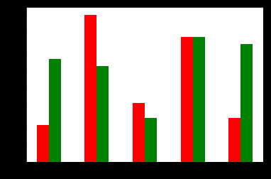
import matplotlib.pyplot as plt
import numpy as np

# 柱状图 x = np.arange(5) y1, y2 = np.random.randint(1, 25, size=(2, 5)) width = 0.25 ax = plt.subplot(1,1,1) ax.bar(x, y1, width, color='r') ax.bar(x+width, y2, width, color='g') ax.set_xticks(x+width) ax.set_xticklabels(['a', 'b', 'c', 'd', 'e']) plt.show()
运行结果:

矩阵绘图:plt.imshow()
- 混淆矩阵,三个维度的关系
示例代码:
import matplotlib.pyplot as plt
import numpy as np

# 矩阵绘图 m = np.random.rand(10,10) print(m) plt.imshow(m, interpolation='nearest', cmap=plt.cm.ocean) plt.colorbar() plt.show()
运行结果:
[[ 0.92859942 0.84162134 0.37814667 0.46401549 0.93935737 0.0344159 0.56358375 0.75977745 0.87983192 0.22818774] [ 0.88216959 0.43369207 0.1303902 0.98446182 0.59474031 0.04414217 0.86534444 0.34919228 0.53950028 0.89165269] [ 0.52919761 0.87408715 0.097871 0.78348534 0.09354791 0.3186 0.25978432 0.48340623 0.1107699 0.14065592] [ 0.90834516 0.42377475 0.73042695 0.51596826 0.14154431 0.22165693 0.64705882 0.78062873 0.55036304 0.40874584] [ 0.98853697 0.46762114 0.69973423 0.7910757 0.63700306 0.68793919 0.28685306 0.3473426 0.17011744 0.18812329] [ 0.73688943 0.58004874 0.03146167 0.08875797 0.32930191 0.87314734 0.50757536 0.8667078 0.8423364 0.99079049] [ 0.37660356 0.63667774 0.78111565 0.25598593 0.38437628 0.95771051 0.01922366 0.37020219 0.51020305 0.05365718] [ 0.87588452 0.56494761 0.67320078 0.46870376 0.66139913 0.55072149 0.51328222 0.64817353 0.198525 0.18105368] [ 0.86038137 0.55914088 0.55240021 0.15260395 0.4681218 0.28863395 0.6614597 0.69015592 0.46583629 0.15086562] [ 0.01373772 0.30514083 0.69804049 0.5014782 0.56855904 0.14889117 0.87596848 0.29757133 0.76062891 0.03678431]] 

plt.subplots()
-
同时返回新创建的
figure和subplot对象数组 -
生成2行2列subplot:
fig, subplot_arr = plt.subplots(2,2) -
在jupyter里可以正常显示,推荐使用这种方式创建多个图表
示例代码:
import matplotlib.pyplot as plt
import numpy as np

fig, subplot_arr = plt.subplots(2,2) # bins 为显示个数,一般小于等于数值个数 subplot_arr[1,0].hist(np.random.randn(100), bins=10, color='b', alpha=0.3) plt.show()
运行结果:


颜色、标记、线型
- ax.plot(x, y, ‘r--’)
等价于ax.plot(x, y, linestyle=‘--’, color=‘r’)
示例代码:
import matplotlib.pyplot as plt
import numpy as np
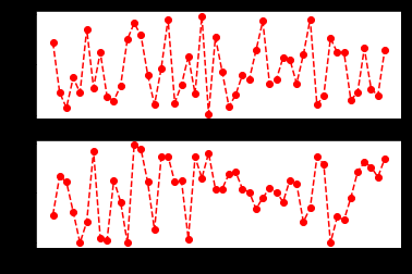
fig, axes = plt.subplots(2) axes[0].plot(np.random.randint(0, 100, 50), 'ro--') # 等价 axes[1].plot(np.random.randint(0, 100, 50), color='r', linestyle='dashed', marker='o') 运行结果:
[<matplotlib.lines.Line2D at 0x11a901e80>]

- 常用的颜色、标记、线型


刻度、标签、图例
-
设置刻度范围
plt.xlim(), plt.ylim()
ax.set_xlim(), ax.set_ylim()
-
设置显示的刻度
plt.xticks(), plt.yticks()
ax.set_xticks(), ax.set_yticks()
-
设置刻度标签
ax.set_xticklabels(), ax.set_yticklabels()
-
设置坐标轴标签
ax.set_xlabel(), ax.set_ylabel()
-
设置标题
ax.set_title()
-
图例
ax.plot(label=‘legend’)
ax.legend(), plt.legend()
loc=‘best’:自动选择放置图例最佳位置
示例代码:
import matplotlib.pyplot as plt
import numpy as np
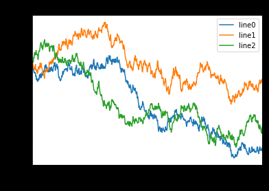
fig, ax = plt.subplots(1) ax.plot(np.random.randn(1000).cumsum(), label='line0') # 设置刻度 #plt.xlim([0,500]) ax.set_xlim([0, 800]) # 设置显示的刻度 #plt.xticks([0,500]) ax.set_xticks(range(0,500,100)) # 设置刻度标签 ax.set_yticklabels(['Jan', 'Feb', 'Mar']) # 设置坐标轴标签 ax.set_xlabel('Number') ax.set_ylabel('Month') # 设置标题 ax.set_title('Example') # 图例 ax.plot(np.random.randn(1000).cumsum(), label='line1') ax.plot(np.random.randn(1000).cumsum(), label='line2') ax.legend() ax.legend(loc='best') #plt.legend() 运行结果: <matplotlib.legend.Legend at 0x11a4061d0>
二、Seaborn
http://seaborn.pydata.org/index.html
Seaborn其实是在matplotlib的基础上进行了更高级的API封装,从而使得作图更加容易,在大多数情况下使用seaborn就能做出很具有吸引力的图,而使用matplotlib就能制作具有更多特色的图。应该把Seaborn视为matplotlib的补充,而不是替代物。
-
Python中的一个制图工具库,可以制作出吸引人的、信息量大的统计图
-
在Matplotlib上构建,支持numpy和pandas的数据结构可视化。
-
多个内置主题及颜色主题
-
可视化单一变量、二维变量用于比较数据集中各变量的分布情况
-
可视化线性回归模型中的独立变量及不独立变量
import numpy as np
import pandas as pd
# from scipy import stats import matplotlib.pyplot as plt import seaborn as sns # %matplotlib inline
数据集分布可视化
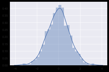
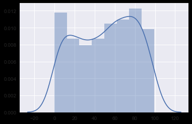
单变量分布 sns.distplot()
示例代码:
# 单变量分布
x1 = np.random.normal(size=1000)
sns.distplot(x1);

x2 = np.random.randint(0, 100, 500) sns.distplot(x2);
运行结果:
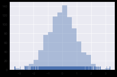
直方图 sns.distplot(kde=False)
示例代码:
# 直方图
sns.distplot(x1, bins=20, kde=False, rug=True)
运行结果:

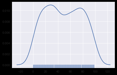
核密度估计 sns.distplot(hist=False) 或 sns.kdeplot()
示例代码:
# 核密度估计
sns.distplot(x2, hist=False, rug=True)
运行结果: 
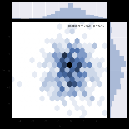
双变量分布
示例代码:
# 双变量分布
df_obj1 = pd.DataFrame({"x": np.random.randn(500),
                   "y": np.random.randn(500)}) df_obj2 = pd.DataFrame({"x": np.random.randn(500), "y": np.random.randint(0, 100, 500)})
散布图 sns.jointplot()
示例代码:
# 散布图
sns.jointplot(x="x", y="y", data=df_obj1)
运行结果:


二维直方图 Hexbin sns.jointplot(kind=‘hex’)
示例代码:
# 二维直方图
sns.jointplot(x="x", y="y", data=df_obj1, kind="hex");
运行结果:

核密度估计 sns.jointplot(kind=‘kde’)
示例代码:
# 核密度估计
sns.jointplot(x="x", y="y", data=df_obj1, kind="kde");
运行结果:


数据集中变量间关系可视化 sns.pairplot()
示例代码:
# 数据集中变量间关系可视化
dataset = sns.load_dataset("tips")
#dataset = sns.load_dataset("iris")
sns.pairplot(dataset);
运行结果:


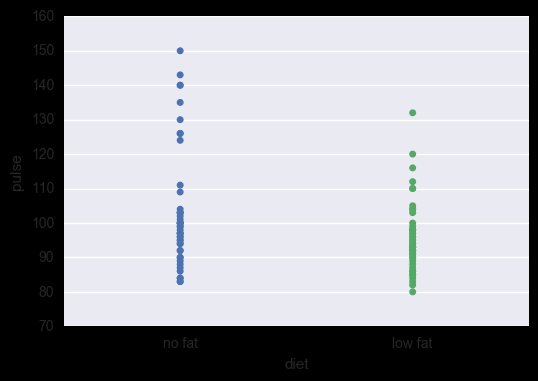
类别数据可视化
#titanic = sns.load_dataset('titanic')
#planets = sns.load_dataset('planets')
#flights = sns.load_dataset('flights')
#iris = sns.load_dataset('iris')
exercise = sns.load_dataset('exercise')
类别散布图
sns.stripplot() 数据点会重叠
示例代码:
sns.stripplot(x="diet", y="pulse", data=exercise)
运行结果:

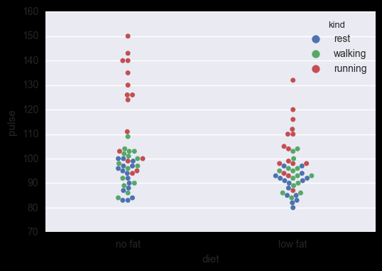
sns.swarmplot() 数据点避免重叠,hue指定子类别
示例代码:
sns.swarmplot(x="diet", y="pulse", data=exercise, hue='kind')
运行结果: 
类别内数据分布
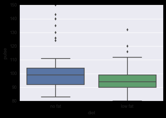
盒子图 sns.boxplot(), hue指定子类别
示例代码:
# 盒子图
sns.boxplot(x="diet", y="pulse", data=exercise)
#sns.boxplot(x="diet", y="pulse", data=exercise, hue='kind')
运行结果:

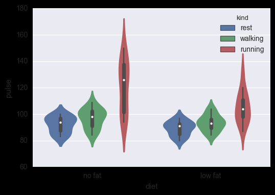
小提琴图 sns.violinplot(), hue指定子类别
示例代码:
# 小提琴图
#sns.violinplot(x="diet", y="pulse", data=exercise)
sns.violinplot(x="diet", y="pulse", data=exercise, hue='kind')
运行结果:

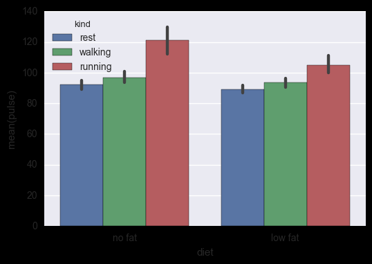
类别内统计图
柱状图 sns.barplot()
示例代码:
# 柱状图
sns.barplot(x="diet", y="pulse", data=exercise, hue='kind')
运行结果:

点图 sns.pointplot()
示例代码:
# 点图
sns.pointplot(x="diet", y="pulse", data=exercise, hue='kind');
运行结果:


