博主声明:
转载请在开头附加本文链接及作者信息,并标记为转载。本文由博主 威威喵 原创,请多支持与指教。
本文首发于此 博主:威威喵 | 博客主页:https://blog.csdn.net/smile_running
感受 Material Design UI 魅力,你不能错过的 Material Design 全系列文章:
Material Design 之一 BottomNavigationView + ViewPager + Fragment 仿微信底部导航效果
Material Design 之二 Toolbar + DrawerLayout + NavigationView 实现QQ侧拉抽屉效果
Material Design 之三 TabLayout + ViewPager + Fragment 今日头条标题切换效果
Material Design 之四 SwipeRefreshLayout + CardView + RecyclerView 精美瀑布流效果
Material Design 之五 CoordinatorLayout + AppBarLayout 提供最佳浏览体验
Material Design 之六 CollapsingToolbarLayout + FloatingActionButton 打造精美详情界面
扫描二维码关注公众号,回复: 7194279 查看本文章
Material Design 之七 TextInputLayout+TextInputEditText 打造精美的登录界面
根据我们上篇的最佳 ui 体验:最佳UI体验之 BottomNavigationView + ViewPager + Fragment 组合使用
我们继续把 Material Design 库下的所有 View 都结合在一起,来一个 Material Design 大杂烩,而且还挺好看的那种。今天呢,我们来使用一下 Toolbar + DrawerLayout + NavigationView 组合起来的一个类似 QQ 侧拉抽屉的效果,这种效果也非常常见,而且还很好看,来看一下要实现的效果吧:

根据上面图片的情况呢,是这样的一个思路,DrawerLayout 是在我们的隐藏区域,也就是我们看不见的屏幕以外,通过手指滑动,将 DrawerLayout 滑倒主屏幕区域,这就显示出来了。当然,如果你问我这个效果怎么实现的,什么原理,那就是自定义 View 来写的,不过对于初学者来说,难度还是比较大的,我自己当然也实现过这样的类似 DrawerLayout 控件,有兴趣的话可以去看我的一个自定义 View 的系列文章:自定义 ViewGroup 实现侧拉抽屉 DrawerLayout 功能 ,我建议你从第一篇开始看,因为后面两篇几乎没写细节,细节都写在第一篇了,后面没什么好写的了,都是代码,哈哈。
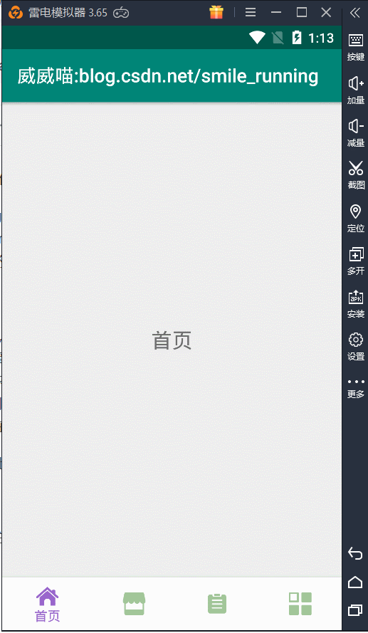
扯了一下。我们继续从上篇留下的代码进行添加,上篇留下的效果是这样的一种:
一、使用 ToolBar 替换 ActionBar
首先呢,我们来看看标题栏,默认使用的是系统的 ActionBar,定制不够好,与我们的 DrawerLayout 配合不起来,所以要把它换掉,这里我们换成了 Toolbar 这个控件,布局文件种的代码变成这样的:
<?xml version="1.0" encoding="utf-8"?>
<RelativeLayout xmlns:android="http://schemas.android.com/apk/res/android"
    xmlns:app="http://schemas.android.com/apk/res-auto"
    xmlns:tools="http://schemas.android.com/tools"
    android:layout_width="match_parent"
    android:layout_height="match_parent"
    tools:context=".MainActivity">

    <android.support.v7.widget.Toolbar
        android:id="@+id/tool_bar"
        android:layout_width="match_parent"
        android:layout_height="?attr/actionBarSize"
        android:background="#aa77bb" />

    <android.support.v4.view.ViewPager
        android:id="@+id/view_pager"
        android:layout_width="match_parent"
        android:layout_height="match_parent"
        android:layout_above="@+id/bottom_nav_view" />

    <android.support.design.widget.BottomNavigationView
        android:id="@+id/bottom_nav_view"
        android:layout_width="match_parent"
        android:layout_height="wrap_content"
        android:layout_alignParentBottom="true"
        android:background="#fcfcfc"
        app:itemIconTint="@drawable/seleced_menu_color"
        app:itemTextColor="@drawable/seleced_menu_color"
        app:menu="@menu/tab_menu" />

</RelativeLayout>
进入 style 里面修改样式,把 ActionBar 给隐藏起来,否则会发生冲突情况:

修改代码为 NoActionBar :
<resources>

    <!-- Base application theme. -->
    <style name="AppTheme" parent="Theme.AppCompat.Light.NoActionBar">
        <!-- Customize your theme here. -->
        <item name="colorPrimary">@color/colorPrimary</item>
        <item name="colorPrimaryDark">@color/colorPrimaryDark</item>
        <item name="colorAccent">@color/colorAccent</item>
    </style>

</resources>
然后进入 MainActivity 在 onCreate 中把 ToolBar 给设置一下,代码如下:
        toolbar =findViewById(R.id.tool_bar);
setSupportActionBar(toolbar);注意:导包要导入 v7 包下面的。
运行起来,效果如下:

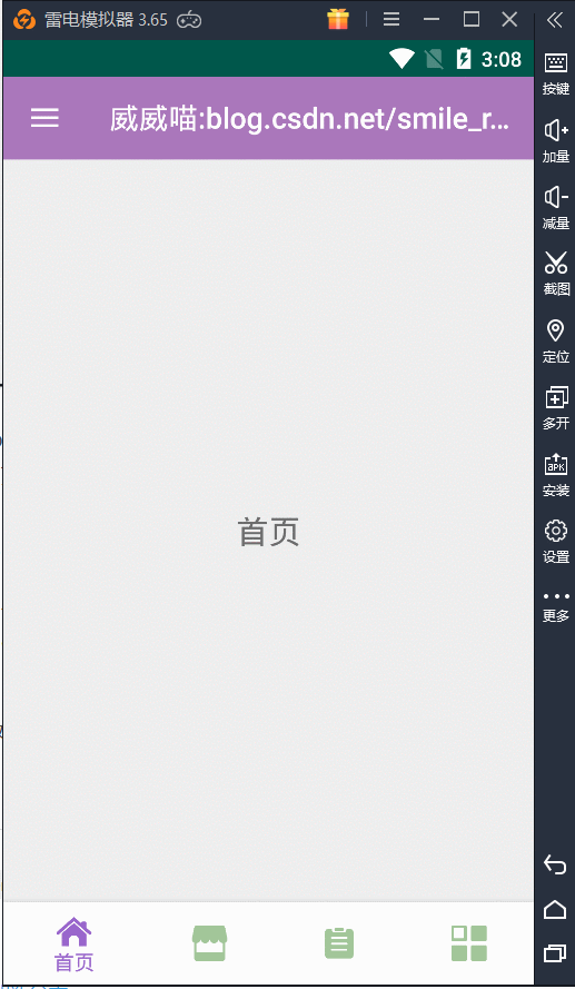
我们的标题,也就是我的博客名和链接都变成了黑色的了,太丑了,所以还要给 Toolbar 设置一下主题,代码如下:
    <android.support.v7.widget.Toolbar
        android:id="@+id/tool_bar"
        android:layout_width="match_parent"
        android:layout_height="?attr/actionBarSize"
        android:background="#aa77bb"
        android:theme="@style/Base.ThemeOverlay.AppCompat.Dark.ActionBar"
        app:navigationIcon="@drawable/ic_white_home_24dp"
        app:popupTheme="@style/Base.ThemeOverlay.AppCompat.Light" />
我们给它设置了两个 theme 主题样式,然后它的运行效果就变成白色的了,并且添加了一个 navigationIcon,也就是 home 按钮,等下可以用于点击开启侧拉抽屉,现在看起来舒服多了:

这样我们的效果就达到了,哦对了,Toolbar 上面还可以添加许多 menu,就是那种图标式的小按钮,由于我这里什么都没加,如果不知都怎么添加 menu 的话,我之前也写过一篇这样的文章,请点击:OptionsMenu 弹出菜单
二 、添加 DrawerLayout
DrawerLayout 的使用也非常简单,只要在布局文件中修改一下即可:
<?xml version="1.0" encoding="utf-8"?>
<RelativeLayout xmlns:android="http://schemas.android.com/apk/res/android"
    xmlns:app="http://schemas.android.com/apk/res-auto"
    xmlns:tools="http://schemas.android.com/tools"
    android:layout_width="match_parent"
    android:layout_height="match_parent"
    tools:context=".MainActivity">

    <android.support.v7.widget.Toolbar
        android:id="@+id/tool_bar"
        android:layout_width="match_parent"
        android:layout_height="?attr/actionBarSize"
        android:background="#aa77bb"
        android:theme="@style/Base.ThemeOverlay.AppCompat.Dark.ActionBar"
        app:navigationIcon="@drawable/ic_white_home_24dp"
        app:popupTheme="@style/Base.ThemeOverlay.AppCompat.Light" />

    <android.support.v4.widget.DrawerLayout
        android:id="@+id/drawer_layout"
        android:layout_width="match_parent"
        android:layout_height="match_parent">

        <RelativeLayout
            android:layout_width="match_parent"
            android:layout_height="match_parent"
            android:layout_gravity="left">

            <TextView
                android:layout_width="wrap_content"
                android:layout_height="wrap_content"
                android:layout_centerInParent="true"
                android:text="威威喵"
                android:textColor="#ffffff"
                android:textSize="30sp" />
        </RelativeLayout>

        <RelativeLayout
            android:layout_width="match_parent"
            android:layout_height="match_parent">

            <android.support.v4.view.ViewPager
                android:id="@+id/view_pager"
                android:layout_width="match_parent"
                android:layout_height="match_parent"
                android:layout_above="@+id/bottom_nav_view" />

            <android.support.design.widget.BottomNavigationView
                android:id="@+id/bottom_nav_view"
                android:layout_width="match_parent"
                android:layout_height="wrap_content"
                android:layout_alignParentBottom="true"
                android:background="#fcfcfc"
                app:itemIconTint="@drawable/seleced_menu_color"
                app:itemTextColor="@drawable/seleced_menu_color"
                app:menu="@menu/tab_menu" />
        </RelativeLayout>

    </android.support.v4.widget.DrawerLayout>
</RelativeLayout>
这里要记住,DrawerLayout 下面不能放太多的 View,我们需要用 ViewGroup 包裹一层,并且如果是抽屉里面的视图,需要用一个 android:layout_gravity="left" 或者 android:layout_gravity="start" 属性注明。
left 和 start 的区别就是,left 永远在左边,start 会根据每个国家不同来确定位置,我们国家的 start 是在左边的,像印度就在右边,所以都有可能。看一下效果吧:

它与我们的 ViewPager 滑动事件不会冲突,在屏幕左侧边缘拉出来就可以了。
三、添加 NavigationView
这样基本就搞定了 DrawerLayout 了,要想里面变得漂亮、炫酷一点,还需要 NavigationView 来衬托。因为抽屉里面一般都是一条条的 Item,所以像 RecyclerView 和 ListView 等都非常适合,不过我们用 NavigationView 更简单,更好看。
新建一个 drawer_menu,代码如下:
<?xml version="1.0" encoding="utf-8"?>
<menu xmlns:android="http://schemas.android.com/apk/res/android">
    <group android:checkableBehavior="single">
        <item
            android:id="@+id/nav_favor"
            android:icon="@drawable/favor"
            android:title="我的收藏" />
        <item
            android:id="@+id/nav_balance"
            android:icon="@drawable/balance"
            android:title="我的钱包" />
        <item
            android:id="@+id/nav_contract"
            android:icon="@drawable/contract"
            android:title="朋友圈" />
        <item
            android:id="@+id/nav_friends"
            android:icon="@drawable/friends"
            android:title="联系人" />
        <item
            android:id="@+id/nav_message"
            android:icon="@drawable/message"
            android:title="我的消息" />
        <item
            android:id="@+id/nav_settings"
            android:icon="@drawable/settings"
            android:title="我的设置" />
    </group>
</menu>
在新建一个 nav_header 布局文件,用于我们的 NavigationView 头部显示,代码如下:
<?xml version="1.0" encoding="utf-8"?>
<RelativeLayout xmlns:android="http://schemas.android.com/apk/res/android"
    android:layout_width="match_parent"
    android:layout_height="200dp"
    android:background="#a2c699">

    <ImageView
        android:id="@+id/img_photo"
        android:layout_width="100dp"
        android:layout_height="100dp"
        android:layout_centerInParent="true"
        android:src="@drawable/wwcat" />

    <TextView
        android:layout_width="wrap_content"
        android:layout_height="wrap_content"
        android:layout_below="@+id/img_photo"
        android:layout_centerInParent="true"
        android:layout_marginTop="8dp"
        android:text="威威喵"
        android:textColor="#ffffff"
        android:textSize="22sp" />
</RelativeLayout>
最后,修改我们的 main_layout 布局:
<?xml version="1.0" encoding="utf-8"?>
<RelativeLayout xmlns:android="http://schemas.android.com/apk/res/android"
    xmlns:app="http://schemas.android.com/apk/res-auto"
    xmlns:tools="http://schemas.android.com/tools"
    android:layout_width="match_parent"
    android:layout_height="match_parent"
    tools:context=".MainActivity">

    <android.support.v7.widget.Toolbar
        android:id="@+id/tool_bar"
        android:layout_width="match_parent"
        android:layout_height="?attr/actionBarSize"
        android:background="#aa77bb"
        android:theme="@style/Base.ThemeOverlay.AppCompat.Dark.ActionBar"
        app:navigationIcon="@drawable/ic_white_home_24dp"
        app:popupTheme="@style/Base.ThemeOverlay.AppCompat.Light" />

    <android.support.v4.widget.DrawerLayout
        android:id="@+id/drawer_layout"
        android:layout_width="match_parent"
        android:layout_height="match_parent"
        android:layout_below="@id/tool_bar">

        <android.support.design.widget.NavigationView
            android:id="@+id/navigation_view"
            android:layout_width="match_parent"
            android:layout_height="match_parent"
            android:layout_gravity="left"
            app:headerLayout="@layout/nav_header"
            app:menu="@menu/drawer_menu" />

        <RelativeLayout
            android:layout_width="match_parent"
            android:layout_height="match_parent">

            <android.support.v4.view.ViewPager
                android:id="@+id/view_pager"
                android:layout_width="match_parent"
                android:layout_height="match_parent"
                android:layout_above="@+id/bottom_nav_view" />

            <android.support.design.widget.BottomNavigationView
                android:id="@+id/bottom_nav_view"
                android:layout_width="match_parent"
                android:layout_height="wrap_content"
                android:layout_alignParentBottom="true"
                android:background="#fcfcfc"
                app:itemIconTint="@drawable/seleced_menu_color"
                app:itemTextColor="@drawable/seleced_menu_color"
                app:menu="@menu/tab_menu" />
        </RelativeLayout>

    </android.support.v4.widget.DrawerLayout>
</RelativeLayout>
运行一下,效果如下:

四、关联 ToolBar 以及优化
这样的话,基本就搞定了,现在已经有模有样了,就差我们的最后几个小优化。一个是关联 Toolbar 那个 home 的点击事件,还有一个是 DrawerLayout 拉出来右边形成一片阴影面积,这样不太好看,我们下面来把它给去掉。
首先,我们把那个阴影部分给去除,看着挺难受的,一句话搞定:
// 设置阴影部分颜色为透明
drawerLayout.setScrimColor(Color.TRANSPARENT);
效果如下:

接下来就是 Toolbar 的 Home 点击事件与 DrawerLayout 关联起来了,这里可能不太好理解,需要对 DrawerLayout 设置一个监听,而监听的对象,是我们的 ActionbarDrawerToggle,代码如下:
ActionBarDrawerToggle toggle = new ActionBarDrawerToggle(this, drawerLayout, toolbar,
R.string.app_name, R.string.app_name);
toggle.syncState();
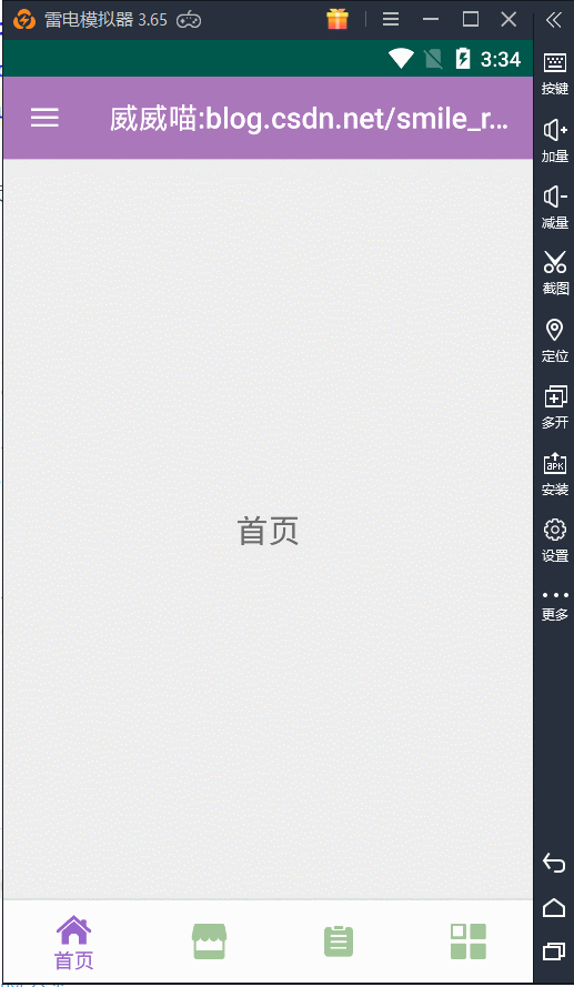
drawerLayout.addDrawerListener(toggle);重新运行一下 app ,效果如下,已经成功的联动起来了,并且 icon 也变了,还会伴随的变化。
还是不够炫酷?那加个特效吧!
修改布局文件,这里要加一个 tag="left"

修改联动的代码,设置主页面偏移:
        ActionBarDrawerToggle toggle = new ActionBarDrawerToggle(this, drawerLayout, toolbar,
                R.string.app_name, R.string.app_name) {
            @Override
            public void onDrawerSlide(View drawerView, float slideOffset) {
                View content = drawerLayout.getChildAt(0); //获得主界面View
                if (drawerView.getTag().equals("left")) {  //判断是否是左菜单
                    int offset = (int) (drawerView.getWidth() * slideOffset);
                    content.setTranslationX(offset);
                }
            }
        };
        toggle.syncState();
        drawerLayout.addDrawerListener(toggle);
效果图如下:
好吧,就这样了,还有一些 View 的特效可以自己加,不过我尝试了一下,x 、y 坐标的缩放效果,不怎么好看。
-
一行代码设置 DrawerLayout 全屏效果
DrawerLayout 默认使用时,侧拉出来的效果会有一点缩进效果,既然它是缩进,那我们直接反向操作,给它缩进一个负值不就好了嘛,直接看代码:
        <!-- 第二个视图放抽屉 -->
        <android.support.design.widget.NavigationView
            android:id="@+id/navigation_view"
            android:layout_width="match_parent"
            android:layout_height="match_parent"
            android:layout_gravity="left"
            android:layout_marginRight="-65dp"  //设置 -65 dp,反向操作
            android:tag="left"
            app:headerLayout="@layout/nav_header"
            app:menu="@menu/drawer_menu" />
来看效果:
一行代码搞定 DrawerLayout 全屏效果,这种是利用 margin 来达到全屏设置。除了这一种方法,我们还可以从它的 width 宽度入手。这样操作:获取屏幕的宽度像素 widthPixel,再获取侧拉父容器的 LayoutParams 属性,把 height 设置为 widthPixel 也可以搞定。上面的 -65 dp 虽然简单粗暴,但是不同手机可能会有一点点差距。这一种就不会了,看代码:
        navigationView = findViewById(R.id.navigation_view);

        ViewGroup.LayoutParams mLayoutParams = navigationView.getLayoutParams();
        int width = getResources().getDisplayMetrics().widthPixels;
        mLayoutParams.width = width;
        navigationView.setLayoutParams(mLayoutParams);
以上两种都可以搞定,也测试过横竖屏切换,不会产生问题。至于用哪一种,看你的心情,哈哈。