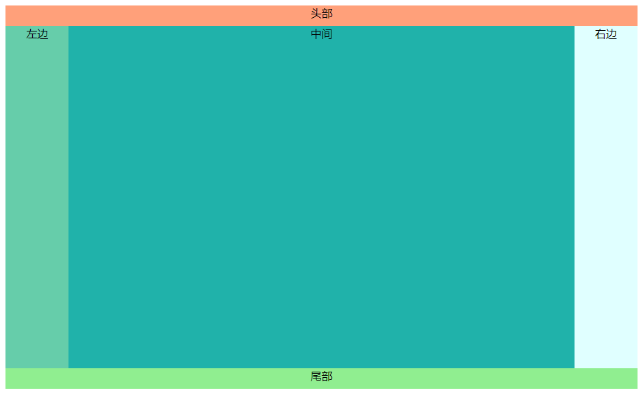
1、经典布局,上头下尾,两侧固定,中间自适应
效果图:
实现代码(普通):
<!DOCTYPE html>
<html lang="en">
<head>
    <meta charset="UTF-8">
    <title>test</title>
</head>
<style>
    .header{
        width:100%;
        height:30px;
        background-color:lightsalmon;
        text-align: center;
    }
    .footer{
        width:100%;
        height:30px;
        background-color:lightgreen;
        text-align: center;
    }
    .left{
        background-color:mediumaquamarine;
        margin-left:0%;
        width:10%;
    }
    .main{
        background-color:lightseagreen;
        width:80%;
    }
    .right{
        background-color:lightcyan;
        float:right;
        width:10%;
    }
    .left,.main,.right{
        height:100%;
        min-height:500px;
        display:inline-block;
        text-align: center;
    }
</style>
<body>
        <div class="header">头部</div>
            <div>
                <div class="left">左边
                </div><div class="main">中间
                </div><div class="right">右边</div>
            </div>
        <div class="footer">尾部</div>
</body>
</html>
2、用flex实现经典布局
应用默认的排序flex-direction:row及flex布局的默认效果代替了float,display:inline-block等效果
代码示例:
<!DOCTYPE html>
<html lang="en">
<head>
    <meta charset="UTF-8">
    <title>test</title>
</head>
<style>
    .body{
        display:flex;
        flex-wrap: wrap;
    }
    .header{
        width:100%;
        height:30px;
        background-color:lightsalmon;
        text-align: center;
    }
    .footer{
        width:100%;
        height:30px;
        background-color:lightgreen;
        text-align: center;
    }
    .left{
        background-color:mediumaquamarine;
        width:10%;
    }
    .main{
        background-color:lightseagreen;
        width:80%;
    }
    .right{
        background-color:lightcyan;
        width:10%;
    }
    .left,.main,.right{
        min-height:500px;
        text-align: center;
    }
</style>
<body>
    <div class="body">
        <div class="header">头部</div>
        <div class="left">左边</div>
        <div class="main">中间</div>
        <div class="right">右边</div>
        <div class="footer">尾部</div>
    </div>
</body>
</html>
3、用网格实现经典布局
用grid-template-columns定义每个的列宽
用grid-column定义每一列从哪个网线开始,哪个网线截止
代码示例:
<!DOCTYPE html>
<html lang="en">
<head>
    <meta charset="UTF-8">
    <title>test</title>
</head>
<style>
    .body{
        display:grid;
        grid-template-columns: 1fr 5fr 1fr;
    }
    .header{
        height:30px;
        background-color:lightsalmon;
        text-align: center;
        grid-column: 1/4;
    }
    .footer{
        width:100%;
        height:30px;
        background-color:lightgreen;
        text-align: center;
        grid-column: 1/4;
    }
    .left{
        background-color:mediumaquamarine;
        grid-column: 1/2;
    }
    .main{
        background-color:lightseagreen;
        grid-column: 2/3;
    }
    .right{
        background-color:lightcyan;
        grid-column: 3/4;
    }
    .left,.main,.right{
        min-height:500px;
        text-align: center;
    }
</style>
<body>
    <div class="body">
        <div class="header">头部</div>
        <div class="left">左边</div>
        <div class="main">中间</div>
        <div class="right">右边</div>
        <div class="footer">尾部</div>
    </div>
</body>
</html>