1.CSS实现文本单行居中,多行居左
效果图: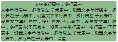
<style type="text/css">
.fu{
  width:380px;
  background:red;
  text-align: center;
}

.fu>p{
   /*text-align: left;*/
 text-align: justify;
  display: inline-block;
}
</style>
<!-- 父元素中,设置text-align:center; -->
<div class="fu">
   <!-- 子元素中,设置text-align:left;display: inline-block; -->
   <p>文字单行居中,多行居左;</p>
   <p>文字单行居中,多行居左;子元素中,设置text-align:left;文字单行居中,多行居左;子元素中,设置text-align:left;</p>
</div>
2.CSS实现文本两端对齐
效果图:
<style type="text/css">
    .box{width:50px;background: greenyellow;}
    .box>p{text-align-last: justify;}
</style>
<div class="box">
    <p>姓名</p>
    <p>手机号码</p>
</div>
3.实现文字竖向排版
效果图:
<style type="text/css">
    .fu{
        width: 25px;
        line-height: 18px;
        height: 200px;
        font-size: 12px;
        padding: 8px 5px;
        box-sizing: border-box;
        word-wrap: break-word;
        }

    .fu>p{
        width:210px;
        line-height: 30px;
        text-align:justify;
        /* writing-mode: vertical-lr;//由左往右排版
        writing-mode: bt-lr;//IE由左往右排版 */
        writing-mode: vertical-rl;//由右往左排版
        writing-mode: bt-rl;//IE由右往左排版
        }

</style>

<div class="fu">
      <p>文字单行居中,多行居左;子元素中,设置文字单行居中,多行居左;子元素中,设置文字单行居中,多行居左;子元素中,设置文字单行居中,多行居左;子元素中,设置文字单行居中,多行居左;子元素中,设置文字单行居中,多行居左;子元素中,设置文字单行居中,多行居左;子元素中,设置文字单行居中,多行居左;子元素中,设置</p>
</div>
4.letter-spacing(字间距,添加每个字母或汉字之间的空白)和 word-spacing(词间距,添加每个单词之间的空白)
效果图: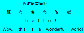
<style type="text/css">
    .text-box{
        width: 300px;
        background: aqua;
        margin-top: 20px;
    }
    .text-box>p{
        line-height:30px;
        text-align: center;
    }

    .text-box>p:nth-child(1){
        letter-spacing:-2em;//倒叙
    }

    .text-box>p:nth-child(2){
        letter-spacing:2em;
    }

    .text-box>p:nth-child(3){
        letter-spacing:1em;
    }

    .text-box>p:nth-child(4){
        word-spacing:1em;
    }
</style>
<div class="text-box">
    <p>距海南岛附近</p>
    <p>距海南岛附近</p>
    <p>hello!</p>
    <p>Wow, this is a wonderful world!</p>
</div>
注意:1.字间距会将单词拆分成字母;词间距在汉字中不会生效。
2.字间距和词间距都可赋负值,当值是负值时,当前的文字倒叙排列;
词间距会缩小间距重叠。
5.使元素鼠标事件失效:pointer-events:none;
6.cursor属性:
<style type="text/css">
    .curbox{
        width: 100px;
        height: 100px;
        background: #008000;
        cursor: pointer;//箭头变小手
        /* cursor: help;//箭头+问号 */
        /* cursor:wait;//转圈圈 */
        /* cursor: move;//移动光标 */
        /* cursor: crosshair;//十字光标 */
    }
</style>
<div class="curbox"></div>
7.Text-transform和Font Variant
效果图: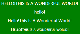
<style type="text/css">
    .curbox{
        width:300px;
        height:200px;
        background: #008000;
    }

    .curbox>p{
        line-height:30px;
        color: #FFFFFF;
        text-align: center;
    }

    .curbox>p:nth-child(1){
        text-transform: uppercase;//将字母全变成大写字母
    }

    .curbox>p:nth-child(2){
        text-transform: lowercase;//将字母全变成小写字母
    }

    .curbox>p:nth-child(3){
        text-transform: capitalize;//将首字母大写
    }

    .curbox>p:nth-child(4){
        font-variant: small-caps;//将字母全变成小字号的大写字母
    }
</style>
<div class="curbox">
    <p>Hello!this is a wonderful world!</p>
    <p>HELLO!</p>
    <p>Hello!this is a wonderful world!</p>
    <p>Hello!this is a wonderful world!</p>
</div>
8.实现一个三角形
效果图:
<style type="text/css">
    .san{
        border-color: transparent transparent royalblue transparent;
        border-style: solid;
        border-width:0px 100px 100px 100px;
        height:0;
        width: 0;
        display: inline-block;
    }

    .san1{
        border-color:transparent green royalblue mediumvioletred;
        border-style: solid;
        border-width:50px 50px 100px 0px;
        height:0;
        width: 0;
        display: inline-block;
    }
    .san2{
        width:100px;
        height:150px;
        background:red;
        display: inline-block;
        margin:0 -5px;
    }
</style>
<div class="san"></div>
<div class="san1"></div>
<div class="san2"></div>